Table of contents
In a world where companies now use dozens (upon dozens) of different tools to track business performance, data dashboards have become critical for quickly conveying the most important numbers to teams within your company as well as to clients.
Having all the information you need to make important business and marketing decisions, the ability to pull data from various sources, track it and present it in a clean and easy-to-track way makes life a lot easier and far more efficient.
Much like the dashboard in your vehicle, data dashboards display real-time key metrics and performance indicators that are essential for guiding decisions and better navigating the surrounding landscape.
Insert after the paragraph ending with “…better navigating the surrounding landscape.”
As dashboards centralize metrics, many teams also want faster ways to interpret what those numbers actually mean. Instead of manually analyzing trends or digging through multiple views, teams now use AI data analysts like Databox MCP to ask direct questions about performance and get answers based on their real metrics, definitions, and historical data. This makes it easier to understand why results changed, what’s driving trends, and whether performance is on track, without replacing dashboards, but adding a clearer layer of day-to-day interpretation on top of them.
But in order for you to do just that, you need the know-how on how data dashboards work and how to create them so as to get the most out of your dashboard reporting.
So let’s get into it.
- What is a Data Dashboard?
- What’s a Dashboard Visualization?
- What are the Benefits of Using Data Dashboards?
- Dashboards Make Goal-Tracking a Team Sport
- How Do Data Dashboards Work?
- The 4 Types of Data Dashboards
- What Types of KPIs and Metrics Should I Track in Data Dashboards?
- What Else Should I Include in a Data Dashboard?
- How Do You Create a Custom Dashboard in Databox?

What is a Data Dashboard?
A data dashboard is an information management tool designed to visually track and present key performance indicators (KPIs) and metrics, providing a comprehensive overview of your business’s performance.
By employing a data dashboard, you can efficiently draw connections between distinct yet interconnected metrics. You can also identify trends and predict potential challenges concealed in an organization’s data. Some advanced data dashboards, like those in Databox, can also include AI-driven features such as Metric Forecasts, which use historical data to predict future outcomes and improve decision-making.
The best part is that you can access your data dashboards through smartphones, tablets, and other mobile technology and just as easily share them with your company, team, or clients.

An example of the Databox Google Analytics (Ecommerce overview) Dashboard Template.
What’s a Dashboard Visualization?
Data visualization is best defined as a graphical representation of information and data. Data visualization tools, like dashboards, use visual elements like charts, graphs, and maps to enable users to easily see and understand trends and patterns in data. Modern dashboards can also incorporate AI-powered insights and interactive elements, allowing users to drill down into specific data points and uncover trends, outliers, and opportunities for optimization. This enhances decision-making by offering not just visual clarity, but actionable insights based on real-time data.
In the world of Big Data, having a dashboard software to help you visualize a large amount of data and easily convey the results is essential. Data visualization is more intuitive and meaningful, and it is very important to use appropriate charts to visualize data.
10 Popular Dashboard Visualization Types
We use different types of data visualization in order to better present and interpret collected data in our dashboards. Here are some of the main digital dashboard
examples that now often include real-time data updates, making it easier for users to monitor the most current information at a glance:
• Line Graphs for tracking trends and projections in real-time.
• Bar Graphs for comparing live values across dimensions.
• Tables and Pie Charts that refresh as new data comes in.
• Gauges and Progress Bars to track progress toward goals with up-to-the-minute accuracy.
Real-time updates enhance decision-making by reflecting the latest available data.
Line Graph Visualization -is used to give a more in-depth view of the trend, projection, average, and growth of a metric over time. The benefit of this type of visualization is that it enables you to visualize patterns over a longer period and compare data to a previous period or goal. In addition, this is a common visualization that will be familiar and easy to read by most.

Bar Graph Visualization – is best used to demonstrate comparisons between values. It is especially valuable when you want to compare different Google Analytics Dimensions to each other.

Pie Chart Visualization – is usually used to illustrate numerical proportions through the size of the slices. It is easy to read and ideal for demonstrating distribution.

Table Visualization – is mostly used to list Metrics by order of importance, ranking, and so on. It is a great option for producing a clear view and comparisons of Metric values. It can show Total SUM, AVG, MIN, or MAX and data for multiple or just a single Metric.

Funnel Visualization – is a great option for tracking the stages potential customers travel through in order to become a customer.

Number Visualization – is best for showing a simple Metric or to draw attention to one key number. It is compact clear and precise and is great for highlighting progress in your Dashboard.

Pipeline Visualization – it is best used to demonstrate the evolution of lead generation through the connection of marketing and sales data. It provides a comprehensive view that not only tracks the journey of leads but also incorporates KPIs for sales representatives, enabling a deeper understanding of their contributions to the overall sales process.

Progress Bar Visualization – is the best way of presenting the achieved progress towards reaching a set Goal.

Gauge Visualization – much like the progress bar, gauge visualization is best used to show progress towards reaching a Goal but also for presenting maximum value.

Compare Visualization – is an advanced version of the number visualization, as is often used to compare two Metrics.

Benefits of Using Data Dashboards
If you want to get a complete picture of how your business is doing it is important to use multiple services to track KPIs and metrics. This can take up time and resources to properly monitor and analyze.
This is where data dashboards show their true value. Modern dashboards now integrate AI-powered insights, automating data analysis and suggesting actionable points. They pull raw data from all your sources, including spreadsheets and databases, and create visualizations like tables, line charts, and even Google Sheets bar charts. With real-time updates, these dashboards allow you to quickly access key metrics and make decisions based on the most current data.
Dashboards also leverage cloud-based integrations, enabling you to sync data across platforms instantly. This significantly simplifies weekly, monthly, and yearly reporting by eliminating the need for manual report generation, saving time, and reducing errors. Your team, management, and clients can track progress with ease, ensuring better alignment and improved decision-making.
Dashboards vs. Reports
Most business users focus on two methods of sharing data – the report and the dashboard. As we explain how each works, it will become clear why one is far more efficient than the other.
So, let’s start with reports.
A report is used to gather detailed data on the operations within an organization. This means that a report can broadly cover a wide scope of related information, or it might narrowly focus on details of a single item, purpose, or event.
Reports can get confusing especially when they involve slideshows, spreadsheets, and your manual creating each one at the end of the week, month or, year. The yearly ones can get very hard to follow once you start presenting.
Dashboard Reporting Is More Efficient
Business dashboards to the rescue.
They present a simpler, more efficient way of presenting data that is easy to interpret and pull whenever you need it.
There is a great way of understanding what makes dashboards more time-efficient, so the name for this type of reporting came from the car dashboard that we all have.
It shows you a number of things you need to keep your eye on so that you have a smooth and safe drive.
Imagine if you needed to change several screens and tap on a different part of the dashboard to get all the information.
There goes your smooth driving.
That is how it is with dashboards and reports.
While reports can be time-consuming and often confusing, using data dashboards to visualize data is cleaner and faster. More importantly, you will get the KPIs and numbers you need within the moment and anyone requesting will easily access it.

Dashboards Connect KPIs and Metrics from Multiple Sources in One Place
As we have already talked about, to track the progress of your business or marketing efforts you will probably need to pull in data from dozens of different tools in order to get a handle on performance. This takes a lot of time, from logging into each tool to checking specific metrics and KPIs that that tool has to offer. When performance lives all over the place, no one ever really has a comprehensive view of what’s going on and how to actually improve.
This where a data dashboard comes in, you can connect KPIs and Metrics from multiple sources in one place. That way all the important data will be in one clear and well-visualized dashboard. It will save you time and allow you to monitor your performance in real-time.
PRO TIP: How Well Are Your Marketing KPIs Performing?
Like most marketers and marketing managers, you want to know how well your efforts are translating into results each month. How much traffic and new contact conversions do you get? How many new contacts do you get from organic sessions? How are your email campaigns performing? How well are your landing pages converting? You might have to scramble to put all of this together in a single report, but now you can have it all at your fingertips in a single Databox dashboard.
Our Marketing Overview Dashboard includes data from Google Analytics 4 and HubSpot Marketing with key performance metrics like:
- Sessions. The number of sessions can tell you how many times people are returning to your website. Obviously, the higher the better.
- New Contacts from Sessions. How well is your campaign driving new contacts and customers?
- Marketing Performance KPIs. Tracking the number of MQLs, SQLs, New Contacts and similar will help you identify how your marketing efforts contribute to sales.
- Email Performance. Measure the success of your email campaigns from HubSpot. Keep an eye on your most important email marketing metrics such as number of sent emails, number of opened emails, open rate, email click-through rate, and more.
- Blog Posts and Landing Pages. How many people have viewed your blog recently? How well are your landing pages performing?
Now you can benefit from the experience of our Google Analytics and HubSpot Marketing experts through a plug-and-play Databox template. It includes key metrics for tracking your leads and can be used as a standalone dashboard or as part of your marketing reports. You can try it during your free trial no setup headaches.
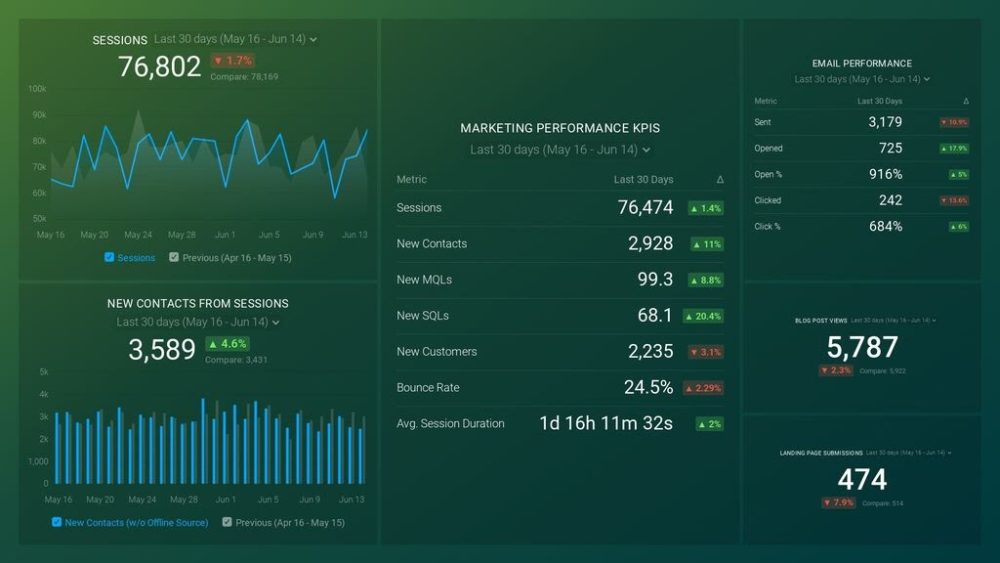
You can easily set it up in just a few clicks – no coding required.
To set up the dashboard, follow these 3 simple steps:
Step 1: Get the template
Step 2: Connect your HubSpot and Google Analytics 4 accounts with Databox.
Step 3: Watch your dashboard populate in seconds.
Dashboards Make Goal-Tracking a Team Sport
In order to motivate your team and have far greater performance transparency, you should make goal-tracking a team sport. And dashboards make it a lot easier.
In a report, goals risk being buried in sheets and are often available just to the management, and often team members don’t have a clear idea regarding how they are contributing to the progress.
By creating a Goal-Tracking Dashboard you can easily show your team where you are currently if you are on track to meet your weekly, monthly, quarterly, or yearly goal. But more importantly, you can make adjustments to your efforts in order to reach the desired goals.
Dashboards Instill a Data-Driven Culture
When running a business you, naturally, need to get well-acquainted with the importance of implementing analytical tools, building reports on data, and creating dashboards. However, it is just a part of having a data-driven company. Most only have certain departments where numbers play a role. This, of course, is usually accounting or marketing.
The fact of the matter is that in order to have a truly data-driven company you need to include compiling and analyzing data in early every element of what your company does. That can significantly help with making informed and important decisions and backing them with the right data.
So where do data dashboards come in? Well, it is simple they help pull in the data you have compiled in one place and make it visible/accessible to your whole team as well as across departments all the way to management.
The sharing options are various from TV dashboards, mobile devices, etc.
Dashboard Allow Your Team to Make Adjustments When They Matter Most
Waiting for your monthly marketing report in order to see if your marketing plan has been successful and if you have reached your goals is no longer a valid option. You will lose both time and resources. And that is exactly why having a marketing dashboard where all your important KPIs are being tracked along with your goals is vital.

You can check the data daily, and take immediate action to adjust your campaign or ads so that you hit the marks you have set. With a marketing dashboard software, your team will be able to spot trends quickly and make adjustments when they matter instead of waiting until the end of the month.
Not only does a data dashboard make the data more accessible to you but also it allows for transparency on a much larger scale so that your entire team has a clear picture of how their efforts are affecting the final outcome.
How do Data Dashboards Work?
It is important to keep in mind that not all data dashboards are the same. The best data dashboards need to be able to answer the most important questions regarding your business. Data dashboards are designed for quick analysis and informational awareness. They are there to pull in information from various sources that are relevant to your business and present it in a way that is easy to analyze and track.
Integrating Data into Dashboards
In Databox, you can add data from multiple Data Sources to a Dashboard using the Metric Library, the list of blank Visualization Types, or My Metrics in the Dashboard Designer.
When using the Metric Library to connect follow the steps below.
Step one – Click the Metric Library icon on the left-hand side of the Designer

Step two – Choose the Data Source you want to add to the Databoard from the Metric Library from the Data Source drop-down.

Step three – In the right-hand Datablock Editor, select your first Data Source and Metric.

Connecting Data to Dashboards via API
It is important to keep in mind that you can sync custom data regularly into Databox from a Cloud-Based application with API access. Databox offers Java, PHP, Ruby, Node.js, GO, and Python SDKs. You can also sync custom data using the Google Sheets integration.
So let’s go through some general guidelines for syncing data. First, keep in mind that a maximum of 10 requests per second is possible. When it comes to size its maximum of 500kb. Finally, sync frequency should not be less than every 5 minutes to ensure optimal performance.
You will also need to define the Data Source from where you want to pull your data, the SDK where you want to push your data to, and a scheduler application so that the data can automatically be synced with Databox on a regular basis.
The 4 Types of Data Dashboards
An important factor to a dashboard’s success is choosing the right type of dashboard for your business needs. In order to decide which one is perfect for you, you need to know which problems it solves.
You can start with the following questions
- What is the main purpose of a dashboard?
- Should your dashboard be analytical or operational?
Now, an operational dashboard helps you track current performance related to your KPIs. On the other hand, analytic dashboards are there to help you establish targets based on insights into historical data.
Depending on how you answered the questions above here are the four main types of data dashboards.
Strategic Dashboards
A strategic dashboard can simply be defined as a reporting tool for monitoring the long-term company strategy with the help of critical success factors. Due to the fact that the data in these types of dashboards provides an enterprise-wide impact on a business, strategic dashboards are mainly used by senior-level management within a company.
A strategic dashboard should display the critical information needed to manage an organization—like goals, critical measures, projects, and action items. When creating a strategic dashboard make sure you answer the following questions:
- What role does my audience play?
Are they your investors, your team, your board members, etc?
- What type of people are they?
Are they analytical, detail-oriented, time-poor, etc?
So a strategic dashboard for the CMO should contain some of the following – Users, New Leads, New Customers by Source, MQL, and SQL by Source. Of course, there are many other options. You can see more executive dashboard examples here.

Analytical Dashboards
An analytical dashboard contains a vast amount of data created using executive dashboard software and used by analysts to provide support to executives. It is mostly used by middle management in the company since it is meant to present a comprehensive overview of data.
Analytical dashboards are important for analyzing historical data, based on which analysts can identify trends, compare them with multiple variables and create predictions, and targets. All of these are meant to be implemented in the business intelligence strategy across your company. Analytical dashboards often include advanced BI features like drill-down and ad-hoc querying.
An example of an analytical data dashboard would be an MRR Data Dashboard that can include New MRR by Month, New MRR, Signups, and New MRR (Daily Total). Of course, this is a simplified version of an analytical dashboard and you can create more advanced ones using Databox. You can see more SaaS dashboard examples here.

Operational Dashboards
An operational dashboard is used for monitoring and managing operations that have a shorter time limit and that frequently change. It usually tracks the current performance of key metrics and KPIs as well as monitors progress towards the pre-set goals.
For an operational dashboard, it is important that the data updates very frequently, sometimes even on a minute-by-minute basis as they are meant to be viewed multiple times throughout a day.
An example of a marketing operational dashboard would be a Google Analytics one that contains some of the following – Page Views, New Sessions, Bounce Rate, etc. You can see more web analytics dashboard examples here.

Informational Dashboards
Informational dashboards are, simply put, used to tell a story with the data. They provide essential information for a specific area of your business or can be a great way of informing your clients of the achieved goals on a monthly, quarterly, or yearly level.
When it comes to informational dashboards, they should be clear, easy to understand, and should not have a lot of in-depth data that might confuse your team or your clients.
An example of an informational dashboard would be Content Marketing Overview Dashboard which contains the essential information data such as Sessions, Sessions by Channel, Audience Behavior, Page Views, Events by Event Action, and Goal Completion. You can see more content marketing dashboard examples here.

What Types of KPIs and Metrics Should I Track in Data Dashboards?
Deciding which KPIs and metrics to track on a data dashboard is vital for designing a useful dashboard. Remember, that the main purpose of a dashboard is to provide clear and concise answers to data-related questions that your team, business, or clients might have.
What makes dashboards so versatile is that they can be used for any industry and department. From executives, sales, marketing, social media, SaaS, development all the way to supply, call centers, and healthcare.
- Marketing Dashboard
- Sales Dashboard
- Customer Support Dashboard
- Financial Dashboard
- Executive Dashboard
- Management Dashboard
- Project Dashboard
- KPI Dashboard
You can decide which metrics and important KPIs to track depending on the individual needs of each department.
Marketing Dashboard
A good marketing dashboard will provide you with instant clarity on email, PPC, social, content marketing, and web traffic campaigns from your favorite services. Marketing dashboards are designed to provide your marketing department insights into their marketing performance.
It is important to remember that the marketing dashboard has to answer one key question – “How are we performing right now?” So the answer to this question needs to drive your choice of KPIs and metrics for the marketing dashboard you are creating.
For example, your content marketing reporting dashboard should include some of the following –
- Average Session Duration
- Average Time on Page
- Bounce rate
- Pages by Click-Through Rate (CTR)
- Goal Completion
- Average Engagement by Post

Sales Dashboard
A sales dashboard enables you or your aisles department to keep a close eye on sales KPIs and monitor them in one central place. At the same time, sales teams can have access to a detailed analysis of sales performance, cycle lengths, and sales funnels.
Both the management and the teams can use a sales dashboard software to monitor the sales KPIs and metrics and have a real-time data overview in terms of their targets, progress, with the ability to share the information with your clients or stakeholders in just a few moments.
Some of the KPIs and Metrics that you should include in your sales dashboard are the following:
- Funnel Revenue
- Deals Won
- Time to Close a Deal
- New Deals
- Sales Leaderboard
- Deals won $
- Top Won Deals
- Sales Performance

Customer Support Dashboard
A customer support dashboard allows your support team to monitor all relevant customer KPIs in an easy and accessible way. The main benefit of this dashboard is that it allows you to track responsiveness and handling time across your support team, as well as other key metrics that you choose to include.
A good example of this type of dashboard is Intercom Customer Support Overview Dashboard Template from Databox. It includes the following relevant metrics:
- New Conversations
- New Conversation Volume
- Open Conversations by Teammate
- Conversations
- New People
- Tags by Tag Name
- Teammate Leaderboard

Financial Dashboard
A financial dashboard helps to track all your relevant finance KPIs. It enables effective cash management and detail expense, sales, and profits tracking so that you can meet and outperform the financial objectives of a department or company.
One example of a financial dashboard is Financial Performance dashboard template from Databox. It can help you keep high-level tabs on your overall financial health, and quickly identify points of friction slowing your success. The following relevant KPIs should be included in this type of dashboard:
- Income
- Gross Profit Margin
- Total Expenses
- Pipeline Revenue
- Closed Lost Amount
- Open Invoice Amount
- Paid Invoice Amount
- Open Invoices by Client

Executive Dashboard
With an executive dashboard, you can make sense of massive amounts of data and make fact-based decisions in real-time. This type of dashboard is also known as a strategic dashboard and their ultimate usefulness comes from the fact that they provide you with a graphical interface using real-time data, based on which you can make split-second decisions.
The fact of the matter is that executives have a limited amount of time and that is why it is imperative they have access to accurate and reliable information they need when they need it.
So, when considering executive dashboard metrics, the following should be included:
- Revenue
- Unique website visitors
- On-time delivery (OTD)
- Marketing profit
- Annual recurring revenue (ARR)
- Goal conversion rate
- Conversions by channel
- Year-to-date sales growth
- Trials started

Management Dashboard
A management dashboard is a visual presentation of all important business KPIs in one place. It uses an easy-to-read format that can be shared with company executives up to the C-level, so that all goals, metrics, action items, and KPIs are laid out for everyone to see.
When creating a management dashboard you can consider adding some of the following KPIs.
- Customer acquisition cost (CAC)
- Red-amber-green (RAG) status indicators
- Campaign performance and clicks
- Quarter-by-quarter comparisons
- Time on page and session duration length
- Monthly profit and loss
- Target revenue vs. actual revenue

Project Dashboard
The main purpose of project dashboards is to track tangible goals pre-set by different teams and departments within your company. However, a project dashboard doesn’t just focus on such goals as hitting a sales quota or increasing marketing revenue by a certain margin. The real function of a project dashboard is to track specific metrics related to the progress and completion of a project, which, in return provides continuous up-to-date tracking.
A great use for a project dashboard is to have each team member create their own so that they can track their contributions to the projects they are currently working on, and make the necessary adjustment in order to ensure that the set goals are met in the set time frame.
A great example of a project dashboard is this Client Time Dashboard Template in Databox. With this, easy-to-use dashboard template you’ll be able to monitor all your tracked time, billable hours, and billable amount split by clients. Depending on your needs, you can also split up the metrics by project, tasks, and team.

KPI Dashboard
Key Performance Indicators or KPIs are the business metrics that you consider to be the most important for your company. Their main purpose is to help you determine what your business needs to achieve as well as to measure if you are on the right track to achieving them.
So having them clearly represented is a must in order to track them properly. This is where a KPI dashboard comes into play. It brings them all into one place from where you can see how you’re performing on each different measurement, and compare them.
By now you know that the chief benefit of a data dashboard is to combine a vast amount of information and presented it in a visually compelling way making it easier for you to both track it and share it with your clients and team.
A great example of a KPI dashboard would be Google Analytics KPI Dashboard Template from Databox. Its main purpose is to help you monitor your Website Engagements so the KPIs include are:
- Avg. Time on Page
- Avg. Session Duration
- Bounce Rate
- Goal Completion
- Goal Conversion Rate
- % Sessions
- Pages/Sessions
- Pageviews
- Pageviews by Page
- Sessions
- Sessions by Channel
- Users

What Else Should I Include in a Data Dashboard?
What we have shown you so far is just the tip of the iceberg when it comes to everything that you can include in your data dashboard. The main purpose of using dashboard reporting is to tailor it to your personal needs and the needs of your business.
However, if you are just beginning with this type of data presentation, there is a chance that you might miss out on certain options. That is precisely why we have added some of the options that you should definitely consider including in your data dashboards.
Progress Toward Goals
It is important that you know at all times if you are on the right track to reaching your business goals. That way you can adjust your current efforts in real-time in order to improve your chances of meeting the goals you have set.
Databox enables you to set goals for any metric, from any of the data sources that you are already tracking. You can track and manage your goals all from one screen, or, visualize goal progress toward any metric in your dashboards.
Once you’ve set your goals, you can monitor your progress towards them on any dashboard using any number of visualization types at your disposal. You can use data dashboards to compare the performance of different metrics over time that way you can pinpoint the reasons you might not be hitting your target goals.
The best part is that you can access the data dashboards containing your goals via Desktop, TV, and mobile devices so that you can check your progress at all times. Not to mention that you have at your disposal the Databox mobile app that you can use to track your current progress toward goals, including the percentage of the goal that’s been hit and the number of days left to hit it.
Here’s how you can track your progress towards reaching a Goal on a Databoard in Databox.
Comparison to Previous Periods
In order to truly see progress, you need to be able to compare data from previous periods. That way you can observe whether the changes you have implemented are showing results.
There are two visualizations that you should consider –
The Compare visualization – which places 2 metrics side by side. These metrics can be from 2 unique Data Sources, or from the same Data Source.
The Interval visualization – is intended to show values of the same Metric for different Date Ranges on one Datablock. This allows the user to see Daily // Weekly // Monthly // Quarterly // Yearly values of the same Metric in one view. This Visualization Type can have a maximum of 10 rows added to it.
Annotations
Annotations are short text notices that can be added to different types of visualizations in your dashboards in order to better interpret KPIs and inform end-users when something noticeable has impacted the data. You can use Annotations to indicate when you launched a new marketing campaign, when a newsletter was sent out, or when seasonal events (like special sales) may have occurred.
By adding Annotations directly to a Chart, you’re drawing a direct correlation between the work you’re doing and the results you’re seeing in the data.
Flexible Date Ranges
By understanding the parameters for each Date Range in Databox, you can build valuable reports to meet the needs of your company. In the Designer, you have the ability to set the Date Range that the Datablock first loads to. Additional Date Ranges are available while viewing the Databoard.
More importantly, you have the option of setting Custom Date Ranges that allow you to define your own Date Range by selecting the start and end dates, Custom Rolling Date Ranges, more specific comparison Date Ranges, fiscal calendars, and more.
Images
Adding images to your dashboard personalizes them and lets you add additional information that you might not be able to present through charts and numbers.
In Databox you can add an image directly to the Databoard as well as link Image to an external URL.
How Do You Create a Custom Dashboard in Databox?
So in case, you don’t want to use one Databox Dashboards Templates that we have on offer. You have the option of creating a custom one to suit your personal needs or the needs of your team and your business in our custom dashboard software.
First thing’s first, in Databox a Databoard is a dashboard that is made up of Datablocks. All Databoards are optimized for desktop and mobile use. You choose which Databloks that show Metrics and KPIs that will be included in your custom dashboard.
So let’s start creating your first custom Databox dashboard!
Step 1 – Create a new Databoard
Navigate to the Databoards page. Click the green + New Databoard button to create a new Databoard.

You’ll have the option to select Use Wizard or Start Blank. The Wizard will take you through a simple process, similar to the signup flow, that prompts you to select a Data Source and Metrics to immediately populate on the Databoard. If you choose to Start Blank, you will be taken directly to the Designer to create your Databoard from scratch.
Step 2 – add a Datablock from the Metrics Library to a Databoard
First, click on the Metrics Library icon on the left side of the Designer.
Then choose the Data Source you want to add to the Databoard from the Metric Library from the Data Source drop-down. These are pre-built Datablocks for the selected Data Source. You can search for specific Metrics using the Search bar at the top of the Metrics Library. You can view Basic, Custom, and Calculated Metrics by clicking on the corresponding tabs at the top of the Metrics Library.
Finally, in the right-hand Datablock Editor, select your first Data Source and Metric and drag and drop the selected Datablock onto your Databoard. This will automatically re-populate with data from the selected Data Source.
In addition, you have the option to click on the Datablock on the Databoard. This will open the corresponding Property Manager on the right-hand side of the Designer. Using the Property Manager, you can further customize the Datablock as you see fit.
There are several other ways of adding Datablocks to Dashboard in Databox. You can also add them from My Metrics or Visualization Library in the Dashboard Designer.
Step 3 – Start tracking and sharing your custom data dashboard.
Reader Questions (FAQ) About Data Dashboards
What is a Data Analytics Dashboard?
A data analytics dashboard is a tool that visually presents key data and metrics to help you analyze performance, identify trends, and make data-driven decisions. It consolidates information from multiple sources into one place, using charts, graphs, and other visualizations to make the data easy to understand.
For example, a marketing analytics dashboard might track website traffic, conversion rates, and campaign performance, allowing you to quickly see what’s working and what needs improvement—all in real-time.
Can I create dashboards without technical expertise?
Yes, tools like ours make it easy. You can use pre-built templates or a drag-and-drop designer to create dashboards without coding. Just connect your tools, pick your metrics, and your dashboard is ready in minutes. No need for complex tools like Microsoft’s Power BI or Google’s Looker Studio.
What is the difference between operational and strategic dashboards?
Operational dashboards track real-time performance for short-term goals, updating frequently to help teams react quickly, like monitoring daily ads performance. Strategic or management dashboards focus on long-term objectives and high-level metrics, helping leaders or C-suite track progress toward annual goals or company-wide KPIs.
You are Ready for Dashboard Reporting
With dashboard reporting, your agency and your clients are both in sync with their current marketing & sales analytics, along with their monthly and quarterly goals.
This now gives your agency or your company the agile ability to address any red flags or supplement any positive trends in your weekly sprint.
If you need additional help, signup up today and contact our team to make your data dashboard vision a reality.