Table of contents
Snooping around trying to understand the difference between dashboard vs report and when to use each?
Get this: A marketing dashboard is a collection of key performance indicators (KPIs) related to a specific objective. The aim? To offer centralized data and help you track progress at a glance.
On the other hand, a report is a collective document that dives into project details and other valuable insights – all put together with the aim of helping you make a data-driven strategy.
Want to learn more? Dive into this guide that discusses the following areas backed with expert insights:
- What is a Dashboard?
- What is a Report?
- Dashboards vs. Reports: What’s the Difference?
- When Should Businesses Use Dashboards
- When Should Businesses Use Report

What is a Dashboard?
A dashboard is a visual display of selected KPIs that show you progress in one look.
For example, if you’re focused on growing your social media engagement, you can create a dashboard to see progress in real-time.
Handpick the metrics that you think are essential for understanding how your social engagement is growing. These could include daily comments, DMs, mentions, retweets, follower count, and so on.
In this way, a dashboard displaying relevant marketing metrics is a foundational requirement for tracking progress.
Instead of having to pull numbers for disparate sources, you can find all the important information on a visual dashboard. Simple, isn’t it?
What is a Report?
A report is a document put together to analyze data around a specific marketing campaign to communicate its performance. The idea is to help the reader devise a plan/strategy after reviewing data over a spread of time.
Let’s suppose you want to understand how well your social media strategy for Q1 worked. In that case, you can’t only look at objective metrics to draw conclusions. Instead, you’ll need data over time.
To this end, a social media strategy performance report will help you understand how well the plan performed, whether it achieved its expected results, and more. The report will also include a set of actionable recommendations for improving the strategy in the next quarter.
Related: What Is KPI Reporting? KPI Report Examples, Tips, and Best Practices
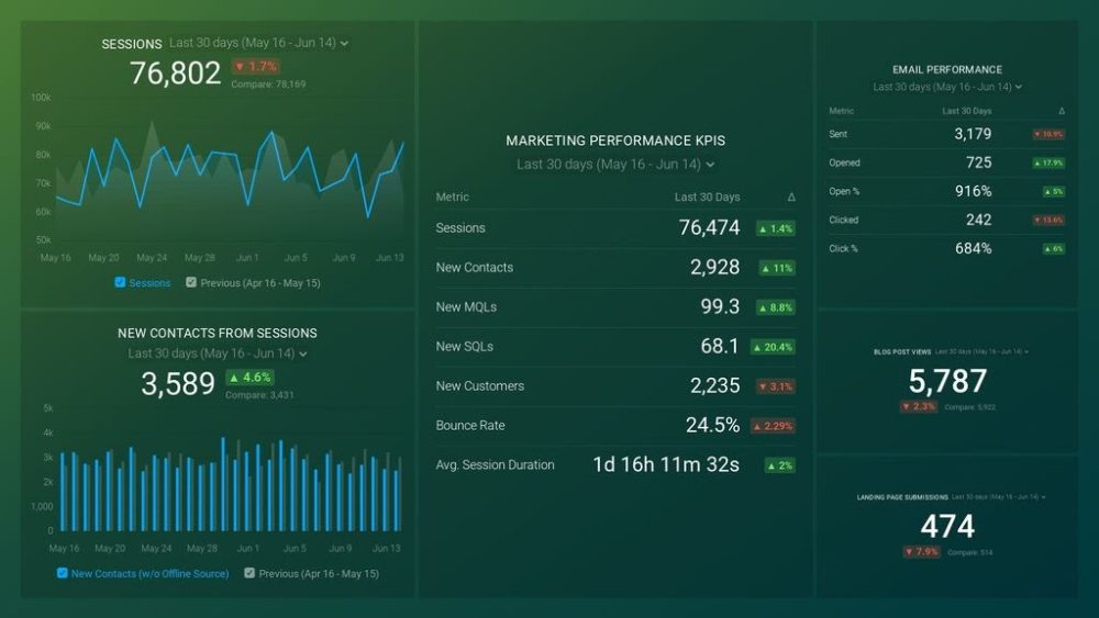
PRO TIP: How Well Are Your Marketing KPIs Performing?
Like most marketers and marketing managers, you want to know how well your efforts are translating into results each month. How much traffic and new contact conversions do you get? How many new contacts do you get from organic sessions? How are your email campaigns performing? How well are your landing pages converting? You might have to scramble to put all of this together in a single report, but now you can have it all at your fingertips in a single Databox dashboard.
Our Marketing Overview Dashboard includes data from Google Analytics 4 and HubSpot Marketing with key performance metrics like:
- Sessions. The number of sessions can tell you how many times people are returning to your website. Obviously, the higher the better.
- New Contacts from Sessions. How well is your campaign driving new contacts and customers?
- Marketing Performance KPIs. Tracking the number of MQLs, SQLs, New Contacts and similar will help you identify how your marketing efforts contribute to sales.
- Email Performance. Measure the success of your email campaigns from HubSpot. Keep an eye on your most important email marketing metrics such as number of sent emails, number of opened emails, open rate, email click-through rate, and more.
- Blog Posts and Landing Pages. How many people have viewed your blog recently? How well are your landing pages performing?
Now you can benefit from the experience of our Google Analytics and HubSpot Marketing experts through a plug-and-play Databox template. It includes key metrics for tracking your leads and can be used as a standalone dashboard or as part of your marketing reports. You can try it during your free trial no setup headaches.
You can easily set it up in just a few clicks – no coding required.
To set up the dashboard, follow these 3 simple steps:
Step 1: Get the template
Step 2: Connect your HubSpot and Google Analytics 4 accounts with Databox.
Step 3: Watch your dashboard populate in seconds.
Dashboards vs. Reports: What’s the Difference?
The examples we shared above give a rough idea of how dashboard vs report stand against one another. Let’s get into the details now.
Dashboards offer real-time data and reports offer data over a span of time
First, data dashboards offer data in real-time that’s refreshed at regular interviews. So each time you check your marketing dashboards, you’ll see fresh numbers. Reports, on the flip side, collate data over a specified time frame.
Dashboards fit on a screen but reports may take pages
Second, dashboards are displayed on digital boards – presenting relevant metrics on one screen. Reports can be both digital and physical though. Plus, they take up a few pages. This static nature of reports explains why reports don’t have real-time, refreshed numbers.
Dashboards offer objective data and reports provide subjective insights
Third, because dashboards offer real-time, often auto-updated (depending on the dashboard software you use) metrics, the data you get is objective. You can analyze it as you review it.
On the other hand, a report is prepared to assist you in taking the next steps – often containing recommendations for the next steps. This makes it subjective as the report maker’s insights are packed into the content.
Dashboards feature numbers with reports showing both numbers and text
Since dashboards display real-time information, they only show metrics in a visually engaging, easy-to-consume manner. However, reports contain KPIs as well as an analysis of them. This way, it’s both text-heavy and packs tables and charts.
The content relevancy differs too
Finally, you can quickly and easily create dashboards with a custom dashboard software to see metrics that you wish to. These could be related to a campaign or objective or you can put together a marketing dashboard displaying metrics essential to your business on the whole.
Reports, however, are always specific to a marketing objective – reviewing a campaign’s performance. It’s why their focus is narrow and they include KPIs related to the objective.
That said, although dashboards and reports have several differences, they serve the same purpose – to help you make data-driven decisions and show marketing performance. This explains their similarity.
To add, both dashboards and reports feature data visualization. It’s why you can expect to see bar graphs, numbers-bearing tables, and other charts.
With the lowdown on the differences and similarities between a dashboard vs report, which one do you think you should use? Our respondents suggest both.
In fact, 95% of our contributors employ dashboards and all of them use reports. Put another way, marketing experts out there leverage both marketing dashboards and reports and you should too.

With that, let’s look at specific situations of when you should use a dashboard vs report.
Related: Business Reporting: 4 Ways to Report Poor Performance to Your Boss or ClientBusiness Report: What is it & How to Write a Great One? (With Examples)
When Should Businesses Use Dashboards?
Use dashboards in the following circumstances:
- Before starting work with clients
- When working with multiple team members
- For focusing on particular business aspects
- For informed day-to-day decision making
- For centralized data on one screen
- When you need an easily adaptable reporting format
- To break through departmental silos
- For on-the-spot simple data analysis
- For daily reporting
1. Before starting work with clients
These could be new clients or old clients returning for working together on new projects. At electrIQ marketing, Brandon Amoroso shares they “set up KPI dashboards right when we start working with clients.”
“This is very helpful for us to show our clients truthful and detailed results from our digital marketing efforts, rather than giving them reports that are too vague and that they cannot fully understand,” Amoroso explains, detailing why they set up the dashboards.
“We want our clients to know exactly how our services are working for them, and they appreciate our transparency in showing them authentic KPI results in real-time.”
Related: Agency Reporting: 9 Tips to Effectively Prove Your Value to Clients
2. When working with multiple team members
Unless you’re a one-person team that doesn’t collaborate or outsource work, you need dashboards.
Why? Because that way, all team members can have access to data related to different campaigns. They can use this for decision-making, tracking progress, and much more.
In fact, at-a-glance visibility into projects, actions, and campaigns is the leading benefit of using dashboards according to the respondents we talked to.
This is followed by the ability to identify trends, improve decision-making, and get updated progress evaluations. Two more benefits of using dashboards, trailing these perks, are that these visual boards offer an easy way to measure efficiency and help save and time resources too.

Draft.dev’s Karl Hughes agrees. “A business should use dashboards when they have multiple team members who need the data to make decisions and operate.”
Here are the reasons for doing so: “Dashboards are easily read and can be easily accessed to show your team members any crucial data they might need to go about their day.”
“If the data shows high bounce rates from a certain page or platform for example, then they can shift their focus to tweaking the content or technical issues to adjust those numbers,” Hughes explains.
“It’s crucial that you only use dashboards with your employees and team members, and use a report to show information to investors or someone who needs to know more in-depth details.”
Related: Reporting Strategy for Multiple Audiences: 6 Tips for Getting Started
3. For focusing on particular business aspects
Admittedly, decide whether to use dashboard vs report based on your data requirements according to Marc Tonkin from JTG Travel.
Says Tonkin: “Dashboards work best when they focus on certain parts of a business. Dashboards can manage help desk tickets, market share, investment portfolios, and other information.”
“Data visualization and organization is the goal of dashboards,” Tonkin adds. “Changes in certain metrics or thresholds can be configured to inform users.”
“Finally, unlike reports, dashboards allow users to edit and interact with data dynamically, whereas, reports present a static image of data. Reports are important for capturing static data, whereas dashboards are ideal for real-time analytics.”
“Dashboards also allow for improved monitoring of certain data and operations.”
Summarizing, Tonkin notes, “Ultimately, the reporting software you pick relies on your current needs. Dashboards are distinct in their dynamic, interactive, and immediate updates. Reports give a high-level picture of real data costs. In the end, they’re both useful tools and you basically have to choose what is best for you and your data needs.”
4. For informed day-to-day decision making
Phil Strazzulla from Select Software Reviews makes this point, sharing “As a CEO I have to keep my eye on several different metrics to inform my decision-making.
Without a dashboard keeping all of this data in a single place, I’d spend most of my day tracking down the data I need, rather than reviewing it.”
“As a company whose public face is a website, I also have to be aware of my site’s performance,” Strazzulla adds. “I have a dashboard so I can monitor traffic and response times so I know when I need to scale up my site in response to high traffic.”
Related: 15 Tips for Setting Realistic Website Traffic Goals
5. For getting centralized data on one screen
“As the tech expert and CEO of a company that utilizes dashboards, I’ve found that: As a tech company, we utilize dashboards for nearly all our reporting,” admits Victoria Mendoza from MediaPeanut.
“This includes important company metrics that can be viewed at a glance to gain insight and KPIs that really move the needle for our company (MediaPeanut).”
Here’s how they plan their dashboards: “We take all our metrics from Google Analytics, CRM, and other areas and combine them into one dashboard. We’re able to centralize the way we handle data, calculate metrics, track goals, and integrate our data and findings visually in a way our team can understand,” Mendoza lays out.
“As a tech expert with several successful projects, it’s become clear to me that business should use a dashboard 100% of the time as the need for at-a-glance data to quickly analyze KPIs is a must. (We personally use Freshworks CRM, but have tried many different reporting and are considering a platform like Databox actually).”
Not only do dashboards provide at-a-glance data, but Mendoza notes it helps with identifying trends and performance as well.
Mendoza explains: “What reports miss that dashboards provide is the ability to quickly identify trends and performance at a glance and display information that communicates instantly with the team. This way we can adjust quickly rather than reading a full report.”
We Are Working’s Bridget Chebo commends the same benefits of using dashboards. It’s why Chebo suggests using dashboards:
- “To look at multiple KPI’s in one place
- To look at trends over time on a graph
- To show agents their performance against KPI’s in real time”
The reason dashboards win in all these situations: they “save time and hassle [by showing] everything in one place.”
6. When you need an easily adaptable reporting format
“Dashboards are much more adaptable, and you can use them to display specific metrics and data that you are most interested in,” points out Ouriel Lemmel of Winit.
“You can modify dashboard settings to be updated as data changes and they are more of a live document, so you can visualize what is happening at the moment. For compartmentalization and monitoring specific metrics and functions, dashboards are ideal.”
Senacea’s Michael Sena appreciates dashboards’ adaptability too. “Dashboards usually allow more flexibility when it comes to filtering criteria and choosing reporting periods,” Sena highlights.
“That makes them much more helpful when searching for explanations and data that will inform actions. They also may enable their users to spot patterns hard to notice, involving multiple data series filtered for specific clients and presented at the right level of aggregation.”
These pointers circle back to the fluid nature of dashboards that we discussed above – you can handpick whatever metrics you prefer to add to a dashboard. Whether these KPIs are tied to a single objective or are ones that are your top priority across the board, you can choose whatever you want to see on a custom dashboard.
In fact, you can make as many dashboards are you want because they’re both easy to create and don’t take much preparation time as well. If you’re using Databox, you can even knock a dashboard together from the vast template bank that we offer.
Or, you can connect data sources and create your own custom dashboard within minutes. Since data is auto-updated in Databox dashboards, you don’t need to worry about maintaining these boards.
7. To break through departmental silos
“Dashboards break through and prevent the forming of silos,” opines GoodHire’s Mike Grossman.
“By clearly displaying data with visual aids like trend charts and graphs, findings are no longer limited to those with direct subject matter expertise. This means that information can freely flow throughout the workplace, and it’s as quick and convenient as taking a look at the dashboard.”
It’s why Grossman recommends: “Businesses should use dashboards to clearly convey information that spans across multiple departments.”
8. For on-the-spot simple data analysis
“Dashboards excel when it comes to data analysis,” observes Alina Clark of Cocodoc.
“Anything that involves breaking down and investigating collected data can become complicated if you don’t find a way to simplify the appearance and figure out the trends. A dashboard does exactly that.”
Sharing their experience, Clark outlines, “As a business, using a dashboard has allowed us to make data-based decisions in a more effective way.”
“Going through data without a dashboard often means crunching through too much information. With a dashboard, one gets to understand what the data says at an instant,” says Clark.
In short, “Compared to other data analysis tools, a dashboard is arguably more powerful, and simpler to use. The simplicity and sheer greatness of a dashboard have made it an indispensable part of our business.”
Related: How to Analyze Data: 30+ Experts on Making Sense of Your Performance
9. For daily reporting
A highly valuable use case for dashboards is leveraging them for your daily reporting. As Adam Stahl from Remotish explains it, “I feel as though data dashboards are to the modern marketer and sales professional what the daily weather report was to my father.”
“As the owner of a landscaping business, the first thing he would do in the morning was make a cup of tea and turn on the weather report,” Stahl recalls. “Now, I make a cup of tea and sit down in front of my dashboards to review the daily insights most relevant for me to make informed data-driven decisions.”
“In modern times when businesses are flooded with more data than they may know what to do with, dashboards compromised of individual reports float the figurative cream of that data to the top. You get timely, relevant, and powerful data and insights tied directly to your business objectives.”
In terms of the value dashboards offer, Stahl makes another analogy. “Dashboards are kind of like a 4-course meal. Your data serves as the ingredients and reports are the individual courses (appetizer, soup, entree, dessert). That 4-course meal bundling shows the value you are getting through those individual pieces but also provides higher-level insights for improved decision making (for example, it could help you avoid the short-term pitfall of filling up on soup because you need to save room for that delicious dessert just down the line)!”
When Should Businesses Use Report
Here’s when:
- To demonstrate to clients the value you offer
- To update one-person teams you work with
- To analyze data thoroughly
- For cases that don’t need criteria modification
1. To demonstrate to clients the value you offer
“Reports are more comprehensive than dashboards,” observes JTG Travel’s Marc Tonkin.
“Reports can provide a better high-level perspective of an organization because they are not active. A manager or CEO may not need to view individual customer service dashboards, but he should understand how the department operates.”
“They also differ in terms of data timing,” which further explains how reports are comprehensive. “Broader reports often include historical data. The fact that they must be sent regularly means they reflect a snapshot rather than a real-time condition.”
What’s more, “reporting allows you to easily assess patterns and demonstrate to clients the value of the services you provide, as well as address any queries your customers may have – often before they emerge,” comments Tonkin.
Ouriel Lemmel from Winit echoes the same. “I’m more likely to use reports for data that doesn’t change rapidly because I don’t need to look at this information once.”
In short, Tonkin concludes the use of dashboards vs reports in two brief pointers:
- “While dashboards are good for examining current data, reports are ideal for reviewing data from a certain time period. Reports are ideal for displaying historical and trending data.
- While dashboards are ideal for real-time overviews, reports allow you to easily study certain timeframes. As a result, reports are an ideal choice for tax season or for gaining an understanding of trends within your organization or business. They are also excellent for transparency.”
2. To update one-person teams you work with
Victoria Mendoza of MediaPeanut advises “using reports rather than dashboard in a situation where there is no need to provide information to the team (think real estate agents who work solo).
However, if a larger team within a business were to only use a report and not a dashboard, they would miss out on the ability to quickly identify trends.”
“The dashboards we use are drawn directly our reports. So, within the dashboard, the underlying data gets pulled from the report and we have access to both in one dashboard,” Mendoza explains.
3. To analyze data thoroughly
While you should use dashboards for quick, at-a-glance analysis, Bridget Chebo of We Are Working suggests you “use reports when you need to investigate data, manipulate data, or drill down into specific pieces of data.”
What’s more, Chebo shares, “If you want to see specific information about a specific customer, or you are doing a deep dive into an audit, or have a need to filter or manipulate the data as you are working, then I recommend to use reports for this as opposed to dashboards as you will get more detail and more functionality.”
Adam Stahl from Remotish also suggests using reports for in-depth data study. “Dashboards are great for data needed at a higher level and from an at-a-glance perspective. They provide information that you need in a digestible format that’s easily delivered or displayed.
However, whenever you need to take a deeper dive into your data or have specific, sometimes one-off use cases, you may get more out of reports.”
Going to another analogy, Stahl explains the use cases of a dashboard vs report.
“One way to visualize this is the dashboard of your car. You’ve got at-a-glance information displays for your fuel level, oil and engine temperature, miles per gallon performance, and other higher-level information that you can gain insights from.
If your check engine light comes on, you’ll need to do more granular diagnostic testing or reporting to uncover the cause of that reported data. Those more thorough diagnostic tests are also not likely ‘reports’ that you’d want on your car dashboard at all times. You only want to pull and reference those when the data on your dashboard indicates that something unexpected is happening.”
4. For cases that don’t need criteria modification
Senacea’s Michael Sena thinks, “Reports are best suited for types of insights that don’t require any criteria modification from the end-users.”
“If the recipients of the reports only need to see the same kind of data breakdowns, filters applied, date ranges and granularity each time, reports are much better,” Sena explains.
“Compared to dashboards, they tend to be simpler and don’t require applying any modifications by their recipients.”
Level Up Your Business Performance Today by Creating Dashboards In Minutes
With this rundown of a dashboard vs report, you’d now be having a clear idea of when to use what.
To recap, dashboards assist with daily reporting, helping identify trends, displaying centralized information on an easily accessible screen. In doing so, dashboards break silos, help evaluate progress, and empower data-driven decision-making.
Reports, on other hand, are best for in-depth analysis of data related to a specific campaign or objective.
Fancy a head start? Use a dashboard software like Databox to create your dashboards quickly. Once you plug in your data sources, you can either use a template-based dashboard or build a custom one.
From there, Databox will auto-update data to provide fresh metrics on visually engaging screens. These display boards make sure all data is delivered in an easy to read and digest format. This way, working with data becomes a breeze rather than a mind-numbing challenge.
So sign up for Databox for free and build your dashboards today.