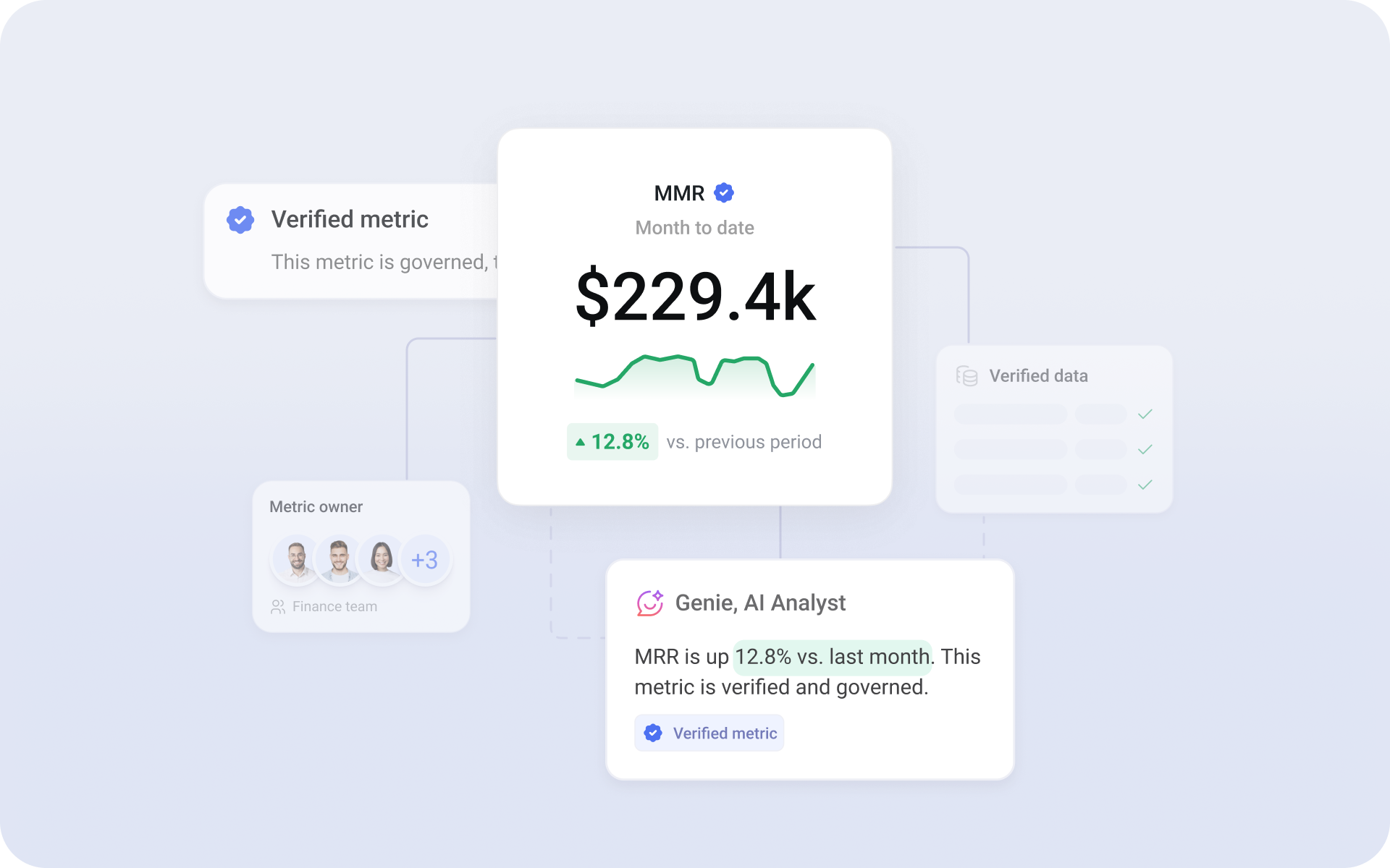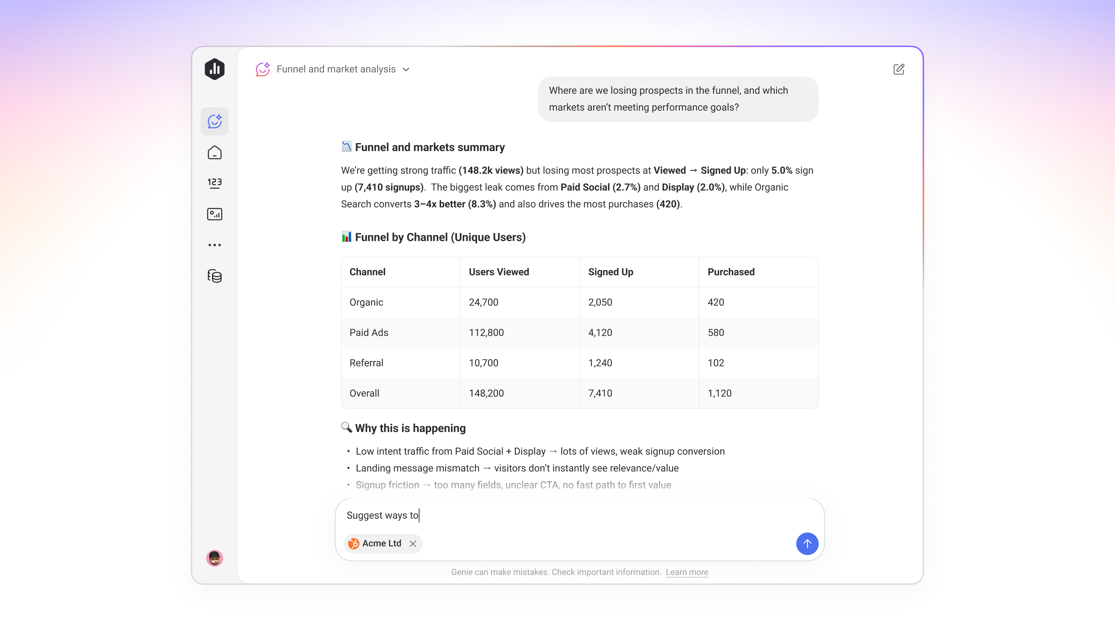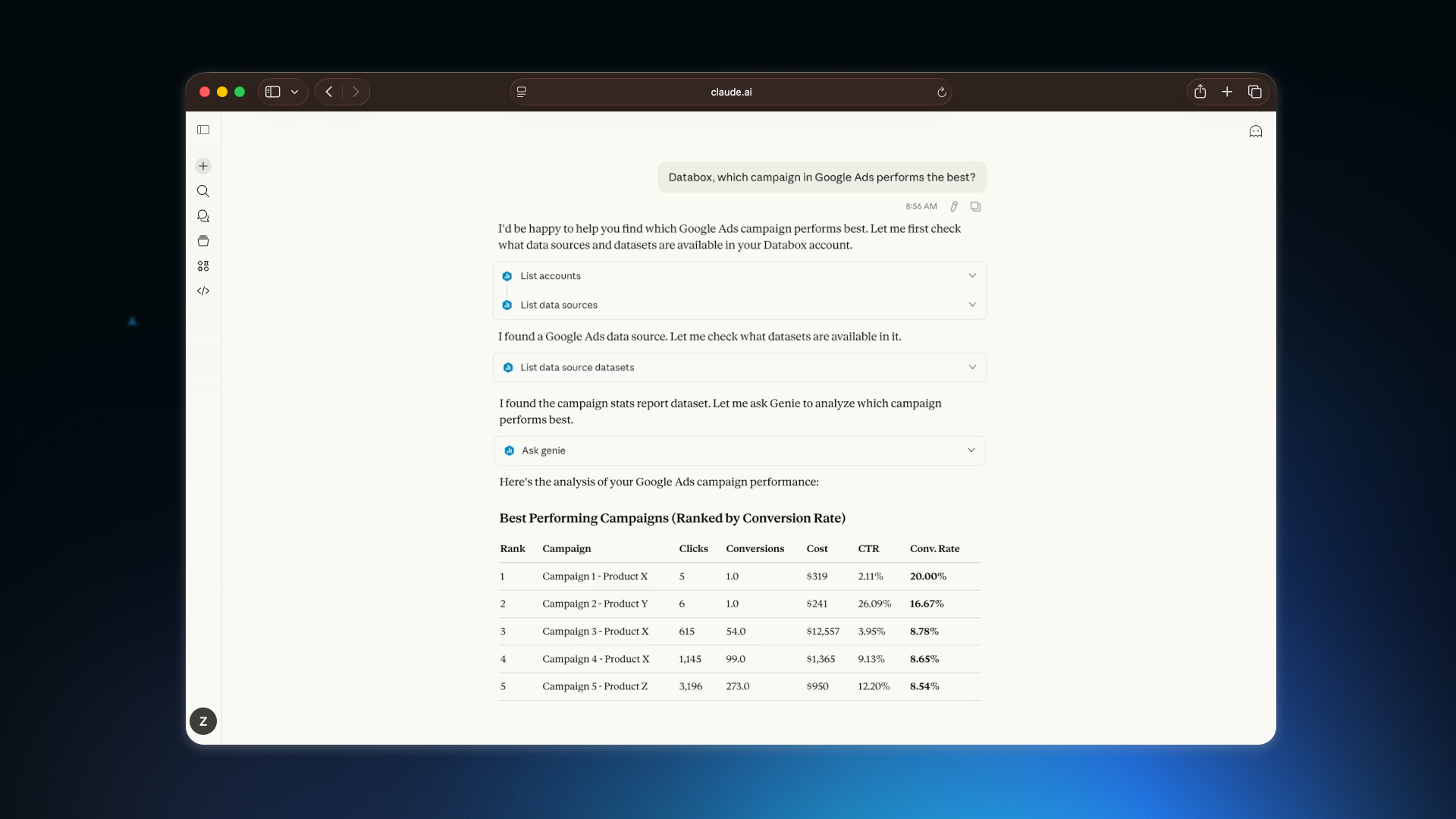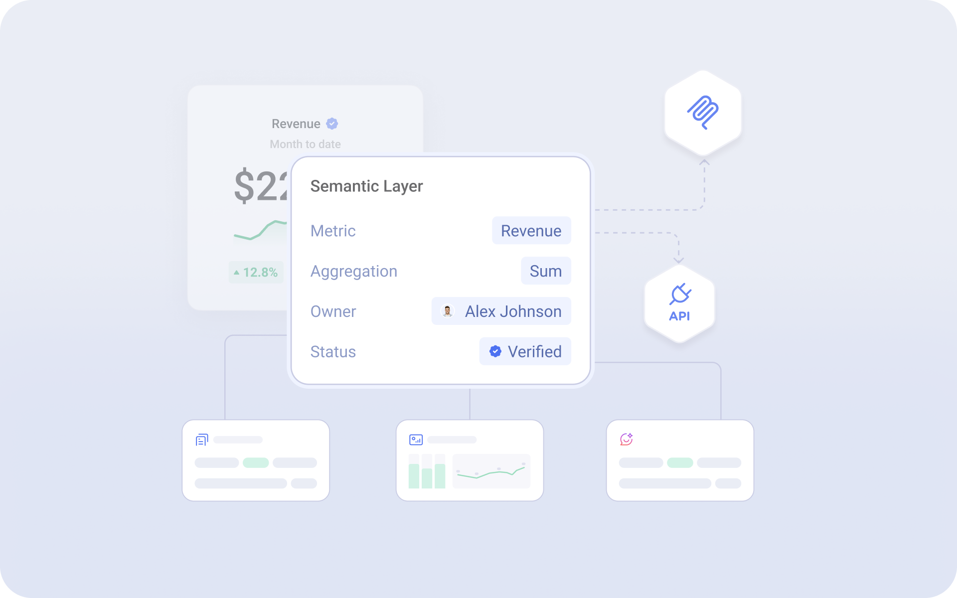
Now you can define what each dataset and column means, so your team and AI Analyst read every number the same way.
- Understand any dataset without asking the analyst. Document what each dataset and column means in plain language, so anyone can read it on their own.
- Get the right answer no matter how it's phrased. Capture the other names your team uses for a dataset or column, so your AI Analyst answers the real question even when someone words it differently.
- Keep every query on the right dates. Set a default time dimension for each dataset, so queries and AI answers always pull from the correct date column.