Table of contents
Customizing your Databoards just got a whole lot easier.
Making it easy to create & customize your own Databoards has always been a big focus here at Databox. And we’ve been told that we do a pretty good job at it. In fact, Databox has consistently been voted the easiest to use Data Visualization software on G2Crowd.
The Databox Designer, the editor where you build and modify your Databoards, has been central to making that possible
There, you can drag, drop, move, resize, and configure blocks of data (or Datablocks) within your Databoard.
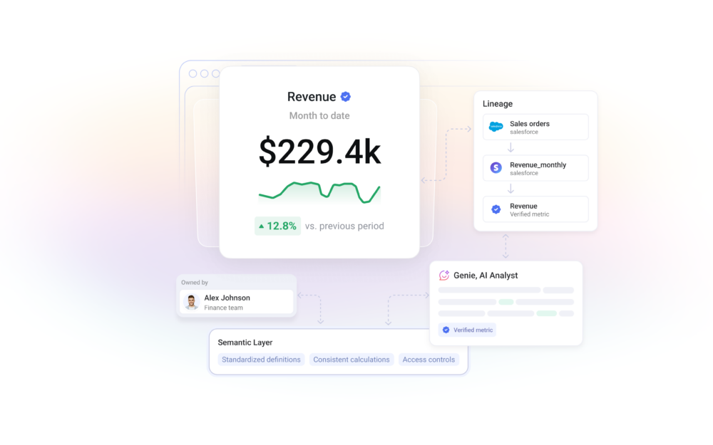
But, what is a Databoard?
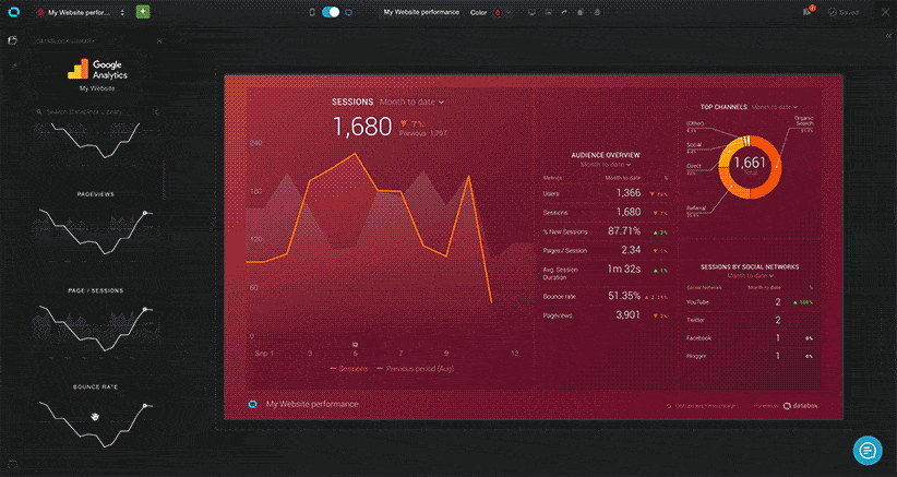
For those that aren’t familiar with our terminology, a Databoard is basically a dashboard, but better because it displays perfectly on any device or browser. How? It is an 8 (across) x 4 (high) grid where you can add from 1 to 32 visualizations.
For example, if you want one really big chart or table, you can do that. In that case, the one Datablock would take up the entire 8 x 4 grid.
But, if you want a more dense view of your data with 32 data points, you can do that on another Databoard and have one block per space in the grid. (You can have any number of blocks in between 1 and 32 too.)
By now you’re probably wondering why we constrain Databoards to 32 visualizations.
First of all, don’t fret – if you want to display more than 32 Datablocks, you can loop Databoards together.
But, let us explain why – we constrain each Databoard to 32 Datablocks because it allows us to make every Databoard automatically viewable on any screen. The beauty of Databoards is that you can design them once and they work perfectly on any device: desktop, TV on your office wall, our mobile apps (IOS or Android) and even a mobile browser.
For companies that want to be able to access and share data anywhere or everywhere, Databoards are the solution.
But, we’re never satisfied and we thought we could make things even easier.
Speeding up Databoard creation and editing
Our ultimate goal is to create a platform that’s as intuitive as possible so that every user can build visualizations of their performance data without coding. One that gives you the ability to customize your Databoards with different metrics, date ranges, visualization types, logos, background images, colors, and more.
And while the Databox Designer was already innovative in its ability to make data visualization easy, the old grid system had two limitations that slowed down the process of creating or altering a Databoard:
- When there were no blank spaces left on a Databoard, new blocks could not be added easily. You first had to make room by either deleting a block (or blocks) or making the existing blocks smaller.
- When trying to move a Datablock to a different part of a Databoard, you first had to move other Datablocks out of the way.
Starting today, you don’t have to waste time doing either of these two things.
The new and improved Databoard grid
The new Databox Designer eliminates both limitations – fewer clicks are needed to reorder blocks, resize blocks or add new blocks to an already full Databoard. We’ve re-developed much of the code behind the Designer too, so it’s also much faster now.
What’s new?
- Datablocks automatically resize
You no longer need to manually resize existing blocks to make room for new ones. Even if your Databoard is full, the grid will automatically make space for you. - Customize your Databoard in fewer clicks
The new grid is fluid and flexible. Now, when reordering blocks, other blocks will be automatically reshuffled to fit your grid. Before, you needed to resize the blocks yourself to make room. - Build Databoards in less time
Because we reworked the grid from ground up, it’s also much faster and more responsive. Not only can you build Databoards with fewer clicks, but in less time, too.
Here’s an animated gif of flexible grids in action:
The Databox Designer is the centerpiece of Databox and available in all our plans, including the free plan.
To try this out, existing users can simply log in to the web application.
If you’re new to Databox you can start by creating a free account here.