DASHBOARD SOFTWARE FOR GROWING BUSINESSES
Always know how you’re performing
Visualize your performance and spot trends faster, uncover new insights, make better decisions, and share your performance with anyone.

Trusted by 20,000+ growing businesses
Create custom dashboards
in minutes, without code

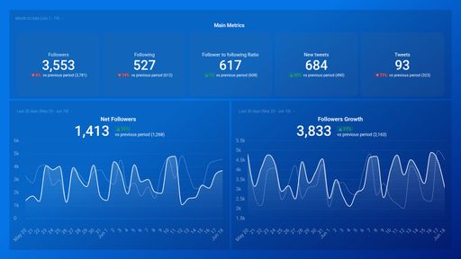
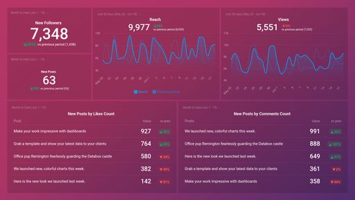
See trends and opportunities more clearly
Find the perfect visualization to help viewers understand performance more clearly, and spot insights they couldn't see before.

Customize your dashboards to match your branding
Add your own colors, logo, and background images, or white label your dashboards if you're sharing them with clients.

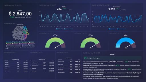
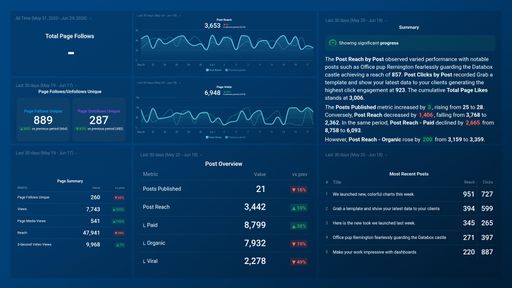
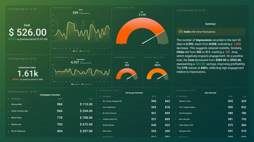
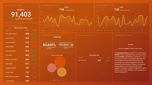
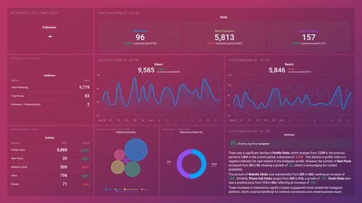
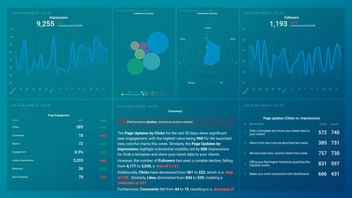
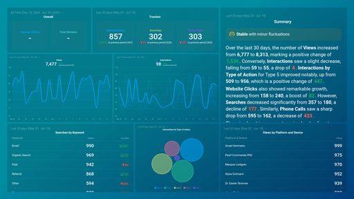
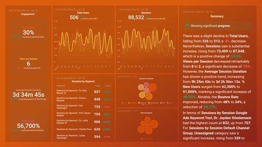
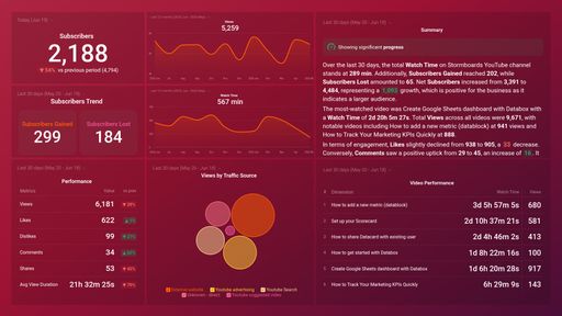
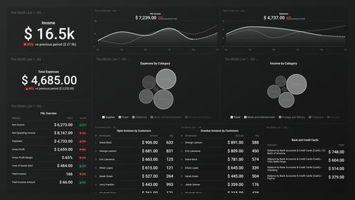
Get concise summaries of your performance
Our AI-powered summaries provide viewers more context on how performance has changed over time, along with ideas to improve.

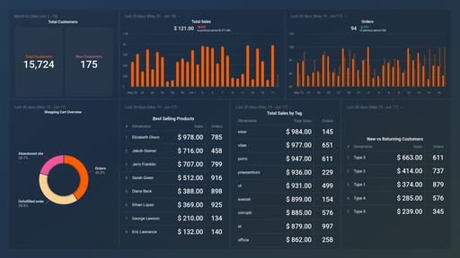
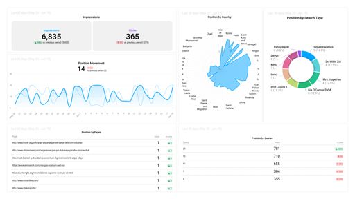
Segment and filter in 1-click
Quickly break down and filter dashboards by dimensions for deeper analysis.

See the detail behind the number
Click any metric built from a dataset to reveal the row-level data behind it.

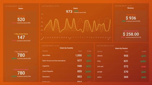
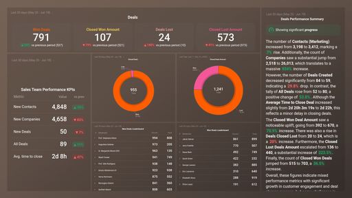
Compare current performance to multiple previous periods
Look back at multiple previous time periods, so you can do deeper analysis.

Check your dashboards anytime, anywhere
View how your team is performing anywhere, with our mobile app.

Project your dashboard to a TV
Share dashboards on TV screens to continuously display real-time performance, or present to your team or clients.
Databox is easy to use and allows us to use templates or create our own completely custom dashboards to track KPIs from many sources. It's a great way for our team to get an overview of marketing performance and identify trends quickly.


Create powerful dashboards, without code

-
Drag & drop your metrics
-
No-code editor
-
Fully customizable
Other Features
Create your first dashboard in 1 click


Customer stories
Learn how other growing businesses are using dashboards to inform decisions, create plans, and drive growth.


Explore dashboard examples
Frequently asked questions
Can I start free?
Yes! Everyone starts with a free 14-day trial of the Growth plan. After your trial, choose to purchase any plan that best suits your needs.
How can I share my dashboard?
In Databox, you have multiple sharing options.
- Shareable Link: Dashboards can easily be shared and accessed through a link. It will display your dashboard(s) with the same date range options and visualizations you have set in your account. Shareable Links are best for sharing live data with your teams, executives, or clients.
- Scheduled Snapshots: You can export your dashboards into PDFs or JPGs at regular time intervals. Scheduled Snapshots are best for sharing static views of your data (regularly) with the relevant recipients. The best part is that recipients don’t need to be Databox users.
- Embeds: You can embed your dashboards on web pages or tools like ClickUp/Notion. Embeds allow you to incorporate your insights directly into your existing workflow.
- Stream To TV: With Databox, you can easily stream your dashboard on a Smart TV. This option is valuable for sharing insights in office settings, team meetings, or presentations.
Are dashboards interactive?
Yes, dashboards in Databox are interactive. Here are a few ways you can engage with the data:
- Hovering over data points to view specific values.
- Adjusting date ranges for individual visualizations.
- Updating visualizations with a single click.
- Choosing which lines (metrics, trend, goals) to view on charts.
Can I create dashboards combining data from different sources?
Yes!
In fact, we recommend doing this to get a comprehensive view of performance. Inside the dashboard builder, you can swap through different data sources you’ve connected and pull whatever metrics you need right into your dashboard. Here’s how you can create a dashboard using data from multiple data sources.
Can I change the logo and customize my dashboard?
Yes, you can change the colors of your dashboards and charts. And customize the logo on your dashboards to reflect your brand. Even better, you can provide create a fully branded experience with the white-label add-on. Personalize the login screen, URL, mobile app, and much more.
Can I combine multiple dashboards?
Yes! Dashboard Loops allows you to group multiple dashboards together to tell a more comprehensive story with your data. They’ll be joined together on one Shareable link that you can then share with your team and/or clients. You can add up to 20 dashboards to a loop.
How many dashboards can I create?
All plans offer an unlimited number of dashboards. Learn more about plans and packaging here.
Can I view my dashboards on my phone?
Yes, using our Databox mobile app for iOS and Android. And, you can receive your daily scorecards, weekly summaries, and performance alerts directly to your mobile phone.
Explore other tools in the platform
Clear answers,
as fast as you have questions.
Compare
Databox Inc.
HQ: Boston, MA, USA
AI-powered analytics for teams that need answers now.
Databox Inc.
HQ: Boston, MA, USA

AI-powered analytics for teams that need answers now.


Compare