Uses one-click integrations:
-
 Mailchimp
If you don't use Mailchimp, you can pull data from any of our 130+ one-click, native integrations or from spreadsheets, databases and other APIs.
Try this dashboard for freeWhat you’ll learn from this MailChimp dashboard template:
Connect your MailChimp account and learn:
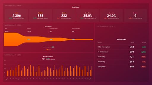
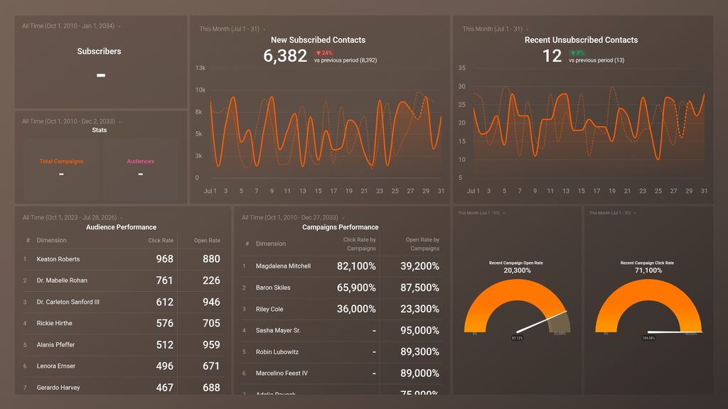
- How many new subscribers joined our email list? See how many people opted to receive your emails within the selected time period and compare your contact growth overtime. Review trends for daily new signups and see how they measure up against your goals. Are you capturing enough leads?
- How many people opted out from receiving our emails this month? View the percentage of your subscribers that have opted out from receiving your emails. Keep an eye on your unsubscribe rate daily, to act promptly once you notice people unsubscribing from your mailing list at an alarming rate.
- How do we assess the health of our email lists? See how many people recently signed up to receive your emails and how many people, in the same manner, opted out from your email list. Track how many email addresses returned back as soft or hard bounces within a time period.
- How do we measure the impact of our email marketing efforts?Measure the effectiveness of your email marketing efforts by examining the growth of your email list. See how many people are subscribed to your mailing list and what percentage of your subscribers opted out.
- How do we measure email campaign performance? Evaluate your email campaigns’ performance and track what percentage of your email recipients actually opened the email and how many of them clicked a link to take action.
- How do we track audience engagement? See how many of your email subscribers that got emails delivered to them actually opened these emails within the time period.
Pull additional data using our deep integration with Google Analytics.
What else can you track and visualize with our deep integration with MailChimp? When it comes to attributing your to traffic and conversions, almost anything:
- Campaign performance
- Audience growth
- SEO results
- Top email recipients
- Click rates by campaign
There are many, many different metrics and metric combinations you can track using MailChimp. And in Databox, you can quickly visualize 100s of MailChimp metrics in a variety of different ways.
Read more about Databox’s MailChimp integration.
Mailchimp metrics included in this template
-
Recent Campaign Click Rate
Recent Campaign Click Rate measures the percentage of email recipients who clicked on a link in your campaign within a specific time frame, typically the past 24 hours.
-
Recent Campaign Open Rate
The Recent Campaign Open Rate is a metric that measures the percentage of people who opened a specific email campaign within a certain timeframe.
-
Click Rate by Campaigns
Click Rate by Campaigns measures the percentage of total recipients who clicked on a link in your email campaign, providing insight into the effectiveness of your email content and Call-to-Actions.
-
Open Rate by Campaign
Open Rate by Campaigns is a metric in Mailchimp that measures the percentage of subscribers who opened a specific email campaign. It helps businesses evaluate the effectiveness of their email campaign and improve their content to increase engagement and conversions.
-
Campaigns
The Campaigns metric refers to the number of emails sent to a target audience for a specific marketing effort, along with the associated click rates, open rates, and conversion rates.
-
Audiences
Audiences in Mailchimp refers to the collection of contacts that have opted into your marketing messages. It allows you to segment and target your audience, as well as track engagement and performance.
-
Click Rate by Audiences
Click Rate by Audiences is a Mailchimp metric that measures the percentage of subscribers who clicked on a link within an email campaign, segmented by audience. It helps you understand which audience is more engaged with your content.
-
Open Rate by Audiences
The Open Rate by Audiences metric is the percentage of subscribers who opened your email campaign, segmented by different audience groups. It helps you understand which segments are most engaged with your content.
-
Subscribed Contacts
Subscribed Contacts is a metric that tracks the number of individuals who have opted-in or subscribed to receive emails from your organization through your Mailchimp account.
-
New Unsubscribed Contacts
The New Unsubscribed Contacts metric measures the number of contacts who have unsubscribed from your email list within a specified time period.