![How to Create a Bar Graph in Google Sheets [3 Easy Steps]](https://cdnwebsite.databox.com/wp-content/uploads/2017/07/14165129/AutomateReportingGifsBG.jpg "How to Create a Bar Graph in Google Sheets [3 Easy Steps]")
Table of contents
Look, while they’re certainly not the easiest way to consume information, most companies are still using spreadsheets in order to pull a lot of different data into one place.
That’s the strength of Spreadsheets – collating a lot of information in one place.
And while there’s a lot of functionality within a tool like Google Sheets to categorize and manipulate the data, it’s not the best tool to present performance data to others.
That’s why most people who put together Spreadsheets also look for ways to visualize the data inside of it.
This way, it’s more accessible to others, whether that’s members of your own team, your bosses, or even the board of directors.
Here’s how to easily create a bar graph (or other visualizations) using your performance data in Google Sheets.
- How to Create a Bar Graph in Google Sheets
- How to Label a Bar Graph in Google Sheets
- How to Customize a Bar Graph in Google Sheets
- How to Add Error Bars in Google Sheets
- How to Change a Visualization in Google Sheets
- How to Make a Stacked Bar Chart in Google Sheets
- How to Integrate Google Sheets with Databox
- FAQs Related to Creating a Bar Graph In Google Sheets
- Turn your Google Spreadsheets into Powerful Dashboards

How to Create a Bar Graph in Google Sheets
For the full written tutorial on how to make a bar graph in Google Sheets, continue reading.
Prefer a step-by-step video tutorial? View the 4-minute clip right here…
Now, for the written tutorial…You can create a bar graph in Google Sheets in 3 simple steps:
- Highlight the cells containing the data you’d like to visualize
- Click the ‘Chart’ icon in the Google Sheets toolbar
- Customize and/or change the visualization type in the chart editor
First, you’ll want to highlight the specific cells you’re looking to visualize.
In the example below, we are going to highlight revenue from our fictional online book shop from Q1.

So, we’ll highlight cells C2 through C12. Then, we’ll click the chart icon in the toolbar along the top of the menu in Google Sheets.

This will automatically display the data we’ve just highlighted in our spreadsheet in bar graph form.

Related: 40 Advanced Google Sheets Tips for Marketing Pros
How to Label a Bar Graph in Google Sheets
Now that you’ve created a bar graph in Google Sheets, you might want to edit or customize the labels so that the data you’re showing is clear to anyone who views it.
To add or customize labels in your bar graph in Google Sheets, click the 3 dots in the upper right of your bar graph and click “Edit chart.”

In the example chart above, we’d like to add a label that displays the total amount of website traffic and leads generated in May and June. To do so, we’ll need to click each month under “Series”, then “Add Labels”, and then select the specific range from my spreadsheet that we’d like to display as a label.

In this case, we’d select “May” and “June” in order to use the data from those columns as labels in our bar graph.

Next, we’ll do the same thing for “June.”
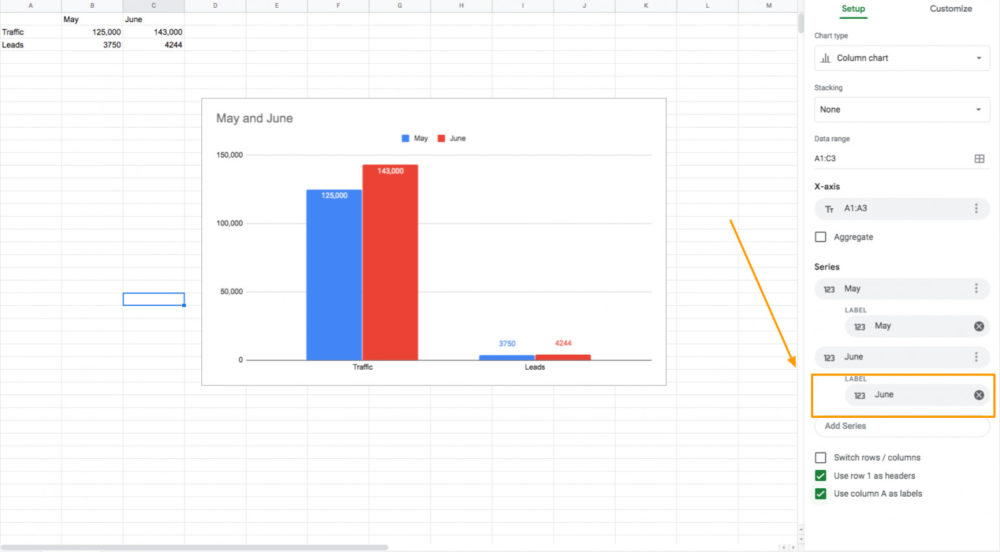
Now we’ve added labels showing the specific volume of traffic and leads generated in May and June.
Next, if you’d like to customize the look of your labels––type, font, size, color, etc.––select “Customize” from the chart editor and you’ll find all of your options.

How to Customize a Bar Graph in Google Sheets
Google Sheets provides us with a few different bar chart customization options and they’re all available in the ‘Chart Editor’ tab.
To open it, click the three-dotted lines that show up in the top-right corner of the graph.
Next, press ‘Edit Chart’.

The ‘Chart Editor’ should now appear on the right side of the screen where you’ll see the ‘Customize’ option.

Once you click on it, you’ll be able to check out the different bar graph customization and formatting choices.
Let’s go through each one separately:
- Chart style – This option allows you to modify the font style, border color, and bar graph background.
- Chart and axis titles – Customize the chart title, vertical and horizontal axis titles, and an option to add a chart subtitle. Also, you can change everything regarding the font here as well (type, size, color, etc.).

- Series – As the name suggests, this is where you can customize the series (e.g. color of the bar). If you already have a stacked bar chart in place, you can pick a specific series that you want to modify. This option also allows you to upload error bars and data labels.

- Horizontal axis – Allows you to customize the font type, size, and format of the horizontal axis label. Plus, you can set the maximum and minimum chart values (the bar graph uses dataset-based maximum values by default).
- Vertical axis – Allows you to change the font type, size, and format of the vertical axis label. Also, you can change the placement of the axis and reverse them.
- Legend – Customize the legend settings (e.g. font format position). This is mostly for those of you that include multiple series.
- Gridlines – Change the color of major/minor gridlines or turn them off completely.
That’s it!
Learning how to set up a bar graph in Google Sheets is pretty simple, but we recommend playing around with all these options to better understand them.
Related: 13 Ideas on How to Use Google Sheets In Your Business
How to Add Error Bars in Google Sheets in 4 Steps
Error bars are used to visually illustrate expected discrepancies in your dataset.
In this example, I’m going to try to visualize data from my office supplies shopping list.
Here’s how to put error bars in Google Sheets in 4 steps.
1. Highlight and insert the values you’d like to visualize

2. Google Sheets automatically visualizes your data as a pie chart. To change it, click on the chart type drop-down and then select a column.

Here’s what your chart should look like…

3. To add error bars to the above chart, still on the chart editor pane, navigate to customize and click on series

4. Select the error bars option

Depending on the expected difference in value(s), you may choose to increase or decrease the number, in our case we chose 5%.
Your percentage error bars should look like this.

In addition, there are other types of error bars to choose from depending on how uncertain you are about your data.

How to Change a Visualization in Google Sheets
Once you learn how to set up a bar graph in Google Sheets, you’ll probably want to move on to modifying the visualizations.
On the chart editor on the right-hand side of your spreadsheet graph, click the “Chart Type” dropdown menu.

Here, you’ll see all the different options for visualizing the data you’ve highlighted in your spreadsheet.
You can choose Line, Area, Column, Bar, Pie, Scatter, Map, and Other options.
Select the one you like and your data visualization will change within your spreadsheet automatically.
Related: How to Visualize Data: 6 Rules, Tips and Best Practices
How to Make a Stacked Bar Chart in Google Sheets
We’ve already shown you how to create a bar graph in Google Sheets by using only one data set.
But, that’s not your only option – you can also use multiple series and build stacked bar charts.
For instance, let’s assume your dataset looks like the one below and you want to use it to create a stacked bar chart.

Here’s how to make a stacked bar graph in Google Sheets:
- Choose a dataset and include the headers
- Press ‘Insert Chart’ in the toolbar
- Click ‘Setup’ and change the chart type to ‘Stacked Bar Chart’ in the ‘Chart Editor’ panel.

To modify the chart’s title, simply double-click on it and enter the title you want.
This is what your stacked bar graph will look like once you’re finished:

That covers the standard stacked bar graph.
But, Google Sheets allows you to also create a 100% stacked bar chart where all bars have the same size, and each series’ value is displayed in percentages.
Here’s how you can add a 100% stacked bar graph:
- Follow the above-mentioned steps to create a standard stacked bar chart
- Select the added stacked bar chart and press the three dots in the top right corner
- Click on the ‘Edit Chart’ tab
- Click on ‘Setup’
- You’ll see a ‘Stacking’ tab – simply choose 100%.

This is what you’re 100% stacked bar will look like:

Related: How to Build a Dynamic Dashboard in Google Sheets in 6 Easy Steps
How to Integrate Google Sheets with Databox
So what happens when you want to visualize data from multiple spreadsheets in one place?
For example, say you want to visualize top-of-funnel metrics like Sessions, but you also want to include downstream performance KPIs like signups and revenue, too?
In many cases, this data is pulled from different tools and is, therefore, located in several different Google Spreadsheets. This is when things get messy and complicated and make data visualization in a tool like Google Sheets impractical.
Here are a couple of other reasons why Google Sheets isn’t ideal for ongoing performance monitoring:
- You have to pull the data into the spreadsheet and manually keep it updated
- There isn’t an easy way to share graphs without copying and pasting them into slide decks (by the time you do, the data is outdated)
The next challenge is making sure stakeholders understand what the numbers actually mean. A chart shows trends, but it doesn’t always explain the drivers behind those shifts. That’s where an interpretation layer like Databox MCP can add context by analyzing patterns across your connected data sources and surfacing insights directly alongside your visualizations. Instead of manually explaining spikes or dips in performance, you can pair your Google Sheets charts with automated narrative context that clarifies what changed and why.
With Databox’s integration with Google Sheets, you can simply connect your Google spreadsheets to Databox and visualize any of the data you have stored in seconds.
Here’s a quick video on how it works. (Skip ahead if you’d rather view the skimmable directions below.)
If you have Google Sheets connected in Databox, you are familiar with our Google Sheets Metric Builder and all the options it offers. After helping hundreds of customers set up their own Databoards and gathering feedback, our goal to create an even more seamless experience for our users was finally realized with the addition of the Google Sheets Wizard.
Here’s how it works.
If you are an existing user, the first step is to select “Use Wizard” instead of “Start blank” in the Databoards section when creating a new dashboard.

After that, you have the option to select an existing data source or connect a new Google Sheets.

Next, choose the specific Sheet you want to pull data from and press Continue.

Once you have selected your sheet, the data will appear on your screen with each column defined. Once you’ve determined that everything looks correct, press Continue to begin creating a custom metric.
| NOTE: Not into the guided metric creation? You can always switch to a manual setup in the top right corner. This will take you to the more familiar Query Builder form for Google Sheets. |

Now it’s time to add some more information to create the custom metric that we want. Begin by selecting a metric value. From there, you will have the option to further segment it by a dimension. Simply select the data you want the value to be shown for.

Finally, we add our finishing touches. Start with naming your metric, then choose the data aggregation option that works best for the values chosen. Don’t forget to select the favorable trend (in other words, your trending preferences) and the number format. After that, all that is left is to add this metric to your dashboard.

And you’re done! From a spreadsheet with cells full of data to a striking visualization of the very same data that’s as easy to read as it is to report on, whether for a marketing report or any other business purpose. Need more information on how to create a custom metric using the Google Sheet wizard? Check out our detailed help doc. If you need more info about the best ways to format your spreadsheet for Databox syncing, read our guide.
Need help pulling all of your spreadsheet data? Creating Google Sheets custom metrics may be easier than ever now with our Google Sheets Wizard, but if you’re still unsure how to connect your data or format your Google Sheets, our team of experts is here to help.
Getting started with our free Google Sheets Setup Service is as simple as completing this questionnaire. Once submitted, one of our Google Sheets experts will get in touch and help you create powerful visualizations of your data – as soon as in the next 24 hours.
FAQs Related to Creating a Bar Graph in Google Sheets
Where Is the Bar Graph in Google Sheets?
To start creating bar graph, you need to go to Insert > Chart.
Then, in the pop-up chart menu, click the dropdown under ‘Chart Type’ and choose ‘Bar Graph’.
Just make sure you highlight the data you want to convert beforehand.
How to Make a Simple Bar Graph in Google Sheets
The process for making a simple Google graph in spreadsheets is identical to the one we mentioned above.
But there’s an even easier way to do it.
Use Databox’s dashboard setup if you want someone from our team to do it for you – for free!
Or, you can connect your Google Sheets with Databox and build a bar graph in literally a few clicks.
A great thing about this is that you won’t need to spend any time looking for a Google Sheets bar graph templates.
How to Make a Bar Graph In Google Sheets with Multiple Columns?
A graph bar with multiple columns is also referred to as a 100% stacked bar graph.
Here’s a step-by-step guide on how to make a column graph in Google Sheets:
- Follow the above-mentioned steps on how to create a bar graph, but instead of ‘Bar Graph’, choose ‘Stacked Bar Chart’ in the ‘Chart Type’.
- Select the stacked bar chart and go to ‘Edit Chart’.
- Set the 100% option in the ‘Stacking’ tab.
How to Make a Triple Bar Graph in Google Sheets?
First, follow the steps needed to create a standard bar graph in Google Sheets.
Now, we can change the standard bar graph into a triple bar graph by customizing it.
This is the exact process of how to make a bar chart with triple columns:
- Go to Chart Editor > Customize
- Select ‘Horizontal Axis’
- In the dropdown menu, tick the ‘Show Axis Line’ tab
- Finish up by setting Axis titles
How to Change Bar Width in Google Sheets?
To change the width of your bar graph, go to Chart Editor > Edit Chart.
Next, click on ‘Customize’ and find the ‘Series’ option. This is where you can modify all the different bar series, including the bar width.
Turn your Google Spreadsheets into Powerful Dashboards
Knowing how to create a bar graph in Google Sheets can go a long way in impressing your company’s key stakeholders in the next meeting.
What’s more, it can even be fun playing around with the different chart options!
However, if you’re dealing with dozens of deadlines, barely managing to stay on top of the daily tasks, and have numerous teams to coordinate with – fun isn’t exactly the best description for the process.
Sure, learning the ropes in Google Sheets isn’t the most complicated task in the world, but it will still take up lots of valuable time.
Luckily, there’s a way to create a spectacular Google Sheet dashboard and add much more than just bar graphs in just a few minutes – via Databox.
Databox allows you to skip all the gruesome manual work when making a bar graph.
Simply choose your data source, pick the metrics you want to include, and visualize them in a stunning dashboard with all the key insights in one place.
Or, skip even that and contact our team directly!
We’ll build you a free dashboard as soon as in the next 24 hours — all you have to do is tell us which data you want to visualize.
Sign up for a free trial and turn your Google Sheets into powerful dashboards now.