Table of contents
Creating a great visual report is a lot like being reporting on a news story.
Let me explain.
- You start by collecting all of your sources (i.e. data).
- Next, you analyze all of the information/data.
- Then, you put it altogether in a compelling story.
Great visual reporting is all about telling a compelling story through a mix of data visualizations.
In this post, we’re taking a closer looking at what data visualization is along with some best practices.
Let’s dive in.
What is Data Visualization?
Data visualization is the process of turning data into a compelling visual story through the use of graphics, like charts and graphs.
It is one of the most effective ways to show trends and patterns from data analysis.
So, it is no surprise that when we asked 57 data analysts how important data visualization is that 83% said it was very important.
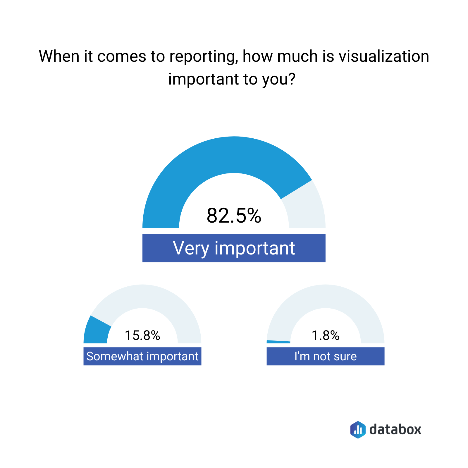
And, 72.2% even confessed to saying that data visualization played a pivotal role in a project’s success.

The two most common formats for visualizing data are dashboards and reports. This allows you to showcase several different images to paint a more compelling story.
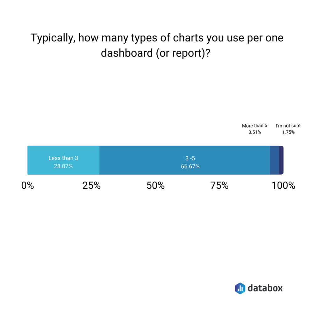
In fact, the average dashboard, according to our experts, contains 3-5 charts or graphs. When you use multiple charts in a dashboard, it is important to mix up the format.
“If you use the same type of visualization every time you present data, it’s as boring as using the same structure in every sentence you speak,” says Melanie Musson of AutoInsureSavings.org. “You’ll lose your audience even if you have great information. Use all the charts but think outside the box. One of my favorite techniques to really make an impact is to use analogy.
For example, if we had a significant improvement toward a goal, I might include a picture of a mouse indicating our small success last year, and an elephant to represent this year. It’s a little silly, but it mixes things up.”
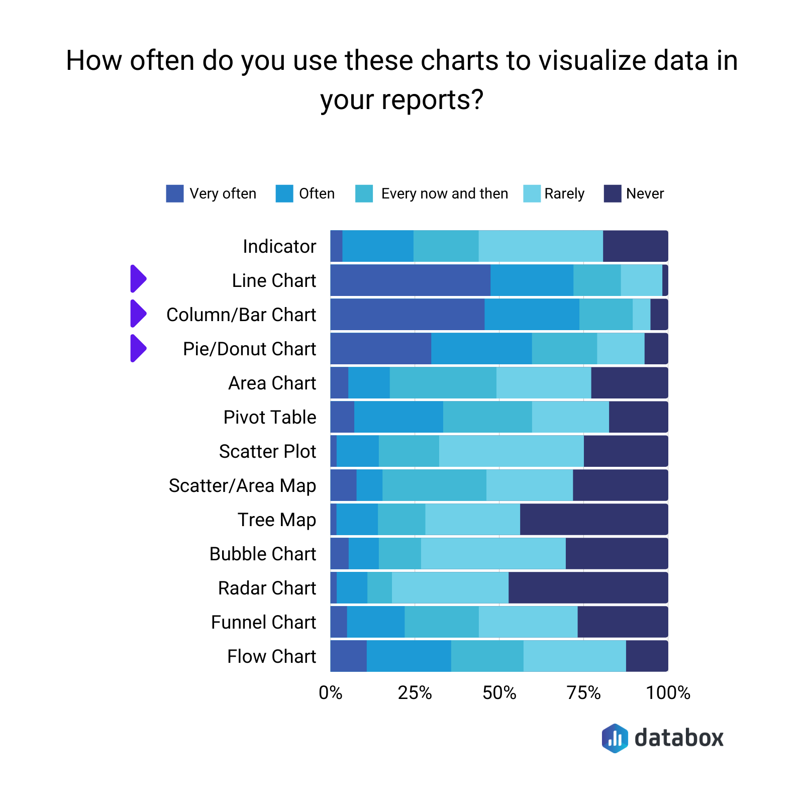
This also doesn’t mean you need to stick to the most popular chart formats – line and bar graphs.
In fact, Eden Cheng of PeopleFinderFree says, “My personal favorite is the bubble chart. It looks attractive and displays information in a very impressive way. Here, the weight of the value is defined by the bubble circumference. So, one can easily spot which factor is important and which is not.
It’s more of storytelling and conveys the idea impactfully. I use it to demonstrate data related to cost and value comparison, highlight the area of constant focus, and streamline activities.
If a bubble chart is not used then my next pick is a customary pie chart. Without making things look clumsy, it conveys the information well. Both these data visualization ways are visually pleasant as multiple colors can be used and information can be conveyed without any mess. But, a pie chart can only be used if you have a few variables or factors to display.”
Angus Chang of Lupilon adds, “We (also) visualize our data with pie charts because it clearly shows proportion and is easy to understand. Pie charts show what percentage each value contributes to the total. The charts are more intuitive than simply listing percentage values that add up to 100%. Using this chart, we illustrate which campaign brings in the biggest share of total leads. A pie chart is our priority because it depicts data accurately and represents percentages.”
Others prefer using funnel charts.
“I personally enjoy funnels and I think they are super helpful for understanding website analytics and just the general user journey as they’re interacting throughout your website,” says Elizabeth Weatherby of Wolf Consulting, LLC, “Funnels can show what page paths users chose, what exit pages users left the site on, and can even give you some solid insight into conversions. No matter what type of visualization you choose, just make sure your date ranges are accurate so you know exactly what data you’re viewing and what you’re comparing it to.”
It is also worth noting that charts and graphs aren’t the only type of visualization. You can also use word clouds to demonstrate trends.
“I use data visualization routinely in the form of word clouds,” explains Janice Wald of Mostly Blogging. “By posting the URL of my published content into a word cloud generator, I show the important results of my data collection since these appear in the biggest letter in the visual. I have just started incorporating line graphs into my content and found I rank higher and quicker. Google likes visuals, readers like visuals. Most people learn by looking at visuals. Incorporating visual data representation is a win-win.”
Pro Tip: Your Go-To Dashboard For Doing a Deeper Dive on Website Traffic and Conversion Sources
Struggling to find an easy yet effective way to gain a comprehensive understanding of your traffic sources, user behavior, and revenue generation?
You can do all that and more with our plug-and-play GA4 Acquisition dashboard template:
- Understand user acquisition: See where users come from, tailor outreach, and track new user growth;
- Focus on high-performing channels: Identify top channels, optimize resource allocation, and adjust underperformers;
- Track revenue & engagement: Monitor revenue growth, active users, and the effectiveness of your campaigns;
- Go beyond traffic & conversions: Gain deeper insights into demographics, sales, customer journeys, ARPU, and more;
- Optimize marketing & drive results: Make data-driven decisions to improve your marketing strategy and achieve business goals.
You can easily set it up in just a few clicks – no coding required.
To set up the dashboard, follow these 3 simple steps:
Step 1: Get the template
Step 2: Connect your Google Analytics 4 accounts with Databox.
Step 3: Watch your dashboard populate in seconds.
How to Visualize Data: 6 Rules, Tips and Best Practices
Here are some of the most important data visualization rules according to the data experts that we surveyed.
- Keep it simple
- Add white space
- Use purposeful design principles
- Focus on these three elements
- Make it easy to compare data
- Blend your data sources
1. Keep it simple
There is a tendency to overcomplicate it and add all of the charts, graphs, and data into your
dashboards and reports. This makes it hard to see what’s going on unless you are using dedicated marketing reporting software.
Being concise and telling your story through the fewest, but most impactful charts are almost always the way to go.
“The main reason to visualize data is to get a point across,” says Amber Theurer of ivee. “For example, if your sales have increased within the past month, it would make sense for there to be a graph showing an incline of sales going in an upward motion from the left to the right side of the screen.
You don’t need to show any extra data that does not pertain to this topic, unless that data is covered on another page within another topic. Especially if you are presenting this data to your teammates at work, you don’t want to bore people with every single minute detail from your data to the point where they might lose interest.
Keep each data visualization clear and simple so that others will be able to easily understand what the data conveys.”
2. Add white space
A good rule of thumb is when in doubt, add more white space to your data dashboard.
“Well, I believe that the No. 1 rule for good data visualization is to let your data breathe,” says David Wurst of Webcitz. “When it comes to data visualization, one of the most common mistakes people make is trying to cram too much visual information into a single design. Whether it’s to “spice up” a design or to convey too much data, the end result is always the same: a visually cluttered, unintelligible design that asks more questions than it answers.”
Will Ward of Translation Equipment HQ adds, “Our number one rule with data visualization is to avoid ‘chartjunk’. This refers to both design elements such as borders, highlights, shading, as well as unnecessary labels, legends, and text. More often than not elements such as these detract from the comprehensibility of visual data, whilst adding very little substantial information in return.
Taking a hard anti-chartjunk stance has vastly reduced the amount of time we spend analyzing and discussing visual data. We found we were losing time discussing the pros and cons of design elements rather than the actual take-away from the data itself.
So, whilst chartjunk might make visual data look more pleasing, in some cases, most of the time it simply distracts. We’ve been able to reach conclusions and identify next steps easier and faster by keeping a strict philosophy of design simplicity regarding visual data.”
3. Use purposeful design principles
Another way to avoid cluttering your data reports and dashboards is to start with your end goal in mind.
“Have a clear goal before you choose the data you want to visualize,” explains Mile Zivkovic of Better Proposals. “Otherwise, you’ll create visualizations, charts, and graphs just for the sake of creating them.”
This applies both to the dashboard design as well as the individual chart level.
“Picking the best way to visualize your data is a lot like picking out the right outfit – you wouldn’t wear a tuxedo to go hiking and you shouldn’t use a pie chart to analyze a trend,” says Alex Kus of Buddy. “You’ve got to ensure your visual is fit to purpose, keeping your audience in mind and it should have one clear message that you want to be conveyed per graphic. Keep your visualization simple – if you’re like me and have seen one overly complex area chart too many, you’ll know this is important because it makes your data actually possible to parse.
Also, be aware that data visualization does not mean use no text – this is a common mistake of the overly enthusiastic designer, but you should really include labels with some text to bring attention to key points where necessary.”
Brad Touesnard of SpinupWP says, ”If you want to compare values, the best format is to use column charts which allow side-by-side comparisons of different values. Column charts are useful for data, such as website views and sessions, that don’t change much on a day-to-day basis. If you want to analyze a trend, line charts can illustrate how values in one or more categories change over the same period of time.
For example, you can use a line chart to visualize the monthly sales of two different product lines over a year. If you want to show proportions, pie charts are your best choice. For example, if you want to illustrate which campaigns generate the greatest share of your total leads, you can create a pie chart with slices for PPC, SEO, social media, and blogging.”
Ed Cravo of Groundbreaker adds, “It’s often challenging to choose the right visualization for the data you want to show. Before jumping to specifics, think about what you want to accomplish with the visualization, which helps you decide what data to include.
One size does not fit all so carefully consider and choose the right format for your visualization that will best tell the story and answer key questions generated by data—all of it connecting with your main purpose.
Once you’ve determined what types of visualizations work best for the data you have collected, it’s time to choose what delivery method makes sense.
If you need to get information out to customers, stakeholders, investors, or employees, an emailed report can be a good method of distribution, especially if this data is being tracked over a period of time where regular updates would be beneficial for your audience.
If you are using data analysis or a business intelligence platform, there are often in-app visualization options, such as templates or custom dashboards, email or PDF report delivery, and even scheduled ongoing reports.
If they’re done well, visualizations tell an interesting story. They can also shine a light on hidden information and details that you wouldn’t uncover in a bar chart, or pie graph or stacked bar chart in Google Sheet.”
4. Focus on these three elements
“I find it useful to keep in mind these three steps when I’m designing information-rich graphics: data, design, and feel,” explains Natasha Rei of Explainerd. “First, the data points need to add up logically and accurately. Check your math! Make sure that your story matches up with what you’re trying to show – if there’s a discrepancy between the data and the caption or scale’s title, then you’ve done something wrong.
Then step back from just purely making a pretty picture and think about how clear a chart will make a point or tell a story most effectively without too much clutter–are your labels readable? Appropriate headings? A simple graph with plenty of room for viewers’ notes might be better than one overloaded by too many numbers.”
5. Make it easy to compare data
Data isn’t just pretty charts. It serves a purpose. When designing for executives or investors, that purpose is usually to make it easier to spot trends, patterns, and see correlations. The easier you can make it compare your data, the better.
“Data visualization is vital to founders in assessing and analyzing company data, making it more valuable and extracting more insights,” says Anton Giuroiu of Homesthetics.net. “One essential advantage of data visualization is determining correlations easier than just plain data. Simple it may sound but column data are appropriate with comparing items and comparing data over time. In highlighting the peaks and trends, you can combine the column chart with the line chart. You can easily say which is higher and which is the highest, without looking at the numerical data.”
For example, Andrew Johnson of Prime Seamless says, “As a business owner, I use data visualization aided by a custom dashboard software to help identify sales trends and be able to compare certain aspects pertaining to my products. I have found that different forms of visual charts serve different purposes. A combination of line and column charts is best suited to help identify trends and to compare items/data over time. This is great for sales reports.
If you need to compare specific items, then a bar chart might be what you need. Personally, my business uses this form of visual data to compare the sales trends of different products and services for multiple age groups. Last but not least, pie charts are a game-changer when it comes to displaying proportional data or percentages. It gives meaningful context to the data and helps quantify the relationship between the data being compared.”
6. Blend your data sources
You also want to make sure your data is accurate, clean, and in a form that makes it compatible for comparing apples to apples.
“Good data visualization starts with blending all of your data sources in one place, and then display this data in a way that allows you to compare values and analyze trends over time,” says Rod Austin of Localize. “By organizing all of your key metrics with the flexibility to dial in views across multiple sources, you’re able to more effectively address real issues and elevate meaningful priorities from a more comprehensive vantage point.”

Visualize Your Data with Databox
Great data visualizations tell a compelling story. This starts by having a goal in mind and then working backwards to identify the number of charts and different formats you need. The final version can be shared as a report or a dashboard.
If you are looking for a simple way to share your data visualizations in a dashboard format, get free trial now.