Uses one-click integrations:
-
 Intercom
If you don't use Intercom, you can pull data from any of our 130+ one-click, native integrations or from spreadsheets, databases and other APIs.
Try this dashboard for freeWhat you’ll learn from this Intercom Customer Support Overview Dashboard Template:
Connect your Intercom account and learn:
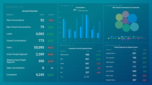
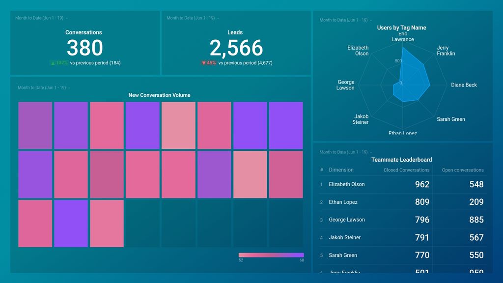
- How many new conversations did our customer support team handle yesterday? Track the total number of new conversations your customer support team handles daily, weekly, monthly, or within your specified date range. Tracking this metric daily allows you to assess your team’s workload, as well as to quickly spot and discover trends or patterns, such as days where you get the most customer enquiries, etc.
- How many conversations are currently open? View the total number of conversations in your support inbox that are still open and find out which team members are handling them. You can also see what percentage of those conversations each support agent is handling. If some team members have too many open conversations, finding out what’s slowing them down in resolving those tickets is crucial. A long resolution time can negatively impact your customer satisfaction rating.
- How do I keep track of the number of leads generated from my support team? Track the number of leads generated by your customer team within a specified date range. Keeping an eye on this data lets you know how beneficial your support team is to keeping your pipeline full and healthy. Dig deeper to learn the nature of the messages that help convert visitors to leads, and use your findings to tweak and improve future conversations.
- How are customer conversations tagged on Intercom? View the total number of conversations your customer support team has handled over time. Also, see how these messages have been tagged in Intercom. Using tags (e.g., bugs, feature requests, partnership requests, and so on) makes it easy for messages to be identified and accessed by anyone looking to get more information on customer needs, interests, etc.
- How do we measure the performance of our customer support agents? Monitor and assess the performance and efficiency of your customer support agents at a glance. See how many open conversations each support agent is currently handling and how many cases have been resolved. If the number of open tickets is significantly higher than the number of closed tickets, it’s an indication that certain issues might need to be addressed.
Pull additional data using our deep integration with Intercom.
What else can you track and visualize with our deep integration with Intercom? When it comes to delivering an excellent customer experience, start with:
- Customer retention rate
- Total conversations
- Customer support team performance
And more...
There are numerous metrics and metric combinations you can track using Intercom. And in Databox, you can quickly visualize dozens of customer service metrics in various ways.
Read more about Databox’s Intercom integration.
Explore more Intercom dashboards.
Intercom metrics included in this template
-
New Closed Conversations by Teammates
The New Closed Conversations by Teammates metric in Intercom measures the number of conversations closed by team members that were previously untouched or unassigned.
-
Leads
The Leads metric in Intercom refers to the number of potential customers who have shown interest in your product or service by providing their contact details, such as name and email address.
-
Open Conversations by Teammates
The Open Conversations by Teammates metric in Intercom measures the number of ongoing conversations initiated by teammates within a specific time period.
-
Conversations
The Conversations metric measures the number of messages exchanged between customers and support agents within Intercom. It provides insights into the volume of customer inquiries and the workload of support teams.
-
New Conversations
New Conversations is a metric that measures the number of first-time interactions with customers in a given time period, indicating the level of customer engagement and potential growth opportunities for a business.
-
Users by Tag Name
The Users by Tag Name metric in Intercom tracks the number of users who have been tagged with a specific tag name. This helps businesses segment their users and target personalized messaging to specific groups based on their interests, behaviors, or other attributes.