


Already have an account? Sign in
Sign up for free
Connect your datasources and instantly see your data in this template.
Creating your account...
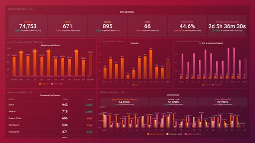
A Mixpanel dashboard provides you with a comprehensive view of user behavior, engagement, and retention within your applications, enabling data-driven decision-making and optimization of the user experience. It helps you track, visualize, and monitor all of your most important KPIs in real time. With a Mixpanel dashboard, you can gain deeper insights into your user experience that will help drive your business strategy.
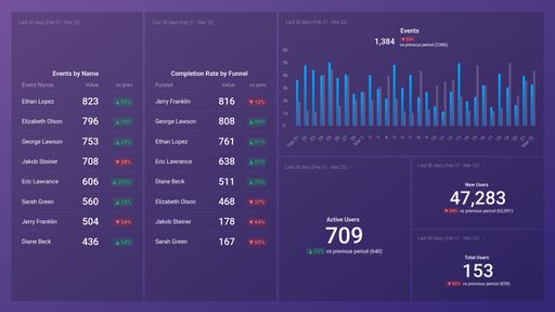
A well-designed Mixpanel dashboard should include a variety of key metrics and insights that provide a comprehensive view of user behavior, engagement, and retention. Metrics like Event Frequency, Completion Rate by Funnel, or Monthly Retention rate are a great source of valuable information that will help you access your overall user experience.
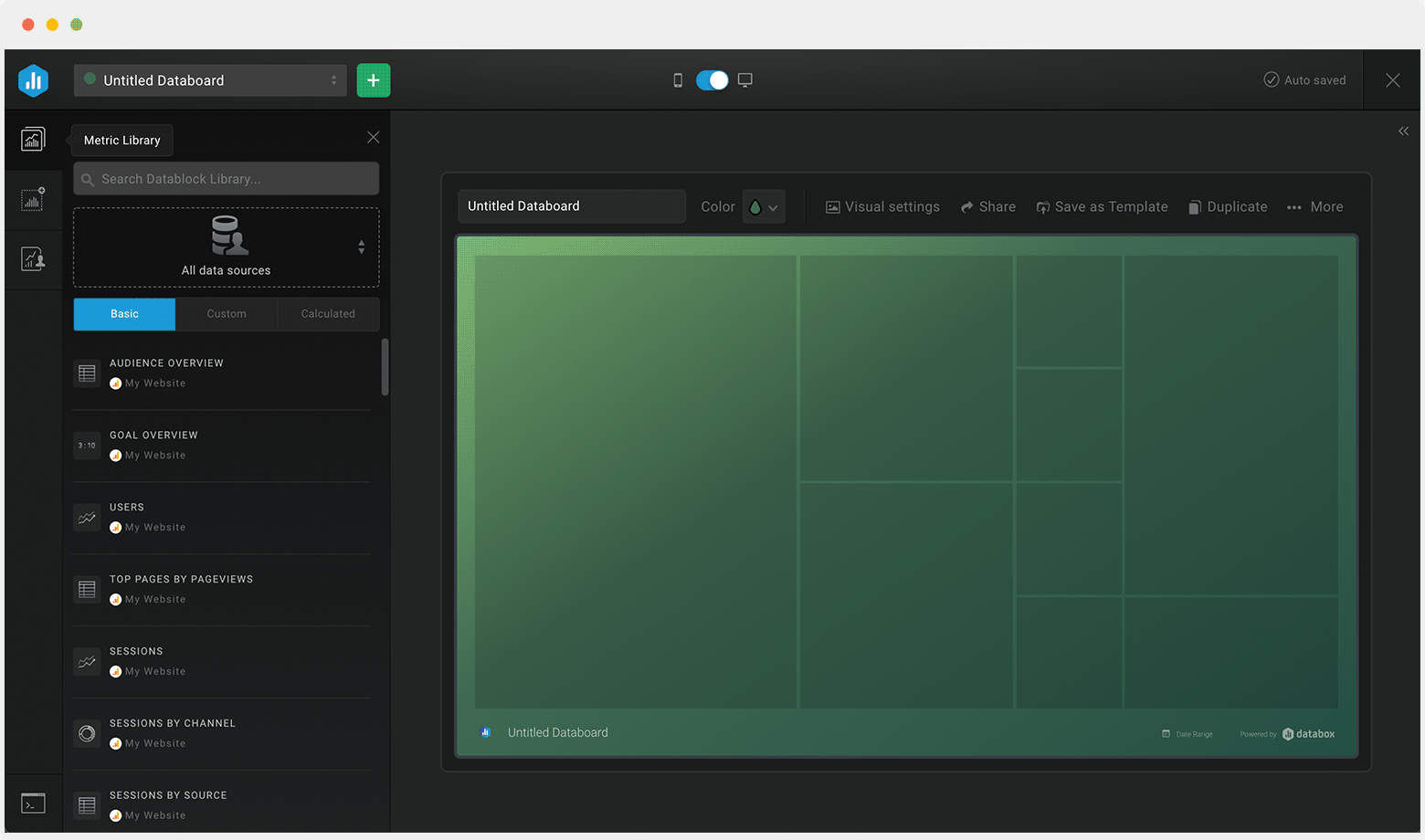
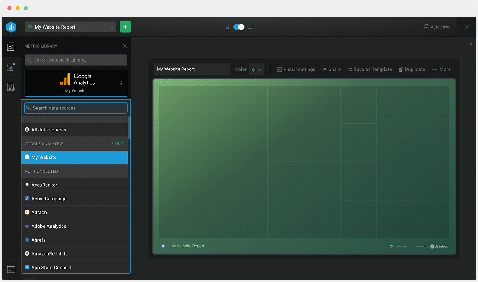
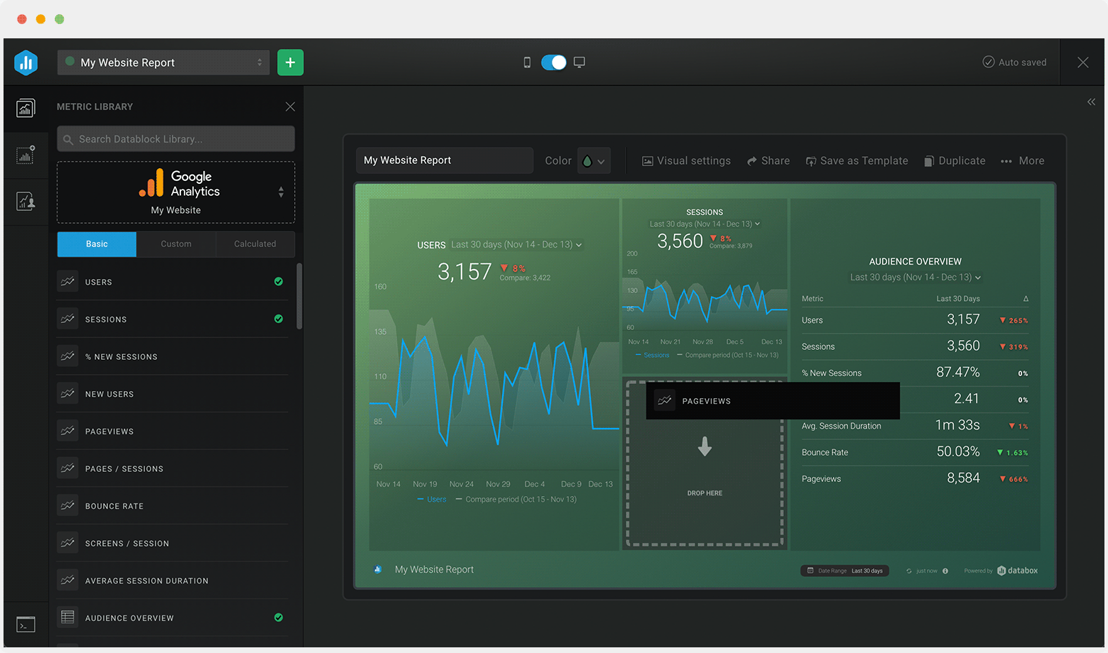
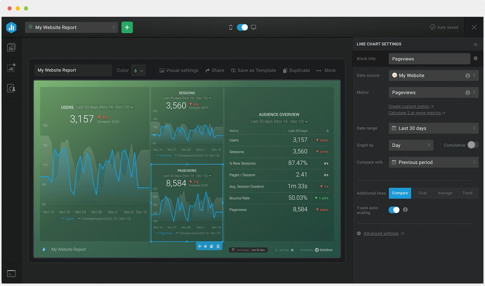

Drag & drop your metrics
No-code editor
Fully customizable
Trusted by 20,000+ growing businesses


Explore all the different ways you can use Databox to gain better data insights needed to drive better business decisions. Discover our pre-built templates from various integrations that businesses use on a daily basis to improve performance.
Whether you are looking for client reporting dashboards, agency dashboards, marketing dashboards, or sales dashboards, Databox can help you build them.
Let us know what you are trying to build and our team of experts will help you turn your data into actionable insights.
Book a callCompare
Databox Inc.
HQ: Boston, MA, USA
Modern BI for teams that needs answers now
Databox Inc.
HQ: Boston, MA, USA

Modern BI for teams that needs answers now


Compare
Connect your datasources and instantly see your data in this template.
Creating your account...