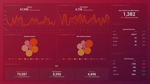
Uses one-click integrations:
-
 Mixpanel
If you don't use Mixpanel, you can pull data from any of our 130+ one-click, native integrations or from spreadsheets, databases and other APIs.
Try this dashboard for freeWhat you’ll learn from this Mixpanel Event Tracking Dashboard Template
With this dashboard template, you’ll be able to obtain an instant report on user patterns within your website and/or mobile app. Connect your Mixpanel account and learn:
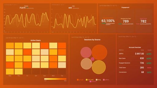
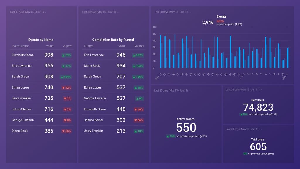
- How do we track user engagement and behavior on our website or application? Get a bird’s eye view of your user engagement trends every day over the last month. See how the actions taken by your users on the app or website compare to the same time the previous month.
- Can we monitor specific user actions taken in the last month? See which specific user actions have taken place on your website or mobile app in the last 30 days. This is useful as it lets you know which (and how many) of these important actions were carried out and how many users will be impacted as a result.
- How do we track the completion rate of our conversion funnels? Plug in your custom funnel and track the conversion rates for each step in real-time.
Pull additional data using our deep integration with Mixpanel.
What else can you track and visualize with our deep integration with Mixpanel? When it comes to tracking your most valuable product metrics, almost anything:
- Conversion rate
- Churn rate
- New and total Users
- Signups from Website
- Top events
There are many, many different metrics and metric combinations you can track using Mixpanel. And in Databox, you can quickly visualize dozens of product metrics in a variety of different ways, alongside all the essential metrics from other data sources you’re using.
Read more about Databox’s Mixpanel integration.
Explore more Mixpanel dashboards.
Mixpanel metrics included in this template
-
Active Users
Active Users is a metric that tracks the number of unique users who have engaged with your product or service within a specified time period, indicating the overall level of engagement and usage.
-
Events
The Events metric tracks the number of times that a specific action or event occurs on your website, app, or product, allowing you to measure user engagement and behavior over time.
-
Events by Name
The Events by Name metric in Mixpanel shows the total number of events triggered over a given time period, categorized by individual event names. This metric is helpful in measuring the popularity and frequency of specific actions taken by users on your platform.
-
Completion Rate by Funnel
Completion Rate by Funnel is a metric in Mixpanel that calculates the percentage of users who completed a specific set of actions in a predefined order. It helps measure how effective a particular funnel or sequence of events is in achieving a desired outcome, such as making a purchase or signing up for a service.
-
Total Users
The Total users metric in Mixpanel measures the total number of unique users who have completed a specific event or visited your website/application within a given time period.
-
New Users
The New Users metric shows the total number of unique users who have performed a specific event for the first time during a selected time period.