Table of contents
The best dashboard is one that presents important metrics in an uber-readable manner.
In doing so, it gives you the information that you’re looking for at a glance, simplifying data-backed decision-making for you.
The question then is: what are some
amazing dashboards that you need? Web analytics, marketing, and sales dashboards are just some of them. In fact, there are 6 main dashboard types that businesses across industries must use according to the 24 expert respondents that we talked to.
Of these respondents, 25% come from the marketing/advertising industry, 20.83% come from IT and services, and 12.50% come from tech companies.
Ready to learn about the best dashboards to use? Let’s go.
- Business Dashboard
- CEO Dashboard
- Marketing Dashboard
- Web Analytics Dashboard
- Sales Dashboard
- HR Dashboard
- Customer Support Dashboard
- SaaS Dashboard
- Software Development Dashboard
- Ecommerce Dashboard
- Management KPI Dashboard
- Financial Performance Dashboard
- Employee Performance Dashboard
- Content Marketing Dashboard
- PPC Dashboard
- Email Marketing Dashboard
- Customer Satisfaction Dashboard
- Social Media Dashboard
Must-Have Dashboard Types for Businesses
According to our research, the six must-have data dashboard types for businesses across various industries are:
- Web analytics dashboards
- Marketing dashboards
- Sales dashboards
- Business dashboards
- HR dashboards
- Customer service dashboards

These insights underscore the importance of dashboards and their role in data analysis. They come from respondents who have at least some experience in using dashboards. In fact, over 60% of them have been using dashboards for some time and 25% have just started using them. The rest (12.50%) don’t use dashboards but plan to.

Based on this research, we identified the top 10 best data dashboards to use regardless of your industry and type of business.
With each digital dashboard, we are also sharing ready-to-use dashboard templates from Databox. The examples that we’ve included, are the most popular ones in our template library. Any dashboard example from our template gallery can be customized and adjusted as you see fit – from adding (or excluding) metrics and data sources, to customizing colors, fonts, and more.
Let’s dive in.
1. Business Dashboard
Business dashboards give a quick snapshot of your business’s key performance indicators (KPIs) in real-time as this fully customizable Stripe (MRR & Churn) Dashboard Template does.

As a result, such a business dashboard can instantly tell you about a company’s overall health and performance in minutes.
The key, however, is to “always start small,” advises Jared Stern from Uplift Legal Funding. “Don’t blindly follow the industry’s best KPIs. Choose what’s relevant and makes sense to your business goals.”
So whether you’re choosing from a business dashboard template or creating yours from scratch, pay attention to the KPIs.
Stern shares, “Sometimes it helps to create a combination to get a better picture. For instance, unique visitors was one metric that was not as important as I had initially imagined. I thought the unique visitors metric would help assess brand awareness and reach.”
“The metric was ambiguous as it did not answer how my customers or potential customers engaged with my site. It was merely a number,” continues Stern. “So, I switched to using Bounce Rate.”
“Furthermore, the Keyword Click Through Rate was a metric I considered extremely important. It provided good insights into how my keywords, ads, and listings performed. However, it felt like a short-term shortcut to increase reach. I combined it with organic search traffic to get the complete picture.”
In short, Stern advises, “Slowly build on your processes. This will help build a data-driven culture for your organization. Better data-backed decisions can be made in the long run.”
2. CEO Dashboard
A CEO dashboard is another useful dashboard to have.
“As the name suggests, it’s intended for business owners who want an easy view of their company insights and always stay alert on customer dealing,” points out Cristina Cason from Texas Family Home Buyers.
In fact, by easily seeing all the essential metrics laid out in a dashboard, a CEO doesn’t need to go through extensive reports for an overview of the business’s performance.
Here’s an example CEO dashboard template showing metrics like Churn, MRR, Customers, New Customers, Upgrades, and more. It also displays Growth Rate over a period of time.

Related: Monthly Recurring Revenue: 11 Tips for Improving Your MRR for Better Business Growth
When choosing and using Databox’s executive dashboard templates though, keep in mind that you’re free to add or remove any of these metrics to create a fully customized dashboard from this template.
In fact, “It’s best to build a customer-centric view of a company across multiple touchpoints and different functions,” points out Cason.
“The dashboard also identifies and provides valuable information like customers who often buy and cancel their plans. The metrics to use for this dashboard are Net Profit Margin Working Capital Return on Equity,” Cason writes.
3. Marketing Dashboard
Marketing dashboards give an overview of your overall marketing performance as in this Monthly Marketing Performance Dashboard Template — one of our most downloaded dashboards.

Again, you can add more metrics and custom calculations to this board depending on your marketing team’s priorities and requirements.
Take it from Keynote Speakers, for example. Sergio Diaz notes that the main KPIs they use are: “Total Traffic, Traffic sources, Traffic Regions, Bounce rate, Leads generated, Total potential business, Conversion rate, Total monthly revenue, Average dwell time, Content/pages viewed.”
“We also run heatmaps to get some data on user experience,” adds Diaz. “For beginners, it is important to keep it simple in the beginning and try not to overcomplicate things as it is easy to get quickly overwhelmed.”
“Conversion Rate Optimization is about testing one key factor at a time and then when you have fully optimized that, then move on to the next one,” Diaz explains.
“For example, if you are optimizing your traffic source, you need to make sure you fully understand the value of one specific traffic source (SEO, Email, Facebook, LinkedIn, etc.) before you start doing more. Very often new businesses are so excited to get out there that they do too many things at once and then it’s hard to measure the success and do proper CRO.”
Pro Tip: Your Go-To Dashboard For Doing a Deeper Dive on Website Traffic and Conversion Sources
Struggling to find an easy yet effective way to gain a comprehensive understanding of your traffic sources, user behavior, and revenue generation?
You can do all that and more with our plug-and-play GA4 Acquisition dashboard template:
- Understand user acquisition: See where users come from, tailor outreach, and track new user growth;
- Focus on high-performing channels: Identify top channels, optimize resource allocation, and adjust underperformers;
- Track revenue & engagement: Monitor revenue growth, active users, and the effectiveness of your campaigns;
- Go beyond traffic & conversions: Gain deeper insights into demographics, sales, customer journeys, ARPU, and more;
- Optimize marketing & drive results: Make data-driven decisions to improve your marketing strategy and achieve business goals.
You can easily set it up in just a few clicks – no coding required.
To set up the dashboard, follow these 3 simple steps:
Step 1: Get the template
Step 2: Connect your Google Analytics 4 accounts with Databox.
Step 3: Watch your dashboard populate in seconds.
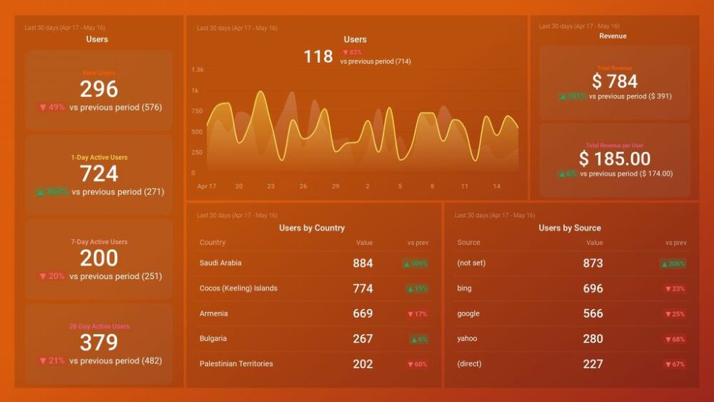
4. Web Analytics Dashboard
Another best dashboard to create is a web analytics dashboard that displays all the essential web data on one screen. Use it to monitor key data that will help you optimize your web pages.
Not sure what to add to this dashboard? Take this Google Analytics Website Traffic & Engagement template, for example. It’s one of our users’ favorite dashboards that tracks and displays all the essential website engagement metrics such as average time on page, bounce rate, and average session duration.

Another web analytics dashboard that our users love is this Google Analytics KPI Dashboard. It displays useful metrics like Top Pages by Pageviews, Sessions by Channel, and a complete Audience Overview.

It’s not necessary that each of these metrics in these templates would be important to you. Chances are you’re focusing on a handful of web metrics — not all of these. In such a case, pick the template that best suits you. Then, remove metrics not important to you — even add different ones as needed.
Portant’s James Fyfe, for instance, shares their company focuses mainly on four metrics:
- “Unique Monthly Visitors. It’s crucial that we monitor the unique visitors it has monthly. It helps us identify where our unique visitors come from – backlinks, social media, or organic traffic. It allows us to focus on the source that generated the most unique visits.
- Conversion. Besides recording the number of visits, it’s also important to identify which of those visitors were successfully converted to active users. We follow the formula of converting leads to customer percentages.
- Monthly Recurring Revenue. This is really a must since we can easily identify whether we improved versus our previous month or not. We can use this as a basis to identify if we’re generating any income, as well.
- Free-to-paid upgrades. This is another important KPI to track when you offer both a free and paid version. In our case, we would see how many free users upgraded because they are maximizing the services we offer. It also gives us a preview of our ROI. Of course, if the rate is low, then all of our investments are lost.”
5. Sales Dashboard
“A sales performance dashboard measures things like sales performance, which will help inform the strategies of not just the sales department, but marketing, financial, and operational planning teams too,” defines Textel’s James Diel.
This Databox Sales Overview dashboard template, for example, does exactly this — informing you about sales performance by displaying KPIs like New Deals, Closed Won, Closed Lost, and more.

You can also customize it to add other KPIs such as profit margin and total revenue — metrics that Diel recommends adding to a sales dashboard.
According to Diel, “This dashboard should include all your metric ‘biggies,’ like total revenue, profit margin, closing rate, and sales growth. Don’t be distracted by all the bells and whistles — dashboards are supposed to make complex data simple and digestible.”
It’s important to keep in mind here that sales and marketing alignment is key for business growth. Diel also mentioned that a sales dashboard is useful to more than just the sales team. To this end, create another dashboard that offers shared insights relevant to both teams.
Our users love this fully customizable Marketing & Sales Overview Dashboard template for this very reason.

Remember: you can change KPIs to track in this template as needed.
David Reid from VEM Group recommends tracking metrics like Customer Lifetime Value and Customer Acquisition Cost. You can always add them to the templates above.
Here’s a walkthrough of the KPIs Reid suggests adding to a sales dashboard and why:
- “Marketing revenue attribution. Understanding this metric is very crucial as it determines the success rate of the campaign. Since no company wants to spend their budgets on things that do not give them good returns, this KPI metric, when included in marketing, can let the companies know about the places where they are missing out on it. One can use either single-touch attribution or multi-touch attribution, depending on their capabilities. This is merely a metric that shows how your revenue is influenced by the marketing efforts that you put in.
- Customer Acquisition Cost. This KPI metric looks at the total money spent on marketing and how much more has to be done to gain a new customer. It also includes other metrics like salaries, technology, commission, and software needed to associate a lead to your business.
- Customer Lifetime Value. This metric calculates how much a company can expect to provide from an average single person in their lifetime. It is more important than the others as it also includes the money needed to attract new customers to one’s business. The lifetime value of the customers can be obtained as a product of average sales per customer, the average number of times a customer purchases, and the average lifetime of a customer.”
6. HR Dashboard
An HR dashboard is another best dashboard to design as it helps optimize human resources. In fact, Tim Schroeder from Learning Real Estate says “HR dashboards are a must-have for a company because it promotes effective communication within the organization.”
“This particular dashboard is not only beneficial for the HR department but also for employees. It can be used as a platform to share important news, such as work anniversaries, birthdays, etc.,” Schroeder says.
Using an HR dashboard, in particular, “reduces any chances of human error, like double booking candidates at the same time or misplacing resumes. It also helps the HR team to be organized and efficient.”
“It’s most helpful for the HR department, but others can use it to view the company policies and procedures,” adds Schroeder. “This dashboard becomes a portal to check all the resources for employees. As a result, it boosts employee morale due to a transparent work environment.”
The best part? Creating this HR dashboard isn’t rocket science. Simply pick a dashboard template from Databox’s template library, customize it to meet your needs, and your dashboard is ready.
Here’s an example Team Time Report dashboard template to try:

While this is an example of a time-tracking HR dashboard, another example of an HR dashboard is a workforce diversity dashboard that Foxbackdrop’s Evelyn Smith highlights.
“This allows us to dig deeper and understand our workforce. It enables us to understand any potential gaps in management representation at the senior level. This type of dashboard is helpful to managers, Chief Human Resource Officer, CEO, and the company’s stakeholders.”
Smith goes on, “The metrics that you can track in this dashboard would be the ethnicity of employees, country of origin, and the compensation of diverse employees. The data provided through this dashboard is easy to understand, allowing stakeholders to make decisions to ensure the sustainability of our company.”
7. Customer Support Dashboard
Quick and helpful customer support can help you stand out against competitors because it shows your customers you value them. It’s why we couldn’t miss adding a customer support dashboard to this list.
The dashboard helps you see all essential support metrics in one central place, assisting in improving your support service.
Not only that but a customer support dashboard template can help you see how your team is performing. This is crucial for optimizing performance and setting realistic goals around improving your service.
Here’s a Customer Support Overview Dashboard template that you can use. It gives a full overview of the Leads coming in, the ongoing Conversations, how many conversations the support team is having on a given day, and so on.

8. SaaS Dashboard
“The subscription model is beneficial because it ensures continuous revenue for businesses. A subscriber commits to your service for a fixed length of time, resulting in regular monthly income for the duration of the contract,” notes Alex Haley from YardsNearMe.
But for you to track how much revenue those users bring, how many of them are staying with you, and more, you need to track performance metrics. It’s here that another useful dashboard comes into the picture: a SaaS dashboard.
Like other dashboards shared in this list of amazing dashboards, a SaaS dashboard also shares important KPIs. These are, however, relevant to your SaaS product, showing how well it’s doing.
This Profitwell Churn Overview Dashboard, for instance, shares all churn-related metrics and happens to be one of our most downloaded templates.

If you don’t want to limit your SaaS dashboard to churn-related metrics only, personalize this template to add other KPIs.
Haley even shares ideas for creating different SaaS dashboards:
- “Large Ticket Item Dashboard. This dashboard would be valuable to a marketing team in almost any company with a high price point and, as a result, a high client acquisition cost.
- Deals Closed Dashboard. This is an accommodating KPI dashboard for determining whether your marketing plan is on track to meet your objectives. For example, the ‘First Page Seen’ area displays which page your visitors interact with first; if that page hasn’t been updated in a while, consider optimizing it for better conversions.”
9. Software Development Dashboard
SaaS businesses also need to keep track of new features released, their performance, bug complaints, fixes, and similar.
Again, using an IT dashboard helps reduce work and tasks related to tracking new features and bug fixes across your team.
Thankfully, this GitHub Overview Dashboard Template can help save time by providing easy-to-digest information on a well-designed dashboard.

It gives all the latest updates on one screen including the Issues Open and Close, and Total Pull Requests.
10. Ecommerce Dashboard
Don’t run a SaaS company? Use an ecommerce dashboard that shows your store’s performance metrics such as Revenue, AOV, Transactions, and so on.
This way, you can easily track and optimize your store’s performance and understand which products and channels drive the most revenue. Use the information to double down on revenue channels that are working and improve or provide offers on products that drive the most revenue.
Instead of creating a dashboard from scratch though, use this Google Analytics (Ecommerce overview) Dashboard Template that shows all key metrics on one screen:

If you prefer, you can change the metrics as well as the data sources in this dashboard template.
And if you have a Shopify store and want to track metrics from there instead of Google Analytics, use this Shopify Store Overview Dashboard Template instead:

Management KPI Dashboard
A management KPI dashboard is a must-have tool for anyone in an organization who is monitoring or leading teams related to ongoing sales activities, conversions, marketing strategy, and conversion optimization. This Pipeline Performance template is an excellent example of a good dashboard that will make monitoring and data analysis much easier for both managers and executives.
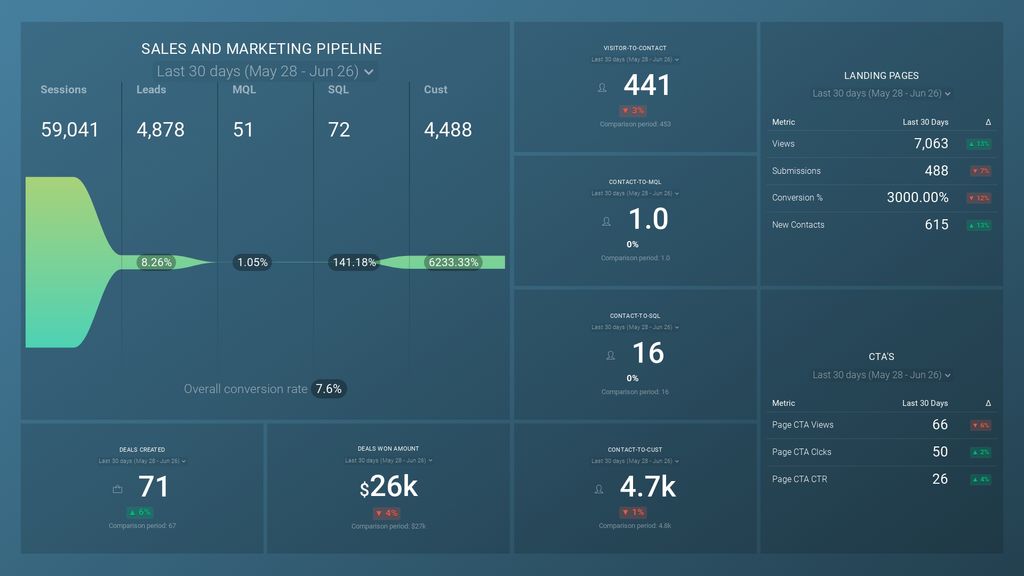
With it, you’ll get a comprehensive overview of the pipeline performance, significantly reducing the management workload and allowing you and your team to track KPIs and make data-driven decisions.
Financial Performance Dashboard
Your company’s financial health is possibly THE most important indicator of its viability, and it’s an important basis for making informed business decisions. A good financial performance dashboard should provide a clear view of your financial data, including revenue, expenses, and profitability. This financial performance dashboard template provides that and more, allowing you to keep high-level tabs on your overall financial health and quickly identify issues that might impact your business’s cash flow and turnover.

As with all Databox dashboards, you can fully customize it to match your needs and connect it with almost any data source you can think of.
Employee Performance Dashboard
Your employees are the backbone of your organization, and monitoring both individual and collective performance is crucial. This makes an employee performance dashboard a powerful for HR managers and team leaders. It provides a comprehensive overview of individual and team performance metrics, helping managers identify areas of strength and opportunities for improvement. This employee performance task drilldown dashboard from Harvest allows you to better understand your employees’ strengths, weaknesses, and behavior.

This is a popular customizable template that helps managers identify trends and patterns in employee performance, enabling them to make informed decisions about training and development.
Content Marketing Dashboard
If you need a high-level overview of your key content and conversion metrics, you need a content marketing dashboard. These types of dashboards are the best way to get insights into key metrics such as page views, bounce rate, and conversions. This Google Search Console Dashboard Template is a great example of a tool that will make monitoring content marketing performance a breeze.

While built for GA, you can use GA4 or other website analytics tools (Adobe Analytics, Matomo, etc). Thanks to its customizability, you’ll be able to adjust it to track the metrics that matter to you and use the information to develop better strategies.
PPC Dashboard
A PPC Dashboard is an essential tool for any organization that uses pay-per-click advertising to drive traffic and generate leads. A well-designed PPC dashboard provides insights into key metrics such as clicks, impressions, and conversions.

This template will allow you to monitor the performance of your PPC campaigns in real-time, helping you optimize your advertising spend and improve ROI.
Email Marketing Dashboard
Email is still an incredibly potent marketing channel, and using the right dashboard can give you all the info you need to make the most out of your email marketing campaigns. A good example is an email marketing dashboard that provides you insight into key metrics like sessions from email, signups from email, session conversion rate, and more.
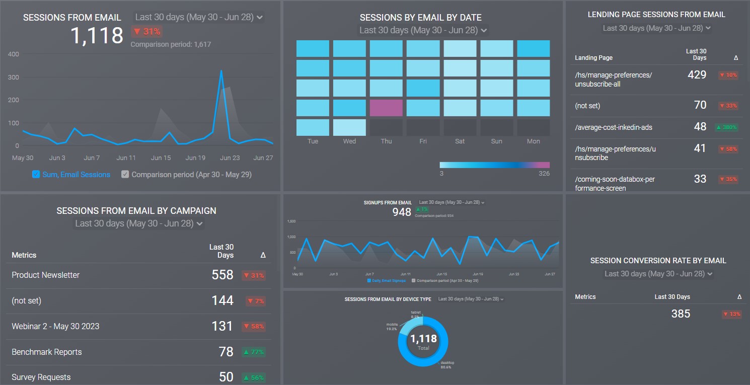
By tracking the performance of your email marketing campaigns in real time, you can optimize your email marketing strategy, improving its overall effectiveness and ROI.
Customer Satisfaction Dashboard
The world is more connected than ever, and consumers have a true wealth of options. That means that keeping them happy should be very high on your priority list. This Customer Success Overview dashboard covers customers helped, new customers, churn, support team leaderboard, and more.
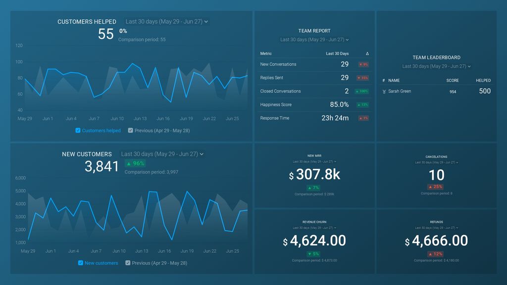
Having a good customer satisfaction dashboard gives you a clear overview of key metrics, and this one is fully customizable, allowing you to adjust data sources and display only the data you need. With it, you can quickly analyze pertinent customer information and optimize your growth and retention strategies based on the data.
Social Media Dashboard
Social media has become a critical platform for businesses to engage with their audience and promote their brand. A social media dashboard is a versatile tool that provides a comprehensive overview of a business’s social media performance, allowing marketers to develop data-driven social media strategies. If you rely on this Social Networks dashboard template, you’ll be able to track important metrics across all major social networks, including followers, impressions, likes, and more, in order to gain a better insight into post performance.

This dashboard helps businesses optimize their social media strategy, improve engagement, and ultimately, grow their online presence. Like all Databox dashboards, the interface is clean and intuitive, and fully customizable, so you can adjust it to match your needs.
Build Beautiful Dashboards in Databox
Here’s hoping you’re ready to start leveraging dashboards for your business now that you have a ready list of the best dashboards to use.
Stuck on choosing the right dashboard building tool? Chances are “you may be tempted to choose a tool that slices and dices data in every way imaginable,” James Diel from Textel points out.
“But if it leads to a complex interface that is less user-friendly, you may be better choosing another option,” Diel warns.
So what should you be looking for instead? “Look for a data architecture that presents the most essential data simply, and progressively drills down into more detail as needed for clarity. Your goal is to remove as much of the ‘noise’ as you can to save time and gather valuable insights.”
And to simplify the decision further, we recommend using Databox.
For one, it gives you customizable, ready-to-use templates that help users hit the ground running. All you’ve to do is to connect your data sources with the dashboard building software and it’ll pull all the important metrics on one visually engaging screen.
And two, not only does Databox present data simply and beautifully, but it also auto-updates it so every time you review a dashboard, you see freshly updated insights.
To top it all, Databox is easy to use. So what are you waiting for? Take Databox for a free trail and create well-designed dashboards today.

FAQ
Databox is a Business Intelligence (BI) platform known for its ease of use, analytics, and fully customizable dashboards. It enables businesses to create the best dashboards for tracking KPIs across departments—without writing a single line of code.
With 500+ templates and integrations for tools like Google Analytics, HubSpot, Salesforce, and Shopify, you can build tailored dashboards for marketing, sales, customer support, finance, HR, and more. Databox consolidates fragmented data into a single, automated reporting hub—keeping your team aligned and your performance metrics clear, actionable, and always up to date.
A Marketing Dashboard in Databox helps you track overall marketing performance. By using templates like the Monthly Marketing Performance Dashboard, you can monitor Traffic Sources, Leads Generated, Conversion Rate, and Total Monthly Revenue. You can also segment your audience by channel, and with Databox, you can adjust the dashboard to focus on the metrics that matter most to your marketing team.
Databox’s Sales Dashboard helps you monitor sales performance by displaying KPIs such as New Deals, Closed Won, and Closed Lost. The Sales Overview Dashboard template in Databox can be customized to include additional metrics like Profit Margin and Total Revenue. This makes it easy to align your sales and marketing efforts, and provides insight into your sales process for better decision-making.
For SaaS businesses, Databox provides dashboards like the Profitwell Churn Overview Dashboard that tracks churn rates, customer lifetime value (CLTV), and other subscription metrics. You can also customize this dashboard to include other important KPIs specific to your SaaS model, such as Free-to-Paid Upgrades and Monthly Recurring Revenue.
Use Databox’s eCommerce Dashboard templates to track important store metrics like Revenue, Average Order Value (AOV), and Transactions. The Google Analytics (Ecommerce Overview) Dashboard Template or Shopify Store Overview Dashboard Template allow you to track product performance, channel effectiveness, and optimize sales strategies.
Track the success of your email marketing campaigns using Databox’s Email Marketing Dashboard. With templates like the Email Marketing Campaign Dashboard, you can monitor metrics such as Sessions from Email, Signups from Email, and Session Conversion Rate, ensuring that your email strategy is driving maximum ROI.