Uses one-click integrations:
-
 Stripe
-
 Help Scout Mailbox
If you don't use Stripe or Help Scout Mailbox, you can pull data from any of our 130+ one-click, native integrations or from spreadsheets, databases and other APIs.
Try this dashboard for freeWhat you’ll learn from this Customer Success Dashboard Template:
Connect your Help Scout and Stripe accounts and learn:
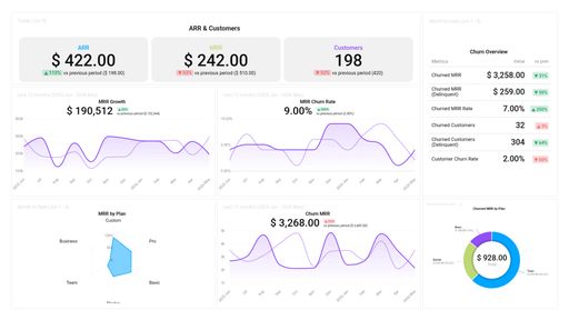
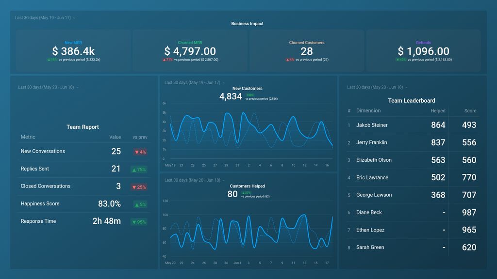
- What is the monthly recurring revenue that comes from new customers? Track the monthly recurring revenue generated from new customers at a glance. Tracking your New MRR is crucial as it allows you to make accurate financial projections, as well as to measure your business’ growth in acquiring new customers and generating revenue.
- How do I track revenue churn? See how much in monthly recurring revenue your business lost due to subscription cancellations and downgrades within a specified period of time. One effective way to reduce churn is to invest in your customer support team, as they play a key role in keeping your customers happy and satisfied. It is also relevant to invest in finding out reasons why customers are churning in order for you to step in and address these issues in a timely manner.
- How much in refunds and cancellations did we issue last month? Keep an eye on your refunds and cancellation data. See the total amount of money refunded to customers within a given time period (depending on your refund policy, this can be a partial or complete refund). Also, see how much in monetary value your business lost due to customers canceling their subscription or not renewing their contract.
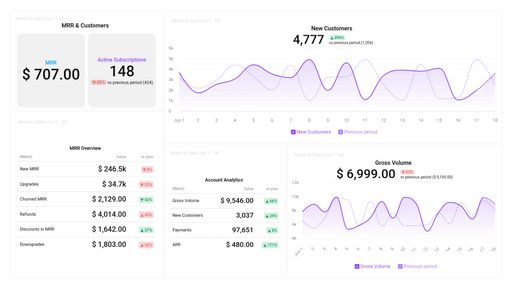
- How many new customers did we acquire this week? Track the number of new customers acquired by your business each day. Be on the lookout for sudden dips or spikes in the inflow of new customers. Follow up by digging in to learn why this might have happened. E.g., as a result of your most recent email campaign? Active ad campaign? A constant flow of leads monthly indicates that your business is growing its reach and your customer acquisition program is effective.
- How do I measure the success of my support team?Evaluate and analyze your customer support team’s performance and efficiency by tracking your most valuable metrics in real time, such as the number of new conversations handled, replies sent, closed conversations, response time, and happiness score.
- How do we measure the performance of each customer support agent? Evaluate the performance of your customer support team members based on the number of customers they helped individually and their happiness score. Tracking this data lets you know your best-performing customer agents and the ones that are underperforming and might need some support or guidance to perform better.
- How many customers needed help today? Get a day-to-day update on the number of customers your customer support team assisted through live chat, email, or phone.
Pull additional data using our deep integration with Help Scout.
What else can you track and visualize with our deep integration with Help Scout? When it comes to delivering an excellent customer experience, pretty much anything:
- Cases by topic, cases by location
- Average handle time
- Resolved cases
- Customer satisfaction score
- Time to first response time
- Landing page performance
- interactions per resolution
There are numerous metrics and metric combinations you can track using Help Scout. And in Databox, you can quickly visualize dozens of customer service metrics in various ways.
Read more about Databox’s HelpScout integration.
Explore more HelpScout dashboards.
Stripe metrics included in this template
-
Refunds
Refunds metric measures the amount of money refunded to customers for a specific period of time. It helps businesses understand how much revenue they have lost due to refunds and identify areas for improvement in their product or service.
Help Scout Mailbox metrics included in this template
-
Closed Conversations
The Closed Conversations metric measures the number of support conversations that have been marked as resolved or closed within a specific timeframe.
-
Customers Helped
The Customers Helped metric tracks the number of unique customers who have received support from the helpdesk within a specified time frame. It provides insight into the overall level of customer engagement and support effectiveness.
-
Customers Helped by Team Member
The Customers Helped by Team Member metric measures the total number of customers assisted by a single team member within a specified time period, indicating their individual productivity and efficiency in providing customer support.
-
Replies Sent
The Replies Sent metric measures the number of responses or messages sent by a Helpscout user in a given time frame, indicating the overall efficiency and engagement of customer support.
-
Response Time
Response Time is the average time it takes for a customer support agent to respond to a customer's initial message. It's a key metric in measuring customer satisfaction and efficiency of customer support teams.