Uses one-click integrations:
-
 HubSpot CRM
-
 Stripe
-
 QuickBooks
If you don't use HubSpot CRM, Stripe or QuickBooks, you can pull data from any of our 130+ one-click, native integrations or from spreadsheets, databases and other APIs.
Try this dashboard for freeWhat you’ll learn from this SaaS Leadership Dashboard (Stripe + QuickBooks + HubSpot CRM) Dashboard Template:
Connect your Stripe, QuickBooks, HubSpot CRM, GA4, and Mixpanel accounts and learn:
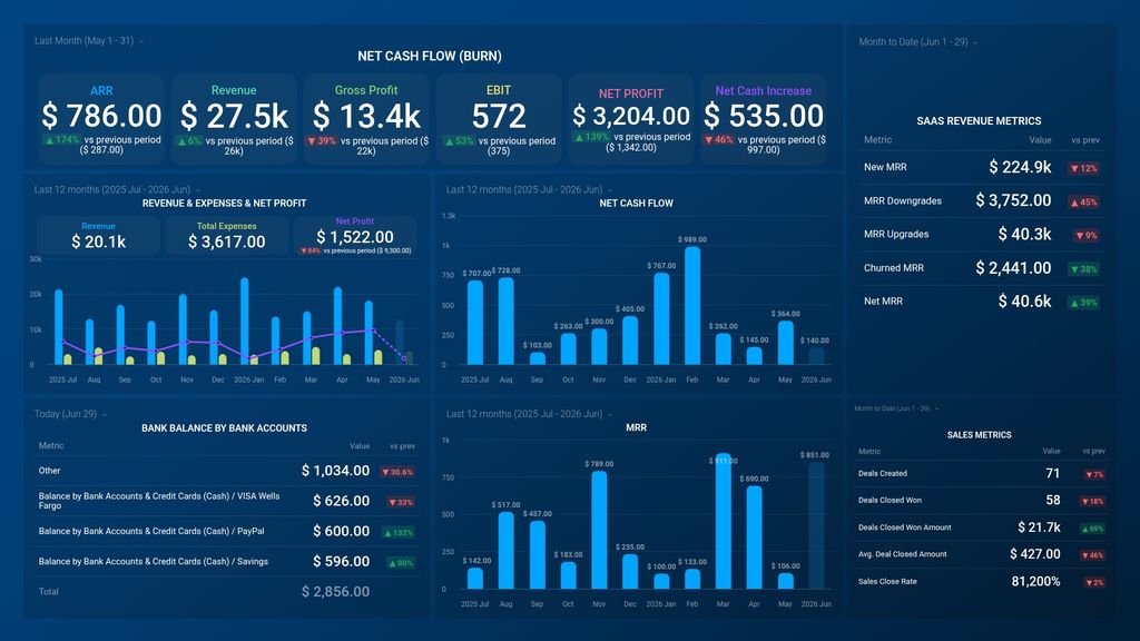
- How to track a bank balance? Track your bank balance by bank accounts to get in-depth insight into the current values in comparison to previous periods.
- What is your gross profit margin? Query the essence of your profitability by examining your gross profit margin. This measurement reveals the profit earned after deducting the costs associated with your business operations. By analyzing this over different periods, you gain valuable insights into your business's growth patterns.
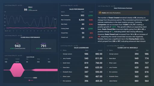
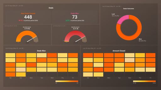
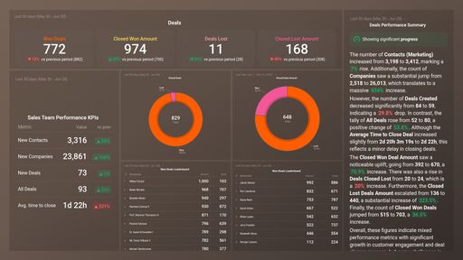
- What can I learn from my key sales metrics? Uncover the effectiveness of your sales efforts by evaluating key sales metrics. This includes the total number of successful transactions, the average value of deals secured, and the conversion rate. Such analysis is pivotal in assessing the efficiency of your sales force.
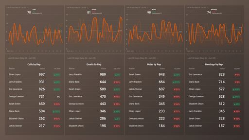
- Keep track of your marketing and product performance?Maintain a vigilant eye on the pivotal metrics that define the success of your marketing and product initiatives. By tracking sessions, signups, new subscriptions, and other vital data points, you can strategize on amplifying your market presence and fostering future growth.
Pull additional data using our deep integration with Stripe, QuickBooks, and HubSpot CRM
What else can you track and visualize with our robust integration with Stripe, QuickBooks, and HubSpot? When it comes to your most important payment metrics, churn, etc, almost anything:
- Gross and Net profit
- Customer retention rate
- Paid Invoice Amount
- Cash flow
- Deals Won by Pipeline
There are many, many different metrics and metric combinations you can track using Stripe, QuickBooks, and HubSpot CRM. And in Databox, you can quickly visualize dozens of Stripe, QuickBooks, and HubSpot CRM metrics & KPIs in a variety of ways, alongside all the important metrics from other data sources you’re using.
Read more about Databox’s Stripe, QuickBooks, and HubSpot CRM integration.
Explore more Stripe dashboards, QuickBooks dashboards, and HubSpot CRM dashboards.