Table of contents
Curious about which Google Analytics reports can truly elevate your marketing game? Our article dives into the best Google Analytics reports recommended by nearly 50 marketing experts to help you analyze your performance and plan smarter strategies.
Did you know there are over 29 million websites that use Google Analytics? If Google Analytics were a country, it would be the 50th largest in the world. In fact, more websites use Google Analytics than there are people living in Australia.
Google Analytics is a free website analytics platform that allows you to see how many people find, visit, and engage with your website in a given time period. It’s an incredibly useful tool for marketers and businesses who want to get the most out of their marketing efforts.
It supports a variety of report types that can truly make a difference when analyzing campaign performance and planning future strategies.
Once you start pulling the right GA4 reports, you’ll usually run into a familiar problem: the data is easy to export, but harder to interpret across channels and time periods. Teams now use AI data analysts, like Databox MCP, to ask plain-English questions about report results and get answers based on their real metrics, definitions, and historical context. This helps clarify why traffic or conversions shifted, which report signals matter most for the goal you’re tracking, and how changes in one report connect to outcomes in another.
In this post, we’re going to dive deep into Google Analytics reporting, including:
- What is a Google Analytics report?
- How to Build a Google Analytics report
- How to Display a Google Analytics Report on Your Website
- How to Export a Google Analytics Report
- 16 of the most useful Google Analytics reports
- How to Streamline Google Analytics Reporting with Databox

What is a Google Analytics Report?
Google Analytics is a free website analytics platform that allows you to see how many people find, visit, and engage with your website over a given time period. It’s an essential tool for marketers and businesses aiming to maximize their marketing efforts, holding a 26.87% market share in web analytics, with Google Universal Analytics at 17.31% and Google Global Site Tag at 30.35%. This widespread use underscores the importance of understanding and leveraging Google Analytics reports for businesses of all sizes.
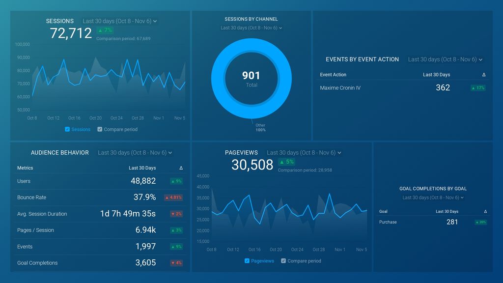
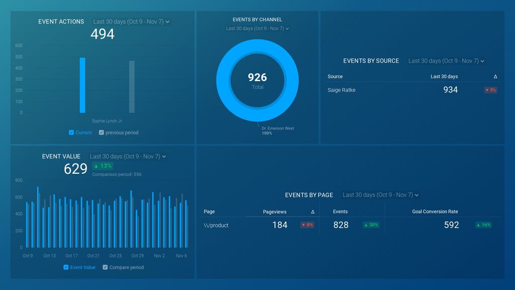
Put simply, a Google Analytics Report is an all-in-one tool that lets you monitor and display multiple GA metrics in a single dashboard. It is used by businesses and marketing agencies to determine how users interact with websites. With it, you can automate complex reporting tasks and integrate Google Analytics data with your own business.
If you connect it with Databox, you can build Google Analytics custom reports that are tailored to the needs of your business. You’ll be able to use relevant metrics and present the data in a way that makes the most sense, allowing you to analyze your past performance and develop a strategy for the future.
PRO TIP: Before diving deep into Google Analytics reports when building reports, it’s important to understand the crucial differences between analytics vs reporting. This involves considering the purpose and scope of the key performance indicators (KPIs) that will be analyzed.
Types of Google Analytics 4 Reports
Standard Reports
Google Analytics 4 offers a variety of standard reports that provide insights into user behavior, acquisition, engagement, and conversions. These include reports on real-time activity, user acquisition, engagement metrics, and monetization for ecommerce sites.
Exploration Reports
GA4 also features powerful exploration reports that allow for more in-depth analysis. These include funnel exploration, path exploration, and segment overlap reports that help uncover deeper insights about user journeys and behavior patterns.
How to Build a Google Analytics Report
Of course, you can create and save custom reports in Google Analytics as well.
The process is fairly simple:
First, go to Customization → Custom Reports.

Then, select New Custom Report.

Now, it is time to build your custom report.
You have the option to design three types of reports:
- Explorer – This resembles the standard Google Analytics report look and feel.
- Flat Table – This is a table layout.
- Map Overlay – This is a map layout.

Next, you’ll choose the metrics and dimensions that you want to analyze.

Finally, select if you want this report to be viewable for just this view or all views within your Google Analytics and hit Save.

How to Display a Google Analytics Report on Your Website
You can also display customized live Google Analytics dashboards directly to your audiences on your website. Databox’s Databoard Embed feature allows you to share and publish live dashboards on any web page.
The process is fairly simple and it only takes a few steps.
First, navigate to the Databoards page in the Databox web application.
Then, click on the “share” icon on the Databoard you would like to share.

Switch to the new “Embed” tab. Here, you’ll see the code snippet that you’ll need to add to the page you want the databoard displayed on.

You can select Responsive (automatically adjust the width of the iFrame to your page’s width) or Fixed (custom size) formatting for your embedded Databoard.
After that’s done, you can simply click on the Copy Code and paste it into the HTML view of the desired webpage.
How to Export a Google Analytics Report
Sometimes, you’ll want to export a GA report and share it externally.
In that case, just follow these steps:
First, open the report you’d like to export. Note that Google Analytics exports the report as currently displayed, so you might want to adjust the date range and report settings to desired values.
Second, click Export (across from the report title).

Lastly, select the format you want to export the report into. Possible options are CSV, Excel (XLSX), Google Sheets, and PDF.

And you’re done!
If you’re using Databox to build GA reports, you can execute the entire operation with a single click.
In addition, you can use the Scheduled Snapshots feature to export reports. It allows you to export PDFs or JPGs of your Databox dashboards at regular times. With Scheduled Snapshots, you can also choose a single Databoard or a set of Looped Databoards in the Snapshot.
Best Google Analytics Reports
From users, sessions, and pageviews to acquisition sources, conversion paths, and goals, there are countless things you can track in Google Analytics.
For example, here are a few popular use cases:
- SEO – understand what pages and posts on your site bring in the most organic search traffic.
- Content Marketing – monitor your top-performing blog posts.
- PPC Campaigns – track what ad copy, creative and landing pages result in the most sales.
- eCommerce – analyze the eCommerce full funnel to understand what turns a visitor into a buyer.
- PR – monitor site traffic and social media impressions from new press/media features.
We talked to 50 marketers and asked them to share their most useful Google Analytics reports. We pared down the list to 16 reports that you should definitely check out. No matter the industry or specific niche you’re collecting the data for, it’s likely you’ll find a use for at least some of them.
- Audience Overview Report
- Demographics Report
- Acquisition Overview Report
- Channel Reports
- Landing Pages Report
- Mobile Overview Report
- Behavior Flow Report
- Content Efficiency Analysis Report
- New vs Returning Users Report
- Goal Overview Report
- Top Conversion Paths Report
- Assisted Conversions Report
- Funnel Analysis Report
- Site Content Report
- Custom Events Report
- Custom Report
Did you know that Google Analytics isn’t just for big corporations? In fact, 72% of companies using Google Analytics are small businesses with only 1-10 employees. Even more interesting, the majority of users are businesses generating between $1 million and $10 million annually. This shows that Google Analytics is the go-to tool not just for giants, but for smaller businesses looking to make smarter, data-driven decisions.
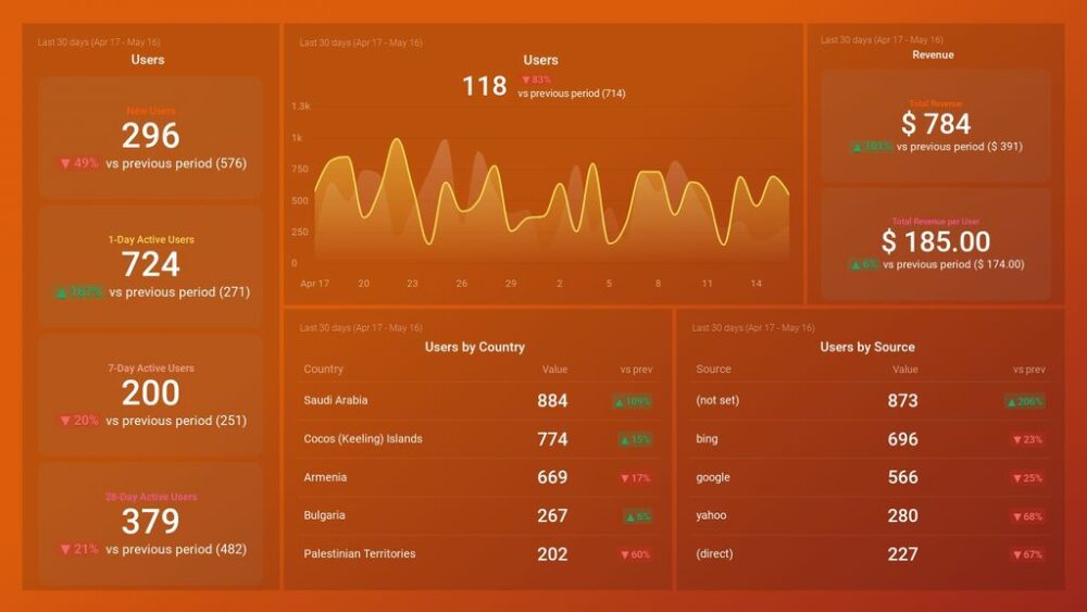
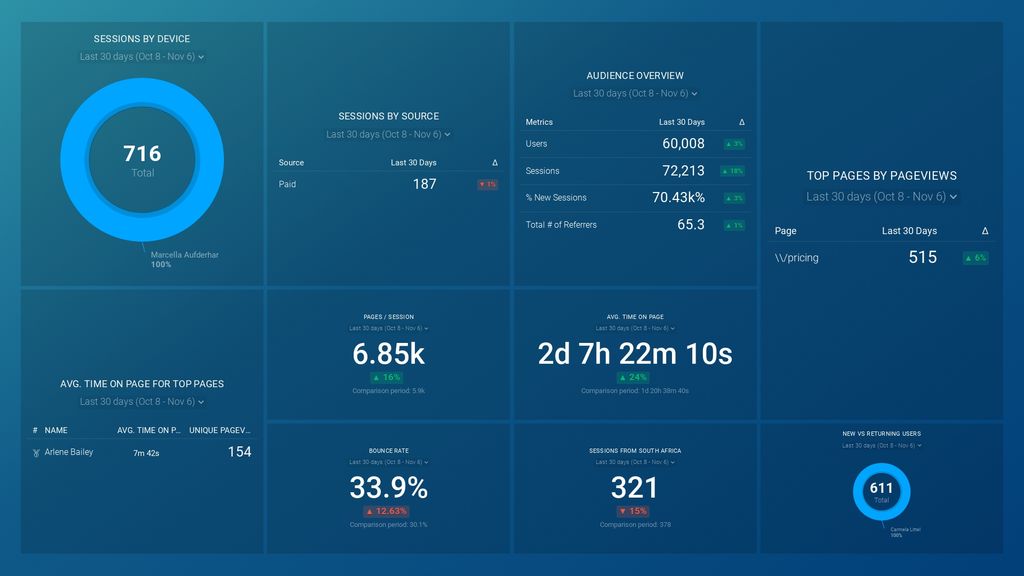
Audience Overview Report
If you want an overall snapshot of the traffic going to your website, then the Audience Overview report is exactly what you need. It allows you to see exactly where your traffic is coming from and what are the conversion rates for each source.
According to Daniella Pozzolungo of PupDigital, this report is extremely useful for exactly those reasons. “It can help provide a snapshot of not only how effective your marketing is, but also it can identify focus areas for your strategy. You can also compare time periods to see if there has been an increase or decrease against a traffic source which can help guide your strategy development further.”
Bruce Hogan of SoftwarePundit also likes the fact you can examine data very quickly. “Other reports in Google Analytics only show you traffic on a daily, weekly or monthly basis. As a result, the Audience Overview report can be used to monitor website traffic performance in almost real time. Personally, we use it to compare today’s traffic performance to the same day in the prior week.”
You can also use Databox’s Google Analytics audience report template to ensure you have a top-level overview of your website users. This is a great option if you need to build a comprehensive Google Analytics monthly report since you’ll be able to learn who is visiting your site, what are their favorite mobile devices and how long they stick around. You can also customize it to include different metrics, if they’re relevant to your current situation.
Pro Tip: Your Go-To Dashboard For Doing a Deeper Dive on Website Traffic and Conversion Sources
Struggling to find an easy yet effective way to gain a comprehensive understanding of your traffic sources, user behavior, and revenue generation?
You can do all that and more with our plug-and-play GA4 Acquisition dashboard template:
- Understand user acquisition: See where users come from, tailor outreach, and track new user growth;
- Focus on high-performing channels: Identify top channels, optimize resource allocation, and adjust underperformers;
- Track revenue & engagement: Monitor revenue growth, active users, and the effectiveness of your campaigns;
- Go beyond traffic & conversions: Gain deeper insights into demographics, sales, customer journeys, ARPU, and more;
- Optimize marketing & drive results: Make data-driven decisions to improve your marketing strategy and achieve business goals.
You can easily set it up in just a few clicks – no coding required.
To set up the dashboard, follow these 3 simple steps:
Step 1: Get the template
Step 2: Connect your Google Analytics 4 accounts with Databox.
Step 3: Watch your dashboard populate in seconds.
Demographics Report
There’s no denying that the data about the demographics of your users is very useful. Google Analytics Demographics report will help you learn who your users are, their engagement, and what they do on your website.
Liam Barnes of Directive is particularly fond of demographic data. “It is the most useful because it allows us to segment our audiences to the group of users that are most likely to convert.”
Databox has a Google Analytics 4 report template focused on demographic details that can help you get complete insights into your website and app audience. You’ll have all the data you need to understand where your audience is coming from and create effective campaigns based on what you learn.
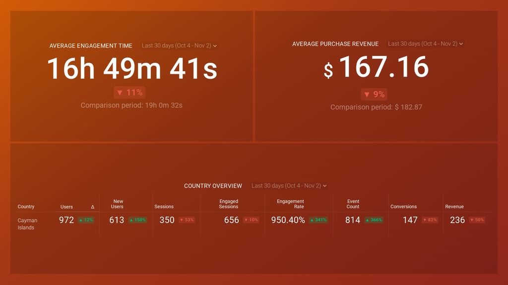
If you want who your users are, where are the most engaged ones coming from, how much time they’re spending on your website, and what’s their purchase revenue, this is the dashboard you need.
Acquisition Overview Report
This is a broad and basic Google Analytics report that can help you quickly identify what source of traffic is currently the best performer. You’ll get behavior and conversion insights that will help you determine if you’re on track to achieving your goals.
Thanks to that information, you’ll be able to determine how your channels are performing and focus your efforts on the ones that provide the best ROI.
Md Mohsin Ansari of Mailtrim agrees with this assessment, “With this report, we analyze how much traffic is coming from specific channels (paid versus unpaid channels)- organic, paid, direct, referral, and social media and which channels are giving high conversions based on the analysis. We tried to focus on and optimize those channels to get more conversions.”
If you want to use Databox to analyze your acquisition data, then you can check out the Acquisition Snapshot Dashboard Template.
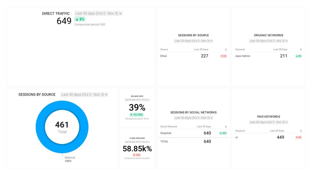
This Google Analytics template will allow you to dig deeper into your traffic sources and help you track direct traffic in GA, find out where your traffic is coming from, and which keywords bring in the most traffic to your website. You’ll be able to identify your top-performing campaigns and keywords (paid and organic), monitor user behavior, and more.
Channels Report
Also called Source/Medium reports, these types of marketing reports help you analyze the origin of your traffic and the general category of said source. It allows you to monitor traffic and conversions by channel and measure the success of new initiatives and strategies.
Andre Oentoro of Breadnbeyond agrees, “My go-to Google Analytics report in any situation is the channel report. You can see what traffic sources are driving the most and the best traffic to your website. Also, there are three critical metrics types in a single overview; acquisition, behavior, and conversion, which I find extremely handy for measuring my nonprofit website’s success.
For instance, even if you drive a lot of traffic to your site (acquisition metrics), but the visitors aren’t engaged (behavior metrics) and don’t take any action (conversion metrics), your website may not be bringing you the results as much as it could be.”
If you need a Google Analytics report example that you can use to compare the performance of your most popular acquisition channels, then you can’t go wrong with Databox’s Google Analytics Channel (or Acquisition) Overview dashboard.
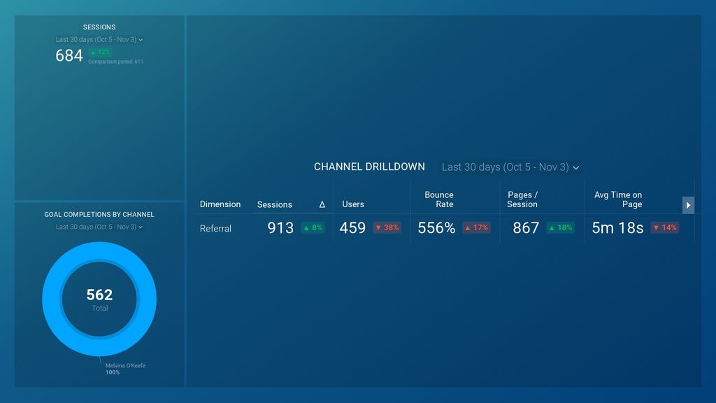
It will allow you to drill down into your metrics and better understand your most effective channels. By collating sessions, users, bounce rate, pages per session, and goal completions by channel you’ll reach a new level of understanding of your website and the user journey.
Landing Pages Report
This is one of the most useful reports you can look at in Google Analytics. It tells you which pages visitors see first when they land on your site and what they do afterward — i.e. if those visits turn into conversions.
That’s all good info to have, after all, you need to know how your landing page is performing if you want to convert visitors into customers.
Noelle Fauver of Trust & Will agrees that this is an important report, “You can see what pages the site’s users are interacting with most and it gives you insight like the bounce rate, % of new sessions, new users, etc. The data it provides can give you enough information on where you should concentrate your efforts. For example, if one page has a much higher bounce rate, then you could investigate to find out why.”
For everyone who wants to drill down into the landing page metrics, Databox offers a Google Analytics report template that focuses on tracking landing pages and leads.
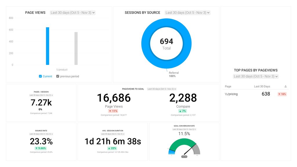
You can use this template to dig deeper into the specific pages on your website that drive traffic and conversions. You’ll also learn how much time visitors spend on your website and what’s its overall bounce rate.
Mobile Overview Report
Mobile has long since overtaken desktop when it comes to traffic. This makes monitoring mobile metrics and performance incredibly important.
This type of report enables you to understand the number of users in your app, their characteristics, and where they come from, measure what actions they’re taking and measure in-app payments and revenues. With a proper understanding of the relevant metrics, you’ll be able to slice and dice your data to understand the behavior of different user groups.
“The mobile performance is the most underrated report of Google Analytics,” says Rameez Ghayas Usmani of PureVPN. “After the Google update that rolled out regarding Mobile-First Indexing, this report helps us to see how well the site is optimized for mobile and where you need to make improvements.
You can even segment the report further to see which mobile devices/browsers customers are using to access your site. This will tell you if your site is performing poorly on some devices.”
Of course, desktop is still huge, and you need to ensure your website or app is optimized for both desktop and mobile environments. Databox has just the right dashboard template that allows you to assess the way mobile and desktop visitors use your site and make better-informed decisions based on your findings.

Using this dashboard template and connecting it with Google Analytics will give you a breakdown of your userbase by device, bounce rate by device or browser, what’s the average length of sessions across devices and browsers, and much more.
Behavior Flow Report
This report allows you to see how your users traverse and interact with your site.
Behavior Flow Report visualizes the path users traveled from one page or event to the next, and it can help you discover what content keeps users engaged with your site as well as identify potential content issues. You can get a lot of information on new and returning user behavior, allowing you to optimize every aspect of the visitor journey.
If you’re wondering how to set up a returning user behavior report, check out our video below:
“The behavior report is most useful because it allows you to understand what new users and returning users are interested in or not interested in,” says Melissa Hughes of Foundation Marketing. “This allows you to make important adjustments to your investment in content and user experience.”
Shiran Sugerman of Spitfire Inbound agrees, “The one report I always take a look at is the Behavior Flow. It’s so important to know how people explore your site and understand where people drop off so you can optimize. This report lets you dig into the behavior of your website visitors, which you can then use to add key CTAs to ensure your visitors are going through their buyer journey easily.”
When it comes to Databox’s solutions, you can turn to the Google Analytics Website Engagement Dashboard. With it, you’ll be able to track your most important website engagement metrics, including average time on page, average session duration, bounce rate, and more.

This report template will allow you to learn more about your daily or monthly website traffic, which channels are driving traffic to your website, and which keywords are driving the most organic traffic. Of course, as with all Databox dashboard templates, you can fully customize it to get to the metrics you care about the most.
*Note: Keyword data is available only if you have connected your Google Analytics account with your Google Search account.
Content Analysis Report
Content is still king and you need to ensure this crucial element of your marketing strategy is on point.
A well-made Content Analysis Report will help you understand how your content is performing and discover its strengths and weaknesses. It should focus on metrics like pageviews (a variety of those, depending on your focus), bounce rate, sessions by landing page, users by landing page, and goal conversion rate by landing page. If you want to build good content analytics reports you need to know what metrics are useful for content analysis reporting.
“My favorite report in Google Analytics is the Content Efficiency Analysis,” says Dan Gower of Buddy Gardner Advertising. “This helps see which pages and blog posts are performing the best, so I know what my readers appreciate the most. Armed with this information, I can tailor my content creation efforts to create more posts that will appeal to my audience. This is incredibly helpful for SEO.”
Databox also offers an incredibly useful Google Analytics report template for content analysis. You can use it to measure your content performance and find out which of your web pages are exceptionally engaging and useful to your visitors.
With that information, you’ll be able to figure out where the visitors are viewing your site from, and which pages lead to goal completions or encourage visitors to read further. You’ll have in-depth information about user interaction with your content, allowing you to fine-tune it for even better performance.
New vs Returning Users Report
This is exactly what it says on the tin. Visitors who have never been on your website and visitors who have. There needs to be a healthy balance of new and returning visitors, but there’s no universal benchmark. You need to consider a variety of different factors and how they apply to your business, including but not limited to the type of website, how long it has been around, the traffic source, and the primary business goals and objectives.
Shiv Gupta of Incrementors Web Solutions calls this report very helpful. “With this data, you need to understand who is coming to your website. You should use the New vs Returning reports to analyze the potential for different types of visitors to your website and how they become your customer. Adding custom variables will take this analysis to the next level and really make the data matter more to you. Moreover, you’ll need to plan your marketing campaigns more effectively to reach the best type of visitor.”
To help you with this, you can use one of Databox’s Google Analytics report examples. The Google Analytics Traffic Source Breakdown Dashboard will give you full insights into your traffic segments and discover which marketing campaigns or channels drive the most valuable visitors to your website.

Thanks to Databox’s deep integration with Google Analytics, you’ll be able to get a variety of different metrics as well as learn how new and returning users interact with your website, which pages get the most organic traffic, and how long visitors stay on your website (by channel).
Goal Overview Report
If you need a high-level view of goal-centric metrics, like the goal value, the total number of goal completions, conversion rates, and others, you need the Goal Overview Report.
It will allow you to drill down into the metrics and extrapolate which parts of your site are driving users down the funnel to your most valuable product pages. Also, if you set up specific interactions such as downloads, subscriptions, and form submissions, you can track them as goals. You can then customize the report for desired date ranges and analyze the results.
“The Goals Overview is still arguably the most important report you should be analyzing in Google Analytics,” insists David Sanchez of Digitalis Medical. “This feature helps you set any goals for your website and track conversions.
With this data, you can easily identify which part of your website gets more user interactions and optimize your pages for better conversions. The goals you set can also map your customer journey and identify any areas on your website which need improvement.“
If you need the right Google Analytics report example for this, Databox’s Conversion Report: Goals Overview Dashboard can help you track the goal completions and conversion rates on your website.

If you need a versatile Google Analytics monthly report template, this is a solid choice. With it, you’ll be able to monitor your overall goal conversion rate, track the performance of your top-performing pages, and see goal completions and conversion rates. Set up the date ranges and notifications properly, and you’ll have an excellent periodic report.
Top Conversion Paths Report
This report shows popular referral paths and the number of times a visitor interacted with each channel before converting at the website. It’s an excellent Google Analytics report for eCommerce as it focuses on essential conversion metrics that will help you understand what’s going on with your online store and make better business decisions.
After you set up Google Analytics Conversion tracking, this report will give you deep insight into the conversion paths based on the campaign, landing page, channel, etc. You can also use it to learn about the behavior associated with various conversions, allowing you to become more effective at cross-channel marketing.
Paige Papineau of Rocket Clicks says, “In my experience, the most useful report in Google Analytics is the Top Conversion Paths report. As attribution continues to be at the forefront of measuring digital success, it’s important to discuss how campaigns and channels work together to drive conversions—or how channels could be supporting each other more effectively.
For instance, blogs typically have high traffic, but a low conversion rate. The lack of conversions might lead a client to discredit the blog’s value since it’s not directly attributable to conversions using certain attribution models. However, when you review the Top Conversion Paths report, you’re likely to find blogs contributing to conversions on other, lower-funnel pages. Explaining this report to a client helps them understand that blogs (and other pages) are still valuable assets to the website despite low surface-level conversion rate. This could help pitch and drive strategy, especially working across multiple channels.
From a PPC perspective, specifically, we can start to see if a campaign is higher in the funnel, allowing for a user to start their search through one campaign and ending in another channel/campaign. I know our clients find it very valuable (not to mention interesting and insightful to user behavior). Because of its implications for strategy, the Top Conversion Paths report is the best way to showcase how campaigns and initiatives are performing.”
For a comprehensive overview of conversion paths for eCommerce, you can use Databox’s Google Analytics report template focused on eCommerce conversions. It allows you to track transactions, revenue, and product performance.
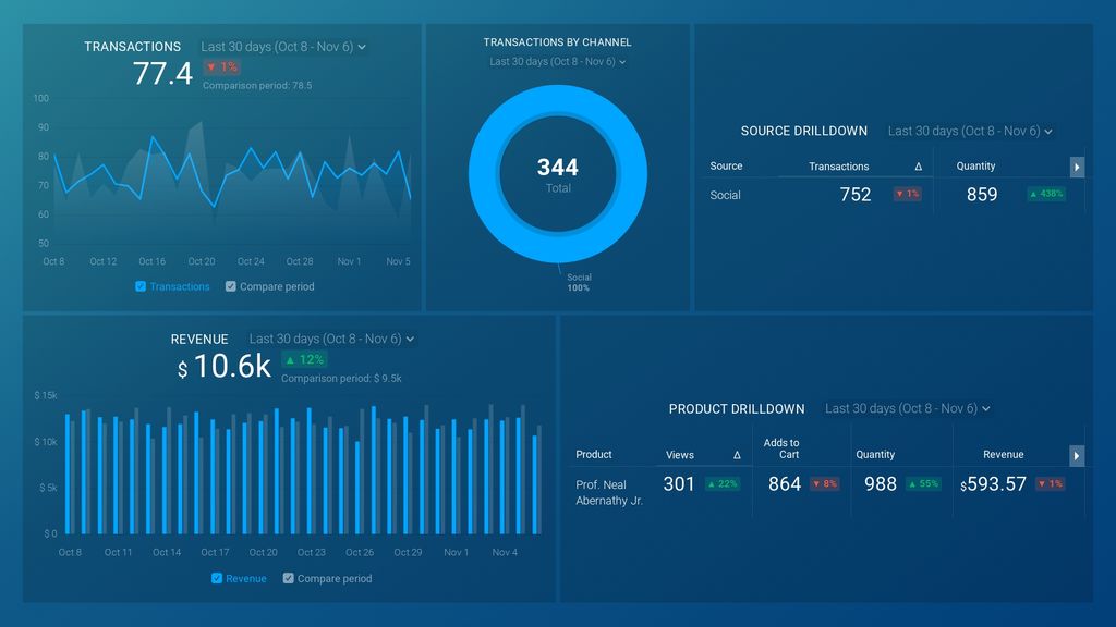
This template is an excellent choice if you are using Google Analytics reports for clients. With it, you’ll be able to show your clients transactions and revenue by day, transactions by channel and source, and top-performing products or services on their website.
Assisted Conversions Report
An assist is any interaction (except attributed ones) that occurs prior to a conversion. The Assisted Conversions report shows how many conversions were attributed to and assisted by each channel, as well as the value of those conversions.
It’s one of the best google analytics reports for ecommerce as it allows you to map all channels that contribute to a purchase and gain insights that will be incredibly valuable when it comes to tracking customer lifetime value and analyzing the effectiveness of your content.
Anif Muz of Jooble.org says they like this report because it allows businesses to see the path to the set goal. “GA tracks visitors who have been to your site more than two times and eventually converted, and who didn’t.
We are using the reports in the Multi-Channel Funnels section to find out which channels helped lead a customer to a conversion.
The Assisted Conversions report shows how many conversions this channel was associated with, did not lead the customer directly to a conversion, but was in the chain. This data is useful for evaluating marketing channels.”
Funnel Analysis Report
GA funnels help you track the steps users take to complete a goal on your site or app that turn them into customers. The main goal of Funnel Analysis Reports is to provide you with an insight into the visitor’s behavior during each stage of the conversion process. This lets you know which changes you have to make to optimize your website.
“The Google Analytics Funnel Analysis feature is underrated,” says Alex Birkett of Omniscient Digital. “You can see conversion rates by landing page if you’ve set up Goals, but that’s only last touch attribution. In a funnel report, you can adjust the parameters to include users (instead of sessions), which increases the scope of the funnel and casts a wider net for giving credit to that page. Great for content marketing reports!”
Setting up funnel reporting in such a way that you have easy access to all relevant metrics allows you to gain valuable insight into user acquisition and behavior on your website at a glance. Databox’s Top of Funnel Website Performance Dashboard can help you do just that
This template is excellent for your clients as it’ll help you show which pages on the site received the most page views last month, bounce rate, the average amount of time users spend on specific web pages, what device type visitors tend to use, and where visitors come from.
These and many other metrics, in combination with eye-catching visualizations, will allow you to build comprehensive and easy-to-understand reports that will make reporting to clients much easier.
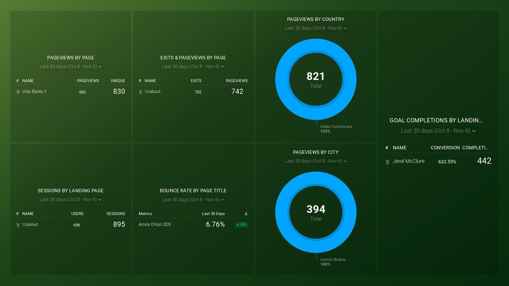
Site Content Report
The Site Content Report focuses on metrics that show how users interact with your site and content.
It includes four views:
- All pages – shows engagement metrics for each page on your site.
- Content Drilldown – engagement metrics for directories and pages on your site.
- Landing pages – acquisition, behavior, and conversion metrics for the landing pages on your site.
- Exit Pages – exit metrics for the last pages users open on your site
You can use these views to tailor your reports to match your needs. Content Drilldown can help you analyze page behavior by site section, while with Landing Pages, you can look for outliers (high and low bounce rates or conversions, for example), allowing you to make modifications as necessary. If you want to identify the most popular pages and determine the exit rate and bounce rate, you’ll use the All Pages view. Exit Pages can help call attention to pages that have high exit rates but shouldn’t.
“I find the Site Content report in Google Analytics to be the most helpful,” says Bruce Harpham. “In particular, I look at average time on page and page views to identify the content that is resonating with my audience. This helps me to plan future blog posts for my website.”
If you need a high-level overview of your key content and conversion metrics from Google Analytics, you can use Content Marketing Overview Dashboard for Google Analytics.
You’ll be able to monitor your traffic and conversions, see audience behavior and trends, and measure channels generating traffic to your website.
Custom Events Report
With custom events, you can measure additional information that’s important to your business. This will allow you to fine-tune your reporting and give you a better insight into how visitors interact with your content.
If you’re using GA4, after setting up custom events you want to track, you might have to create custom dimensions and/or metrics to make use of non-standard event parameters.
“When Google Analytics is paired with Google Tag Manager and GTM’s various tracking options are activated, the Events report becomes very powerful,” says Keith Moehring of L2 Digital. “With GTM, the events report can show the different ways visitors are engaging with your content, and it’s data that’s not available through the standard Google Analytics implementation.
For example, you can report on which pages form completions take place, how far visitors scroll down a page, what external links they click on, which PDFs they download, the YouTube videos they watch on your site and for how long, and various other ways they interact with your content. This information can prove very helpful when evaluating page performance and optimizing your site for conversions.”
Making custom events is a great way to build a tailored Google Analytics report for website analysis and review. To track event actions and sources with most qualified leads, we recommend using this GA Conversion Report (Event Overview) template.
With it, you’ll be able to learn which pages perform the best, generate the most qualified leads and produce event actions.
Custom Report
Every company is different and no campaign is the same. This is why it’s sometimes a good idea to create Google Analytics custom reports. You can pick the dimensions and metrics and decide how they should be displayed.
It’s extremely useful if you want to ensure you’re getting the exact info that you need. It’s easy to drown in superfluous “standard” reports, but building the best custom reports in Google Analytics (or, at least, the most useful ones for you) will require you to dig a bit deeper into the data.
Kevin Orbach of The In House SEO agrees with that sentiment, “No one can tell you what success is except yourself. You need to define your own key performance indicators and understand how they are calculated and why they are important. Out-of-the-box standard reports are pretty, but they’re a dime a dozen. You won’t get any answers until you ask the question yourself.
At my agency, we empower clients to understand and take ownership over their data. It doesn’t have to be intimidating. It’s about defining what success is in that instance, identifying the factors, and calculating the result.”
Of course, you need to figure out what data points to pick and what you actually expect to learn from the report. That’s not always a simple thing, especially during your first foray into building reports.
Fortunately, Databox can help with that. You can simply talk to our product experts about your needs and they can tell you everything you need to know, from which metrics you should track to how to structure your entire reporting process. If you want to learn how to pull data from Google Analytics reports, we’ve got you covered there too. Check out our Dashboard Setup service and we’ll help you build your first dashboard.
Streamline Google Analytics Reporting with Databox
From learning more about how people are finding your site to what landing pages are converting best, Google Analytics reports are powerful tools you can use to improve your sales and marketing campaigns. They’re essential for any marketer, but making full use of them can be challenging.
Databox’s pre-made Google Analytics report templates are a great kickoff point in our analytics program to develop your skills and make the whole reporting process faster and easier. The reports are fully customizable, so you can fine-tune them to your needs.
Integrating Google Analytics with Databox is a simple one-click process and you can then combine it with any number of other data sources for a truly comprehensive overview of your marketing efforts.
Want to take your Google Analytics reporting to the next level? Just start your free trial today.