Table of contents
What percentage of your site traffic should be new visitors? How much time do returning visitors spend on your website? Which pages do they return to?
Drilling into the new vs. returning visitors metric can lead you to the answers to these questions, and more.
Even though the metric seems straightforward, it can cause a lot of headaches.
That’s why in this article, we’ll show you everything you need to know about this engagement metric and explain the best way you can interpret the data obtained in GA.
We also asked 34 marketers to give us their two cents on the topic and share some additional advice.
As you dig into differences between new and returning visitors, the real challenge isn’t accessing the numbers, it’s understanding what they actually mean in context. Teams now use AI data analysts, like Databox MCP, to ask simple questions such as why returning visitor engagement dropped last month or which traffic sources bring back the most loyal users. Because it works with your actual metrics, definitions, and historical data, it can explain performance changes in plain language and help you interpret trends without second-guessing the analysis.
Let’s jump in.
- What’s the Difference Between New vs. Returning Visitors in Google Analytics?
- How to Find User Data in Google Analytics
- What is a Good Number of New Website Visitors per Month?
- What is a Good New vs. Returning Visitor Ratio?
- How to Analyze New vs. Returning Visitors Behavior
- New vs. Returning Visitors in Google Analytics
- Make Sense of Your Google Analytics Performance Data with Databox

What’s the Difference Between New vs. Returning Visitors in Google Analytics?
Let’s start first define what a user is in Google Analytics.
Users are people who interacted with your website (i.e. had a session) within a certain time frame.
Now, there are two types of website users – those who’ve visited it in the past and come back (returned) and those who are seeing it for the first time (new).
This is the whole difference between new and returning visitors, whether they’ve been on the website before or not.
Before Google places a user in the new or returning category, it checks their tracking snippet.
Tracking snippets are cookies on the visitor’s device that let Google know whether you’ve been there before.
If the user doesn’t have the cookie, Google assigns them one and pulls them to the “new user” pile.
Conversely, if they do have a cookie, Google categorizes them as a “returning user”.
Now, this entire system is pretty simple to understand, but it’s not always 100% reliable.
This is because there are certain scenarios in which Google Analytics won’t be able to properly detect a tracking snippet and count returning visitors as new ones.
Even though the explanation for this is a bit technical, we’ll try to do it in English.
Google Analytics provides tracking cookies to each user that opens your website, and that cookie tracks their domain, the time and number of past visits, where they come from, and when they start/end a session. This cookie is stored within the user’s specific browser.
So, if the visitor uses the same browser on the same device to open your website, Google Analytics will count them as returning visitors.
But, problems can arise in these situations:
- The visitor uses multiple devices to open your website (e.g. phone first and laptop later). Each device is counted as a different user.
- The visitor uses multiple browsers to open your website (e.g. Mozilla first and Google Chrome later).
- The visitor doesn’t accept website cookies or deletes them. This way, they eliminate the tracking ID.
- The visitor uses Incognito Mode to visit your website.
So, the new visitors metric will probably never be completely precise. Instead of looking at it as 1,000 new users, you should take it as 1,000 tracking snippets.
How to Find User Data in Google Analytics
You can look up user data and metrics in a few different Google Analytics reports, but these two are the most popular:
Audience Overview Report
The Audience Overview Report in GA shows you the total number of users and new users who visited your website in a specific time frame.
You can find it by going to Audience > Overview.

Other data you can find in this report includes:
- Total pageviews (when a page is loaded or reloaded)
- Total number of sessions per user
- Total number of pages per session
- Average session duration
- Bounce rate
- New vs. returning visitors pie chart
You can get even more granular with the report and drill into location demographics, desktop systems, and mobile systems data.
New vs. Returning Visitors Report
This is the most granular report on these metrics and you can find it under Audience > Behavior.

You can use the New vs. Returning Visitors report to get behavioral data on both types of users and use those insights to better understand your customers and further optimize your website.
Some specific information you’ll be able to extract includes pages per session, revenue, transactions, conversion rate, and average session duration – for both new and returning users.
This data can be especially useful if you run an eCommerce website, for example.
What is a Good Number of New Website Visitors per Month?
Before we present any data, you should know that there isn’t any set-in-stone benchmark for every business out there.
Website traffic varies based on multiple factors like target audience, industry, company stage, website maturity, ranking, etc.
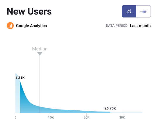
With that said, using our Benchmark data, we found that the median number of new monthly visitors for B2B companies is 3.07K. This benchmark was calculated from anonymized data from 600+ contributors.
Are you a B2B company and want to benchmark your marketing performance, including Sessions, Pageviews, Avg. Session Duration, and more, against other companies like yours? Join the Benchmark Group for free.

*Important note: Databox Benchmark Groups show median values. The median is calculated by taking the “middle” value, the value for which half of the observations are larger and half are smaller. The average is calculated by adding up all of the individual values and dividing this total by the number of observations. While both are measures of central tendency, when there is a possibility of extreme values, the median is generally the better measure to use.
For B2C companies, the median number is 6.05K new website visitors per month. This benchmark was calculated from anonymized data from over 800 companies. Are you a B2C company and want to benchmark your marketing performance against hundreds of other companies like yours? Join the Benchmark Group for free.
Instantly and Anonymously Benchmark Your Company’s Performance Against Others Just Like You
If you ever asked yourself:
- How does our marketing stack up against our competitors?
- Are our salespeople as productive as reps from similar companies?
- Are our profit margins as high as our peers?
Databox Benchmark Groups can finally help you answer these questions and discover how your company measures up against similar companies based on your KPIs.
When you join Benchmark Groups, you will:
- Get instant, up-to-date data on how your company stacks up against similar companies based on the metrics most important to you. Explore benchmarks for dozens of metrics, built on anonymized data from thousands of companies and get a full 360° view of your company’s KPIs across sales, marketing, finance, and more.
- Understand where your business excels and where you may be falling behind so you can shift to what will make the biggest impact. Leverage industry insights to set more effective, competitive business strategies. Explore where exactly you have room for growth within your business based on objective market data.
- Keep your clients happy by using data to back up your expertise. Show your clients where you’re helping them overperform against similar companies. Use the data to show prospects where they really are… and the potential of where they could be.
- Get a valuable asset for improving yearly and quarterly planning. Get valuable insights into areas that need more work. Gain more context for strategic planning.
The best part?
- Benchmark Groups are free to access.
- The data is 100% anonymized. No other company will be able to see your performance, and you won’t be able to see the performance of individual companies either.
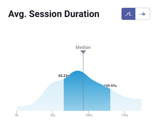
When it comes to showing you how your performance compares to others, here is what it might look like for the metric Average Session Duration:
And here is an example of an open group you could join:

And this is just a fraction of what you’ll get. With Databox Benchmarks, you will need only one spot to see how all of your teams stack up — marketing, sales, customer service, product development, finance, and more.
- Choose criteria so that the Benchmark is calculated using only companies like yours
- Narrow the benchmark sample using criteria that describe your company
- Display benchmarks right on your Databox dashboards
Sounds like something you want to try out? Join a Databox Benchmark Group today!
What is a Good New vs. Returning Visitor Ratio?
When you open your audience overview report in GA, you’ll see a pie chart that represents a new vs. returning visitor ratio (in %).

Some businesses will strive for a 50:50 balance here, but that doesn’t necessarily mean that you should too.
Instead, you need to consider a variety of different factors and how they apply to your business, including the type of website, how long it has been around, the traffic source, the primary business goals and objectives, etc.
The marketers we spoke to agreed with this methodology and we categorized their insights into a few main categories.
- Type of Website
- Business Strategy and Goals
- Context
- Source/Medium
- Consider Ignoring the Metric Altogether
Type of Website
What kind of website do you run? Is it eCommerce? A blog website?
According to Andrew Ruditser of Maxburst, this is one of the first things that affect the new vs. returning visitor balance.
“If you are more of an informative, or a one-time purchase type company, then new visitors will be more beneficial to you. This is because an increase in website traffic will allow you to gain more leads, as your returning visitors might have already completed your desired action.
If your website is more of an eCommerce-based website, then returning visitors/loyal customers may be more beneficial as you know they already take an interest in your brand and will make a purchase. Although, new visitors can help increase your recognition and growth as well. This is why it is important to know your company’s goals and the type of website you want to have in order to find the right balance for your company.”
Business Strategy and Goals
Next, you should check whether the data in the new vs. returning users matches with what you’re trying to achieve, your overall business goals.
Depending on your objective, one type should outweigh the other.
Here’s an example we got from Pixelstorm’s Paula Glynn:
“With most marketing, if lead generation is what you are wanting, then new visitors are likely your key performance indicator. However, it comes down to, ‘What is your objective?’
Let’s take a transport company, for example. When we did a case study, we found 85% of their traffic was returning visitors, and from those, the number of people who placed an inquiry was very low. Digging deeper, those returning visitors were after tracking my order. Therefore, the benchmark was set that 85% was an acceptable level of return visitors for this website. And the focus was on NEW customers and increased conversion rates for those. The right balance is determined by the content and how much of a business tool your website is. All analytical work on these metrics should separate out new vs. returning, which often have different purposes, as shown in this example.”
Related: 15 Tips for Setting Realistic Website Traffic Goals
Context
New vs. returning users can vary for a number of reasons, which is why you should always add context to the equation as well.
Chris Wilks of BrandExtract says that you first need to ask yourself the question – “What’s most important to my business?”
“If you have a news site, you want to build up a loyal following so you may not care as much about new users, but you want your core users to come back over and over.
On the flip side, if you manage a site that doesn’t offer new content regularly (i.e. a blog), but you sell annual subscriptions, it’s going to be important to get lots of new users in there regularly. In that case, you won’t care as much about returning visitors.”
Ben Johnston of Sagefrog Marketing Group agrees with this and adds that it also “depends on the strategies that are in the works at that moment”.
“Did one of your content pieces just start ranking at the tops of the SERPs or in a featured snippet for a keyword you were targeting? Then, there will most likely be a spike in new users. As far as balance, the answer is contextual to tactics. Are you engaging with your existing user base, or are you targeting new users to bring them to your site? Typically, we see about a 25/75 split between new users vs. returning.”
Source/Medium
Erin Barr of Kiwi Creative shared an alternative way to look at the ratio and explained that just examining the pie chart won’t bring much value to your strategy.
Instead, she shares how you can use that metric to track the success of your outreach channels:
“For example, let’s say you launch a paid Google Ads remarketing campaign to drive new users to your website. If you look at the pie chart and there are more returning users than new users, then that tactic probably didn’t work. Use the pie chart and these two metrics to drive optimizations to your marketing strategy to pinpoint what works!”
Consider Ignoring the Metric Altogether
Lastly, we had an interesting output from Andy Crestodina of Orbit Media Studios who recommends “ignoring the metric completely”.
“It’s one of the least useful in all of Analytics. In 15 years of using GA, I’ve never been able to use it to make a good decision. The problem is that you can always read it in two different ways:
- If returning visits are high, you’re doing a bad job of attracting new users
- If new visits are high, you’re doing a bad job of bringing old visitors back
It’s a number that people read and react to, but then don’t act on. And it’s not very accurate. A visitor is a device, not a person.
The only hope of getting insight from new/returning is to combine it with other dimensions (source, medium, etc.).”
How to Analyze New vs. Returning Visitors Behavior
Once you compile the reports and start analyzing the metric in GA, you’ll be able to see how both types of users behave and what separates them.
For instance, returning visitors typically spend more time on the website, don’t bounce as often as new visitors, and are more likely to convert.
While Google Analytics shows you all of these numbers and data, there’s one key component missing – it doesn’t tell you why this is occurring.
Databox can help you get to the bottom of this and understand what causes the different behavior among new and returning users.
By visualizing the quantitative data that GA provides in a Databox dashboard, you can better understand the context and story behind those numbers.
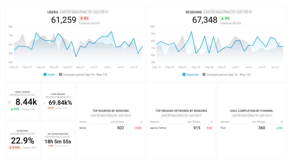
For example, in this dashboard, we visualized new vs. returning sessions, bounce rate, session duration, and included the top pages that return visitors come back to.

After connecting data from GA and noticing that return visitors make up for a bit more than a quarter of the total sessions, we wanted to check whether this split was consistent over time.
As you can see in the dashboard, we added a line chart that can be used to stay on top of new vs. returning users over time. With it, we can immediately notice irregularities and sudden drops/spikes, which we can then immediately attribute to a certain event.
Then, in the middle, we created two combo charts – one for bounce rate comparison and the other for average session duration.
We found that returning visitors are less likely to bounce and generally spend more time on the website, which might not be very shocking, but it shows how valuable it is to get visitors to come back to the site.
Lastly, we wanted to see where returning visitors spend the most time and which pages are their favorites. That tells us more about the potential prospects and we can use the information to optimize the pages even further and promote them a bit more through content marketing and other channels.
Overall, rather than just providing data, Databox helps you understand why certain things happen. And we can do this for a bunch of other engagement metrics too.
PRO TIP: How to track these 10 popular Google Analytics 4 metrics
Sure, there are dozens (and dozens?) more Google Analytics 4 metrics you could track. But, starting with these 10 commonly tracked metrics will give you a pretty high-level view of how your marketing is working…
- Sessions: The number of sessions can tell you how many times people are returning to your website. Obviously, the higher the better.
- Sessions by organic keyword: Which organic keywords bring in the most traffic to your website? This may help you determine whether your SEO investments are paying off.
- Bounce rate: Do visitors leave shortly after landing on your website? Or do they stick around?
- Average session duration: How much time are people spending on your website? Users with a high average session duration are most likely relevant to your company.
- Goal completions: How many users responded to your call to action?
If you want to track these in Google Analytics, you might find the visualizations limiting. It’s also a bit time-consuming to combine all the metrics you need in one view.
To better understand how your website performs in terms of traffic growth and conversions, we’ve made this plug-and-play dashboard that contains all the essential metrics for understanding how successful you are at optimizing different aspects of your website.
You can easily set it up in just a few clicks – no coding required.
To set up the dashboard, follow these 3 simple steps:
Step 1: Get the template
Step 2: Connect your Google Analytics account with Databox.
Step 3: Watch your dashboard populate in seconds.
New vs. Returning Visitors in Google Analytics
Considering that Google Analytics 4 will take over in 2023, it’s worth covering what you can expect to change if you’re still using UA.
Like most other reports, the new vs. returning visitors report in GA4 is a lot more granular than it used to be, which means there’s also a learning curve.
To find it, go to the Reports section and click on Retention.
In the Retention Overview, you’ll notice several charts that visualize new vs. returning users. You can click on each retention chart to get more information on how they work and get more insights.
At the beginning, it might even be useful to create a table that showcases that in a similar way as Universal Analytics, until you fully adapt to the new layout.
To create this table in GA4, follow these steps:
- Open “Explore”
- Create a “Free Form” report
- Select New/Established under Dimensions – Just for clarity, new/established is actually new vs. returning. Now, new refers to the first visit in the last seven days (not overall). Established is returning, but the first visit happened more than seven days ago.
- Choose which metrics you want to measure (e.g. Conversions, Sessions, Average Session Duration, etc.)
- Transfer Dimensions to Rows and Metrics to Values
- Open the table to make sure you have the proper data layout
Now, while this new setup is a bit confusing and it might even be frustrating in the first few weeks, you will get used to it eventually.
But, if you want to shorten the learning curve and make sure no dots are left unconnected with your data, you can try our free setup service.
We’ll create a comprehensive GA4 dashboard for you that captures the metrics you’re most interested in tracking – all you need to do is complete a quick questionnaire and explain what you’re looking for. We’ll have it done in less than 24 hours.
Make Sense of Your Google Analytics Performance Data with Databox
Google Analytics is probably the most popular online “warehouses” for engagement metrics, and new vs. returning visitors is one of the easier ones to obtain.
However, while GA does offer a bunch of behavioral data and raw numbers, this metric isn’t very actionable on its own and those numbers don’t really paint the full picture.
Instead, you’ll need an external tool like Databox to make sense of the data.
You can pull up your new vs. returning visitor data onto the dashboard and visualize all the aspects that you want to assess (bounce rate difference, average session duration, returning visitor by channel, etc.).
When you have all the data organized in one place, connecting the dots and spotting patterns become a whole lot easier.
And the best thing is, the building process won’t take a huge bite off your schedule – it literally takes a few minutes to set everything up.
You connect Google Analytics as the data source, pull out the metrics you want to track, and immediately visualize them with a few clicks of a button.
No coding or technical knowledge is required.
And you don’t have to pay for anything either – there’s a free trial account you can sign up for right now.