


Table of contents
Hello everyone. Welcome to another episode of Data Snacks. I’m Monja, a product marketer here at Databox.
Today, we’re going to talk about analyzing Return User behavior using Google Analytics metrics which helps us better understand how many people visit our website multiple times and how they behave when they do visit. That will help us optimize our site for better engagement and more conversions down the road.
Specifically, we’re going to assess the breakdown between New and Returning Visitors, how often they bounce and how long they stay, and which pages they visit most frequently.
With this information, we can understand the value of attracting more return visitors and adding value to their most popular pages to make sure that they stay even longer and return more often.

In this episode of Data Snacks, I’m going to show you how to:
- Visualize a variety of Return User metrics, including return sessions vs new, weekly traffic patterns, bounce rates and average session duration, and most visited pages by our returning users.
- Assess the differences in user behavior between new users and returning users
- Identify pages that people return to, so that we can make them even more valuable to returning users and increase engagement.
Below, you can view the full episode, or, keep reading for a fully transcribed version of the episode complete with relevant screenshots.
Let’s start!
Choosing The Right Metrics
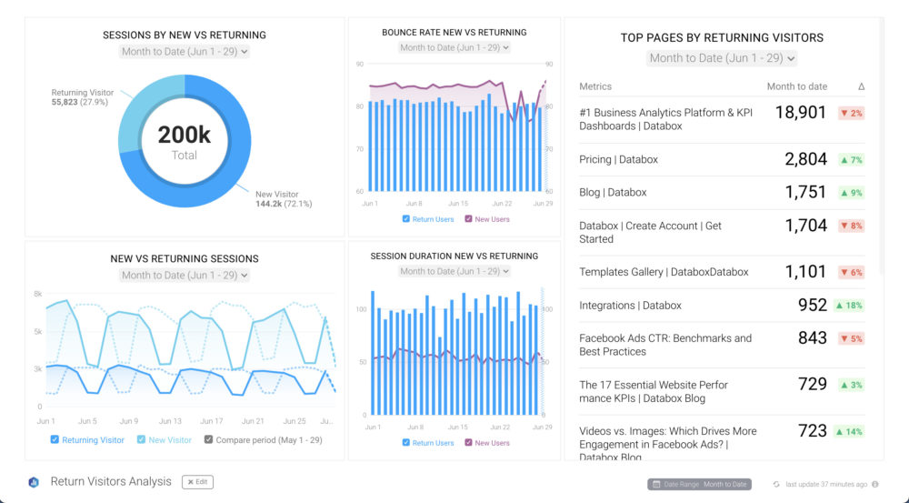
Here’s what I want to see––I want to track Sessions by New vs Returning Visitors in the context of comparing and understanding their behavior. Google Analytics is the perfect data source for this.
From the Databox Designer, I’m going to the Metrics Library and selecting Google Analytics as the data source, then search on “return” and drag and drop the Sessions by New vs Returning pie chart metric to my data board. Next, I’m going to click on the data block I just created and set the date range to Month to Date, so I can see what’s going on recently.
At a glance, I can see that returning visitors make up about a quarter of all my sessions.
Next, I want to see if this split between new and returning is consistent over time, so I drag and drop a line chart metric onto my dashboard and create a custom metric in Google Analytics that selects Sessions and uses a dimension of User Type. This creates two lines on my chart where I can compare new vs returning users over time. I can see that the proportion stays pretty consistent week over week and month over month. If I saw an irregular part, it might be due to a one-off event, like an email campaign to existing customers.
New vs. Returning Visitors’ Behavior
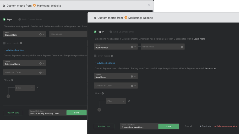
Now, to get some insights into how new vs returning visitors behave, I create a combo chart to compare bounce rates for both segments. I used two custom metrics to calculate bounce rates for new vs returning and overlaid them in my chart. As you can see, new users bounce at a much higher rate than returning users by a factor of about 10 percent. So, returning users are more engaged and less likely to lose interest, which is probably what we would expect.
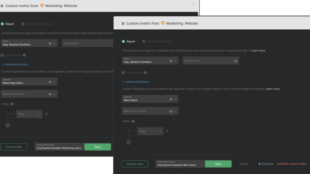
I then create a duplicate of the bounce rate chart, only now I use comparative metrics for Average Session Duration, and you can see that returning users spend almost twice as much time on our website – that’s great news!
Where Our Return Visitors Spend Most of Their Time
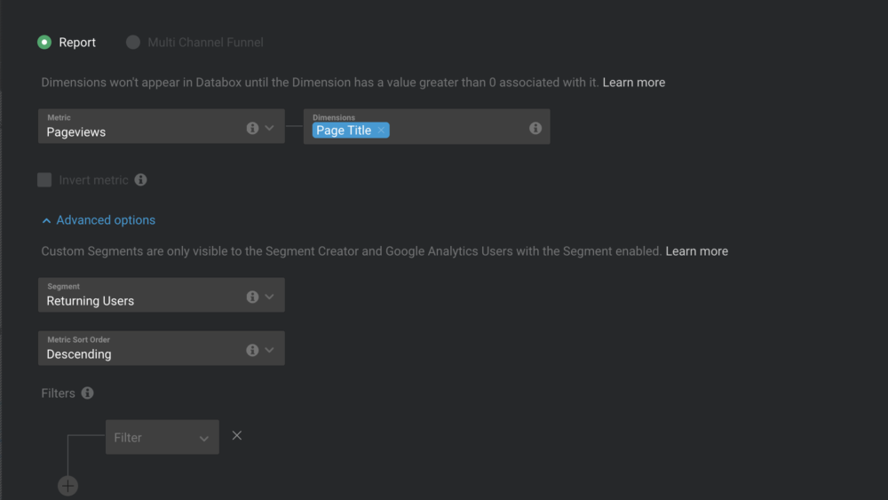
Finally, I want to know where our return visitors spend most of their time, i.e., which pages they visit most frequently when they return to our site. I use a table that uses a custom query from our Metric Builder to pull the pages most visited by returning users.
Now we know which pages are resonating with these valuable visitors, so we can review and optimize them even more and promote them using content marketing and paid campaigns to drive even more interested visitors with a higher probability of becoming new customers.
Time to Track
There are certainly more insights you can pull from this visualization––these examples were just a few to get you started.
At a high level, tracking your New vs Returning Visitor behavior and engagement can improve your website performance and yield more interested, even sales-ready leads.
Want help creating this report? Start a chat with one of our dashboard experts and they’ll help build this report for you for free.
If you haven’t already, just create your free Databox account and reach out to our team either via chat or email.
See you next time.


