Table of contents
Hello everyone. Welcome to another episode of Data Snacks. I’m Monja, product marketer at Databox.
Today, we’re going to talk about Bounce Rate by Blog Post, and more specifically, how to properly track this metric in order to create a better blog content strategy that will increase blog post engagement and CTA clicks.
Bounce Rate by Blog Post is a custom metric that I will build using Query Builder, a feature inside Databox that allows you to build custom metrics based on a host of different variables and dimensions. It’s available to our professional and performer users, but if you’d like a free trial of the feature after seeing this episode, contact our Support team and they’ll set you up.
In this episode of Data Snacks, I’m going to show you how to:
- Discover what your bounce rate for each blog post is
- Review topics and modify your blog content strategy
- Apply best practices to reduce bounce rates
Below, you can view the full episode, or, keep reading for a fully transcribed version of the episode complete with relevant screenshots.
Let’s start with Bounce Rate by Blog Post
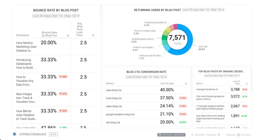
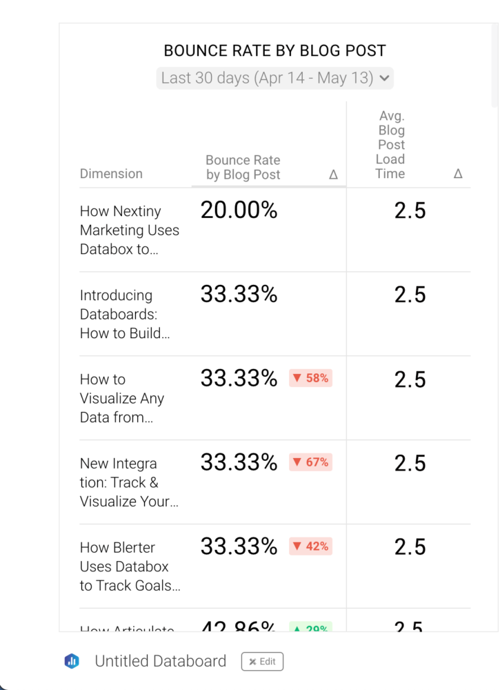
Here’s what I want to see––I want to track Bounce Rate by Blog Post to identify my most popular blog posts, but I also want to include other blog-related metrics like AVG. Page load time by Page, Blog CTA Conversion Rate, Returning Users by Blog Post, and Top Blog Posts by Organic Sessions, so that I have the ability to analyze and understand exactly which blog posts are engaging with my audience.
To do this, I’m going to the Databox Databoard Designer, selecting my dashboard, or creating a new one, and I’m going to drag and drop an advanced table visualization into my dashboard. From here, I’m going to select the metrics I need.
I’m going to select “Bounce Rate by Blog Post”, which I have previously built in the Query Builder, as the column that the entire table should be sorted by. The reason I’m doing this is that I want to order pages from highest to lowest in terms of Bounce Rate by Blog Page in my table. This makes it easier to see which blog posts have the highest bounce rate thus are not performing well with the audience.
Interpreting the Data Visualization
Once I’ve got my table put together, you can see that it’s very easy to interpret. I’ve got my posts ordered from the highest bounce rate to the lowest, and I can also track other valuable metrics for my blog:
Let’s look at the posts with the lowest bounce rate first to get an overview of which topics are performing best. We can use this insight to see how they compare to poorly performing posts. When looking at Bounce Rate by Blog Page table, let’s choose ascending. That way, we can see which topics have the lowest bounce rate. Set the minimum at 20%, anything lower is a glitch. Now you can check out the topics.
So let’s do this. Focus both on the topic and the format. In our case, you can see that different formats interest our readers, so we have a case study, a blog post, and new integration page. This can provide even further insight when it comes not just to the topic but also what format of content works best for your readers, thus further helping you format your content strategy.
Have You Considered Your AVG. Page Load Time by Page
When we look at posts with a high Bounce Rate by Blog Page we need to also compare their AVG. Page Load Time by Page, another custom metric you can create in QB, since it might not be the question of content but rather page load time. Make sure that you make a note of the posts that could use an update to reduce load time (large images, for example). If you don’t know what number to aim for, think about it like this- stay under 2 seconds. According to Semrush, if your site loads in 1.7 seconds, it is faster than approximately 75% of the web.
If your Page Load time is fine, it is time to look at the content. Use the insights from your high-performing blog pages to improve the ones with a high bounce rate. You can pivot the content to a more popular topic where possible or add more relevant data and visualizations to make it more engaging.
Time to Discover Your Bounce Rate by Blog Post
There are certainly more insights you can pull from this visualization––these examples were just a few to get you started.
At a high level, tracking your Bounce Rate by Blog Page in this way will allow you to see if the content you produce is engaging your readers, and then you can adjust your strategy accordingly.
Want help creating this report? Want a free trial of Query Builder? Start a chat with one our dashboard experts and they can help.
See you next time.