Uses one-click integrations:
-
 Google Analytics 4
If you don't use Google Analytics 4, you can pull data from any of our 130+ one-click, native integrations or from spreadsheets, databases and other APIs.
Try this dashboard for freeWhat you’ll learn from this Google Analytics Acquisition Snapshot Dashboard template:
By connecting your Google Analytics account, you’ll learn:
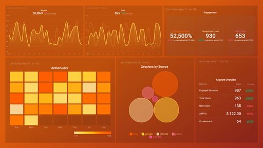
- How do I track direct traffic in Google Analytics? Track website visits that occurred but with no known source on how that user landed on your website. Closely monitor the volume of direct traffic your website gets daily for unusual spikes and take necessary actions.
- How do I find out where my traffic is coming from? Find out which sources generate the most traffic and how many sessions can be attributed to each traffic source.
- How do I find out which keywords bring in the most traffic to my website? See top-performing keywords within a specified time period, both paid and organic. By tracking this, you’ll know which keywords to optimize your content and ad campaigns for to drive more visitors to your website.
- What’s the overall bounce rate of my website? See what percentage of your website visitors leave after viewing a page without taking any further action.
- How do I track social media traffic in Google Analytics? Measure your top social networks by visits. See if your social media efforts are paying off and if there’s a continuous increase or decline in the number of visitors that land on your website from your social media channels.
Pull additional data using our deep integration with Google Analytics.
What else can you track and visualize with our deep integration with Google Analytics? When it comes to attributing your traffic and conversions, almost anything:
- Website traffic and conversions
- Traffic and lead demographics
- Social media engagement
- Paid advertising
- Landing page performance
- Campaign performance using custom events
There are many, many different metrics and metric combinations you can track using Google Analytics. And in Databox, you can quickly visualize 100s of Google Analytics metrics in a variety of different ways.
Read more about Databox’s Google Analytics integration.
Google Analytics 4 metrics included in this template
-
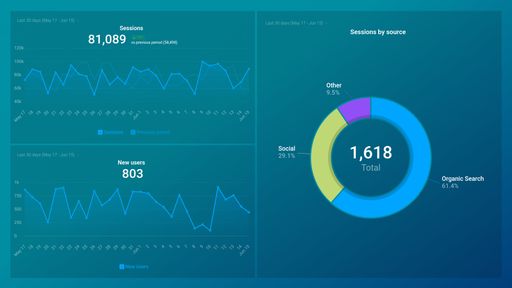
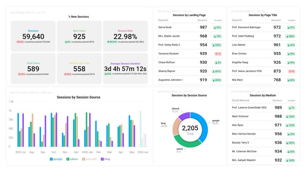
Sessions by Landing Page
The Sessions by Landing Page + Query string metric measures the number of sessions that start with a specific page on a website, providing insights into which pages are most effective at attracting visitors.
-
Sessions by Page Title
The Sessions by Page Title metric measures the number of user sessions that include a specific page title or set of page titles on your website within a given timeframe.
-
Sessions by Session Source
The Sessions by Session Source metric shows the number of sessions generated by different sources like direct traffic, organic search, referral, email, social media, paid search, etc., and helps in analyzing the effectiveness of various marketing channels in driving traffic to a website.