Table of contents
Despite what you’ve heard, website forms still work.
Sure, website chat offers a better alternative for brands to engage in real time, and in many cases, also a better experience for the end user.
However, both of these are fixable problems for brands still employing website forms.
In fact, many companies have already found ways to increase form conversion rates by making their forms smarter, more engaging, and just an overall better experience.
How? Well, as it turns out, there is no single best way to optimize forms. According to our latest research, every aspect of a website form impacts conversion rates: its design and length, the copy you use, the questions you ask, and even how people get to it.
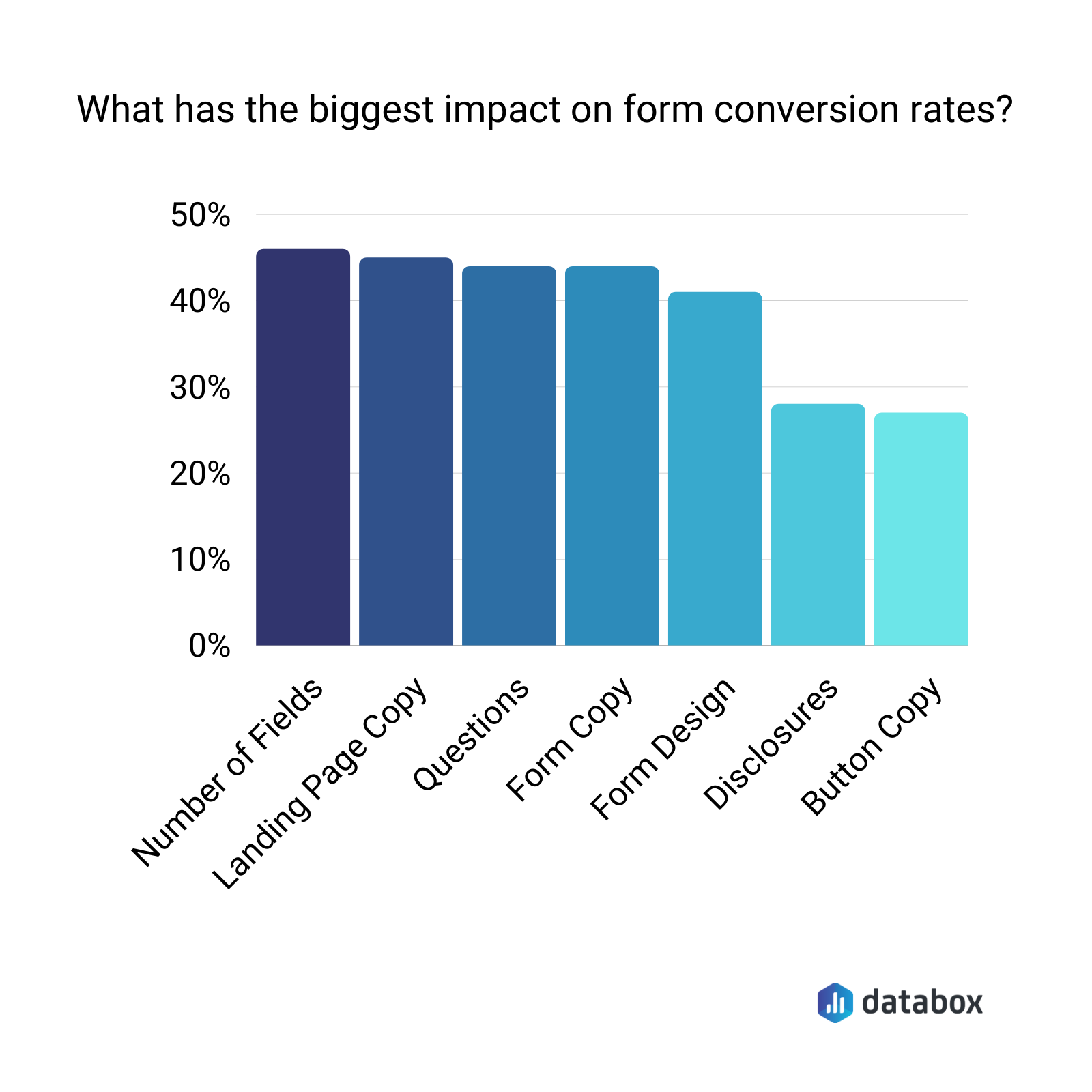
Gathering information through a form on your website isn’t as simple as picking a form builder, adding some fields, and copying and pasting the embed code.
You might gather some leads that way. But you’ll probably have more abandons than completions, and you’ll inevitably get a lot of bad data.
By looking at your form holistically—by optimizing every part of it—you can improve your form conversion rates.
In fact, most of the marketers who responded to our survey have form conversion rates of 7% or more, which is significantly higher than the average landing page conversion rate of 2.35%.
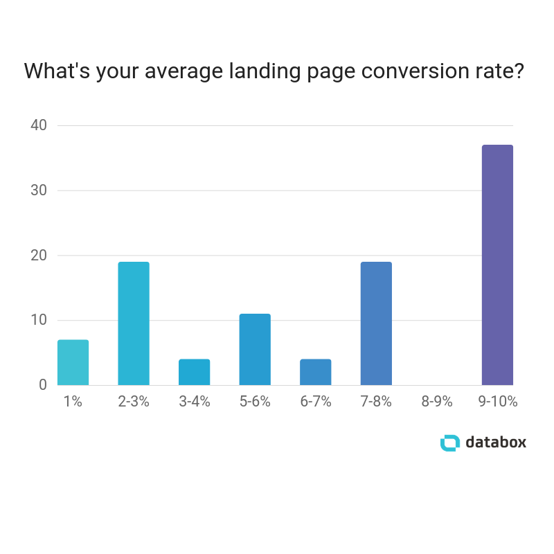
So how do our respondents build website forms that convert so well?
Here’s what we learned.
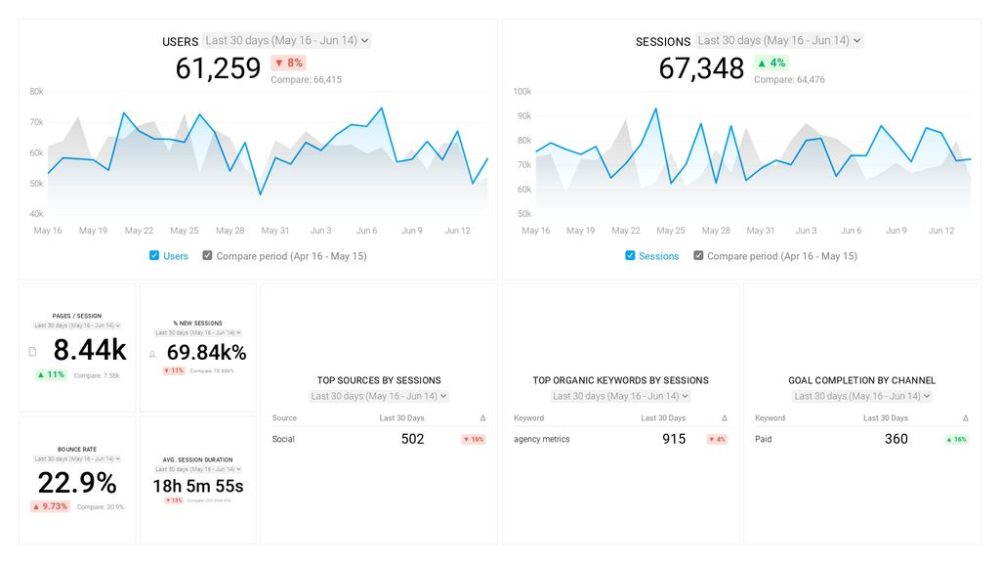
PRO TIP: How to track these 10 popular Google Analytics 4 metrics
Sure, there are dozens (and dozens?) more Google Analytics 4 metrics you could track. But, starting with these 10 commonly tracked metrics will give you a pretty high-level view of how your marketing is working…
- Sessions: The number of sessions can tell you how many times people are returning to your website. Obviously, the higher the better.
- Sessions by organic keyword: Which organic keywords bring in the most traffic to your website? This may help you determine whether your SEO investments are paying off.
- Bounce rate: Do visitors leave shortly after landing on your website? Or do they stick around?
- Average session duration: How much time are people spending on your website? Users with a high average session duration are most likely relevant to your company.
- Goal completions: How many users responded to your call to action?
If you want to track these in Google Analytics, you might find the visualizations limiting. It’s also a bit time-consuming to combine all the metrics you need in one view.
To better understand how your website performs in terms of traffic growth and conversions, we’ve made this plug-and-play dashboard that contains all the essential metrics for understanding how successful you are at optimizing different aspects of your website.
You can easily set it up in just a few clicks – no coding required.
To set up the dashboard, follow these 3 simple steps:
Step 1: Get the template
Step 2: Connect your Google Analytics account with Databox.
Step 3: Watch your dashboard populate in seconds.
Only Ask for the Information You Truly Need
“In our experience, more people convert if you have fewer fields,” says Emelie Svedberg of Structsales.
Blogging.org’s Zac Johnson agrees: “If you can do without a physical address and phone number, you’ll see conversions jump.”
“In most cases,” says Praveen Malik of PM-by-PM, “asking for an email address is enough. It is very difficult to convince a web reader to share personal info. Generally, people do not have the time or patience to provide a lot of information.”
“Odds are, you’re going to be contacting the person afterward as a follow up anyway,” says Catalyst Marketing Agency’s Ollie Roddy, “so to increase the likelihood of them filling the form out, use the absolute bare minimum number of fields. Then, gather more information in your follow-up call.”
Minimize Form Fields with Smart Fields and Progressive Profiling
One way to limit the amount of information your leads have to supply to complete a single form—without limiting the amount of data you collect over time—is to use smart form fields and progressive profiling.
“Smart form fields use queued questions so leads don’t have to fill in the same information twice when they enter the next stage in the buyer’s journey,” says Avidly’s Thoralf Lindström.
“Make every landing page form progressive,” says Jackie Tihanyi of Fisher Unitech. “Progressive profiling allows you to gain new information about the user over time, and it also helps you increase conversion rates and decrease exit rates.”
LyntonWeb’s Jennifer Lux agrees: “Creating more relevance on forms is an effective way to improve conversion. This might mean using smart forms based on persona information or previous behavior, or using progressive forms that show different questions based on where a contact is in the buyer’s journey.”
“Relevance is critical all along a buyer’s path to purchase and helps accelerate the journey,” Lux says.
Explain How You’ll Use the Data You Collect
If there’s a piece of data you absolutely must request, it helps to explain why you need that information and what you’re going to do with it.
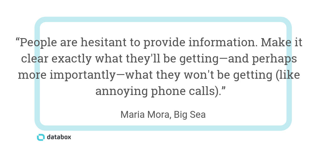
“Use microcopy to reassure people,” says Big Sea’s Maria Mora. “People are hesitant to provide information. They don’t want to be annoyed with unwanted phone calls. Make it clear exactly what they’ll be getting and—perhaps more importantly—be clear about what they won’t be getting (like annoying phone calls).”
Design Your Form so it Feels Less Overwhelming
If you do need to collect a lot of information in your form, our respondents recommend a few design tips to make it feel less overwhelming.
“Be upfront with how much time it will take to complete the form,” says Blair McKee of Constellix. “This weeds out people who won’t convert before they even touch the form.”
Telling people how long a form will take to complete is particularly important if you take the advice of British Business Energy’s Ian Wright: “Break your forms into steps/pages and only ask one question per step/page.”
“This prevents people from being overwhelmed and also works on the sunk-cost basis whereby people are more likely to complete the whole form once they’ve completed some of it,” Wright says.
Rob Powell of Rob Powell Biz Blog agrees: “The most effective technique I’ve discovered for increasing the conversion rate on my website forms is the two-step opt-in. This is a type of form where I don’t immediately ask the visitor for any information. Instead, I ask them a yes/no question. They hit the ‘Yes’ button, and only then do they get taken to the opt-in form.”
“The reason the two-step opt-in works so well is that the visitor has already made a micro-commitment by clicking the ‘Yes’ button. This creates momentum and makes it more likely that they’ll complete the next step as well: filling in the form with their email address.”
But if you want or need to have your entire form display on one page, Lola’s Kaeli O’Connell offers another recommendation: “If you aren’t able to reduce the number of form fields, split the form into two columns.”
“Although you haven’t actually changed the number of fields, making the form module physically shorter will make it feel like less to do. I’d recommend three or four fields per column.”
Feature Testimonials to Build Trust
If people don’t yet trust you, they’ll be less likely to fill out your form. Digital Elevator’s Daniel Lofaso says you can overcome this issue by “having social proof—testimonials, customer logos, etc.—next to or part of your form.”
Sitback Solutions’ Carl Brown agrees: “Stick some customer praise alongside your website form to help alleviate any concerns your new prospect might have about your product or service. The more of a commitment you’re asking for (either in terms of cost or information), the more difficult it will be to get someone to fill out the form.”
“Providing proof-points will help convince prospects that it’s worth their while, and it removes the doubt in their minds that they might not get as much value as they’re hoping for. If all these other people have completed this step before them and come out the other side smiling, then they should be fine too!”
“Adding testimonials is the most effective way to create high-converting landing pages,” says Growth Hackers’ Jonathan Aufray. “Of course, testimonials don’t work by themselves. You also need a good design, a great CTA, and maybe some urgency and scarcity.”
“But after a lot of testing, we found that including testimonials is by far the best factor to improve conversions.”
Use Design to Draw Attention to Your Form
You can’t increase form conversions if people never notice your form. Use these tips to draw attention to your website’s forms.
“Add a face,” says Orbit Media Studios’ Andy Crestodina. “When a face appears next to a form or near a call-to-action, two magical things happen. The face draws and keeps the visitor’s attention because faces are so visually prominent. We are hard-wired to look at other people.”
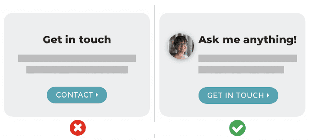
“The second reason is more subtle. Every visitor to every form has a tiny bit of uncertainty. If I fill this out, who will respond? The face answers that question. And answering questions is the key to conversion optimization. We’ve seen a strong lift in conversion rates (up to 40%) by adding people to contact pages and near calls-to-action.”
“The more personal and human you make your website, the higher your conversion rate will be,” Crestodina says.
Take Advantage of Automated Pop-Up Forms
Other respondents recommend using automated pop-ups to display forms.
“There are many different ways to create website forms, but one that really beats out the others is employing non-annoying pop-up forms,” says SurgeStream’s Kevin Williams. “When we split test a regular in-page form versus a strategically placed pop-up form, the pop-up form usually wins.”
“The key,” Williams says, “is to make sure the pop-up is programmed so that it doesn’t annoy your visitors.”
Riley Adams of Young and the Invested agrees: “I’ve had the greatest success using pop-up forms from MailChimp to add subscribers to my newsletter. I used one during a high-traffic event and had a subscribe rate of almost 2.5%. In the time since the event, I’m much lower: closer to 0.2-0.5%. This likely due to discontinuing the pop-up subscription form.”
“Pop-ups annoy readers; I know they annoy me,” Adams says. “But they also prompt the reader to subscribe. They may not have had a clear call-to-action after reading a post without the pop-up prompt.”
Conversely, Trigger Pop-Up Forms to Load on Click
Grow Hack Scale’s David Oragui suggests a different, non-automated way to use pop-up forms: “Make your forms trigger as a pop-up when users click on a link instead of having your forms live as part of your page’s HTML markup.”
“People prefer to take action when they feel in control. From our experience, submission forms that can be seen on our website fall prey to banner blindness. They get ignored by most visitors because they treat them as an advertisement.”
“By giving control back to end users—i.e. they see the form on their terms—they become more receptive to forms and pop-ups in general.”
“From this alone, we’ve seen conversions as high as 70% on some days,” Oragui says.
Use Actionable Copy and Eye-Catching CTAs
“To get your contact forms to convert, your copy is everything,” says Taylor Hurff of 1SEO I.T. Support & Digital Marketing. “Sure, you can have the forms pop up or fly out in new and creative ways, but if it feels like a form that every user gets hit with, it’s going to be easy for the user to decide to click out of it.”
“If your form is on an internal page specific to a product, service, or region, relate the copy to that in some way.”
“For example, instead of a general headline of ‘Get in contact with one of our experts,’ we might have ours say, ‘Ask the experts what an SEO campaign would look like for your business’ if it were on our SEO page, or ‘Learn how 1SEO can lower your CPC’ if it were on our PPC page.”
“Even if it’s the same general contact form, you can still update the copy so it speaks more directly to the end-user and his/her needs,” Hurff says.
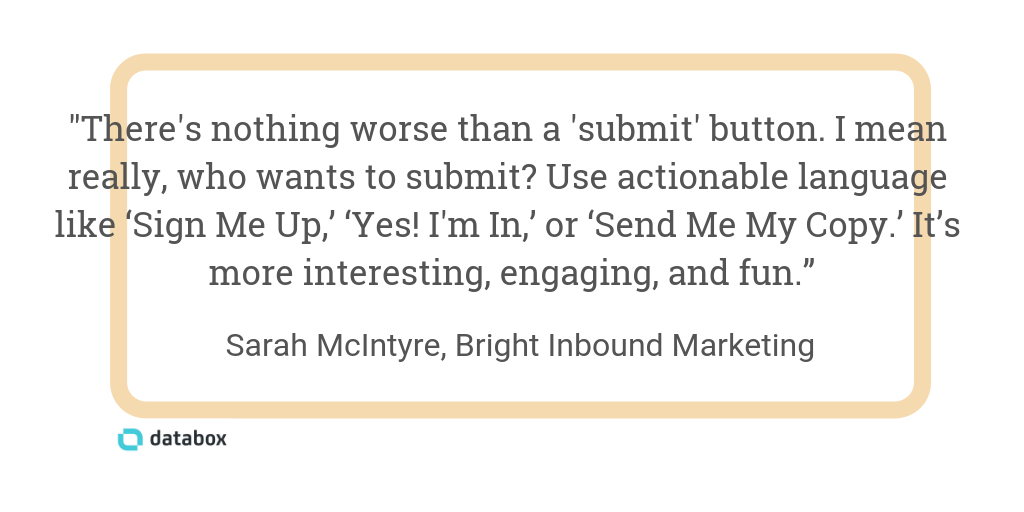
“In my opinion, there’s nothing worse than a submit button,” says Sarah McIntyre of Bright Inbound Marketing. “I mean really, who wants to submit? Use actionable language like ‘Sign Me Up,’ ‘Yes! I’m In,’ or ‘Send Me My Copy.’ It’s much more interesting, engaging, and fun.”
Andrew Ruditser of MAXBURST says the copy you use to get visitors to click through to your form is also key:
“Ensure you have a strong, eye-catching call-to-action button on the landing page that leads users to the form. It’s also best to place the call-to-action button in the header of the landing page before the fold in an uncluttered space so it grabs the user’s attention right away when visiting your website. This will help increase your website conversions by pulling in your users.”
Kristel Staci of BloggingTips.com agrees but recommends using image-based CTAs instead: “To create high-converting website forms, we use original high-quality graphics at the top of the page. Most sites will just have simple text that says ‘Use the contact form below,’ but we like to create customized images with eye-catching calls-to-action.”
Adopt the Perfect Form Builder for Your Audience and Goals
When we asked our respondents what tools and apps they use to build forms for their websites, Hubspot was the clear winner.
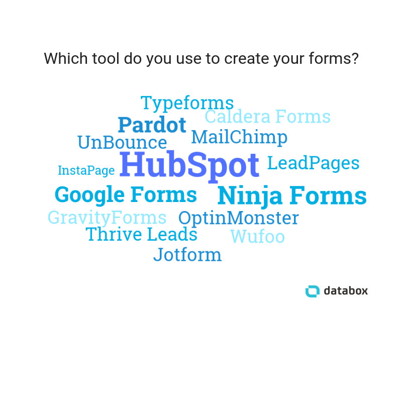
But the best form builder for your business depends on your audience and goals.
For Ryan Irving of Ri Web, Typeform is the ideal tool: “The closer the experience of completing a web form is to answering questions in a face-to-face situation, the higher the conversion rate.”
“Of course, this will vary depending on the client, but introducing questions/fields in a conversational manner (Typeform is great at this) makes the experience more enjoyable—no matter how many fields there are.”
James Pollard of The Advisor Coach agrees with the conversational form approach: “One way to create high-converting website forms is to build them in Mad-Libs style. For example, you could have: ‘My name is _____, and my email is _____. My biggest problem is _____.’”
“Then, have people fill out the form that way. I’ve tested this and it almost always converts at a higher rate than a standard form. I still use standard forms in certain areas, but the Mad-Libs style works wonders.”
Finally: Set Expectations, and Give to Get
SocialChimp’s Lauren Petermeyer provides this advice for boosting form conversions: “Offer value. You’re trying to capture an email or get users to answer a question. Offer them something in return.”
And Jorge Sheffy of Loclweb says setting the right expectations is key: “Set up expectations so a person that gets to a form already knows it’s coming and has a goal that requires them to fill out the form to achieve it.”
“If it’s a form on a website, then there should be a clear purpose as to why someone should fill out the form. If it’s a form on a landing page, then it should be clear exactly what someone will get by filling out the form.”
“In all cases, expectations should be 100% clear,” Sheffy says. “When someone gets to a form, the form should already be expected, and it shouldn’t ask for any more information than what is reasonable to expect from the user—or more than what’s needed.”
Forms or website chat?
Want more on the evolution of website conversions?
Listen in on a recent episode of Ground Up a we discuss the following:
- Are website forms dying?
- Are chatbots a better experience?
- Should you still be gating your content?
Tune in to the episode below.


