Table of contents
Are you looking for an easy way to monitor your KPIs so you can react timely to grab an opportunity or solve a problem?
Would you like to save time while tracking and analyzing your metrics and set up an efficient reporting process?
Do you struggle with integrations and want to know what the best practices in your industry are?
If you’re nodding your head right now, we got you covered. Growing your business isn’t easy, especially when you have little time and a lot to learn. It’s stressful to manage everything you have on your plate, but it’s where dashboard reporting steps in.
While overcoming the obstacles such as the lack of staff and limited time to acquire new skills, dashboard reporting helps you gain important insight into your business performance and build strategies to perform better or keep up the momentum.
This guide will walk you through all you need to know about dashboard reporting: benefits, types, best practices, examples, and more.
- What is Dashboard Reporting?
- What is a Dashboard Report?
- Dashboard vs Report: What’s the Difference?
- Dashboard Reporting Types
- Benefits of Dashboard Reporting
- What Should You Include in a Reporting Dashboard?
- How to Create a Dashboard Report?
- 5 Best Practices for Dashboard Management
- Dashboard Reporting Examples
- Automate Dashboard Reporting with Databox

What is Dashboard Reporting?
Dashboard reporting is the process of monitoring and reporting on your business performance through data visualizations, based on the KPIs and metrics you consider relevant.
Dashboard reporting allows you to track your performance in real-time and gives you an opportunity to react and make changes immediately if necessary, for instance, if you notice an ad campaign is wasting your budget without a decent ROI or that your churn rate is too high.
Dashboard reporting usually includes different types of charts, tables, graphs, maps, and more.
What is a Dashboard Report?
A dashboard report is an interactive visual representation of your essential business data that allows you to quickly gather vital information about your business, financial, sales, marketing, or other performance, and choose what action to take.
Dashboard reports provide you with information at a glance and are often centralized, which means that you can pull the data from different sources and interpret it more accurately just by looking at a single screen. For example, a marketing report template can include different relevant marketing metrics from email to SEO metrics depending on your company’s or team’s needs.
Dashboard vs Report: What’s the Difference?
Although dashboards and reports have several aspects in common, the data they represent differs. Here’s how.
- Reports are static, which means they can only display historical data. You can include several snapshots of your data in a report, but you can’t refresh them to get a glance of the most recent changes in your chart. Dashboards, on the other hand, include live, up-to-date information.
- Dashboards usually tend to display all relevant data, charts, and tables in one screen and give you a more streamlined overview of your performance. To read the whole report and capture all the data included, you need to scroll.
- Reports usually cover a specific topic, while dashboards may include more broad information and allow you to compare multiple charts, data sets, topics, and more.
- Reports are typically longer and more thorough than dashboards and provide the reader with more granular information about the performance.
Dashboard Reporting Types
There are several types of reporting dashboards available–you choose one depending on your needs and goals:
Analytical Dashboards
Analytical dashboards are the essential tool for data analysts to draw conclusions about your business performance. They usually contain a lot of data digested into simple visualizations so they’re easier to interpret.
The main focus of analytical dashboards is on the historical data, so that the data analyst can make comparisons, which is one of the most effective tools of data science.
By interpreting data contained in an analytical dashboard, you can identify trends in your business or industry, change dimensions and variables to test if your performance will improve, make predictions about future performance, and more.
Related: How to Make an Analytical Report: 9 Best Practices
Strategic Dashboards
Strategic dashboards help companies monitor their overall strategy performance. These dashboards include KPIs and metrics and enable management and teams to monitor whether they’re on the right track when it comes to progress toward long-term company goals.
A strategic dashboard contains metrics that are relevant on a company-wide level and may be complex.
Business leadership and senior management usually track strategic dashboards to gain important business insights that may affect all teams and evaluate business performance in periods: monthly, quarterly, annually.
Related: What Is Strategic Reporting? 4 Report Examples to Get Inspiration From
Operational Dashboards
Operational dashboards are used to monitor business operations managed by junior-level management and they’re focused on short-term goals and performance. It presents the real-time data and helps managers answer the question: “What’s going on in my team/our business at the moment?”
Operational dashboards, unlike strategic ones, are very detailed and focus on day-to-day business operations. They provide you with an at-a-glance overview of your daily performance.
Also, managers can draw conclusions by just looking at these dashboards, without having to drill-down into too many details.
Related: 10 Key Operational Metrics to Track for Better Business Results
Tactical Dashboards
Tactical dashboards enable you to drill down into more detailed data to identify a trend and get more information about it.
By tracking data through tactical dashboards and getting deeper insights, you can make more informed decisions, adapt your future steps based on the trend you track, and measure your success against the goals you’ve set.
Many departments within a business may benefit from using a tactical dashboard. For example, sales, so you can find the best time to launch a specific product, or HR, so you may use the dashboard to implement a new employee benefit plan and measure how it affects employee happiness.
Benefits of Dashboard Reporting
In a Databox survey, the majority of agency respondents said they used dashboard reporting for their Facebook ad campaigns. Nevertheless, dashboard reporting can be used in multiple situations–not just for advertising purposes–and offers multiple benefits to your business.
- Dashboard Reporting Saves Time
- Dashboard Reporting Supports Decision Making
- Dashboard Reporting Improves Data Literacy
- Dashboard Reporting Allows a Deep Dive into the Data
- Dashboard Reporting Helps You Get Necessary Buy-Ins
Dashboard Reporting Saves Time
It provides an at-a-glance overview of your data, which is a significant time-saver when you work with multiple KPIs and complex data and need to draw conclusions quickly. Also, dashboards allow you to create templates and automatically pull the data from the connected sources, so you don’t have to enter anything manually.
Dashboard Reporting Supports Decision Making
It helps make informed business decisions based on data without delays in the process, as you don’t need to wait for the report to be created to be able to act. Creating a dashboard and tracking the data in it is way faster than pulling the data for a report and waiting for it to be created, so dashboards can be helpful when you need to act quickly.
Dashboard Reporting Improves Data Literacy
It improves data literacy in data-driven companies, which helps the whole organization understand the data and gain insights, regardless of their skill level. Many of your teammates don’t need to be data analysts to be able to track relevant KPIs and draw conclusions on their own.
Dashboard Reporting Allows a Deep Dive into the Data
It helps you get the most out of your data as it’s easy to let something slip when you work with large quantities of data every day. Analyzing the data, drawing applicable conclusions, and creating lists of recommended steps takes a lot of time and effort, so it’s important to dig deep to understand different trends and issues.
Dashboard Reporting Helps You Get Necessary Buy-In
It provides clear, understandable, concise visualization of the data, which is incredibly useful in situations where you have to present your findings to executives or managers, especially if they’re not very familiar with data analysis. When the stakeholders can understand what you’re telling them, you’ll be more likely to get their buy-in.
What Should You Include in a Reporting Dashboard?
Before you set up your dashboard, you need to understand what exactly your goal is. Then, you can determine what metrics and KPIs you need to include in it and what type of dashboard you need (operational, strategic, etc.)
When it comes to the right number of KPIs to include, there’s no universal answer. However, you should remember that less is more in this case. If you place every little metric on your dashboard, it may become chaotic and you may miss valuable insights because of the lack of structure and order. That’s why it’s critical to make a selection of the most relevant KPIs and metrics to include: those that coincide with your goals and can provide you with vital information.
For instance, if you’re creating a sales dashboard, you may want to include monthly recurring revenue or quote to close, as these metrics are very important. Marketing specialists will include metrics such as conversion rate or monthly organic traffic, depending on their goals. Finance teams usually track and measure net profit margin and return on investment.
How to Create a Dashboard Report?
Want to start creating dashboard reports? Here’s what you need to do.
Choose the right tools
Before you start building, make sure you equip yourself with tools that make your job easier. A good dashboard software should offer pre-made templates that you can use to save your time, but also give you a chance to customize your dashboard when necessary. Also, make sure your chosen tool offers plenty of integrations so you can pull the data from various sources.
Select the right KPIs
Define your dashboard goal and what you need to report on. Based on that, choose relevant KPIs and metrics that you’ll include in the dashboard. Set expectations regarding what you need to find out and how you’re going to use that information (for instance, an example of a healthcare KPI dashboard would include – patient satisfaction score, average wait times for ER and OR, and number of referral patients)
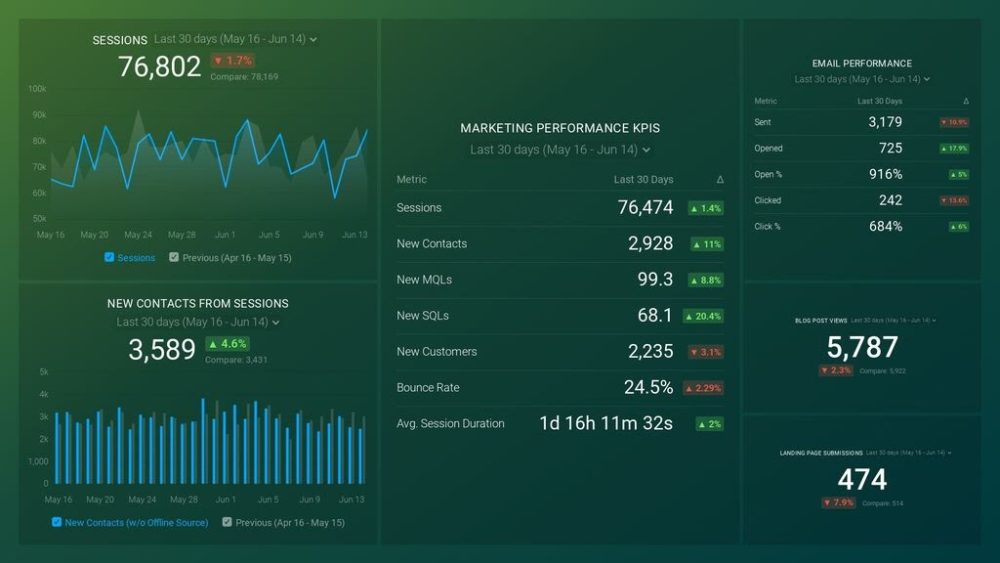
PRO TIP: How Well Are Your Marketing KPIs Performing?
Like most marketers and marketing managers, you want to know how well your efforts are translating into results each month. How much traffic and new contact conversions do you get? How many new contacts do you get from organic sessions? How are your email campaigns performing? How well are your landing pages converting? You might have to scramble to put all of this together in a single report, but now you can have it all at your fingertips in a single Databox dashboard.
Our Marketing Overview Dashboard includes data from Google Analytics 4 and HubSpot Marketing with key performance metrics like:
- Sessions. The number of sessions can tell you how many times people are returning to your website. Obviously, the higher the better.
- New Contacts from Sessions. How well is your campaign driving new contacts and customers?
- Marketing Performance KPIs. Tracking the number of MQLs, SQLs, New Contacts and similar will help you identify how your marketing efforts contribute to sales.
- Email Performance. Measure the success of your email campaigns from HubSpot. Keep an eye on your most important email marketing metrics such as number of sent emails, number of opened emails, open rate, email click-through rate, and more.
- Blog Posts and Landing Pages. How many people have viewed your blog recently? How well are your landing pages performing?
Now you can benefit from the experience of our Google Analytics and HubSpot Marketing experts through a plug-and-play Databox template. It includes key metrics for tracking your leads and can be used as a standalone dashboard or as part of your marketing reports. You can try it during your free trial no setup headaches.
You can easily set it up in just a few clicks – no coding required.
To set up the dashboard, follow these 3 simple steps:
Step 1: Get the template
Step 2: Connect your HubSpot and Google Analytics 4 accounts with Databox.
Step 3: Watch your dashboard populate in seconds.
Visualize your data
Choose what type of visualizations you’re going to use. Pie charts, graphs, tables… the world is practically your oyster–it’s up to you to determine what data goes well with which type of visual. For example, bar charts can help you compare metrics that belong to the same category, like organic vs. paid traffic. Pie charts are good for representing the questions that offer only two options as answers.
Make sure the data is easy to read and consistent across different dashboards, especially if you’ll be presenting to people who aren’t familiar with data analytics.
5 Best Practices for Dashboard Management
How do you ensure your dashboard reporting process is efficient and as productive as possible? Follow these best practices.
- Assign KPIs to Your Team
- Automate Reports
- Focus on Dashboard Structure
- Include Dashboard Filters
- Round Your Numbers
Assign KPIs to Your Team
If you have multiple KPIs (or dashboards), assign everyone on your team with specific KPIs to track. That way, everyone can be accountable for their metrics and nothing on the dashboard will go unnoticed. Make sure everyone has access to all the tools they need!
Automate Reports
To save time and embed reporting into your daily activities in a smooth manner, automate reports. Have them automatically generate every week or month and come straight to your inbox–it’s faster and you can cross off one thing from your to-do list. Automated reports may also prevent you from falling into the “live data” trap–you don’t want to spend hours updating the dashboard just to get the latest data.
Related: How Automated Reporting Saved 16 Agencies Time, Money, and Headaches
Focus on the Dashboard Structure
How you organize your data matters. Use hierarchical order to place metrics and KPIs on your report, to give both yourself and any other viewer a clear idea of the reporting topic and tell a story with your data. Grouping your metrics into blocks and resizing them to create a beautiful image also helps the report’s readability. You can also use a benchmark visualization next to your graphs since a little bit of context will explain to the viewer if the figures in the marketing reporting software are good or bad.
Include Dashboard Filters
Different people may take a look at your dashboard report, so including filters is a good option. That way, you don’t have to create multiple dashboards for multiple audiences, but allow your teammates and managers to simply filter out what’s relevant for them.
Round Your Numbers
Accuracy doesn’t always trump everything else. If you’re tracking website traffic, for example, you may want to represent the month-to-date number of visitors as 55K rather than 55,016 visitors. The difference is minimal and doesn’t affect any decisions you may make regarding your marketing activities.
Dashboard Reporting Examples
We’d like to illustrate the guide with some notable examples of reporting dashboards. Databox is a user-friendly dashboard reporting tool that offers hundreds of templates, and we’ve singled out examples by industry and by job function, so you can see what beautiful, practical dashboards look like.
By Industry
SaaS Dashboard
SaaS dashboards offer templates with the most common industry metrics that allow you to track growth, revenue trends, and other metrics you consider essential.
For example, the Stripe MRR and Churn dashboard template helps businesses monitor their churn rate and MRR growth in real-time. It also answers questions like: How much did you make in sales in a given day? How many customers do you currently have?
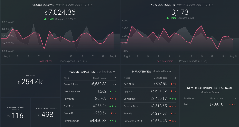
Available metrics:
- Customers
- MRR
- Gross volume
- Churn rate, etc.
Ecommerce Dashboard
Have an ecommerce store? Ecommerce dashboards contain the most commonly tracked metrics, so you can get a high-level overview of your store, track your online sales performance, or learn how sales affect your business development.
For example, Google Analytics Product Revenue dashboard template allows you to customize the metrics as you see fit, and create a simple overview of your ecommerce performance data. You get to answer questions like: How much revenue was generated from a specific device? Which traffic source generated the most revenue? And much more.

Available metrics:
- Average order revenue
- Revenue by device
- Sessions by source/medium
- Ecommerce conversion rate, etc.
IT Dashboard
IT dashboards allow your IT department to track all the relevant metrics and monitor their performance in one place. Integrations with the most popular software development tools, such as GitHub, are available in all free templates and can be customized according to your needs.
For example, GitHub Overview dashboard template provides you with the latest updates on your projects and lets you identify bug fixes across your team quickly and easily. You’ll be able to answer questions like:
- What changes have been made to a project?
- How many open issues do you have?
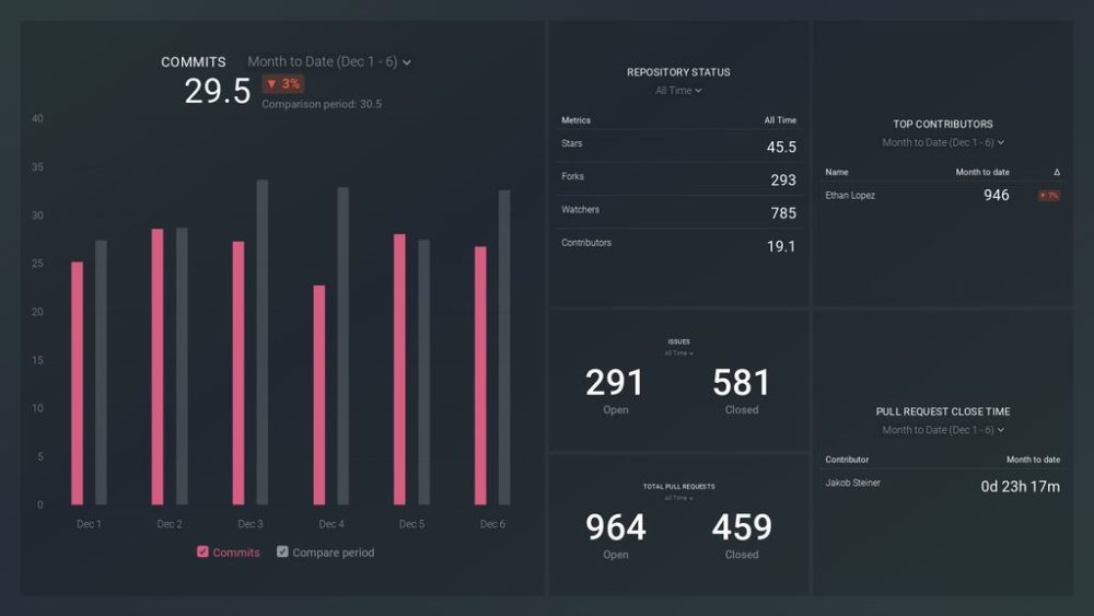
Available metrics:
- Commits
- Commits by user
- Total closed issues
- Total closed pull requests, etc.
By Job Function
- Marketing Dashboard
- Sales Dashboard
- Finance Dashboard
- Customer Support Dashboard
- Project Management Dashboard
Marketing Dashboard
Marketing dashboards allow you to track a variety of strategy aspects, such as SEO, automation, social media, PPC, and more. You can connect the dashboard with the most popular marketing tools such as SEMrush, Ahrefs, Google Ads, Google Search Console, and more, and stay on top of your rankings, ad performance, etc.
For example, Google Analytics Acquisition dashboard template allows you to dive deep into the channels, networks, referrers, and pages that bring traffic to your website.
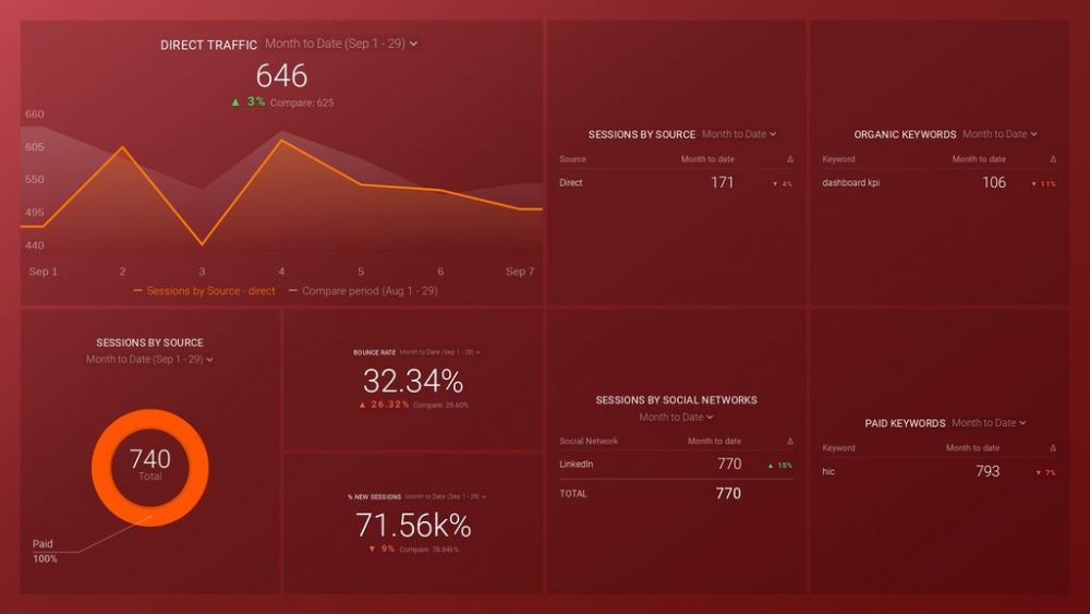
Available metrics:
- Average session duration
- Top channels by sessions
- Sessions by social network
- Visit-to-signup rate, etc.
Sales Dashboard
Your sales team can easily track their activity, leads, pipeline and funnel performance, calls, events, and more by using a sales dashboard template. Right after downloading a free template and connecting it with your data, you can get streamlined visualizations of important metrics that measure your sales success.
For example, HubSpot Full Funnel Analysis dashboard template lets you gain quick insight into how your marketing and sales teams are performing together. Thanks to this dashboard, you can identify bottlenecks and create a plan to optimize your lead conversion process.

Available metrics:
- Sessions
- New contacts
- New SQLs
- Deals created, etc.
Finance Dashboard
Finance dashboards allow you to pull the data from the most popular financial management tools and track your financial performance in a straightforward way. You can track important business KPIs such as profit, loss, revenue, and expenses.
For example, Quickbooks dashboard template allows you to visualize the data from your Quickbooks account and monitor your cash flow, bank account, sales, expenses, and more, all in one place. This dashboard can answer important questions, such as: How much income did your business generate last month? How do you track unpaid invoices?

Available metrics:
- Gross profit
- Net income
- Open invoices amount by customer
- Balance by bank accounts and credit cards, etc.
Customer Support Dashboard
Customer support dashboards allow you to measure the efficiency of your customer care team and you can connect them with all popular customer support tools like HelpScout or Intercom. Your dashboard may include relevant KPIs such as first response time, happiness score, resolution time, and more.
For example, Intercom Customer Support Overview dashboard template contains all the metrics you need to assess your team’s performance, but you can also customize it to your liking. You may answer important questions like: How many new conversations did your customer support team handle on a given day? How are customer conversations tagged on Intercom? And much more.

Available metrics:
- Leads
- Conversations
- New conversations
- Open conversations by teammates
Project Management Dashboard
If you need a dashboard to track your projects from multiple sources, you can do it all in one place with project management dashboards, whether it’s employee time tracking or client tracking. You can use Asana, Jira, Harvest, or any other project management tool from over 70 available integrations in Databox.
For example, this Harvest Task Time Report dashboard template lets you track custom metrics from this app and is particularly useful for businesses that use Agile principles. You can see the number of hours tracked monthly, quarterly, and annually, and more.
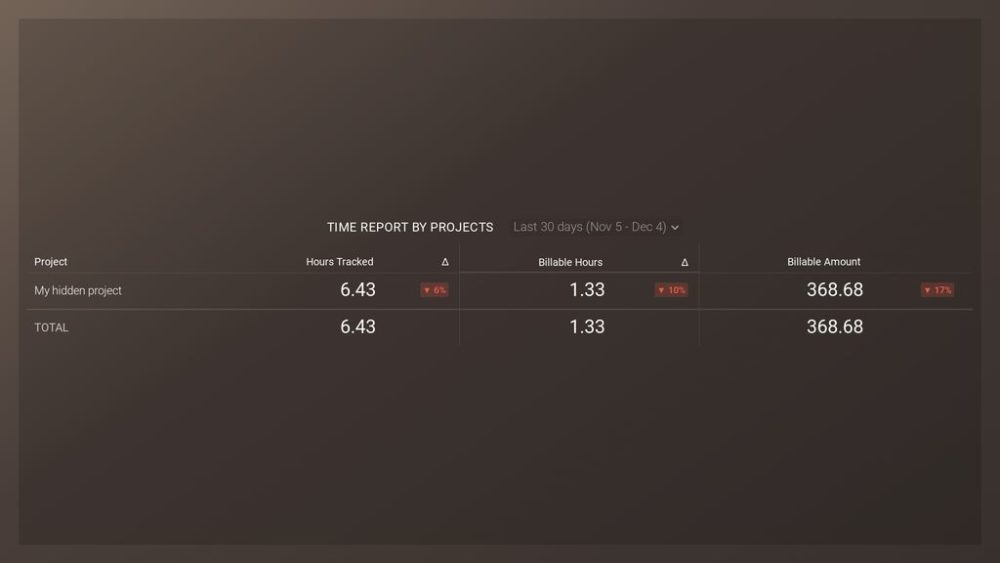
Available metrics:
- Hours tracked
- Billable hours
- Billable amount, etc.
Automate Dashboard Reporting with Databox
Batman has Robin, and you have Databox by your side to help you generate amazing results for your business.
Want to catch issues in performance faster? Done. Want to save time when creating reports? Done. Want to see relevant data from over 70 popular tools in one, streamlined dashboard?
Also done.
Databox pulls your data into a single, clear, compact visualization so you can gain instant insight into your performance, identify trends and opportunities, and fix issues at an early stage. Choose pre-built dashboards or customize them to create your own and use the Scheduled Snapshot feature to receive and share Databox reports at regular times, without spending time creating new reports from scratch and sending them to everyone on the team. While Scheduled Snapshots provide valuable data shared in real-time, a Report enables users to add context and build a story around that data for their teams and clients. Databox Reports can be exported as PDFs, which makes them easily shareable across devices.
Sounds like the tool you could use to optimize your reporting process? Don’t waste time and set up your free Databox dashboards today.