Table of contents
Wondering how you can improve team collaboration and productivity?
An analytical report that studies campaign performances to bring all team members on the same page might just be the answer you need.
Creating effective analytical reports can take some effort though. But once you’ve a grip on the best practices, you’ll start seeing their benefits in no time.
So in this piece, let’s dive into analytical reporting.
We’ve got insights from 49 expert contributors. Of these, 42.86% come from the agency side, 30.61% are from the B2C services/products field, and 25.53% are from the B2B services and products industry.
Here’s a rundown of everything you’ll learn today.
- What is an Analytical Report?
- Benefits of Analytical Reporting
- Top 4 Tools for Analytical Reporting
- 9 Best Practices for Making a Comprehensive Analytical Report
What is an Analytical Report?
An analytics report is a business report that uses data to study and evaluate a business strategy or process.
Based on the analysis, the report also makes data-backed recommendations for future action.
The best part? All departments can use analytical reports to evaluate strategies and campaigns. For example, the marketing department can create a Q1 social media marketing plan analytical report to understand how the strategy played out and how you can improve it.
Keep in mind though: the analysis aspect is important.
Far too many people assume that analytical reporting is about sharing data and letting it narrate the trends. That’s certainly true. But to create outstanding reports, it’s essential you include recommendations in addition to numbers and trends as Help Desk Geek’s Aseem Kishore suggests.
“Many of these trends are obvious and can easily be created by online tools,” Kishore notes. “But what can make your report stand out is if it includes suggestions to change or support these trends.”
For instance, “an analysis report will show more views on video content so you can suggest an experimental phase where more video content is shared.”
Sharing an example of their bi-monthly SEO report, Kishore writes “we produce an analytical report to understand our website traffic, reach, and engagements. We look at trends and make changes to our workflow accordingly.”
However, thanks to the analysis they do, the team was able to “identify a shift in Google’s ranking algorithm, which helped us shift to long-tail keywords. This substantially improved our reach as we were able to get ahead of the competition.”
Benefits of Analytical Reporting
According to our research, the biggest upside of analytical reporting is improved team collaboration and communication.
Over 75% of our contributors say these reports help them bring all team members on the same page while keeping them up-to-date and empowering them with data.

But that’s not all. A vast majority also agree that analytical reporting helps with the following:
- Improved productivity
- Refined business model
- Improve the way business responds to change
- Encourages more innovation.
Considering its benefits, it’s no wonder why 98% of companies create analytical reports. The remaining 2% don’t practice analytical reporting but plan to use it.

Top 4 Tools for Analytical Reporting
More than half of our contributors use dashboards for analytical reports. This makes sense as dashboards present data in a visually engaging format, which makes it easy to read and analyze data.
To add to that, Tim Gibbon from Elemental Communications observes dashboards save time.
“Far too frequently, heads of operations, and digital marketers build Martech stacks that may serve the needs of the business, but without the correct dashboards in place. They are stressed creating numerous reports which dashboards could more easily manage.”
Having dashboards set up, however, saves from the manual work that goes into creating reports, according to Gibbon.
“If more bespoke reporting is required, with the right dashboards in place, they could be quickly modified to drill down if needed,” adds Gibbon.

Apart from dashboards, our respondents listed the following three tools they use for analytical reporting.-
Spreadsheets
24.5% of our respondents use spreadsheets for analytical reporting. While spreadsheets keep everything well structured, they are definitely not the most visually appealing tool for reporting back to clients. This is where Databox can help by pulling data from your Google Sheets or Excel Sheets and visualizing it in an easily shareable dashboard that can be part of a more detailed report.
Slides/Presentations
A smaller group of our respondents, just 18.4%, reported using slides or presentations as analytical reporting tools. While static presentations might not be the answer. Interactive ones, with visually appealing images and data-driven context, can make a huge difference in analytical reporting.
TIP: You can now use Databox Reports to create a story around your data. You get to visualize, analyze, and report on your company’s or clients’ performance in one place.

Google/Word Documents
Only 6.1% of our respondents listed using Google Docs or Word Docs as their preferred tools for analytical reporting. Apart from being static and limiting when it comes to visual data sharing, they can also often be tedious to go through. Given how fast-paced most industries are, being able to see data at a glance and quickly determine where the issue is is a huge upside, and that is why we are seeing dashboards come out as winners every time.
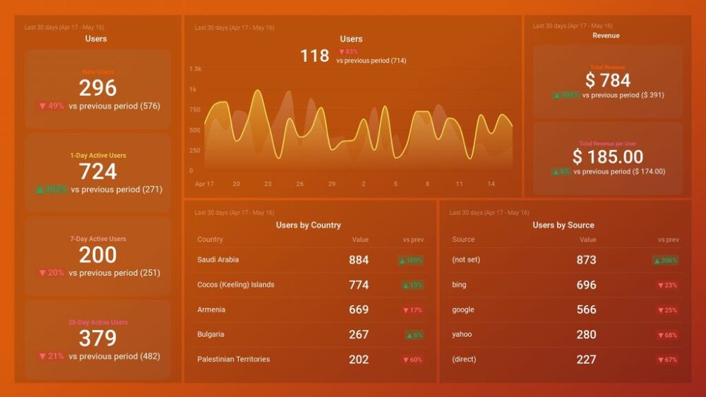
Pro Tip: Your Go-To Dashboard For Doing a Deeper Dive on Website Traffic and Conversion Sources
Struggling to find an easy yet effective way to gain a comprehensive understanding of your traffic sources, user behavior, and revenue generation?
You can do all that and more with our plug-and-play GA4 Acquisition dashboard template:
- Understand user acquisition: See where users come from, tailor outreach, and track new user growth;
- Focus on high-performing channels: Identify top channels, optimize resource allocation, and adjust underperformers;
- Track revenue & engagement: Monitor revenue growth, active users, and the effectiveness of your campaigns;
- Go beyond traffic & conversions: Gain deeper insights into demographics, sales, customer journeys, ARPU, and more;
- Optimize marketing & drive results: Make data-driven decisions to improve your marketing strategy and achieve business goals.
You can easily set it up in just a few clicks – no coding required.
To set up the dashboard, follow these 3 simple steps:
Step 1: Get the template
Step 2: Connect your Google Analytics 4 accounts with Databox.
Step 3: Watch your dashboard populate in seconds.
9 Best Practices for Making a Comprehensive Analytical Report
Now for the meaty part: how to create comprehensive analytical reports.
- Curate accurate data
- Use dynamic data
- Keep your analytical report short and to the point
- Visualize data
- Keep the goal front and center
- Add fewer but relevant details
- Think in terms of usability and appearance
- Share necessary context
- Tell a story
1. Curate accurate data
“While there are many ways to create an insightful analytical report, the most valuable component is the data itself,” opines Kristy Hartman from Ariad Partners.
“Reports with confusing, repeat, or missing data, can negatively affect your understanding of where to attribute your teams’ successes and failures.”
This means there’s a dire need for having a system in place to gather data from the right sources. Hartman’s suggestion? “Using a centralized system that reports on marketing and sales historical data. It allows team members to analyze and reflect on their efforts.”
What’s more, “it provides data-driven insights to optimize campaigns, increase sales effectiveness, and generate more leads.”
“This type of closed-loop system will produce full-funnel visibility into traffic, lead, and customer metrics, allowing you to create in-depth, customized reports on all areas of your business,” adds Hartman.
2. Use dynamic data
Not only is it important your data sources are accurate, but it’s also helpful to use dynamic reporting – a hat tip to Doug Pierce from Sigma Computing.
“Using software that enables dynamic reporting has proven to be our most effective strategy at creating insightful, and impactful analytical reports,” Pierce shares.
The benefit though? “With dynamic reporting, real-time data can be easily integrated into the analytical document, ensuring that the data used in decision making is up-to-date, accurate, and relevant.”
“Moreover, this form of reporting is interactive in nature, thereby enhancing engagement and facilitating easier understanding of the information presented,” adds Pierce.
Pierce walks the talk too. An example of a dynamic report they create is their Advertising Campaign Report. “It entails dynamic and interactive reporting and monitors key ad campaign KPIs. Examples of the KPIs reported on include Ad cost, conversions, ad clicks, and ad impressions,” Pierce points out.
Eliana Levine from FindPeopleEasy applauds dynamic data too – noting it makes reports authentic. “The authorities must use the data to predict the company’s future, and with dynamic data, we can easily access the immediate result through prediction,” observes Levine.
TIP: You can take a look at some examples of metrics dashboard.

3. Visualize data
In addition to using interactive data, FindPeopleEasy’s Eliana Levine appreciates data visualization too.
Essentially, data visualization makes analytical reports easy to understand and use. It also makes the report accessible as Levine points out.
“When I prepare an analytical report for my company, I visualize it in the digital dashboard, where the charts and graphs represent information even before I explain; this makes the report accessible anywhere and easier to understand.”
To add, it’s essential you not only present data in charts but also pay attention to which chart type you’re using.
“I always pick the correct chart to represent data because if the data is described differently by choosing the wrong chart or graph, it may be chaotic,” Levine notes. “Therefore, after selecting your data representation tool, it is necessary to have a proper flow of the data displayed.”
Related: What’s the Best Chart Type for Your Dashboard Metrics?
4. Keep your analytical report short and to the point
“Always choose the proper Key Performance Indicator (KPI) template to match the type of analysis to be done appropriately,” Levine adds.
“KPI template can also ensure that the other company members can study the data in detail to understand the workings.”
This improves the reading experience and makes it super easy to digest all the data and suggestions.
Evelyn Smith, of SmithFoxbackdrop commends this. Sharing their experience, Smith writes, “I have realized after years of writing technical pieces that the key to a good report is how it clearly communicates information.”
The question now is: how can you clearly communicate information? By simplifying everything – from your word choices to the data you present in the report and the way you present it.
Smith observes, “A lot of times people tend to overcomplicate simple things which makes it difficult for others to understand. So, I have incorporated different visual representations of our data. As a result, the analytic report is easy to understand because the whole company may not be aware of technical processes.”
“I have always been open to feedback to improve my report writing skills,” Smith continues.
So every once in a while, ask your analytical report’s audience how easy it is for them to digest it. And, if there’s something you can do to improve its usefulness for them. This will leave you with a handful of suggestions for improving your analytical reports.
Smith also applauds creating templates for simplicity. “Previously, I created each report from scratch but I have realized efficiency is important. So, I have drafted a skeleton to edit and change every time. As a result, we saved a lot of time and energy creating a report. Now, we fill in the important details and wait for feedback from others.”
“This process is further improved by using digital dashboards to collaborate with other employees,” adds Smith.
“It also gives us valuable insights like churn rate, consumer retention, to name a couple. These metrics are an integral part of my analytics reports. It helps everyone understand the performance of our data-driven strategies. This has allowed us to further lead our company towards success with better analytical tactics.”
Related: What Is KPI Reporting? KPI Report Examples, Tips, and Best Practices
5. Keep the goal front and center
The key to creating insightful analytical reports is to only present the most impactful and most useful data. This ensures you aren’t overloading your reader with too much data, which can make it challenging for them to analyze it all and use it for making decisions.
But to cherry-pick the data to feature in the analytical report, it’s essential you understand your goal first.
As eMathZone’s George Tsagas puts it, “the purpose of an analytical report is to make decisions that will benefit the company.”
So “present information in a way that is transparent and organized to ensure that everyone involved can understand the data and make a collaborative, informed decision.”
Sharing an example analytical report that the eMathZone team created for marketing lead generation, Tsagas comments: “We began with a brief summary and then used cluster charts to clearly show traffic sources. From there we were able to discuss as a team the best lead generators and opportunities for growth and make marketing decisions accordingly.”
“Making a collective marketing decision as a result of the report helped all team members better understand the decision process and share in the victory of better marketing results,” notes Tsagas.
The take-home message here? Understand and write down the goal of your analytical report. Ask yourself: what is it that we want to achieve with this report? What decisions can it help us make better?
From there, handpick supportive data to add to the report and decide on how you’ll present it (example: using cluster charts or by creating bar graphs).
Related: Goals Based Reporting: Everything You Need to Know
All this pre-preparation planning work will help you create focused analytical reports that are far more useful than reports put together with little thought.
Unsure of the goal? Ask the report’s audience about it.
At Elemental Communications, for instance, Tim Gibbon highlights, “with so much data and the way it can be presented, at Elemental, we find the best way is to enquire with the stakeholders what they need to review, frequency and why.”
“Otherwise, reports can become unwieldy, irrelevant, and not used as intended,” Gibbon notes.
With a well-defined goal though, Gibbon shares “we provide reporting that provides actionable insight and servicing the needs of the request of the stakeholder.”
6. Add fewer but relevant details
“Get your audience’s attention with fewer details,” Rajeev Bera of acompiler.com advises. “Instead of writing and adding more information, focus on less but relevant details in your analytical reports.”
“In this digital world where attention span is short, making things easier to understand is simply HUGE,” Bera explains.
“As a Senior Software Developer, I’ve to prepare analytical reports in every sprint, and I always focus on fewer but relevant details. And with this practice, the audience can understand it easily.”
Knowing your report’s goal and audience’s requirements helps you select which details to pick and which ones to omit.
Related: Reporting Strategy for Multiple Audiences: 6 Tips for Getting Started
7. Think in terms of usability and appearance
The truth is: reports that look visually appealing are far more widely read than cluttered reports that take a lot to read.
It’s why Bankdash’s Steve Wilson uses dashboards for analytical reports as they improve the usability of an analytical report.
“A spreadsheet, whitepaper, or a basic Word document or file can all be used to create an analytical report,” Wilson notes. “Traditional report writing procedures can be sometimes clumsy and time-consuming.”
Moreover, even though “data can be structured in a variety of ways, the end result can be more confusing than useful.”
It’s why Wilson “prefers gaining access to dynamic measurements and data in a consumable, actionable, and accurate manner by using an online dashboard.”
Thanks to dashboards and automated reporting software, “there’s no slogging through reams of spreadsheets, data processing, or reporting methods that are erratic,” says Wilson.
What’s more, “you’ll be able to watch the insights emerging before your eyes using digital analytical reporting.”
8. Share necessary context
“Make your analytical reports problem-solvers,” advises Bill Glaser from Outstanding Foods.
To do so, identify the specific problem your report will solve.
Matt Paige from HatchWorks echoes the same. “When it comes to making a great analytical report, you must begin with the end in mind.”
For this, “It is critical you understand the business problem, and clearly understand what value the user is looking to get out of the report, and what outcome they are looking to achieve by having this data at their fingertips.”
Remember: “Data is only powerful in context. You have to explain how you found the problem and what steps you’ve taken to correct it,” according to Glaser.
Sharing their processes, Glaser points out, “Our team uses analytical reports to compare solutions. Following the numbers, we collaborate to establish our next steps. Our most successful reports clearly state the problem, identify our target audience, and review the success or failures of previous solutions.”
In short, “Get to the root of [your audience’s] problem to determine what report will serve their needs best,” in Paige’s words.
9. Tell a story
Another effective tip for creating insightful analytical reports is to leverage storytelling.
“The human brain prefers strong storylines or a plot to follow, therefore, if you build your analysis report style with storytelling in mind, your business analysis report efforts will be significantly more potent,” Bankdash’s Steve Wilson shares.
“I’ve realized that more employees and managers understand and act on the findings in reports more effectively when there’s a story to follow,” Wilson adds.
Matt Paige from HatchWorks agrees. “Your dashboard must be designed in a way that it tells a compelling story and makes the end-user achieve their ‘aha’ moments quickly.”
Here’s how Paige recommends you tell powerful stories with your data:
- “Make the complex simple
- Tell a clear and compelling story
- Properly represent the data
- Enable self-service
- Make it actionable”

Create Better Analytical Reports with Databox
And that’s a wrap.
To start creating valuable analytical reports today, we recommend you take the easiest route to create, distribute, and study these reports. And what’s that? Centralized dashboards.
Use Databox to create a dashboard-based report that features dynamic data on one screen. Not only are such analytical reports easy to create (as Databox does the legwork – you only have to plug in the data sources) but they also make it super simple to digest data.
What’s more, the dashboard report is automatically updated. Not only does this reduce the work on your plate but also reduces room for reporting errors.
So what are you waiting for? Sign up for Databox for free and create a winning analytical report today.