Table of contents
Marketing report templates can help you break free from the “always-on” mode. If you’re spending too much time on repetitive, manual tasks like creating reports instead of focusing on meaningful work, you’re not alone. According to a StatusBrew survey, 59% of agencies spend at least an hour on reporting. With mounting internal and external expectations, endless client requests, increasing competition, and limited staff or resources, it’s easy to feel overwhelmed.
What if we told you there’s a simple, yet permanent solution?
Databox specializes in helping busy agency owners, executives, and marketers like you save time and achieve better results with the resources you already have. By using digital marketing report templates, you can streamline your reporting process, stay organized, and focus on strategies that drive results.
From our library of over 200 free dashboard report templates, we’ve handpicked the 15 best marketing templates for reporting to help you save time and consolidate all your key metrics into one easy-to-use platform. These templates are designed to automatically update, making it effortless to share real-time data with your boss or clients at the end of the week or month—no manual updates required. Best of all, you can use them forever with our free plan and only upgrade when you need extra features.
Let’s dive right into the article.
- Email Marketing Report Template
- Social Media Report Template
- SEO Report Template
- Content Marketing Report Template
- PPC Report Template
- Web Analytics Report Template
- Facebook Marketing Report Template
- Google Ads Report Template
- Facebook Ads Report Template
- HubSpot Marketing Report Template
- Monthly Marketing Performance Report Template
- Marketing Automation Report Template
- YouTube Video Marketing Report Template
- Instagram Overview Report Template
- HubSpot Lead Generation Report Template

1. Email Marketing Report Template
Do your email campaigns deliver strong ROI? With this email marketing report template, you can track critical metrics like sessions from email, signups, and conversions. This data allows you to optimize your marketing campaign performance and allocate resources more effectively.
Our easy-to-use email marketing reporting template allows you to quickly gather information about your email campaigns’ performance: how many landing page sessions come from your emails? What devices does your audience use to read your emails? Which email campaigns are the most successful?

Download this free email reporting template and track: sessions from email, signups from email and other relevant metrics, customize the dashboard to fit your needs, or explore more templates from our library.
2. Social Media Report Template
Jumping from platform to platform, taking screenshots, and manually pulling the data from multiple social media networks is tiring. Luckily, our centralized social media report template helps you access all your data from social media platforms in one place and automate your reporting process.
You can easily customize the dashboard to include the metrics that matter the most for your marketing goals: Facebook likes, Twitter followers, Instagram reach, sessions, and more. You get a consolidated report that will help you draw conclusions faster and adjust your social media strategy accordingly.

Download this template, customize it to fit your needs, or explore other similar templates in our library.
3. SEO Report Template
Do you combine various tools to track your SEO efforts? You don’t need to get entangled in multiple reports and spend hours creating a consolidated presentation. You can use a Databox dashboard template with SEO metrics to monitor your keywords, ranking, and backlinks.
Thanks to the numerous integrations we offer, you can populate your data dashboard with metrics from SEMrush, Ahrefs, Moz, Google Analytics, Google Search Console, and other tools, and have a simple overview of your most important metrics in one place. With automated reporting software, you save hours of building reports from scratch, and you get to act instantly in case you spot an issue on your website.

Download an SEO report template for free, add and remove metrics as you see fit, choose different visuals, or check out other SEO reporting templates.
4. Content Marketing Report Template
Which blog posts attract the most visitors to your website?
Do your CTA banners convert?
Are visitors returning to read more?
Your website is one of your most powerful online marketing tools, especially if you invest in an educational, engaging blog. A content marketing report helps you evaluate your performance and justify your budget when necessary.
In this content marketing report template, you can easily track your most popular pages, dwell time, pageviews, pages per session, and other relevant metrics. Based on your goals, you can customize the dashboard and remove unnecessary metrics and add the ones that you need to measure. You can also pick the visualizations that you like instead of the existing ones.

Download the free content marketing report template or visit our content marketing template library to find similar templates.
5. PPC Report Template
Whether social media or Google ads, paid advertising can be challenging and it’s critical to target the right audience and carefully craft your message. Otherwise, you’ll be wasting your budget on ineffective ads and not getting any ROI. A real-time PPC report comes in incredibly handy for you to monitor your ads and adjust the budget, audience, and other parameters when necessary.
In our PPC report template, you can track and analyze metrics like impressions, CTR, and CPC. You get a centralized view of your Facebook ads, Google ads, or any other campaigns you’re running at the moment.

Download the PPC report template now and adjust it to your needs, or explore other PPC templates to find other dashboards you may like.
6. Web Analytics Report Template
Is your website bringing in new leads? How much traffic does your blog generate?
Is your bounce rate suddenly increasing?
Being on top of your website metrics will allow you to take action, whether you notice positive or negative trends and fix issues or seize opportunities timely. This is where a web analytics report comes in.
In our web analytics dashboard (former Google Analytics), you can track metrics like sessions per channel, average time on page, or bounce rate, and produce weekly reports more easily, without spending hours taking screenshots and putting together a presentation.

Download the web analytics report template from our template library, or explore it for more fully customizable dashboard examples.
Lastly, check our full guide on the crucial differences between analytics and reporting.
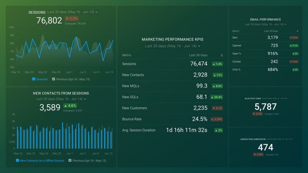
PRO TIP: How Well Are Your Marketing KPIs Performing?
Like most marketers and marketing managers, you want to know how well your efforts are translating into results each month. How much traffic and new contact conversions do you get? How many new contacts do you get from organic sessions? How are your email campaigns performing? How well are your landing pages converting? You might have to scramble to put all of this together in a single report, but now you can have it all at your fingertips in a single Databox dashboard.
Our Marketing Overview Dashboard includes data from Google Analytics 4 and HubSpot Marketing with key performance metrics like:
- Sessions. The number of sessions can tell you how many times people are returning to your website. Obviously, the higher the better.
- New Contacts from Sessions. How well is your campaign driving new contacts and customers?
- Marketing Performance KPIs. Tracking the number of MQLs, SQLs, New Contacts and similar will help you identify how your marketing efforts contribute to sales.
- Email Performance. Measure the success of your email campaigns from HubSpot. Keep an eye on your most important email marketing metrics such as number of sent emails, number of opened emails, open rate, email click-through rate, and more.
- Blog Posts and Landing Pages. How many people have viewed your blog recently? How well are your landing pages performing?
Now you can benefit from the experience of our Google Analytics and HubSpot Marketing experts through a plug-and-play Databox template. It includes key metrics for tracking your leads and can be used as a standalone dashboard or as part of your marketing reports. You can try it during your free trial no setup headaches.
You can easily set it up in just a few clicks – no coding required.
To set up the dashboard, follow these 3 simple steps:
Step 1: Get the template
Step 2: Connect your HubSpot and Google Analytics 4 accounts with Databox.
Step 3: Watch your dashboard populate in seconds.
7. Facebook Marketing Report Template
Organic social media posting can help you reach new audiences, but only if you’re able to track your performance and modify your strategy when you discover a tactic is working or not. To learn if you’re successful, you need to track metrics such as page visits, post reach, click actions on page, followers by gender or location, and more.
With this free Facebook marketing template, you’ll have an overview of your Facebook performance at a glance. You’ll be able to share the report with your whole team effortlessly and spend minutes, not hours, generating new reports each week to stay on top of your performance.

Download the Facebook marketing report template and track the metrics you need, or choose a similar template from our library.
8. Google Ads Report Template
The quality of your ad can make or break your position compared to your competitors. To outrank them, you need to monitor your ads performance closely and track your cost per conversion and other metrics.
In our all-in-one Google Ads Competitive Health dashboard, you can track your average impressions, CTR, CPC, and more. This overview will give you complete insight into the changes in your Google ads in real time so you can quickly adjust them to drive better results.

Download the template and tailor it to your needs or check out our template library for similar report templates.
9. Facebook Ads Report Template
Are your Facebook ads reaching the right audiences? Is your audience seeing your ads too frequently? Is your ad copy persuasive enough? These are all the questions you can answer if you track your Facebook ad preformance daily.
By tracking the metrics available in this dashboard template, you can evaluate the effectiveness of your Facebook ads, without jumping from one screen to another. You’ll get a real-time overview of your active campaigns and monitor your CPC, frequency, cost per lead, ROAS, and more, all in one place.

Download this report template from our library or explore more similar templates. Remember that you can add or remove any metrics to tailor the dashboard to your needs, or replace the existing visualizations with new ones.
10. HubSpot Marketing Report Template
Where does your audience come from? Which sources are converting visitors to leads? Are you going to reach your goal number of leads this month?
The HubSpot marketing report template can answer these questions for you. Track metrics like number of website visitors, sessions by source, or conversion rates to learn more about your performance. You can share this report with your team or send it to your manager in a few clicks. Moreover, the report shows real-time data in one place so no need to collect screenshots and paste them together.

Would this template improve your reporting process? Download it now or find more examples in our template library.
11. Monthly Marketing Performance Report Template
No need to spend hours preparing marketing reports every month. By downloading our dashboard report template, you can save time and create beautiful presentations for the whole team.
The Monthly marketing performance report provides you with an overview of your complete marketing strategy. You can track metrics like sessions, new contacts, emails opened, blog post views. These insights will help you learn which sources generate the most traffic and conversions and if you’re making progress toward your lead generation goals.

To download this template, visit our template library. While you’re there, explore more customizable templates similar to this one!
12. Marketing Automation Report Template
Do your visitors use your website chat when they need help? If so, you’ll want to know how many visitors use it or what your response time is. If you use Drift, this dashboard template is ideal for keeping an eye on campaigns and number of prospects generated through them.
Even if you’re not using Drift, you can pull the data from 100+ sources and use this template to monitor your chat conversations. Track the heatmap to identify your busiest days and improve your chat support for higher customer satisfaction.

To download this template, visit our template library. Customize the template to fit your needs or choose another one from our collection of over 250 marketing templates.
13. YouTube Video Marketing Report Template
YouTube is the most popular search engine after Google. Your audience is most likely already there, so video marketing should be an essential part of your overall strategy. How will you track your subscriber rate, watch time, comments, and other relevant metrics?
This YouTube video marketing report template allows you to get a centralized overview of the most important data in real time. This way, you can easily identify your most popular videos and work on replicating your most successful tactics.

Download this free template and customize it according to your needs, replace the existing visualizations with new ones, or find more similar templates in our library.
14. Instagram Overview Report Template
Active social media presence allows you to raise brand awareness and reach a variety of audiences, so a business profile on Instagram is a great idea. The only question is: do you really need to scroll and click for hours to get the latest stats on your performance?
Thanks to our dashboard templates, you won’t need more than a few minutes to generate reports for your managers, clients, or team members. Moreover, you will be able to see all the data in one place and in real time, so you can act quickly if you identify an issue.

Download this template from our library and explore more fully customizable reports to boost your marketing reporting process.
15. HubSpot Lead Generation Report Template
How many leads did you generate last week? Is your landing page performing well? Which sources brought in the most leads?
The HubSpot lead generation report template can help you answer these questions at a glance. This easy-to-understand dashboard allows you to track metrics like new leads by source and progress toward reaching your landing page conversions goals. By monitoring these (and more) metrics, you can determine whether your lead generation strategy needs modification.

Download this free marketing template and find more similar ones to customize and include in your marketing reporting process.
Put Your Marketing Reporting on Autopilot with Databox Templates, Reports and More
Brainstorming with your team instead of screenshotting.
Writing and testing instead of manually entering data into a spreadsheet.
Working on a strategy instead of endlessly scrolling and jumping from one platform to another to make reports.
That sounds like an ideal world where you can put repetitive tasks on autopilot and do meaningful marketing.
Luckily, this ideal world can be your own with Databox. We’ve come up with fully customizable dashboard templates to make your job easier and remove the burden of reporting. Instead of the tedious process of collecting the data and building reports from scratch, you can actually have fun creating automated reports and choosing visualizations to make the presentation visually beautiful, clear, and concise.
Reporting has never been faster, easier, and more fun. But don’t take our word for it — see for yourself. Create your free Databox account and get started today.