Table of contents
Thousands of HubSpot customers use Databox to monitor and report tens of thousands of metrics from HubSpot.
From website sessions to deals closed, Databox pulls 100s of Key Performance Indicators (KPIs) from the HubSpot software.
But, unfortunately, we can’t pull everything from HubSpot. No one can, since HubSpot doesn’t have Application Programming Interfaces (APIs) for every data point and feature included in their app. (Many platforms are missing key APIs, not just HubSpot.)
If we can pull a metric from HubSpot, though, we prioritize it. Making our integration the most ‘complete it can be’ is critical since HubSpot Marketing and HubSpot CRM are our 4rd and 5th most popular connectors, right behind Google Analytics, Facebook Ads and AdWords.
But we don’t stop there. Not only do we prioritize improvements to our HubSpot integrations, but we also try to make it as easy as possible to view HubSpot data using Databox by offering pre-built HubSpot report templates, as well as pre-configured visualizations for use in our custom report designer too.
Up until now, though, we haven’t been able to help HubSpot partners or customers accurately report the number of contacts in each lifecycle stage. If you wanted to report the number of Marketing Qualified Leads (MQLs) generated in a month — sorry, it wasn’t accurate. SQLs by marketing channel? Nope. New subscribers or customers? Sorry.
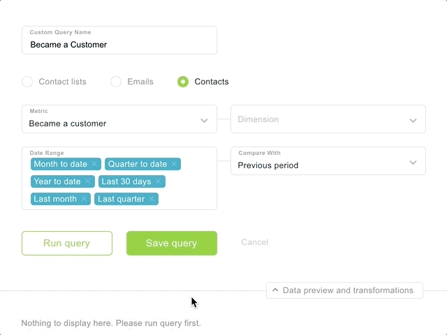
The problem? HubSpot’s initial API (which we still support) shows the number of contacts currently in a specific lifecycle stage. It did not allow us to track totals based on the time when the contact first entered that lifecycle stage.
So, when a MQL would become a SQL or opportunity within the same month, that month’s MQLs would go down by one, downplaying the impact of marketing’s effort on sales.
As we worked with more and more of HubSpot’s top agency partners, it became painfully clear that this was not tenable.
Knowing this couldn’t persist, we documented the issue and requested that HubSpot create an API to enable access to this critical data. In order to show HubSpot how critical this request was, we published the request to their community forum where customers and partners can comment on the request.
Jon Stanis from Weidert Group summed up the need for a new API perfectly:
“Because we are a B2B marketing agency, our clients have long marketing and sales cycles, sometimes several months long. Having these data available would allow us to more accurately show the results of our and our client’s inbound marketing efforts while reducing the amount of reporting work we have to do manually.”
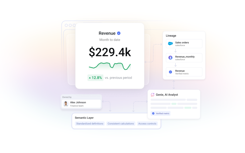
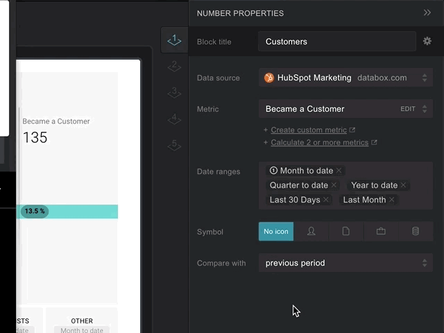
In response, HubSpot launched a new API that allows us to pull the data. As soon as it was available, we got to work enhancing our integration, building templates and as of this week, I’m excited to announce that more accurate HubSpot lifecycle stage data can now be visualized in one-click inside Databox, alongside any other metric from our 130+ integrations.
Easily Report Lifecycle Stage Metrics with One of These Templates
The easiest way to start using the new lifecycle stage reporting metrics is by using one of our templates.
There are multiple ways you can visualize this data inside Databox. The templates allow you to choose your preferred method.
Template #1: HubSpot’s Old Sources Report
Recently, HubSpot improved their entire analytics tools and redesigned their default “Sources Report”. It used to look like this:
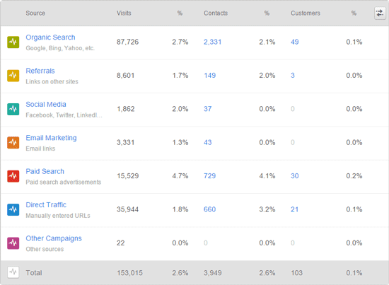
The new version of HubSpot Sources includes bounce rate and average session length alongside those same metrics above, but if you want to view additional lifecycle stages, this Databox dashboard will give you that in one click.
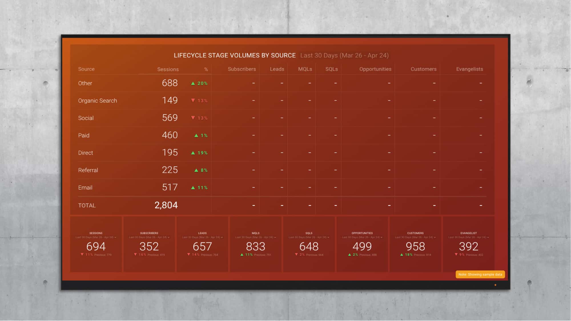
Download this HubSpot Sources Lifecycle Stage Report Template here.
While there is a sum total at the bottom of each column (not shown), we also have included number Datablocks in this template that show total numbers for each lifecycle stage. These number blocks allow you to quickly toggle to different time frames such as last 30 days, month to date, year to date and others. Both the table and the Datablocks show comparison to the time period before. So, when looking at data from the “Last 30 days”, it’s comparing to the 30 days before that.
Template #2: Became A (Lead, MQL, SQL, Customer) Metrics
These are more than a few ways you might want to visualize how your contacts are moving through your lifecycle stages.
If you were a very, very early HubSpot customer, you might remember this funnel visualization, circa 2008.
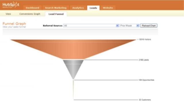
If you have been waiting these 8 years patiently for HubSpot to enable a funnel visualization like that again, here you go… (You can have a vertical one too, but this is horizontal, of course.)
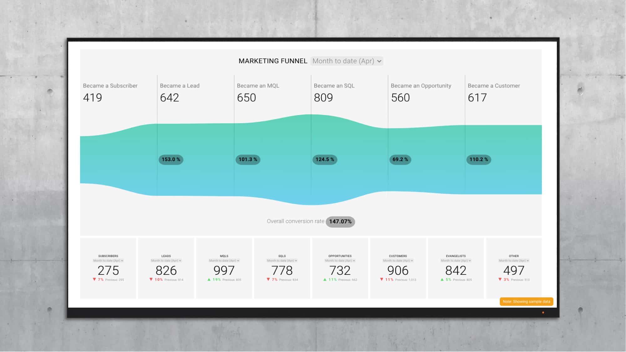
Download the HubSpot Marketing Funnel by Stage dashboard here. (That’s fake data in the above image, btw. Hopefully, your funnel looks more like a funnel.)
Copy Datablocks to Your Existing Boards
Once you add these templates to your account, you can copy a Datablock from either or both of these Databoards to your existing reports.
Here’s a GIF of how to do that…
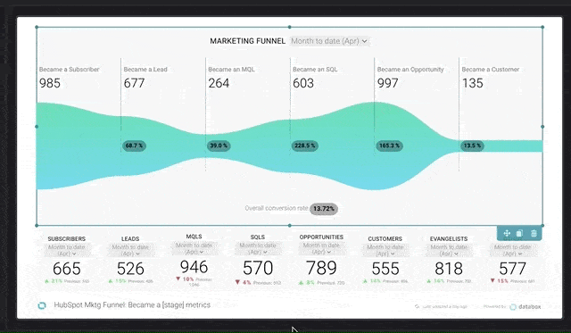
This is the quickest way to add the new lifecycle stage metrics to an existing Databoard.
Use Databox’s Designer to Build Other Visualizations
You can also re-use the custom metrics we’ve built for these templates in other types of visualizations.
For example, you might want to create a funnel visualization by marketing channel to answer questions like:
“How well does our organic search traffic convert to leads, MQLs, SQLs, Opportunities and customers?”
“What % of our MQLs from paid social turn into customers?”
Or you might want to monitor which channels produce the most MQLs in a pie chart.
To do that, grab a blank visualization from our left-hand menu, like this…
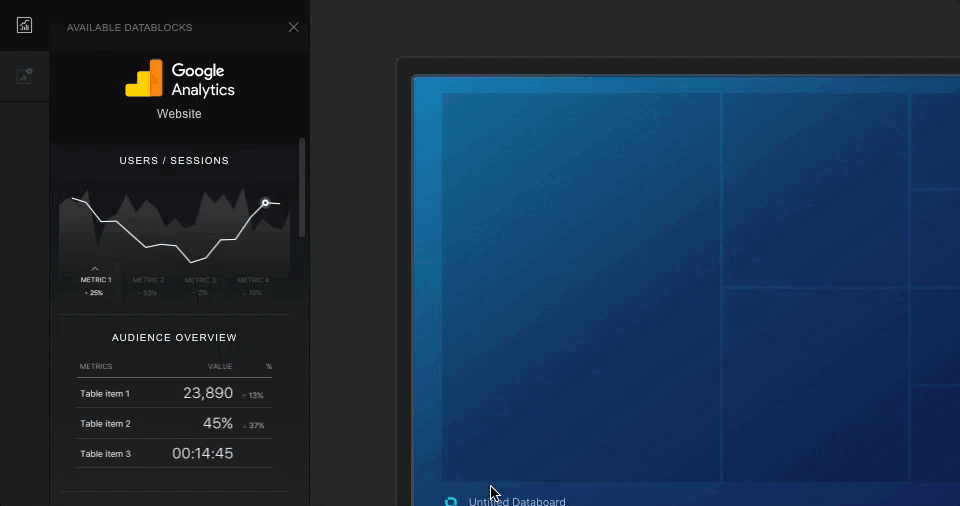
Then, select the custom metric in the right-hand pane. (These custom metrics were copied into your account when you copied the templates above.)
Use Databox’s Metric Builder to Pull Additional Time Intervals
While you should be able to visualize what you need from the templates and custom queries these templates provide you, you might need our Custom Metric Builder to pull additional time intervals. The pre-configured metrics provided via the templates include the following time intervals:
- Month to Date
- Last 30 Days
- Year to Date
However, other time intervals are available: Today, Yesterday, This week, Last Week, This month, Last Month, This quarter, Last Quarter, This year, Last Year, Last 7 Days, Last 14 Days, Last 28 Days, Last 30 Days, Last 12 Months, Week to date, Month to Date, Quarter to Date, Year to Date.
Here’s a GIF that shows how to add a time interval using the HubSpot Contact Builder…
We do not pull all of these time intervals by default because it would be expensive to do so, unnecessarily taxing our system and HubSpot’s systems. Metric Builder is available for our Plus, Business, Agency Plus and Agency Business plans.
We used Metric Builder to pull this data because we hope that HubSpot will allow us to query by other contact properties by further enhancing their Contacts API. We will expand the capabilities of our HubSpot Contacts Metric Builder when they do.
You Can Still Visualize Contacts in their Current Lifecycle Stages
In HubSpot, when building a report, you can choose to track the number of contacts currently in each lifecycle stage in your HubSpot dashboard. To replicate this in Databox, use the following Default metrics.
- New Leads by Source
- New MQLs by Source
- New SQLs by Source
- New Opportunities by Source
- New Customers by Source
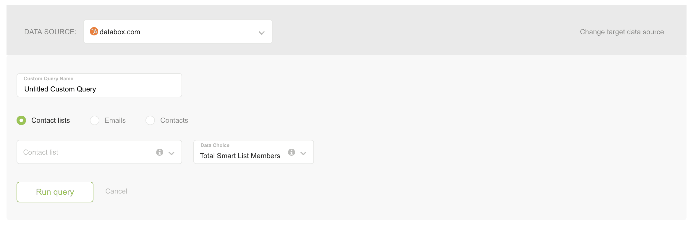
Use Smart Lists to Track Number of Contacts that Meet Other Criteria
If, for some reason, you have not defined your lifecycle stage criteria inside HubSpot or you just want to track the number of contacts by other Contact Property criteria, use Smart Lists in HubSpot. Then, you can plot the growth of that list going forward in Databox.
You’ll need to use the Databox Contact Lists Metric Builder to visualize your HubSpot list growth.
Here’s what that looks like…
—
That’s it! If you need help implementing HubSpot lifecycle stage reporting inside Databox, please contact our support team for guidance.