Table of contents
Across the full HubSpot sales and marketing software suite, you can do everything from publish blog posts to close deals.
As a by-product of all of that activity, HubSpot measures hundreds of metrics for you.
And while HubSpot can help you analyze almost any sales and marketing metric, pulling a full report requires a lot of clicks.
Not anymore.
Say goodbye to clicking into multiple HubSpot screens and drilling down into multiple reports to get a full picture of your data. Say sayonara to waiting until you have thirty minutes free in front of your computer to check how your marketing and sales teams performed yesterday, last week or month to date.
Databox has rolled out pre-configured HubSpot templates that allow for easy and continuous monitoring of your KPIs. They give you the ability to choose between a variety of HubSpot reporting strategies and view the up-to-date dashboards on multiple screens.
Here’s how we create templates- 116 HubSpot power users from the Databox Partner Program have been sharing the dashboards that they use on a day to day basis. We allow any HubSpot user to download the templates from our Template Gallery for free. That way, elite inbound marketers can share their knowledge accrued over the years.
You can continue reading below to see images of these dashboards (or Databoards, as we call them), or you can just as quickly sign up for an account, download the app (on iTunes or Google Play) and connect your HubSpot Marketing and/or HubSpot CRM/Sales accounts to see for yourself.
Once setup, you can check all of your HubSpot stats on your mobile device or desktop in a single view before you even get out of bed. And since you can connect up to 3 data sources for free to Databox under the free plan, you can add HubSpot Marketing, HubSpot CRM/Sales and one of a number of pre-built connectors for popular apps used by many HubSpot customers including Google Analytics, Salesforce, Wistia, Drift, Twitter, Facebook, Facebook Ads or Google Adwords – to name a few. You can even set up a Databoard to display your stats on a television screen hanging in your office – making it possible to view your key metrics with no clicking at all.
The rest of this article describes how to view real-time HubSpot data and discover immediately-actionable insights for improving your marketing and sales results.
The Ultimate HubSpot Marketing Analytics Dashboard
The beauty of HubSpot is that you can complete a bunch of marketing activities all in one piece of software. HubSpot’s CEO, Brian Halligan is fond of saying, “One login. One User Interface. One bill.” HubSpot’s marketing software is as all-in-one as any marketing and sales software gets.
What could make HubSpot more all-in-one? Maybe an all-in-one mobile view of all of your key marketing metrics. That’s exactly what Databox’s HubSpot Marketing default Databoard gives you: all your key marketing stats in one view. Here are the different Datablocks included and what you can learn from looking at them.
Make Sure You’re Making Marketing Progress Daily
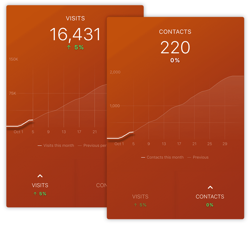
The best marketers produce a steady flow of new leads for their sales team. That can’t be done unless a consistent volume of new visitors convert as new leads on the website. Use the “Visits/Contacts” Datablock to track daily progress.
Just click “Contacts” to change the daily progress graph from visits to contacts.
Check Your Marketing Funnel Performance at a Detailed Level
Because HubSpot’s software enables so many marketing activities, you can measure every touchpoint a prospect makes with your company from the time they are an anonymous website visitor to when they become a customer. Because of this, Databox can pull HubSpot stats that show the health of your full marketing funnel.
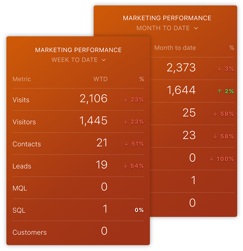
With the “Marketing Performance” Datablock, monitor visits, visitors, contacts, leads, marketing qualified leads, sales qualified leads and customers.
Want to see just today’s or week to date data? Tap the table and it quickly changes to the next time interval.
Want to add other HubSpot defined lifecycle stages like subscribers and opportunities, sales metrics from the CRM or any other metric? You can do that too in the Databox Datablock Designer. You can even add metrics like sessions or new users from your Google Analytics account.
Monitor Your Conversion Rates with a Funnel Visualization
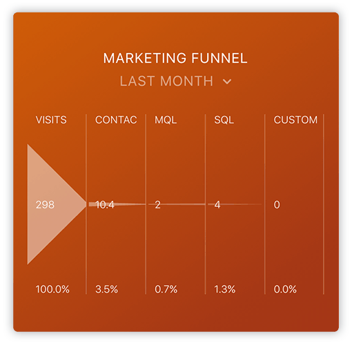
Want to see your overall marketing performance in a funnel visualization? Maybe you just love looking at funnels instead of tables (like I do). Or maybe you don’t. Either way, you can’t deny the usefulness of measuring your conversion rates from one step to the next, which is shown by default at the bottom of any funnel Datablock.
How many visits does it take to get one contact? How many contacts turn into marketing qualified leads? Answer those questions with the “Marketing Funnel” Datablock.
Check Which Traffic and Lead Sources Are Performing the Best
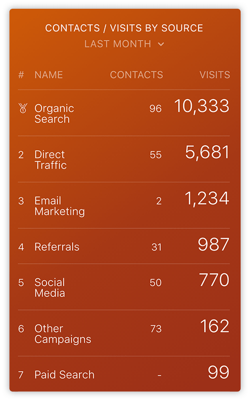
The HubSpot Sources report is probably the simplest, yet most powerful report ever made for marketers. HubSpot’s analytics tools “automagically” categorize every visit into one of seven buckets: organic search, referral traffic from other websites, email marketing, paid search, direct traffic, social media and other marketing campaigns a marketer might want to run. It’s exactly what a busy marketer needs: one snapshot to see how every marketing activity is performing.
The “Contacts/Visits by Source” Datablock is a clone of that report, just without the fancy, multi-colored bar graph you might be used to seeing at the top of the Sources screen inside the HubSpot interface.
Detect Changes in Traffic Volume from Different Sources
What if I told you Databox took the HubSpot Sources data and made an even better report? You be the judge…
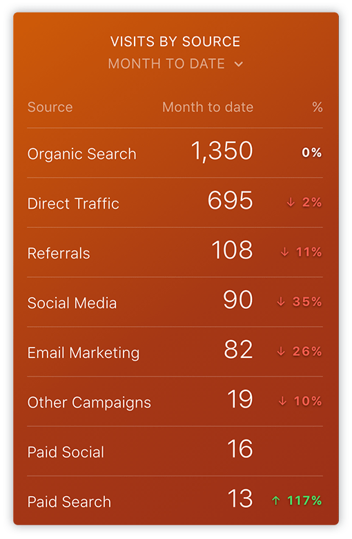
Anyone who is doing their online marketing right is getting traffic and leads from all of the seven different sources in the HubSpot Sources report. On the flip side, everyone knows it’s a fool’s errand to try and grow traffic from all of these different sources at once. Performance is bound to go up for some sources and down for others as marketers shift attention to different projects and, sometimes, for no discernible reason at all. Having a great month getting your content mentioned on social sites, but direct traffic is mysteriously down? Unfortunately, your gain is wiped out. Organic search traffic went down a bit because one of your competitors just usurped your ranking for a key phrase? There’s no way to really anticipate that one.
But you can watch it happen as it happens using the “Visits by Source” Datablock. With it, monitor changes in traffic by source. You can see how today performed compared to yesterday, and how this month to date compared to the month to date period 30 days ago. Instead of guessing which color on the HubSpot bar chart changed a bit in the Hubspot Sources report, just look at the percent change column in the Databox table
Fortunately for you, this report helps you detect traffic dips by source, so that you can do the things needed to compensate for any shortfalls. Need a last minute lift in leads and traffic to hit your goals? Maybe it’s time to do another email send to see if you can turn some of your email subscribers into sales leads. Is direct traffic down because your public relations efforts flopped? Maybe do a few extra blog posts to boost your social traffic or update an old blog post to get an organic boost in a few weeks.
As your efforts start to result in increased traffic and leads from different sources, you can use the same Datablock to watch your progress. Don’t think this is a game changer for you?
Just to make sure your traffic increases are resulting in lead increases too, you can also create a “Leads by Source” table if you’d like.
Measure Lead Volume from Your Outreach Efforts
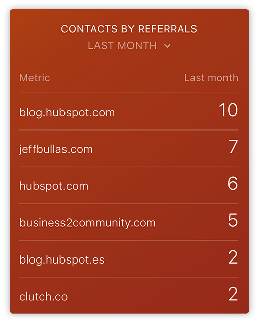
Every good inbound marketer worth their salt creates lots of great content. But, today, it’s not enough to just create it – you need to promote it too. A great way to do that is to get inbound links to your content. You can publish content on other websites with a link back to yours via guest posting or try to get others to link to your content from their own articles by requesting a link. (See what I did there?)
With the “Contacts by Referrals” Datablock, monitor the impact of those efforts on your lead generation.
Monitor Overall Blog Performance
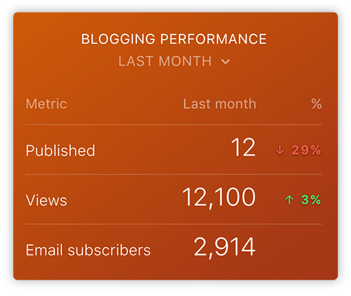
Blogging pays off. Companies that blog more, get more traffic (according to HubSpot’s data).
But, as you may know, it’s hard to publish a lot of great blog content on a regular basis.
To keep up the momentum, use the “Blogging Performance” Datablock to monitor how many posts you’ve published, how many views your new and previously published articles are generating and to make sure your subscriber list is growing.
If you’re managing the person who writes your content, use this Datablock to make sure they’re cutting the mustard.
If you’re the one writing or editing your company’s blog posts and you’re slacking, these three metrics are a great reminder for you to step-up the volume a bit. If you’re crushing it, these should be good encouragement for you. And if your boss isn’t using Databox, you can quickly email them a screen grab right from the Databox app when these numbers are up and over your target.
Track Traffic from Every Blog Post
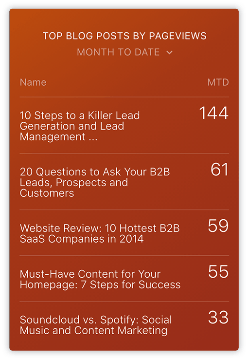
Unfortunately, not all blog posts are created equal. Well, maybe they are all created with the same amount of love from their creator, but, they certainly don’t perform equally. Beauty (and blog performance) is in the eye of the beholder, after all.
Use the “Top Blog Posts By Pageviews” Datablock to measure which blog posts are performing best. Spend more time sharing and promoting the ones that are performing.
Measure Landing Page Performance
Landing pages are where the inbound marketing rubber starts to hit the road. There’s no reason to blog unless you’re converting those visitors into leads.
A good marketer has lots of offers because more of them means more ways to convert visitors. Don’t just take my word for it, though. Here’s data from HubSpot:
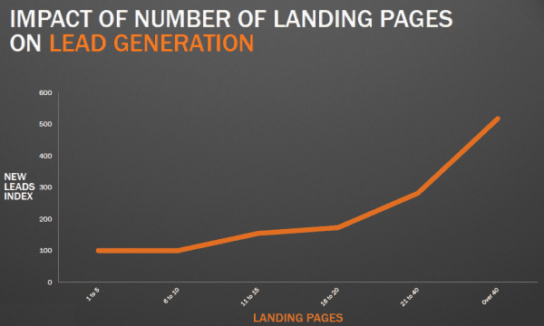
As you place more calls-to-action links or buttons on your site pages or blog posts, you’ll be directing more visitors to your landing pages, increasing your landing page views. As you add more landing pages, your landing page submissions and new contacts should increase. As you improve the offers and your landing page designs, your conversion rate should increase.
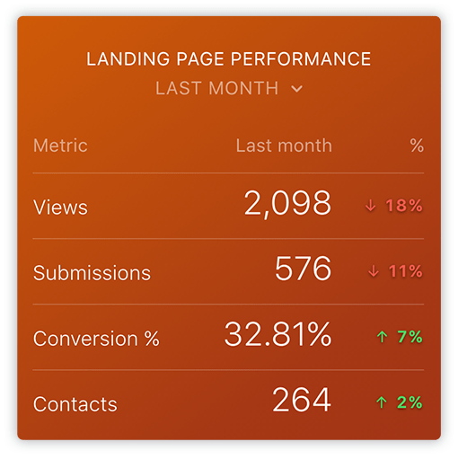
Monitor how well your landing pages are performing across all four of these metrics with the appropriately named “Landing Page Performance” Datablock. It makes it easy to ensure you’re driving enough visitors to your landing pages and they’re generating the number of leads you need.
See High-Level Email Marketing Performance
If there’s one area where HubSpot really excels, it’s email marketing. Whether you’re running email campaigns to your whole list, a segment of your list, or via automated workflows, HubSpot’s got you covered. However, once you set up a bunch of automated campaigns and start deploying different campaigns to different segments, things can get complicated and difficult to track.
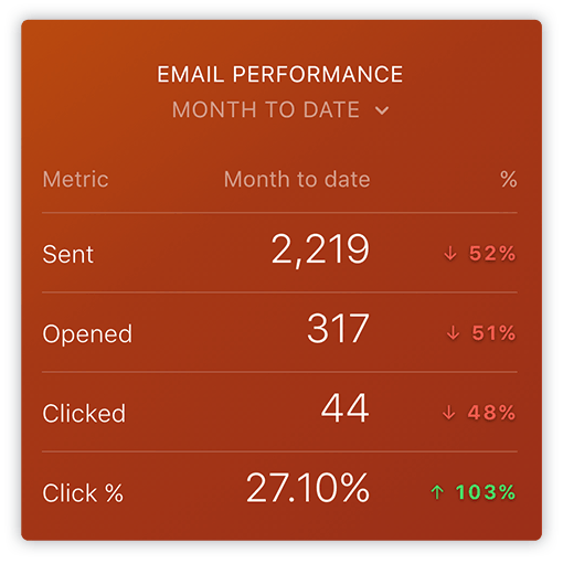
Make sure nothing’s going off the rails by paying attention to overall email results via the “Email Performance” Datablock.
If the data shows you’ve sent less emails, maybe you need to get another campaign out. If opens are down, it’s time to find a high performing subject line you can re-use for your next campaign. If clicks are off, maybe you need to take a look at the content (or the design) of your most recent messages.
The Busy Sales Leader’s All-in-One HubSpot Sales Dashboard
What’s the point of all of this inbound marketing? One word: Sales. So, let’s switch over to the default Databoard for HubSpot CRM/Sales customers.
As an aside, the marketing and sales dashboards are set up as separate Datablocks, in case you only use one platform or the other. But, if you want to view both your marketing and sales stats together, you can add all of the Datablocks below to the same Databoard or set up a separate Databoard inside Databox to view just your sales stats. You can also change the order of the Datablocks to suit your routine, eliminate ones you don’t need or even add new ones that show different metrics, time intervals or even important key performance indicators (KPIs) from other software you use.
Make Sure Your Sales Metrics are Up and to the Right
A great sales team raises the bar every month, every quarter, every year. But, you can’t improve what you don’t measure.
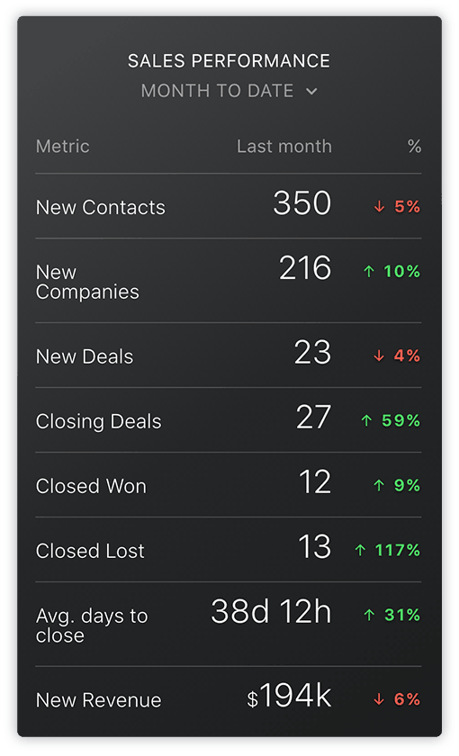
How many new contacts and companies are your salespeople pursuing? How many deals are created, scheduled to close or already closed? What’s your average sales cycle? And, of course, the most important question: how much new revenue have you booked?
Answer all of these questions from the first Datablock of the default HubSpot CRM/Sales dashboard, “Sales Performance”. Want to know how your team performed yesterday, today or last week? No problem. Just click this Datablock to move to the next time interval.
The most important part of this datablock is the percent change from the previous time period, so you can compare current performance to the historical performance. For all but one of these metrics (closed lost deals), make sure the trend is up and to the right, or in this case, green.
Monitor Your Sales Conversion Rates
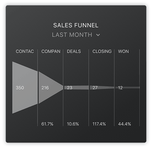
Sales teams live and die by their conversion rates. Not getting any of those leads on the phone? Not turning appointments into deals? Proposals not turning into deals won? If any of these are true, you need to know about it. And immediately.
The best way to detect any of these sales conversion issues is to pay attention to your conversion metrics. The “Sales Funnel” Datablock shows the absolute values of the steps in your sales funnel from prospecting to close, as well as the conversion rates from one step to the next.
Make Sure You’re On Track for Creating & Closing Enough Deals
Conversion rates are important. But, anyone who has managed a sales team knows they are hard to change quickly. For that reason, consistent sales activity is the key to making the number month after month and quarter after quarter. This means activity should be consistent no matter what day of the month it is.
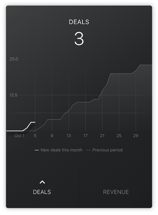
Monitor the number of deals created and the amount of revenue booked on a daily chart with the “Deals and Revenue” Datablock. By using a graph Datablock to visualize these metrics, you can quickly compare it to the previous time period. For example, in the chart below, you can see the number of deals created month-to-date (solid line) vs. the number of deals created the month before (shaded area).
See something going the wrong way in this graph? Me too. Looks like the first few days of the month started a little slow for this sales team. Fortunately for them, it looks like they closed most of the gap in week three. Having this kind of chart handy allows you to know when you need to close gaps too.
Want to chart another metric on a daily basis with a graph like this one? No problem. Just configure the Datablock to read a different metric.
Monitor Win Rates
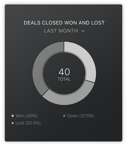
You win some. You lose some. But, if all of the sudden you start losing more than you win, you might have trouble winning the season. With sports, there’s always next season. In business, you don’t always get a chance to redeem a losing streak.
With the “Deals Closed Won and Lost” Datablock, you can monitor how many of your deals you’re winning and losing.
Quickly change it to other time periods to see whether your win rate is going up or down.
This Datablock will help you estimate how many more deals you might win this month (or quarter) by tracking open deals too.
Catch a losing streak before it’s too late.
Track Win Rates by Sales Rep
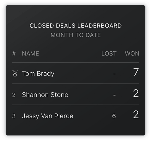
If your win rate is dropping, the next logical question to ask is, “Which reps are losing more deals than the average rep?” Use the “Closed Deals Leaderboard” Datablock to dig a bit deeper into a sales rep’s funnel by looking at how many deals he or she is losing.
See a spike in lost deals? Dig into the deals with your rep to see if you could salvage them or if your rep is pursuing the wrong types of deals. Imagine what would happen if this sales team lost their Tom Brady for a few weeks.
Or maybe they’re not losing any deals? Maybe they need to take more risks. It’s rare that someone can win as much as Tom Brady does without taking a few risks.
Stoke the Competitive Flame with a Salesperson Leaderboard
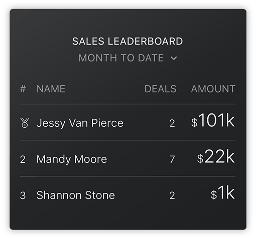
To manage a sales team effectively, you need to know how each salesperson is performing compared to their goals and each other.
How many deals did each sales rep close? How much new revenue did they book so far this month or this quarter? Answer these questions with the “Sales Leaderboard” Datablock.
“Publishing results by salesperson was a way of life and a reflection of two critical realities: First, that sales is all about results. And second, by nature, [good] salespeople are competitive.” laments best-selling sales book author Mike Weinberg in a post about the disappearance of salesperson leaderboards in many overly-sensitive sales organizations.
Ensure Your Team is Creating Enough Deals & Moving them Towards Close
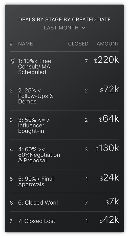
The HubSpot CRM allows you to create your own custom deal stages. You can define these stages by naming the steps in your sales process or the steps that your prospects take before deciding to buy a solution like yours. Watch HubSpot’s free online sales training for naming recommendations.
No matter what stages you set up, though, you then need to measure how many deals and how much revenue is at each stage to be assured that you have enough deals to hit quota in future months or quarters. Track this with the “Deals by Stage by Created Date” Datablock. This view allows you to see whether you’re creating enough deals and whether you have enough deals at each stage. If it seems like you don’t have enough, refocus your team on deal creation.
Make Sure You’ll Hit Quota this Month
As a sales leader, knowing you’re creating enough deals for next month is critical. It’s good to keep an eye on it week to week.
But, most sales leaders obsess over this month’s quota attainment much more frequently – on a daily or even hourly basis.
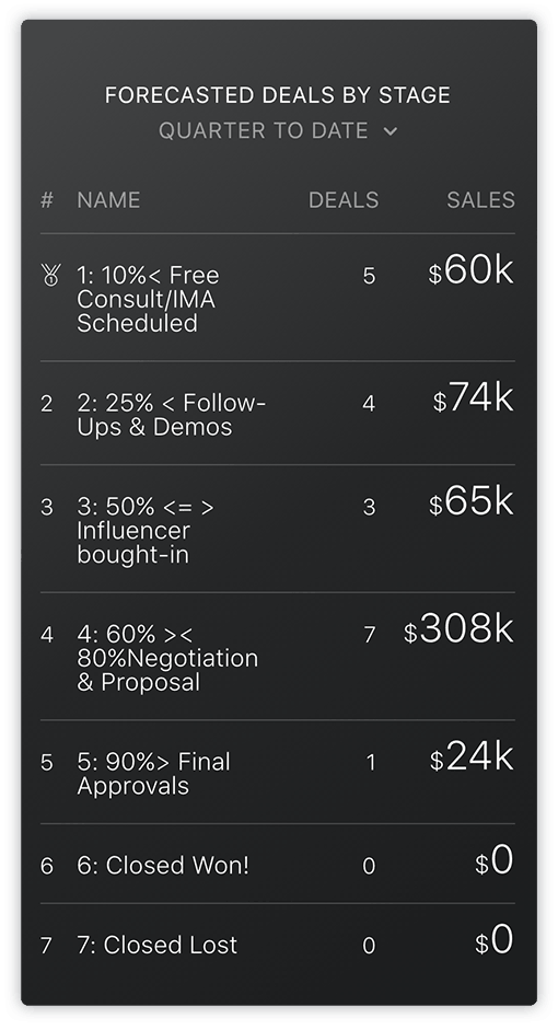
With “Forecasted Deals by Stage”, you can check your forecast at anytime, anywhere, as you enter this month’s home stretch. (Any deal with a close date set to this month will be included in this table.)
Earlier in the month, use it to answer the question, “Do we have enough deals in play this month to hit our quota?”. Later in the month, refresh it frequently as you close in on your target.
Celebrate the Big Closed Deals
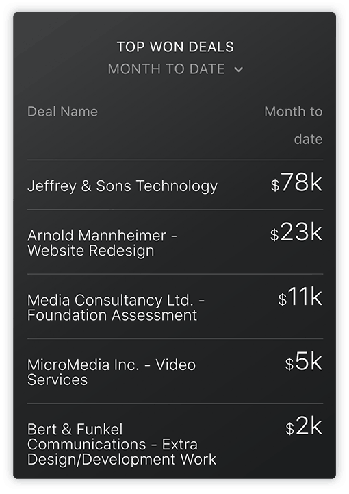
While you should probably celebrate every deal, it’s the big ones that move the needle most for your business. “Top Won Deals” gives you exactly what you’d expect: your biggest new deals. You can show as many as you want by adjusting the number of rows to display in the Databox Designer.
Stay on Top of Your Top Clients
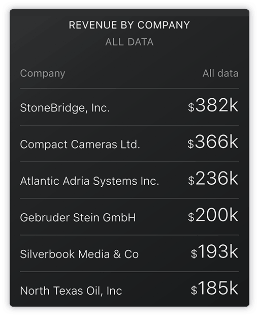
Just like it’s important to know the big deals that close, it’s also important for most companies to take great care of their biggest clients. The “Revenue by Company” Datablock shows a list of your biggest clients based on the amount of revenue booked all time. It adds up all of the revenue booked across all deals for a given company and lists out the top ones.
Use Databox Templates to Make Comprehensive Dashboards with No Additional Work
Why stop at the all-in-one mobile view? Why not create custom dashboards to be viewed on your computer, tablet, or TV screen that are pre-configured and designed by experts?
Not only does the new Databox Template Directory provide you with full reports that extensively address different needs, but it identifies key metrics you want to track, potentially even before you recognize their significance. Without having to manually put together the Datablocks listed above, you can produce thorough reports using metrics from your HubSpot accounts.
Here are some of our favorite HubSpot Templates:
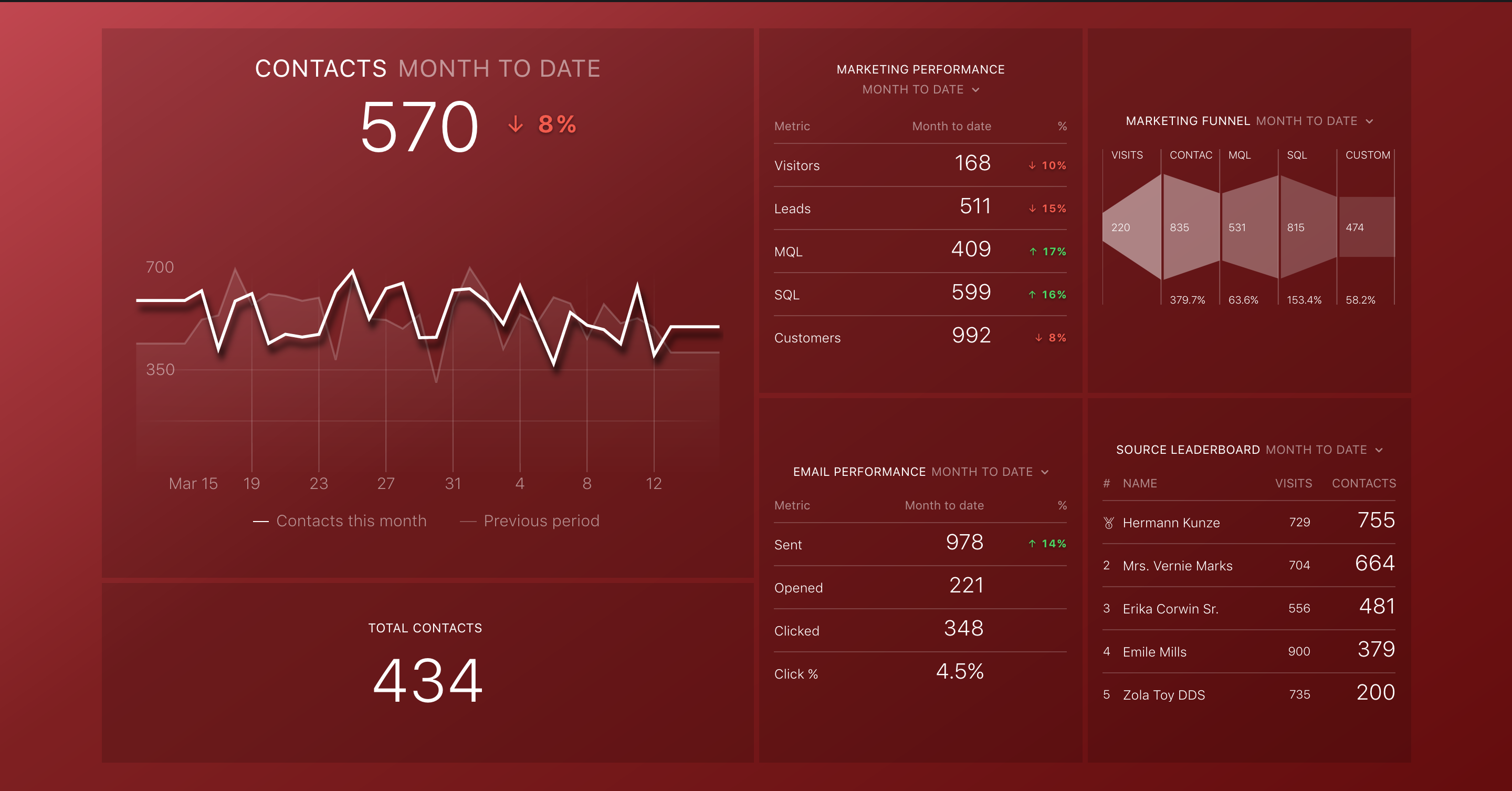
HubSpot Marketing
Datasource(s):HubSpot Marketing
Benefits: Provides you with insights to increase traffic, convert leads, and prove ROI.
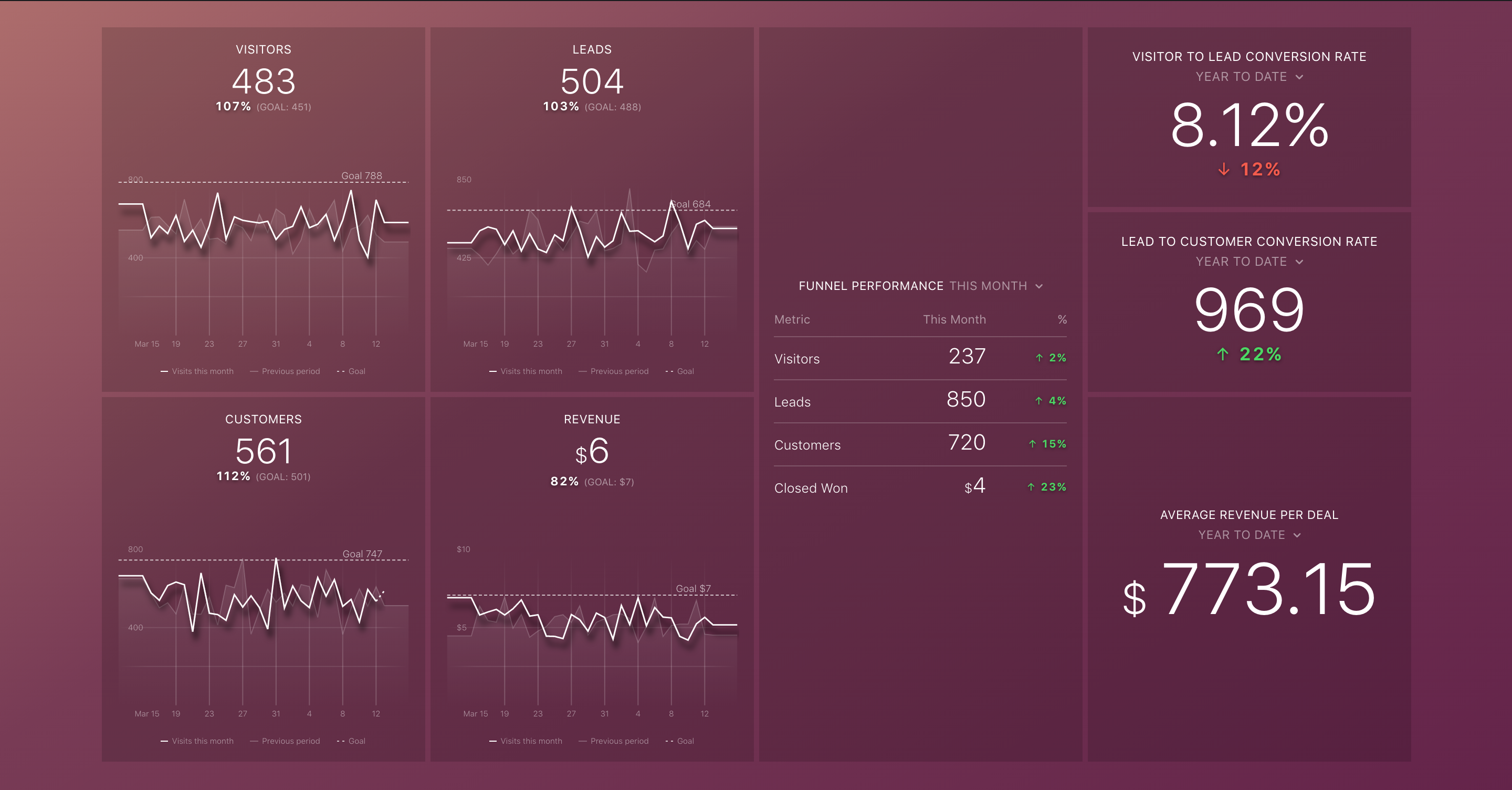
Simple Marketing + Sales Waterfall (HubSpot)
Datasource(s): HubSpot Mktg, HubSpot CRM
Benefits: Helps you monitor both your conversion rates and your progress to your traffic and lead goals.
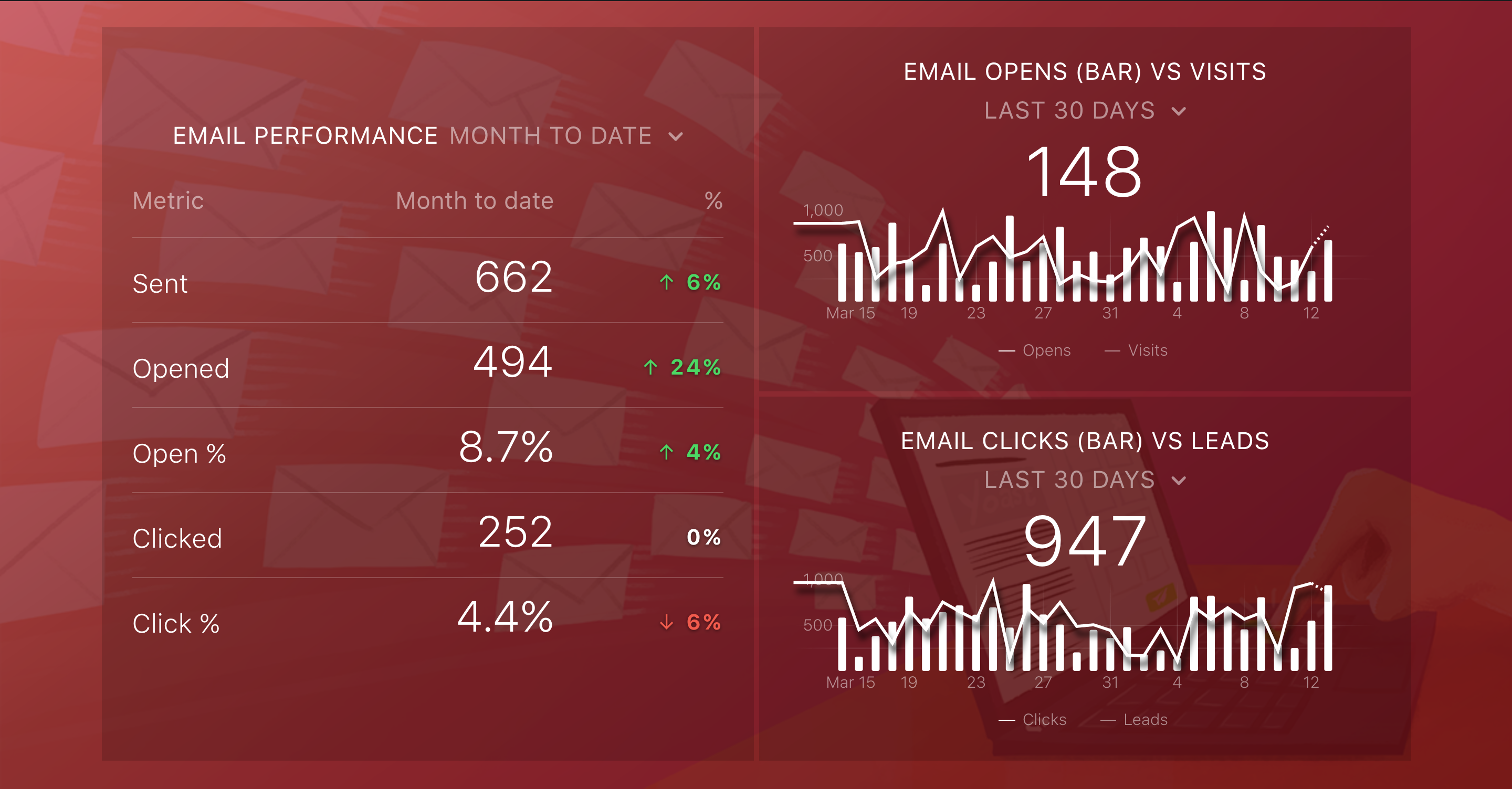
HubSpot Email Performance
Datasource(s): HubSpot Marketing
Benefits: Lets you see how email marketing translates to web traffic and leads.
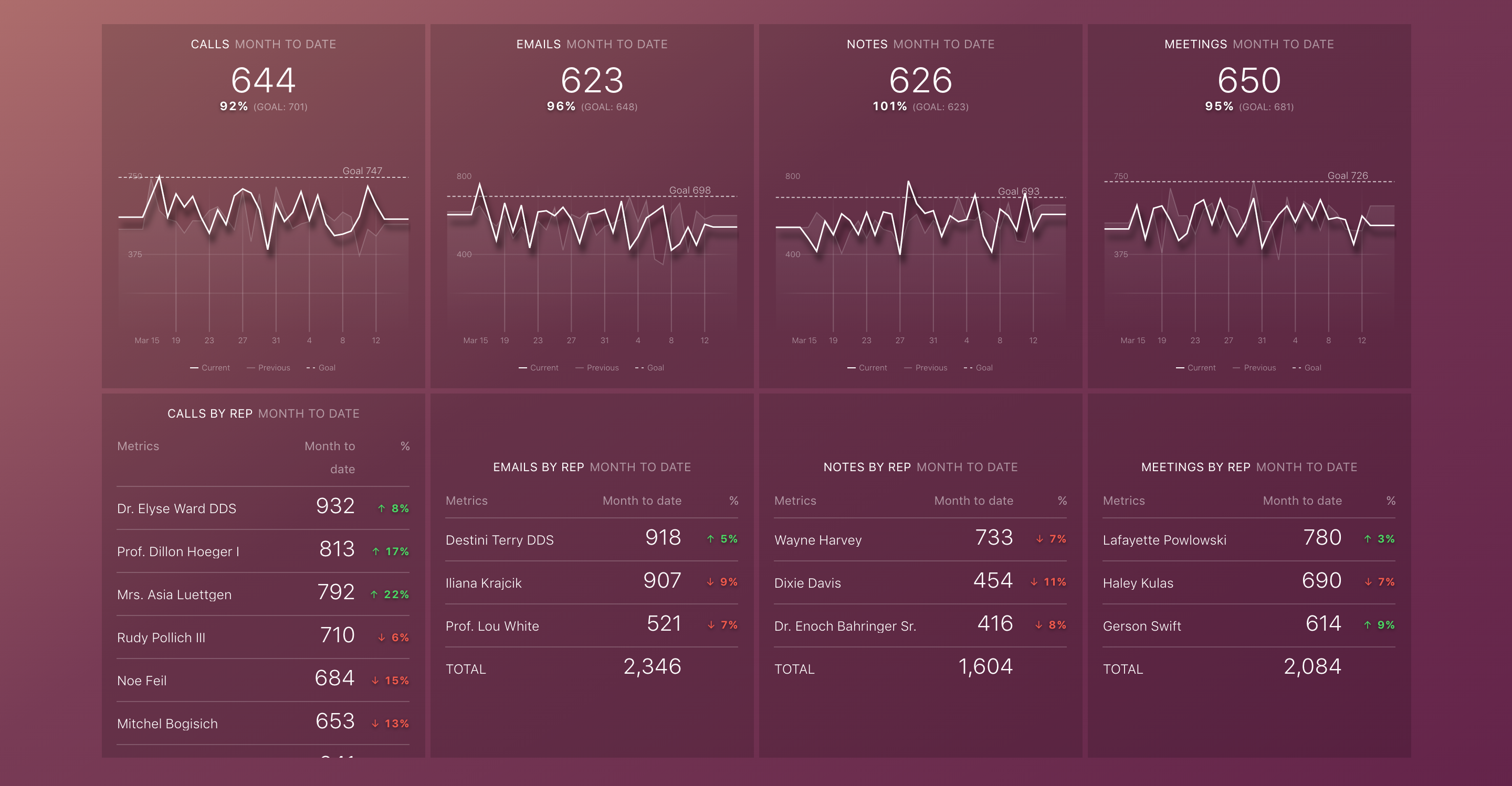
HubSpot (Sales Activity)
Datasource(s): HubSpot CRM
Benefits: tracks every stage of your sales funnel and watches for leaks.
That’s Not All Folks! Here’s All the Data Databox can Pull from Your HubSpot Account
Those are some of the default dashboards Databox has pre-configured for you. With just a few clicks, you can have all of the above Databoards on your mobile, computer, tablet, or TV. But that’s not all…
You can also design custom Datablocks using any of the data Databox is pulling from HubSpot’s Application Programming Interface (API). Below is a complete list of all the data currently being pulled for both the HubSpot marketing and sales products.
HubSpot Marketing Metrics:
| Blog post subscribers total Blog post views Blogs published ˪Top blog posts by CTA clicks ˪ Top blog posts by Click-through rate ˪ Last blog posts ˪ Top blog posts by Pageviews Total blogs published New Contacts (w/o Offline Source) ˪ Contacts by Email Title (by Last updated) ˪ New Contacts by Email Marketing Source ˪ Contacts Lost by Email Campaign ˪ New Contacts by Organic Search Source ˪ New Contacts by Other Source ˪ New Contacts by Paid Search Source ˪ New Contacts by Paid Social Source ˪ New Contacts by Referrals ˪ New Contacts by Social Source ˪ New Contacts by Source Total contacts ˪ Contacts by Static List ˪ Contacts by Smart List New contacts New customers (w/o Offline Source) ˪ New Customers by Email Marketing Source ˪ New Customers by Organic Search Source ˪ New Customers by Other Source ˪ New Customers by Paid Search Source ˪ New Customers by Paid Social Source ˪ New Customers by Referrals ˪ New Customers by Social Source ˪ New Customers by Source New Customers Emails Created Emails Clicked ˪ Emails Clicked by Email Title (by Last update) ˪ Emails Clicked by Email Campaign Emails Delivered ˪ Emails Delivered by Email Title (by Last update) ˪ Emails Delivered by Email Campaign Emails Opened ˪ Emails Opened by Email Title (by Last update) ˪ Emails Opened by Email Campaign Emails Sent ˪ Emails Sent by Email Title (by Last update) ˪ Emails Sent by Email Campaign New Email (Blog) subscribers Inbound links |
Landing Page New Contacts ˪ New Contacts by Landing Page Landing Page Conversion Landing Page Customers ˪ Customers by Landing Page Landing Page Submissions ˪ Submissions by Landing Page Landing Page Views ˪ Views by Landing Page New Leads ˪ New Leads by Email Marketing Source ˪ New Leads by Organic Search Source ˪ New Leads by Other Source ˪ New Leads by Paid Search Source ˪ New Leads by Paid Social Source ˪ New Leads by Referrals ˪ New Leads by Social Source ˪ New Leads by Source New Leads (w/o Offline Source) New MQLs New MQLs (w/o Offline Source) New blog post subscribers New Opportunities ˪ New Opportunities by Email Marketing Source ˪ New Opportunities by Organic Search Source ˪ New Opportunities by Other Source ˪ New Opportunities by Paid Search Source ˪ New Opportunities by Paid Social Source ˪ New Opportunities by Referrals ˪ New Opportunities by Social Source ˪ New Opportunities by Source New Opportunities (w/o Offline Source) Page CTA clicks Page CTA views Page views Total landing pages Total sites New SQLs New SQLs (w/o Offline Source) New Subscribers New Subscribers (w/0 Offline Source) Visitors Visits ˪ Visits by Email Marketing Source ˪ Visits by Organic Search Source ˪ Visits by Other Source ˪ Visits by Paid Search Source ˪ Visits by Paid Social Source ˪ Visits by Referrals ˪ Visits by Social Source ˪ Visits by Source |
HubSpot Sales/CRM Metrics:
| Average Time to Close Deal Calls ˪ Calls by Owner All deals Companies ˪ Companies by Custom Field ˪ Total Revenue by Company New companies by First Conversion Contacts (Marketing) Total contacts (marketing) Deals Created ˪ Deals by Original Source Data 1 ˪ Deals by Original Source Data 2 ˪ Deals by Original Source Type ˪ Closed Won Amount by Owner ˪ Closed Lost by Owner ˪ Closed Won by Owner ˪ All deals by Owner ˪ Deals Created by Custom Field ˪ Closed Won Deals by Deal Name ˪ Deals Created by Owner ˪ Deals by Deal Type (by Create Date) ˪ Latest Deals by Name ˪ Deals Created by Pipeline ˪ Deals by Stage by Create Date ˪ Deals by Stage by Close Date |
New Deals Created Amount ˪Latest Deal Amounts by Name ˪ Open Deals Amount by Stage by Pipeline ˪ Deal Amount by Stage by Create Date ˪ Deal Amount by Stage by Close Date Deals Closed Lost ˪ Deals Lost by Pipeline Open (unclosed) Deals ˪ Open (unclosed) Deals by Owner ˪ Open (unclosed) Deals by Pipeline ˪ Open (unclosed) Deals by Stage by Pipeline Deals Closed Won ˪ Deals Won by Pipeline Deals Closed Won Goal Deals Closed Won Amount ˪ Deals Won Amount by Pipeline Emails logged ˪ Emails logged by Owner Meetings ˪ Meetings by Owner Notes ˪ Notes by Owner Tasks Completed ˪Tasks Completed by Owner |
Don’t see what you’re looking for? Want something else? Please let them know. The Databox engineering team is very responsive.
Make Smarter, Quicker Marketing & Sales Decisions
If you’ve chosen HubSpot as your marketing and sales platform, it means you’ve made the first big step in becoming a data-driven, growth-driven organization. It means you know the importance of not just following the inbound marketing and sales methodologies, but measuring your marketing and sales activities so you can do more of what works and less of what doesn’t.
With the launch of the new Databox+HubSpot connector, Databox is heavily invested (and interested) in helping HubSpot customers like you become even more data-driven. But, it’s not just about viewing the data when you need it and wherever you are. Databox also believes that analytics and analytics tools should be available to everyone in your organization on every screen you use so that everyone can work together to improve your company’s metrics. With quicker and democratized access to current data, this custom dashboard software can make the whole team smarter, quicker decisions.
With Databox and HubSpot, you can spend less time analyzing and more time marketing and selling. Use Databox to adapt your inbound strategy and your HubSpot marketing campaigns in real-time (and with input from your whole team) without the need to click through multiple screens or compile reporting manually.
Sign up for Databox’s free plan to get started.
Not using HubSpot yet? Request a demo of the marketing software or start using the free CRM.


