Table of contents
Growing any business is difficult, but scaling a software as a service (SaaS) company is on a whole other level.
Most SaaS companies struggle to achieve predictable revenue growth, while even public SaaS companies struggle to achieve profitability.
To make a SaaS company successful, you can’t just change your software delivery model to the web and expect it all to work. You have to make thoughtful, data-driven decisions when it comes to your marketing, sales, and customer success operations.
And to make data-driven decisions… you have to track the right SaaS metrics and KPIs.
But with 1,000+ of them available in the various web analytics tools, picking the ones you should zero in on can be difficult.
In this article, we’ll help you narrow down the list and show you the most important SaaS metrics and KPIs you should track.
- SaaS KPIs vs. SaaS Metrics
- Why Is Data so Important for SaaS Businesses?
- Most Important Areas Your SaaS KPIs Should Cover
- Most Important SaaS Metrics and KPIs
- Track and Report on Your SaaS KPIs and Metrics Like a Pro with Databox

SaaS KPIs vs. SaaS Metrics
They sound similar and a lot of people mix them up – but SaaS KPIs and metrics aren’t the same thing.
SaaS KPIs are high-level metrics that are used to assess the overall health of a SaaS business and are directly linked to a business outcome. These KPIs are typically used by executives and management teams to make strategic decisions about the direction of the company.
On the other hand, SaaS metrics are more detailed measurements that help teams to understand how specific aspects of the business are performing. These metrics are typically used by product managers, marketing teams, and customer support teams to optimize specific areas of the organization.
To put it simply, KPIs give a high-level overview of the company’s overall health, while metrics provide more granular insights into specific aspects of the business. KPIs take metrics and mold them into actionable targets.
Why Is Data so Important for SaaS Businesses?
The SaaS economic model is unique.
In comparison to the enterprise software firms that tend to rely on large, upfront fees to get a quick payback, the SaaS business model relies on small amounts of recurring revenues.
And unlike service businesses where you can pay for your new equipment after the first few jobs—or a consulting business with no overhead that can close big upfront contracts from the get-go—revenue in a SaaS business is built one small sale at a time, paid in small increments.
This makes marketing, sales, and customer success a lot more complex for SaaS businesses.
- SaaS marketing is difficult because you need to find ways to find and attract a high volume of quality leads, and then find ways to increase lead volume for years to come—all on a small budget.
- SaaS sales are difficult because you need to find ways to make your salespeople more efficient so they can close more deals more quickly. But every investment you make in productivity increases your payback period even further. And often, you can’t afford to hire experienced salespeople to help you figure it out.
- SaaS customer success is difficult because it’s just another upfront expense you must justify within an already limited budget. But it’s critical because you might not get any payback on your marketing, sales, or customer service if customers cancel before break-even occurs.
Put simply, SaaS organizations can’t rely on traditional strategies. When recurring revenue is the lifeblood of your business, you need to stay on top of data and be able to react promptly to any sort of decline.
What’s more, things move quickly in SaaS companies, and while enrollment is made simple, the same thing can be said about churns.
You need to carefully select the data you’ll prioritize so you can recognize early signals of both positive and negative effects on your company, and understand what to focus on in the upcoming period.
Most Important Areas Your SaaS KPIs Should Cover
Even though no two businesses are alike, the lifeblood departments tend to be the same in each one. This is why it’s important you cover KPIs from each one when measuring the success of your business.
Here are the areas you should focus on:
- Sales and revenue: Some examples of sales KPIs are customer lifetime value, monthly recurring revenue (MRR), and customer acquisition cost. They typically show you how potential customers are progressing through the sales funnel.
- Marketing: Shows whether you’re doing a good job at generating product interest and whether your SaaS marketing campaigns are reaching the right audiences.
- Customer retention and satisfaction: Retaining customers and keeping them satisfied is critical for long-term business success. KPIs in this area may include churn rate and Net Promoter Score (NPS).
- Product usage and engagement: KPIs that help you understand how customers use and engage with your product, which later helps you improve it.
Related: How to Calculate Growth Rates in SaaS: Start with These 12 Growth Metrics
Growth metrics like MRR, churn, and CAC show whether performance is improving, but they don’t explain how to make that growth repeatable. Many SaaS companies experience uneven results because they lack a structured approach to turning strategy into consistent execution. The Predictable Scale course is a free, self-paced program that teaches teams how to define a clear growth strategy, translate it into a practical quarterly plan, align the company around shared priorities, and use data to forecast performance more reliably. Instead of relying on short-term wins, it focuses on building a system that supports steady, measurable progress over time.
18 Most Important SaaS Metrics and KPIs
Now that we’ve laid out some groundwork, let’s check out which SaaS metrics and KPIs you should focus on in your organization.
- Monthly Unique Visitors
- Product Signups
- Product-Qualified Leads (PQLs)
- Qualified Lead Velocity Rate (LVR)
- Organic vs. Paid Traffic ROI
- Viral Coefficient
- Conversion Rate to Customer
- Average Revenue Per Account (ARPA)
- Customer Acquisition Cost (CAC)
- Monthly Recurring Revenue (MRR)
- Number of Support Tickets Created
- Average First Response Time
- Average Resolution Time
- Net Promoter Score (NPS)
- Number of Active Users
- Customer Retention Rate
- Churn Rate
- Customer Lifetime Value (LTV)
PRO TIP: How to Track the Right Metrics for Your SaaS Company
It’s not easy to know which KPIs to track for sales, marketing, and customer success in a SaaS company. There are many possibilities, and so much to do! Why not start with the basic metrics that determine the health of your company?
- Sales (Gross) Volume: How much revenue did your sales team bring in this month, this quarter, or this year?
- MRR Growth: How fast are you growing revenues from recurring subscriptions?
- Customers: How many customers do you have right now?
- Customer Churn Rate: What’s your customer churn rate, and how much revenue have you lost to churn?
If you want to track these in Stripe, you can do it easily by building a plug-and-play dashboard that takes your Stripe customer data and automatically visualizes the right metrics to allow you to monitor your SaaS revenue performance at a glance.
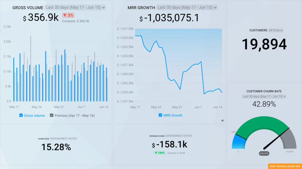
You can easily set it up in just a few clicks – no coding required.
To set up this Stripe dashboard, follow these 3 simple steps:
Step 1: Get the template
Step 2: Connect your Stripe account with Databox.
Step 3: Watch your dashboard populate in seconds.
Monthly Unique Visitors
Monthly unique visitors is a count of the number of unique individuals who visited your website in a given month (New Users). If someone visits your site multiple times, they will only be counted as one unique visitor (assuming the same device and browser is used for each visit and the visitor doesn’t clear their cookies between visits).
While this metric alone doesn’t provide many insights, it’s a great reflection of the size of your audience, and it’s a good measure of the impact of your overall marketing efforts.
Plus, by measuring the volume of unique visitors from each source, you can also measure the effects of marketing on different channels.
You can track this metric in Google Analytics. Here’s what the metric looks like when you visualize it in Databox.

Depending on what insights you want to pull from this metric, you can select between different visualization types.
If you switched to Google Analytics 4, you can track the same metric within the native tool or Databox, but keep in mind that the metric is tracked and measured differently.
In GA, the New users are website visitors who interacted with your site for the first time, while in Google Analytics 4, New Users are visitors who interacted with your site or launched your app for the first time. The metric is strictly measured by the number of new unique user IDs that logged the first_open or first_visit event.
And what is a good number of monthly unique visitors to aim for?
According to Databox’s own Benchmark data, the median value for unique monthly visitors for SaaS companies was 3.03K a month in February. This benchmark was calculated from anonymized data from close to 300 companies.

Are you a SaaS company and want to benchmark your marketing performance, including Sessions, Pageviews, Avg. Session Duration, Bounce Rate, and more, against other companies like yours? Join the benchmark group for free.
Featured SaaS Dashboard template
Download this Google Analytics 4 Acquisitions dashboard to determine where your traffic and visitors come from, monitor user behavior, and analyze how your marketing activities impact product revenue.

Product Signups
Not every SaaS product offers a free trial or a self-service option. Many force you to talk to a salesperson before trying out the software.
But, self-service is perhaps the best way to lower the cost of customer acquisition.
And for self-service SaaS companies, product signups is probably the most important metric. Whether you offer a free trial or a freemium plan, marketing’s goal should be to drive signups.
Here is an example of product signups visualization in Databox.

Our tool of choice for tracking signups is Mixpanel.
There are many ways to increase signups, including writing helpful, educational content for both prospective and existing users and optimizing your website’s conversion rate.
Related: How CoSchedule Increased Trials and Product Signups from Content by 30 Percent
Product-Qualified Leads (PQLs)
Product-qualified leads (PQLS) are potential customers who have used a product and reached pre-defined triggers that showcase a strong potential to become a paying customer.
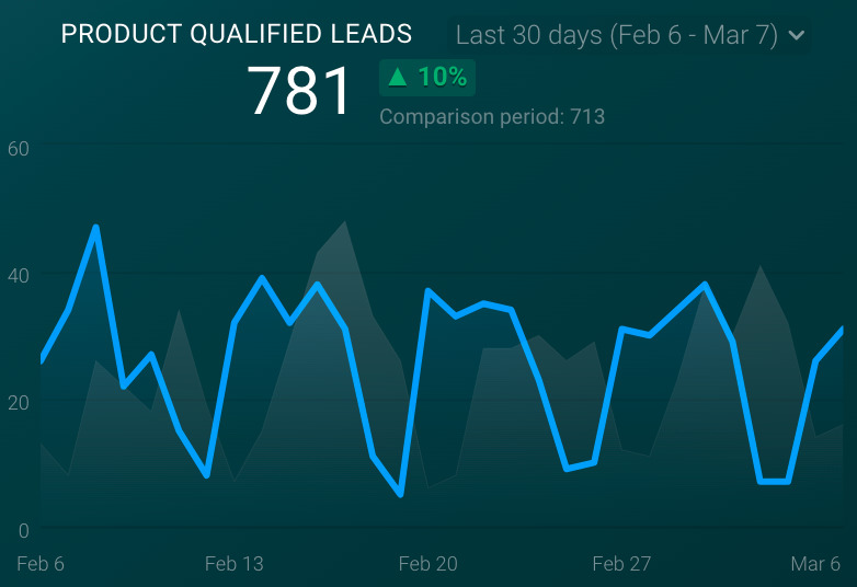
For freemium business models, PQL is the new MQL (marketing-qualified lead). It helps SaaS businesses pre-qualify potential customers based on their product usage.
At Databox, PQLs are one of the most important metrics we track. Our product allows users to connect three data sources, access all standard features, and receive 100+ Databox integrations.
Qualified Lead Velocity Rate (LVR)
Once you’ve documented your PQL (or MQL) data, you need to calculate how many new PQLs you need each month.
After getting your qualified lead-to-customer conversion ratio, work backward from your revenue target to calculate the volume of leads needed.

Plan to increase your lead volume every month so that you’re comfortably hitting your annual revenue target by the end of the year.
Why should you obsess over Lead Velocity Rate? Since it’s just a matter of time before some percentage of your qualified leads convert, LVR is a great indicator of future sales attainment.
To calculate LVR, use the following formula:
LVR = (Current Month’s Qualified Leads – Previous Month’s Qualified Leads) / Previous Month’s Qualified Leads x 100
For example, say you created 1,100 qualified leads this month and 1,000 qualified leads last month. That would mean that you’re growing LVR at 10% month-over-month.
Assuming the quality of your leads stays the same, use your average sales cycle to forecast new sales revenue in future months.
Organic vs. Paid Traffic ROI
Organic traffic metrics include visitors who arrive from a non-paid (organic) listing in the search results. Paid traffic metrics, on the other hand, include visitors who arrived from paid search results like pay-per-click (PPC) ads.

Where you invest your marketing dollars should depend on how quickly you need results and how much money you have:
- If you need immediate results and have the budget for it, paid search is the right place to focus.
- If you don’t need immediate results, focus your time and budget on content creation to steadily grow organic traffic over time.
Of course, if you intend to be in business in the long run, it’s always smart to invest in growing your organic traffic regardless of where you focus your efforts up front.
If you can do both, do both. Don’t waste money, though. Make sure you’re converting your traffic (especially your paid traffic) into revenue.
No matter where you invest, it’s essential to measure the volume of traffic, leads, and customers you are generating from your organic and paid traffic channels.
Featured SaaS dashboard template
This SaaS dashboard compares your direct traffic to your organic traffic to determine the quality of each channel. The dashboard uses data from Universal Analytics, we our customer support team can easily build it for you in Google Analytics 4 as well.

Viral Coefficient
Word-of-mouth marketing cannot be beaten. When your existing customers help you acquire new customers, growth can be exponential.
Perfected by consumer internet companies as early as Hotmail (before it was bought by Microsoft), Airbnb, and Gmail—as well as newer internet software darlings like Dropbox, Slack, and every successful social network ever—virality is every SaaS startup’s dream.

To measure virality, calculate your viral coefficient. The formula is simple:
Viral Coefficient = Invites x Conversion percent
Here, invites stands for the number of invitations the average user sends, whereas the conversion percent is the percentage of invitees that convert to customers.
As an example, a viral coefficient of 1.5 means that every signup brings 0.5 additional signups, so for 100 signups, you actually get 150.
The greater your viral coefficient, the faster your company will grow.
Conversion Rate to Customer
Depending on how you’ve defined your marketing and sales process, you might have different definitions for different types of leads. You might have:
- Subscribers who simply subscribed to your blog
- Leads that filled out a form on your website to download an eBook
- Marketing-qualified leads who fit a strict definition of “fit” and “interest” based on how they’ve interacted with your site and what you know about them and their companies
- Product-qualified leads who are using parts of your free product
Some of you might even use all of these definitions.

You should pay close attention to the number of PQLs who convert to customers but also measure the overall number of new users who convert to customers, too.
Here’s the formula:
Conversion rate to customer = Number of PQLs / Total number of new customers during the same time period
Whatever lead-to-customer conversion rate you measure, make sure you define different lead types and consistently calculate your conversion rates.
Your conversion rate is a benchmark for how good of a job you are doing at turning leads into customers. By increasing your conversion rate to customer, you’re directly increasing your revenue.
Average Revenue per Account (ARPA)
The average revenue per account (ARPA) is a KPI that showcases the revenue generated per account (usually per month as most subscription businesses operate monthly).

But you can always calculate it yearly or quarterly according to your plans and billing options.
A simple way to calculate ARPA is to calculate the total MRR you have at the end of the month and divide it by the number of active customers at that time:
ARPA = MRR / Total Number of Customers
A good practice is measuring ARPA for new and existing customers separately to have a sense of how your ARPA is evolving—or if new customers behave differently than existing ones. Some companies also calculate this as the average sales price (ASP) to separate the impact of upselling from the price at the initial sale.
Customer Acquisition Cost (CAC)
Understanding how much it costs to acquire new customers—and identifying the most profitable marketing and sales channels—is the key to profitably scaling a SaaS business.
To calculate it, divide your total sales and marketing costs by the number of deals closed within a given period. If you’re following an inside, channel, or field sales model, make sure to include salaries. If your product sells itself without salespeople, you can calculate your costs without the headcount costs.

Follow this formula:
CAC = Total Cost of Sales and Marketing / Number of Deals Closed
A viable business model for a SaaS company comes down to balancing two variables – CAC and the ability to monetize these customers (LTV).
In an unbalanced business model, CAC exceeds LTV, whereas in a balanced model, CAC is significantly smaller than LTV.
There are two rough rules of thumb regarding CAC:
- Your LTV should be about three times your CAC for a viable SaaS company—or any other form of recurring revenue model.
- You should recover your CAC in less than 12 months, otherwise, your business will require too much capital to grow.
CAC changes drastically based on the complexity of your selling model. Freemium or self-service business models have CACs between $0 and $200. Light and high-touch inside sales inflate CACs to between $300 and $8,000. With a field sales team, your CAC can go from $20,000 to even up to $200,000.
Monthly Recurring Revenue (MRR)
We’ll say it once more – recurring revenue is the lifeblood of any SaaS business.
Your MRR is a single and consistent number to track no matter how many pricing plans and billing cycles you have.

But how do you calculate MRR?
The easiest way is to summarize all the revenue you receive from your paying customers per month. Another way is to multiply the total number of paying customers by the average revenue per user (ARPU).
For example, say you have five customers.
Three of them are paying $100/month, one is paying $200/month and one is paying $960/year. MRR in this example is $580: (3 x $100) + $200 + $80.
When divided by the number of customers (5), you get the ARPU ($116 in this case).
While that calculation sounds simple (and it is), SaaS companies need to calculate multiple MRR numbers, depending on the complexity of their businesses. For example, all SaaS companies should measure new MRR and churned MRR to calculate net MRR.
If you’ve built a pricing and packaging strategy that enables you to generate additional revenue from existing customers, you should also calculate add-on MRR and factor that into net MRR.
Here’s a list of different MRR numbers you should calculate:
- New MRR added in a given month by only new customers
- Add-on MRR (or expansion MRR) from existing customers (buying additional product features, upgrading the account, adding new users, etc.)
- Churn MRR: the monthly revenue lost from cancellations and downgrades
- Net new MRR (or total new MRR): the total recurring revenue at the end of each given month by including add-ons and churn
Here’s a formula you can use:
Net New MRR = New MRR + Add-on MRR – Churn MRR
If you measure a higher churn MRR than your new MRR, you are likely losing as many customers as you are gaining each month. That is a recipe for going out of business fast.
When your add-on MRR is higher than your churn MRR, that means you’ve figured out how to have positive retention (or negative churn).
Enough of your existing customers are upgrading, countering the revenue lost from the customers who are canceling. In this scenario, the average new customer you acquire will grow your revenue.
Money companies focus more on measuring annual recurring revenue (ARR). As you’d imagine, ARR is the annual value of recurring revenue and is the monthly recurring rate multiplied by 12.
Once you achieve positive retention rates, ARR gives you an estimation of how much revenue you’ll generate in a year, not including customers you’ll likely book during the remainder of the year.
Related: Increasing Monthly Recurring Revenue (MRR) by 10x
Featured Template
This Profitwell dashboard allows you to track revenue from individual plans offered by your SaaS business.

You can browse more SaaS MRR dashboard examples here.
Number of Support Tickets Created
The number of support tickets created is a measure of how many customers are requesting help.
Better than just tracking an absolute number of support tickets, you should keep an eye on the trend of average numbers of daily, weekly, and monthly tickets in case you see an escalation of tickets.

A good practice is to tag tickets by type (bugs, feature requests, questions, suggestions, and others).
If you stay organized with tags, you’ll be able to quickly determine whether there’s a problem, usability issues, or just active customers requesting new capabilities when ticket volumes inevitably spike.
Related: 20 Customer Service Statistics to Help You Deliver a 5-Star Experience
Featured Template
Use this SaaS dashboard template to gain insights into your tickets, productivity, open vs. closed tickets ratio and more. This specific dashboard uses HubSpot Service, but you can easily recreate this dashboard using data from HelpScout or another tool of your choice.

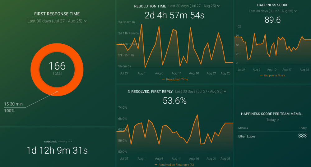
Average First Response Time
Average first response time is the average amount of time it takes for customer support to respond to a case after it’s submitted by a requester (customer).

Here’s how to calculate it:
Average First Response Time = Total of all First Response Times / Number of Cases Opened
Because people don’t like waiting to have their problems solved, the average first reply time correlates with customer satisfaction.
In other words, the lower your average first response time, the more satisfied and engaged your customers will be.
Plan your staffing carefully to scale with your customer count. When SaaS companies are growing quickly, it’s a mistake to underestimate future support ticket volume. When planning your budget, hire and train support people before you need them.
Related: How Databox Helped First Response Grow Sales By 55% Year-over-Year
Average Resolution Time
While responding to users quickly is important, it’s much more critical to resolve their issues quickly.
Average resolution time is the average amount of time it takes your support team to completely resolve or close a ticket.

Average resolution time is a stronger corollary to customer satisfaction and retention than the first response time. After all, it doesn’t matter how quickly you respond to a ticket if you don’t resolve the ticket, too.
Calculate your average resolution time with the following formula (if your software doesn’t calculate it for you):
Average Resolution Time = Total of all Resolution Times / Number of Cases Resolved
Featured SaaS template
This intuitive and customizable HelpScout Customer Support dashboard allows you to track responsiveness and handling time across your support team, as well as other crucial customer support metrics and KPIs.
Net Promoter Score (NPS)
Net Promoter Score (NPS) is the most popular metric to measure customer satisfaction and loyalty.
But don’t just use NPS to measure your customers’ happiness with your products. Customer ratings are also necessary to evaluate your support team’s effectiveness.
Also, it’s smart to measure your NPS after product updates to see which changes triggered a positive or negative response.
The NPS tells us the likelihood of a person recommending a company or its product to someone else.
NPS typically uses the 0-10 scale, where zero means they won’t ever recommend the product and 10 means they definitely would. The higher your NPS the better, as it indicates satisfied users who will likely stay with you over time.

Three categories of people can be distinguished:
- Detractors (respondents giving a 0-6 score)
- Passives (respondents giving a 7 or 8 score)
- Promoters (respondents giving a 9 or 10 score)
Calculating NPS isn’t as simple as averaging the ratings, so it’s best to use specialized software to do it.
Number of Active Users
Active users refer to the number of people that are actively using your product. This metric is a benchmark to determine the health of a SaaS company’s customer base. More usage by more users is a strong sign of a healthy SaaS app.

But since usage patterns and frequency are appropriately different for different companies, there’s no universal measure of “good” versus “bad” usage.
In other words, every company must define the usage that proves user activity:
- Is it certain features?
- Is it certain features used at a certain frequency?
- Must active users use a combination of features to be considered active?
Unfortunately, there are no standard answers; every company is different.
As a best practice, you should define a user as active when they do something from which they have derived undeniable value. For most apps, that means they should do something beyond just logging in before counting them as active.
Furthermore, depending on your business, you might want to define usage differently for your mobile and web apps.
Active users can be measured as daily active users (DAU), weekly active users (WAU), or monthly active users (MAU).
Improvement in these numbers is a good signal that your business is moving in the right direction. These numbers can help you identify the impact of key initiatives, including new marketing channels, sales approaches, and product enhancements.
There’s one last thing we want to address, and that’s the claim that DAU and MAU are vanity metrics.
Some argue that a better indicator of success is retention, which tells you how sticky your product is and how many users return to it after their first experience.
One way to measure stickiness is to divide your daily active users by your monthly active users, as in the formula below:
Stickiness Ratio = DAU / MAU
A DAU/MAU ratio of 50% means your customers return 15 out of 30 days in a month. If it makes sense that using your software should be a daily habit, this is an excellent metric to calculate.
Featured SaaS Dashboard
This easy-to-understand and customizable SaaS Customer Success dashboard allows you to assess the correlation between your customer service performance and churn rate. Easily measure your customer support team’s responsiveness to user concerns in terms of revenue.

Customer Retention Rate
Customer retention rate can be defined as a metric that indicates the proportion of customers that have continued to use your product for a while.
The opposite of retention is churn—also known as customer attrition.

To calculate the customer retention rate at the close of a month, look at repeat orders from repeat customers in the past month and compare these orders to numbers from two months before. Do not count new customers you acquired in the previous month.
For example, if the number of customers who subscribed at the beginning of last month is 200, and the number of customers who continued subscribing at the end of last month is 170, the customer retention rate is 170 ÷ 200, or 85%.
Related: 26 Effective Ways for Improving Your Customer Retention Rate
Churn Rate
The churn rate is the proportion of customers or subscribers who leave during a given time period.
It’s often an indicator of customer dissatisfaction, cheaper and/or better offers from the competition, aggressive and successful marketing from the competition, or reasons outside of your control like business failure or strategy shifts.

Some customer churn is to be expected. But the greater the churn, the more capital is required for the business just to maintain its revenue. Churn can quickly sink a SaaS company.
But what is a good churn rate?
For SaaS companies, a 5-7% annual churn is considered acceptable. SaaS companies that sell to smaller businesses should expect higher churn, while SaaS companies that sell to enterprises should strive for very low customer churn.
According to Databox’s own Benchmark data, the median value for churn for any business type is around 28 customers a month. This benchmark was calculated from anonymized data from a small group of 40 SaaS companies.
Are you a SaaS company and want to benchmark your financial performance metrics from Stripe, including Net MRR, New MRR, New Customers, New Subscriptions, Transactions, Payments, and more, against other companies like yours? Join the benchmark group for free.

Featured SaaS dashboard template
This easy-to-use Stripe dashboard provides you with a holistic view of your SaaS company’s most important financial metrics, including churn, MRR, sales, and other SaaS KPIs that matter to your business.

Customer Lifetime Value (LTV)
Customer lifetime value (LTV) is one of the most important metrics for understanding your customers. It helps you make business decisions about sales, marketing, product development, and customer support.

To calculate customer LTV, you first have to calculate your customer lifetime:
Customer Lifetime = 1 / Customer Churn Rate
For example, if your monthly customer churn is 5%, then your customer lifetime is 20 months (1 / 0.05). If your annual customer churn is 25% your customer lifetime is four years (1 / 0.25).
Once you know your customer lifetime, you can calculate your customer LTV. The simplest formula is:
LTV = ARPA (Average MRR per Account) x Customer Lifetime
For instance, if your ARPA is $100 and the customer lifetime is 20 months, your LTV is $2000.
As you can see, churn has a direct impact on LTV. If you can halve your churn rate, it will double your LTV.
LTV is also important in discovering if a business model for a SaaS company is viable or not. In an out-of-balance business model, CAC exceeds LTV, whereas in a balanced model, CAC is significantly less than LTV.
TIP: Check out other the best SaaS dashboards according to 17 professionals.
Track and Report on Your SaaS KPIs and Metrics Like a Pro with Databox
Steering a business without measurable success indicators is like steering a car in the dark without dashboard lights – you might be going in the right direction, but you have no idea how fast or when you’ll get there.
This is especially the case in SaaS businesses – here, your ability to stay on top of key KPIs and metrics, understanding the nuances of metrics vs KPIs, will determine your growth and success.
And for the longest time, businesses have struggled to keep up with their data due to the complex process behind data collection and analysis.
The main culprit behind this? Manual reporting instead of automated data dashboards.
That’s where Databox steps in.
With Databox, you can get better data insights without spending countless hours doing each step manually.
We have 4,000+ metrics, 130+ integrations, and 100+ templates in our platform, helping you build professional and understandable dashboards in a matter of minutes.
With drag-and-drop functionality, all you have to do is connect your data source and cherrypick the metrics you want to include. Then, you can visualize those metrics with a click of a button to provide more context to some of the dry numbers.
Sign up for a free trial and get actionable data insights in minutes rather than days.