for Any Audience: Process, Principles, Layouts, Best Practices, Examples and More")
Table of contents
One of the main ingredients of a successful company is great decision-making.
While the C-level executives and shareholders are knowledgeable about most of the company’s operations, they don’t have enough time to get into the details of each individual department.
This is why we use business dashboards.
Dashboards are the most powerful way to present valuable findings and key metrics, and better explain them through the use of data visualization techniques.
To be fair, designing a dashboard is hard work, but you don’t need to be a designer to create a great dashboard.
So, how can you pull it off?
We asked 30 experts to share some of their best practices, common mistakes, and overall dashboard designing knowledge to help you streamline the process.
Let’s dive in.
- What Are the Most Common Dashboard Components?
- Who Is in Charge of Designing Business Dashboards?
- Most Demanding Audience to Design Dashboards for
- Key Characteristics of Great Dashboards
- Tailor-Made Dashboards vs Templates
- Dashboard Design Best Practices
- 5 Dashboard Design Mistakes You Should Avoid
- Dashboard Software vs. Multiple Analytics Tools
- Design a Superb Dashboard in Databox for Free

What Are the Most Common Dashboard Components?
Dashboards are probably the best way to organize abundant sets of data in a company, regardless of its size.
They provide employees with quick access to important metrics, simplify complex data, and help explain the overall story behind the data.
This is why the vast majority of companies tend to incorporate dashboards nowadays.
In our research, all respondents are dashboard users: 77% of them have been actively creating and using dashboards for some time and 23% have just started.
At the same time, 67% of respondents are B2C Services or Products, 23% are B2B Services or Products and 10% are Agencies or consultants in the Marketing, Digital, or Media space.
Depending on which department you are creating it for, the dashboard design will significantly vary.
However, even though the prioritized metrics and KPIs will be different, there are some components that are simply indispensable, no matter what type of dashboard you are building.
These dashboard components are:
Data Sources
Information usually comes from a few different sources. To know which data sources to focus on, the designer should always consult the clients or shareholders.
KPIs and Metrics
The KPIs and metrics that you include is what makes or breaks the dashboard. Always focus on filtering out the most important ones and focusing on them. Don’t confuse the audience with any unnecessary information.
Data Visualization Tools
Including visualization tools to better display the important data is a great way to add a professional tone to the dashboard. These tools can be anything from charts and graphs to interesting maps.
When it comes to visualization features, you have to be careful not to overdo it. According to our survey, an average dashboard has 4 to 6 charts in most companies.

Filters
For a better UX design, you should use filters. Not only do filters provide users with more control over the information, but they also allow them to quickly grasp any important metrics by setting up data ranges, regions, or departments.
Here is what Daniel Foley of MCS Rental Software had to say about the importance of filters.
“When I add filters straight to a dashboard, I keep them all in one place so the user can discover them quickly. I choose spots where it adds to the dashboard without detracting from the overall message. Users may easily access filters by placing them at the top, right, or left of the dashboard, while the visualizations remain the primary emphasis.
Using visualizations as filters are my personal favorite. It gives the user a fun, participatory experience, in my opinion. They can design and navigate their own data journeys, as well as delve deeper into the dataset. If you have a pie chart, for example, a user may choose a slice and all the visualizations on the dashboard will change to reflect that subset of data.”
Related: The 7 Most Important Google Analytics Filters for Marketers
Navigation
Lastly, adding a simple navigation menu in the dashboard can go a long way in making the data more accessible and easier to obtain.
In general, the best practice is to focus on 5 or 6 components that you think will be the most useful to the viewers.
Who Is in Charge of Designing Business Dashboards?
Creating a business dashboard isn’t a one-man job (or at least it shouldn’t be). In these projects, there should be multiple people contributing to make it a success.
While the vast majority of companies have different practices and different people in charge of designing the dashboard, this job should optimally be handled by dashboard designers.
Dashboard designers are the ones responsible for designing the dashboard and managing the overall project. Some of the things they do include metric calculation, defining the shareholders’ ideas, chart determination, getting approval from the point person, and ultimately building the dashboard.
Since designers are most often faced with large data sets, they usually have to talk to a point person or some of the internal shareholders to pinpoint which metrics they should prioritize.
However, in lots of companies, designing dashboards tends to fall into the lap of other people, such as marketing and brand managers.
While a marketing manager’s primary job is to work on promoting the business and its products, it’s not uncommon for them to manage dashboard design as well.
Just a shy of 50% of the surveyed companies have marketing managers designing dashboards, and only 17% of the people we surveyed actually have designers in charge of designing dashboards. Only 13% of companies surveyed use prebuilt dashboard templates. And lastly, dashboard software customer support designs dashboards for only 10% of the respondents.

Most Demanding Audience to Design Dashboards For
‘Consider your audience’ is undoubtedly one of the most important practices when it comes to designing dashboards.
However, creating a dashboard that will knock the viewers’ socks off is far from easy, especially if you are dealing with an audience that has a vast amount of knowledge regarding the topic in question.
According to our survey, companies find top management the most demanding audience to design dashboards for, with C-Level executives (e.g. CEO, CMO) being ranked as the most demanding. This is further followed by Investors and/or creditors, and boards.
When asked to explain why this is the case – most often, the reason was that their level of knowledge and understanding is high, and so are their expectations.

Let’s check out their exact thoughts.
C-Level Executives
C-level executives have proven to be the hardest audience to impress.
This is because they tend to have the highest level of understanding regarding the topic, which leads to bigger demands.
“The level of understanding of C-Level executives is second to none. However, with that high level of understanding comes increased demands. They understand the subjects you’re presenting well enough to pinpoint even the slightest oddities,” explains Cristina Cason of Texas Family Home Buyers.
Ava Martin of Quality Water Lab shares this opinion, “My most demanding audience is C-level executives when it comes to creating a dashboard design. That’s because everything needs to be concise and organized, which makes it difficult. These executives want to see the big picture that is better represented by visuals and charts. So, I aim to summarize the data on a single dashboard with stats and figures.”
Daniel Foley of MCS Rental Software adds, “A CEO dashboard displays high-level KPIs and metrics at a glance, allowing executives to track business performance and make data-driven choices. Many executives devote a significant amount of time to running reports on portals, programs, spreadsheets, CRMs, and website analytics. Data silos might result from this reliance on several data sources. There is no single source of truth when data silos exist, and data can soon become outdated, resulting in false intelligence or insights. That is why, in my opinion, CEOs are the most demanding audience for dashboard design.”
Maria McDowell of EasySearchPeople says that even though dashboards for C-level execs are more complex, they are still fairly simple to use.
“I used to work at a company that designed dashboards for a large e-commerce client. Their primary audience was the marketing manager. I have worked on dashboards for a number of different products and industries, so it’s interesting to see how the information is laid out differently depending on the user. The marketing managers’ dashboards were specifically designed to show the performance of each product. They had to be able to look at the dashboard, get a quick understanding of how the product was doing, and make decisions based on that data. Their dashboards were a bit more complex than some of the others I have seen, but they were still pretty easy to use. They were easy to read and I found that most of the data and charts were easy to understand at a glance.”
Investors and Creditors
While C-level execs won the ‘most demanding audience’ contest, investors and creditors finished the race as runner-ups.
This is because they aren’t familiar with all the metrics and KPIs that lead to specific insights, so you have to make sure that nothing in the dashboard is misleading.
James Chapman of Bella Bathrooms says, “Investors and/or creditors do not need the nitty-gritty detail of the business. When designing an overview you have to ensure that they aren’t misleading as some data is reliant on other metrics to provide a clear understanding to the audience.”
Related: Reporting to Investors: 6 Best Practices to Help Increase Funding
Dedicated Teams
Some of our respondents picked out dedicated teams as their most demanding dashboard audience.
Andy Kolodgie of Sell My House Fast explains this, “Dedicated teams are the most demanding when it comes to designing a dashboard. They are usually very experienced and have very particular requirements regarding their dashboard.
They know the audience they are targeting, and have predetermined goals and relevant KPIs to measure those goals. Most of our other clients do not have such extensive knowledge or understanding of dashboard designs, but when dealing with dedicated teams, we conduct thorough research before we pitch them our design ideas.”
Related: Reporting Strategy for Multiple Audiences: 6 Tips for Getting Started
Key Characteristics of Great Dashboards
Telling apart a great dashboard from a decent one can sometimes be a bit confusing.
For instance, the visual design of the dashboard may be spectacular, but when you take a closer look, you realize that the data isn’t presented very clearly and the information is far too complex.
Conversely, the data might be simplified very well and there are tons of valuable insights that viewers can acquire, but the design looks like a complete eye sore.
To create a great dashboard, you need to include the best of both worlds.
Here are some of the key characteristics of great dashboards:
- Information is easily accessible
- The data is displayed clearly and efficiently
- They showcase historical data trends and changes
- There is a visual hierarchy that displays data in one screen
- They are easily customizable
- Everything is one click away
- They include filters that allow viewers to customize the way in which information is displayed
- There is a reasonable amount of visual tools (charts, tables, forms, etc.)
- KPIs and metrics are prioritized
To be fair, keeping track of all this can often be a bit overwhelming, which is why a large number of businesses find different ways to streamline the designing process.
When designing dashboards, most of the companies stick to brand guidelines (or any other similar doc).
And, while data should be prioritized, it’s extremely important to also pay attention to how it’s presented.
For our respondents’ audiences, the way data is represented is equally (or more) important than the data itself.
The companies we have surveyed are also paying a lot of attention to avoiding any chartjunk when designing dashboards, always strive to maximize the ratio of “data to ink” and always tend to simplify their data visualization.
Most respondents said that the key to a good dashboard design is simplicity (take it easy with colors and pay attention to layouts).

Related: Dashboard Design Ideas: 7 Design Challenges Experts Faced and Tips to Overcome Them
Tailor-Made Business Dashboards vs. Dashboard Templates
When creating a business dashboard, you can either use dashboard templates or build custom dashboards from scratch.
To help you make the right choice between the two, let’s review the benefits of both.
Custom dashboard benefits:
- Customization – When building a dashboard from scratch, you can meet the exact expectations of your target audience and present the data in a way you believe is best.
- Tailor-made visuals – With custom dashboards, you have complete control over how you will create the charts, graphs, and other visuals. It’s also much easier to set up the visualizations to display different important factors like data ranges or data type filters.
- Integrative – You can set up customized dashboards to operate on different software programs.
- Improves team collaboration – Creating a dashboard from scratch typically requires getting help from other employees, which can have a positive impact on overall team collaboration.
- More options – Custom dashboards provide you with a lot more room to get granular and better explain the data. With dashboard templates, you will be limited to the options that are already included.
Dashboard template benefits:
- Time-saving – One of the main advantages of dashboard templates is that they can help you save up a ton of valuable time. Designing custom dashboards can sometimes take even hours, while with dashboard templates, the process can literally be done in a matter of minutes.
- Anyone can do it – Creating a dashboard from scratch often requires extensive designing knowledge, which isn’t the case with templates. Everything is already laid out, you just have to apply your specific data.
- Set up visuals in a few clicks – Setting up visual tools and adjusting them is not only time-consuming, but it can also be very complex. With templates, you can customize them in just a few clicks.
- Reduced stress – Worried about whether you will be able to create a custom dashboard in time for the next meeting? Dashboard templates eliminate these worries.
As you can see, custom dashboards and dashboard templates have different sets of advantages, and you should make your choice depending on your and your company’s preferences.
In our research, over 60% of the surveyed companies prefer designing their own dashboards (to sticking to dashboard templates, which is a preferred way for 30% of the companies).

No matter what you choose, Databox can be an efficient solution for both custom dashboards and dashboard templates.
If you are looking for a dashboard template that will help you streamline the reporting process, we have over 300 examples and templates in our gallery that you can download for free.
All you need to do is choose one, connect your data, and the metric visualization along with your data will be automatically populated.
However, if you want to get a bit more granular and design your dashboard from scratch, you can use our custom dashboard designer.
With Databox, designing dashboards has never been easier.
PRO TIP: Need Help Building a Custom Dashboard?
Not sure which metrics to track or dashboards to build? Have old reports you want to recreate in Databox? Share your dashboard needs with one of Databox’s product experts and we’ll build you a customized dashboard for free.
Here is an example of what your dashboard can look like… (just imagine your data populating here)

And here’s another one…

We get it. You may not have the time to build out the perfect dashboard before your next meeting.
But luckily, we do.
Connect with someone on our team, share the metrics or areas that you need to track, and we’ll build your dashboards for you in just 24 hours.
Learn more about our free dashboard setup here, reach out for assistance via email or chat, or book a call.
Dashboard Design Best Practices
Okay, so we have gone over some of the basics regarding the dashboard design process, which means you are ‘half-way’ ready to start building your business dashboard.
Now, it’s time to check out some of the dashboard design best practices that the leading companies in the world stick to in their business. Pay attention to each one because this is the most important part.
- Set a Goal
- Consider Your Readers
- Filter Out the Most Important Metrics and KPIs
- Choose the Right Type of Dashboard
- Pick the Layout
- Prepare a Plan
- Simplicity is Key
- Tell a Story with the Data
- Provide Context to the Numbers
- Group Related Data
- Don’t Go Crazy with Colors
- Use Clear Labels
- Balance the White Space
- Use Size and Position to Display Hierarchy
- Add Animation Features
- Data Ink Ratio
- Give Users Control through Responsive Dashboards
- Optimize for Different Devices
- Preserve Graphical Integrity
- Break the Rules Occasionally
- Get Feedback
Set a Goal
Before you go into any nitty-gritty details, you first have to establish the overall goal you will try to achieve with the dashboard.
What is the purpose? Who will need it the most? What are you trying to show with the dashboard?
These are just some of the questions you’ll have to answer.
Each dashboard serves a different purpose, from directing your team’s focus to a specific objective to making sure everyone is informed on a certain issue.
After you set a goal for the dashboard, choosing the metrics and KPIs you will include becomes a whole lot easier.
Consider Your Readers
Many of the world’s most successful designers would argue that the audience is the most important factor to consider when designing a dashboard.
You have to know exactly who will be using the dashboard and for what purpose. This is the only way you can create a dashboard that will truly make a difference in the company.
The best way to do this is to put yourself in the shoes of the readers.
What device will the audience use to view the dashboard? Will they see it out of the comfort of their office or will the dashboard be displayed in front of a larger audience?
All of these things are significant puzzle pieces that you need to put together to get the bigger picture.
Additionally, you should always remember that your audience isn’t interested in reading any overwhelming data analyses, doing calculations on their own, and that they won’t be impressed with any ‘fancy’ visualization features.
Keep everything simple and approachable, and communicate your valuable findings in the clearest way possible.
Filter Out the Most Important Metrics and KPIs
To make the most out of your dashboard design, it’s crucial that you select only the most important KPIs and metrics to include.
This filtering process usually comes after you’ve determined the objective you want to reach with the dashboard.
Once you know which KPIs are the most significant and will be of most use to the readers, you will also have a clearer idea on which way the dashboard should go.
Remember, each inch of the dashboard is valuable, so adding any type of unnecessary information (no matter how small) will have a negative impact on the overall design. If there seems to be too much valuable data, then you might need more than one dashboard.
Our recommendation is to use 5 to 8 metrics to convey your point. For example, this GA acquisition dashboard uses 8 metrics to help you dig deeper into your traffic sources. Some of the things you can identify with this dashboard are your top-performing campaigns, keywords (paid and organic), bounce rate etc.

Choose the Right Type of Dashboard
Depending on the business-based activity, you should also consider which type of dashboard you need to design.
When deciding, you should factor in things such as the audience, the overall goal, and the analytical purpose.
The 4 main types of business dashboards are:
- Strategic – Used for tracking long-term business strategies by analyzing the most significant trend-based data.
- Operational – This dashboard focuses on monitoring and managing the operations that have a shorter time frame.
- Analytical – Include a wealthy amount of extensive data that analysts can use to extract valuable insights.
- Tactical – These dashboards are generally the most analytical and they are best suited for mid-level management. Tactical dashboards help the company create strategies based on recent trends and each department’s strengths/weaknesses.
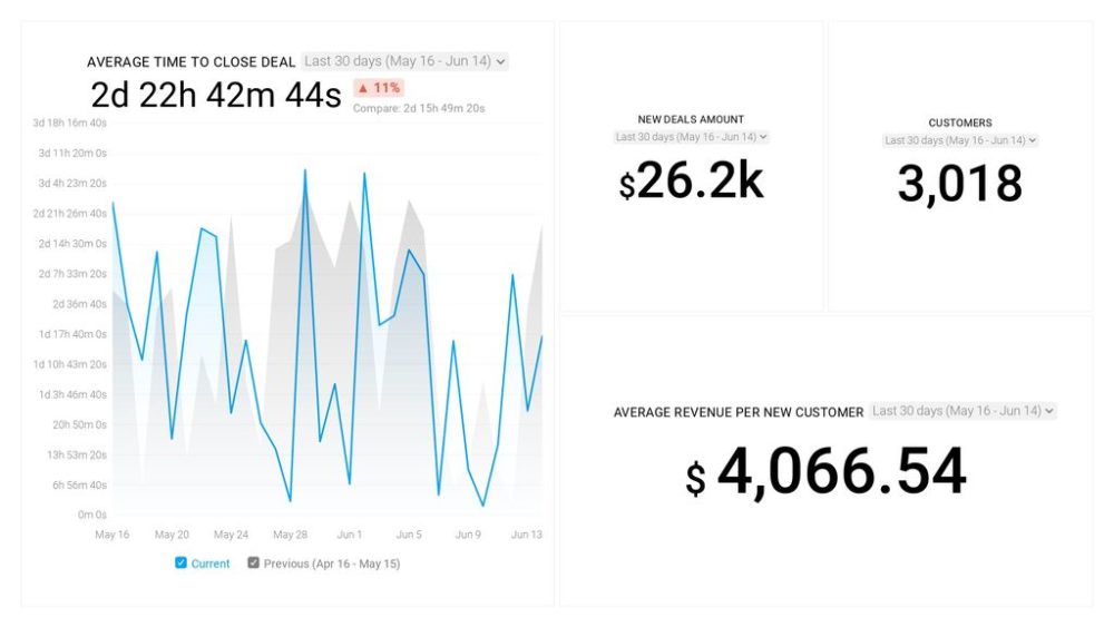
Here is an example of a sales analytics dashboard. This HubSpot’s sales analytics dashboard includes metrics like average revenue per new client or average time to close the deal that helps the viewers extract valuable information, such as:
- What kinds of deals are you successfully closing?
- Will you reach your goals if you continue closing these types of deals?
- Does the time it takes to close a deal seem appropriate when compared to the amount of revenue from each deal?
Pick the Layout
An efficient dashboard design isn’t just a combination of valuable data and insightful charts, it also relies heavily on the visual organization and information placement.
While you might have some extremely valuable insights within the dashboard, they won’t be of much use if the viewers can’t find them quickly when needed.
This is why the layout is a big deal, you don’t want the audience struggling to understand the point and searching for information in tons of different charts and numbers.
The rule of thumb is to present the key data first, somewhere at the upper left corner of the dashboard.
Why there? The answer lies in science.
Since the vast majority of cultures read from left to right and top to bottom, your audience will intuitively look at this part of the dashboard first.
One more great practice is to also start with the most important trends and then move on to the more detailed charts and graphs.
For example, if you are looking for a dashbard to track the activity of your sales team, you should present the totals (like number of meetings booked, calls logged, and emails sent) in the top right corner, and then show a breakdown of each metric by sales rep. Positioned this way, you get an instant snapshot of your top-of-funnel sales goals, and most important activities conducted by your sales reps.

Prepare a Plan
We already talked about considering your audience and setting a goal for the dashboard, but those are just parts of the overall plan.
Once you have that information, designed a specific layout, and chosen a dashboard type, it can be very useful to put all of that on a piece of paper, just so you don’t get lost during the process.
This is what the process looks like in one of the companies we surveyed.
“Great dashboards are clear, interactive, and user-friendly. We begin by defining our stakeholders, determining their decisions, and then deciding on the metrics that would support them. We then prototype dashboards using pen and paper.
Next, we get feedback and iterate:
- Requirement gathering
- Ideation
- Extract, Transform & Load Your Data
- Dashboard build
- Testing and QA
- Documentation
- Launch, Adoption & BAU,”
Johnson Robert of My Wood Rings said.
Simplicity is Key
Many people make the mistake of thinking that their dashboard has to be this fancy representation of large sets of data and numbers, alongside dozens of colorful charts.
This is the completely wrong approach.
You might think that the highest-ranking members of the company aren’t impressed by “simple”, but actually, that’s exactly what they are looking for.
If you are able to convey your findings quickly and efficiently, all whilst having a few solid charts and graphs to visualize the data, you will leave an incredible impression on the audience.
Sure, frames, effects, and various backgrounds might look exciting, but they aren’t always useful, so carefully pick out the right time to use them.
Don’t waste valuable dashboard space, pay attention to the font, and be picky with the labels.
Most importantly, don’t overdo anything – keep the dashboard concise, clear, and on point. This does wonders for the presentation.
Here is a tip from Maria McDowell of EasySearchPeople related to dashboard presentation.
“In my experience, I have learned that there are three key factors in dashboard design:
- Presentation. The presentation of the dashboard needs to be appealing, representing the company in a positive light, as well as being responsive to the viewer.
- Readability. If a viewer has to squint to see the information, or if a font is too small, then it may detract from the overall experience, which is why readability is key.
- Function. A functional dashboard will change the information depending on the needs of the viewer, and it will provide an easy-to-understand display of information, which is why I believe that those three factors are most important.”
Tell a Story with the Data
Let’s face it – data and numbers just aren’t that interesting. Not to you, and not to the readers.
How can you fix this? By telling a story with the data.
While this may sound a bit complicated, it’s actually not that hard to master the art of dashboard storytelling.
This includes presenting your data in a way so the readers can quickly and easily grasp your most important messages and findings.
The most common way of doing this is through data visualization. By displaying the entire narrative of the data analysis process, the readers will have a much easier time understanding the numbers and coming up with future strategies.
“The process of telling a story with data has proved to be the best in dashboard design. It helps us to present information in a way that portrays the entire narrative of the data-gathering process to understand the goals and strategies of the business. This is called dashboard storytelling,” Anthony Minniti of Texas Land and Home opines.
Kevin Callahan of Flatline Van Co agrees with this, “One best process throughout our dashboard design has been telling a story with our data. Using data-driven narratives, our design team members become storytellers in a visual medium. From those narratives, our messages are conveyed in the clearest way possible.”
For example, if you want to tell the story of how well your efforts have paid off over the past X months or years, you want to use a single metric performance over time, like here.

Provide Context to the Numbers
No matter what type of dashboard you are designing, it’s bound to be filled with lots of numbers.
If you don’t add any kind of context to these numbers, then the chances of your audience understanding them is slim to none.
For instance, let’s say you wrote that there were 128 total sales in the previous month. Without proper context, the vast majority of the readers won’t know whether that number is good or bad.
This is why it’s a great practice to include historical data and previous highs/lows.
Even though the meaning of the number might be fairly obvious to you, without any comparison, the audience won’t be able to do much with the information.
Another great piece of advice is to also add warnings next to specific metrics that have been underperforming, so everyone will notice the problem easier.

Group Related Data
For better understanding, it’s very important that the information in the dashboard is presented logically.
This is why recommend that you group all of your related metrics and KPIs next to each other since it will allow the users to find them more easily.
Plus, it makes the design much more appealing.
You can group related data by product, campaign, brand, region, department, etc. Try out different things until you find the most appropriate solution.
Here is an example of a dashboard that groups related data to show the overall SEO performance of a website. By analyzing multiple metrics that contribute to overall performance you can pinpoint potential problems and identify key influences in overall performance.

Don’t Go Crazy with Colors
This is one of the most important practices when it comes to dashboard design.
The days of rainbow-colored PowerPoint presentations are long past us. Nowadays, minimalistic dashboards are the hottest trend.
When picking out the colors, it’s crucial that you stay consistent with them and only choose two or three main ones for the dashboard.
Also, try to avoid using any intense colors. While they can draw the reader’s attention to some specific data, overdoing it can leave the audience feeling overwhelmed.
Your best option is to stick to neutral colors and stay consistent with them throughout the entire dashboard.
“For a dashboard to be considered superior, it must meet a set of specific UX criteria, such as clear and consistent naming conventions, the flow and layout of prioritized data, appropriate margins for readability, and balanced data avoiding overloading. Choosing a balanced color theme for the layout of the dashboard has proved best for us. We don’t recommend using every color in the rainbow, coloring can be confusing.
Also, avoid colors that are too similar. If you are using shades of the same color, make sure they are different enough so that you can quickly distinguish the data. When our dashboard was in the design process, we used very sharp colors with a notion to grab users’ attention. But feedback revealed that these sharp colors are creating confusion for users. We revamped everything to balance out with a more professional color scheme. We used mild and different colors to highlight different aspects. This worked great, and we got very positive feedback,” Ronald Williams of BestPeopleFinder advises.
Use Clear Labels
Labels are an indispensable part of modern dashboards, they are used for describing each specific metric or visual tool.
They should be concise and equivocal, but also as short as possible since you don’t want them taking up too much valuable board space.
You can even use abbreviations if your viewers understand them (e.g. “3w” instead of “3 weeks”). Symbols such as “%” or “&” can be used instead of words.
If you have the same metrics for different time frames, you can put them all in one heading to avoid repetition.
Balance the White Space
This is probably the subtlest design tip and it involves balancing out the white space in the dashboard. White space (aka negative space) is the blank area between the dashboard elements.
While the readers usually don’t understand how significant of a role available space plays in a visual hierarchy, designers know its importance all too well.
This is because if the data, stats, insights, and charts aren’t balanced, they become an eye sore for the viewers.
Balancing out the white space essentially means doubling the margins that surround the dashboard’s primary elements, making sure that each element has enough white space around it.
Use Size and Position to Display Hierarchy
Data hierarchy isn’t something to be taken lightly during the designing process.
One of the best ways to display the hierarchy and highlight the most significant information is by taking advantage of size and position.
Conversely, you can also use them to downplay certain metrics that aren’t as important.
This will help you develop clear patterns and a professional visual flow that will help the viewers grasp the information better.
Here is an example of a dashboard that follows this design principle.

Add Animation Features
To make the dashboard a bit more interactive, you can consider adding animation features. This refers to assigning an animation to a specific dashboard element.
By doing this, the element will automatically move based on the speed and animation type that you set up.
This is pretty common among modern dashboards since it allows you to capture the viewer’s attention a lot easier. Every time you open a certain tab or refresh the dashboard, the animation will be triggered.
However, following our previous practice ‘simplicity is key’, make sure you don’t overuse the animation features.
Data Ink Ratio
Have you ever heard about the data ink ratio?
The term was coined by a famous statistician Edward Tufte, and it refers to minimizing the amount of visual noise in tools to better convey the message.
In essence, it means that designers should think about whether all the chart elements are necessary for conveying a certain finding.
As it turns out, the most successful dashboards typically include the least amount of non-data ink, which means they have a solid data-ink ratio.
This means that you should focus on removing any grid lines, icons, colors, and anything else that might be getting in the way of data presentation.
That includes removing unnecessary grid lines, icons, colors, labels, or anything else that doesn’t actually communicate data. Dashboards with a poor data-ink ratio can be hard on the user’s eyes because the non-data ink is distracting and gets in the way.
Give Users Control Through Responsive Dashboards
Making your dashboard responsive provides the audience with control in picking out which data they want to focus on.
Just make sure that the design is a clear UI that’s simple to comprehend.
Sometimes, data visualization can be very tiresome and the elements only wound up confusing the viewers. This is why giving them control over the dashboard is such a great solution.
Optimize for Different Devices
Unless there is some specific reason to hold an office meeting, most of your team would probably rather access the dashboard remotely through their mobile phone or tablet.
This allows them to take a look at the most valuable insights and answer important business questions on the move, enhancing swift decision-making.
Because of this, it’s important that you optimize the dashboard so it can be opened on these different devices.
Naturally, the dashboard layout won’t be the same on a desktop computer and on a mobile phone. Since mobile devices have much smaller screens, the elements will be placed a lot differently.
Also, the level of analysis can’t be as thorough on mobile devices due to the lack of space, which is why you should focus on adding only the most critical data.
Preserve Graphical Integrity
This might seem fairly obvious, but it’s important to mention – always preserve graphical integrity, it’s one of the most significant design trends.
What we mean by graphical integrity is essentially staying true to the data.
Make sure you are completely objective about the values and don’t look for ways to present them so that they benefit the analysis (if they don’t).
Anything that can lead to data misinterpretation should be entirely avoided.
Break the Rules Occasionally
We have covered dozens of different rules that you should stick to when designing a dashboard. However, rules are sometimes meant to be broken.
Efficiently presenting the data and creating impressive visuals is important, no doubt, but dashboard design is much more than just that.
Overall, your main goal is to make the viewers engage with the data. And occasionally, you will have to break a few rules to make that happen.
So, if you feel like adding a humorous GIF to the dashboard, don’t hesitate because it’s not in the rule book. Just make sure you don’t overdo it.
No matter if you’re dashboard is a success or not, you should always ask your team for feedback.
Some of the questions you can ask are:
Get Feedback
- Which part of the dashboard do they find the most useful?
- Which part of the dashboard do they find the least useful?
- Do you think there’s anything missing that could’ve been useful?
- Has the dashboard made their work easier?
Be sure to always implement the feedback and advice you get.
Even if the team was impressed with the dashboard design, that doesn’t mean there isn’t room for improvement in the future.
Every once in a while, you should take a step back from the dashboard and take a look at how the elements are communicating your message.
Remember, the best designers never stop evolving their skills, especially since trends are constantly changing in the digital world.
5 Dashboard Design Mistakes You Should Avoid
We have covered some of the best practices you should keep in mind when designing a dashboard, but what about the mistakes?
Mistakes can be just as equally important as practices, and knowing which ones to avoid can go a long way in making your dashboard more efficient.
Without further ado, let’s take a look at some of the biggest dashboard design mistakes our respondents pointed out.
- Using Too Many Colors
- Unintuitive Arrangement
- Data without Context
- Including Less Relevant Details
- Going Overboard with Interactivity
Using Too Many Colors
In our survey, including too many colors is the most mentioned dashboard design mistake.
For best results, we recommend that you pick out 2-3 neutral colors and stay consistent with them throughout the entire dashboard. You are designing a tool to provide valuable insights, not a rainbow.
“There is a lot that I tend to take into my own hands, especially when it concerns customer and employee management systems, as it helps me stay on top of things. One such instance was when I was getting into designing an appropriate dashboard for gaining better insights into customer behavior. Since I had no prior experience, I was more drawn toward the cool colorful interactive things like a child in a candy shop. In that process, I lost sight of my purpose and created a more appropriate dashboard for a tech-savvy individual,” Sameera Sullivan said.
Unintuitive Arrangement
Facing an overload of information is actually quite common among dashboard designers, especially beginner ones.
This occurs when you don’t do a great job of filtering out the most important data, which leads to the dashboard having much more information than it can withstand in a single visualization.
Luke Lee of PalaLeather shares that, “The biggest mistake we had was mindlessly placing and arranging data into our dashboard, with data that are unrelated and does not flow well. Dashboards have very valuable real estate. As much as possible, you only add relevant data points that can be viewed on the screen without having to scroll or click too much.
There should be trigger points that a viewer can click to intuitively lead them to other important and related metrics. The dashboard should then be able to guide the viewer to the next set of data that answers the questions in the person’s head as they view the data on the screen.”
Anthony Minniti of Texas Land and Home agrees with this.
“The worst dashboard design mistake I have encountered is the poor arrangement of data. If a dashboard is not organized properly, it will result in a jumbled mess. You cannot just dump pieces of information so it could fit. The data has to be properly placed based on its importance and the viewing sequence you desire. Visual designs can be used to segregate that information into groups in a manner that fits the way it’ll be used.
My encounter with this mistake was very distressing as the information that needed immediate attention wasn’t prominent and noticeable enough. It was hard to conduct comparisons between different pieces of data as they were not properly designed and arranged. This caused our workflow to be affected and slowed down.”
Data without Context
Even though we already talked about adding context to data and numbers in our previous heading, we can’t stress enough how important this is.
You can have the most valuable insights ever seen in your company within your dashboard, but if the audience doesn’t understand them, then what’s the point?
Andy Kolodgie of Sell My House Fast ranks this as one of the top mistakes he’s run into in his company.
“The worst dashboard design mistake I have witnessed was the portrayal of data without any context. In this dashboard, users could not understand the numbers unless there was some sort of context given. Otherwise, they weren’t able to decide whether the data was good or bad. Most importantly, they wouldn’t know what action to take,” says Andy.
Including Less Relevant Details
When it comes to data, there is no such thing as ‘irrelevant’ details, but that doesn’t mean you should include every last thing about a specific metric to showcase its importance.
Rather, you should focus on creating a simple dashboard and leave the more granular information for other types of analyses.
George Hammerton of Hammerton Barbados explains that he had this problem in the past.
“With a background in data analytics, I’ve built many dashboards over the years and continue to do so. In the past, I would have to say the biggest mistakes have been the all too familiar cases of both following too many metrics, whilst also including less relevant details – an easy way for key information to become lost in the malaise. Today we build simple dashboards for day-to-day key metrics, with more granular items designed for more focused analysis,” George opines.
Going Overboard with Interactivity
When designing a dashboard, there are tons of different interesting features that you can explore, such as drop-down lists, animation options, checkboxes, advanced visualizations, etc.
And, while it might be tempting to try out all of them and create a ‘fancy’ dashboard with tons of options, that only drives you further from the main goal – convey the findings clearly and simplify them.
Daniel Foley of MCS Rental Software knows how easy it can be to get caught up with interactivity features.
“Getting Distracted by Sparkly Interactivity: It’s tempting to get caught up in all the interesting features interactive dashboards provide, such as drop-down menus and checkboxes. Interactivity allows the consumer to dig deeper into the data.
In retrospect, some of my interactive dashboards should have been static dashboards. Yes, some of my interactive dashboards make me wish they were static. For the high-level executives who don’t have extra time to investigate data, I wish I had chosen static dashboards. Or for non-technical audiences who only want the highlights. Sometimes your viewers would prefer a one-pager in PDF format,” says Daniel.
Dashboard Software vs. Multiple Analytics Tools
When designing dashboards, many companies still use the ‘old-school’ method of combining multiple analytics tools.
Marketers gather data separately from each analytics tool they use, filter out the most important information, and then staple it into one report.
On the other hand, using dashboard software can streamline this entire process and save you tons of valuable time, mainly because the data from the different tools will automatically be populated in one dashboard.
According to our research, 43% of the surveyed companies use specialized dashboard software (like Databox) to build dashboards for their businesses, while the rest (57%) use several different data sources to build dashboards.

While the results end up fairly similar, why spend both your time and nerves on doing something for hours, when it can be done in a matter of minutes?
With advanced dashboard software like Databox, you can quickly connect all the different tools you’re using in one comprehensive dashboard, which allows you to track the most significant data in one place.
You can easily alter the data ranges to fit your needs and the data will keep refreshing the dashboard each time a change occurs.
This leaves you with much more time to focus on interpreting the information and helping your team understand it.
Design a Superb Dashboard in Databox for Free
Designing a business dashboard is almost always stressful.
Will you communicate the message efficiently? Are the shareholders going to like it? How much time will I have to spend on it?
Even if you’ve done it a hundred times, there is no guarantee that the next one will be as successful as the previous ones.
From gathering an abundance of data, filtering it, and then analyzing it to creating impressive visuals and making sure every last detail is in place, there is always a chance you’ll miss out on something.
Having an advanced tool like Databox by your side can help eliminate this stress and streamline the designing process.
You can say goodbye to the gruesome process of trying to visualize data in spreadsheets or using multiple tools to get the job done. With our DIY Dashboard Designer, you can quickly connect your data sources, choose the metrics you need, and visualize the KPIs through our cutting-edge features.
If you want to design your own dashboard, we can also give you a head start with hundreds of different dashboard templates that you can choose from and customize.
The best thing is – anyone can do it!
With Databox, your dashboard designing skills will be like those of an experienced professional.
So, what are you waiting for? Sign up today for a free trial and design a superb dashboard for free!