")
Table of contents
Managing data may seem simple at first, but it quickly becomes hard when you need to handle different sources without good dashboard reporting software. That’s where these tools help.
Dashboard reporting tools let you see all your company’s data in one place, from operations to sales and marketing. According to Databox’ State of business reporting, over 50% of companies use nine different types of tools when making reports.
These tools bring data from different sources into one view – one dashboard, making it easier to manage. Knowing the types and benefits of dashboards helps you choose the best one for your needs.
We asked 78 data dashboard users about their reporting habits and their software of choice. Here’s what you’ll learn from them:
- What Is a Dashboard Reporting Tool and its Benefits?
- Types of Dashboard Reports
- Dashboard Reporting Examples by Industry
- The Top Qualities of a Good Reporting and Dashboard Tool
- The 8 Best Dashboard Reporting Tools and Apps (where we cover Databox, Looker Studio, GA4, Google Sheets, Tableau, Geckoboard, Whatagraph and Datapine)
- Honorable Mentions (Zoho Analytics, Klipfolio, GoodData, PowerBI, Birst)

What Is a Dashboard Reporting Tool and its Benefits?
A dashboard reporting tool is an application that pulls data from multiple sources and presents them in a single dashboard. These analytics dashboard tools differ from traditional reports through visual representations and real-time updates.
A study highlighted by Harvard Business Review reveals that 70% of organizations utilizing dashboards report enhanced decision-making capabilities. This statistic emphasizes the profound impact dashboard reporting tools can have on a company’s performance by offering visual insights into key metrics and operational processes. By centralizing data and presenting it in an intuitive format, dashboards empower teams to identify trends, monitor performance, and make informed decisions efficiently. (Source: Harvard Business Review)
Here’s what an example dashboard from Databox looks like:

As you can see, it mixes graphs, tables, and numbers to give you a dynamic view of data.
A dashboard report can display data from nearly any type of data source, but users often rely on it for specific, high-priority uses.

The dashboard users we polled overwhelmingly use marketing dashboards (75%) more than other types of dashboards. Besides marketing dashboards, the most common types were web analytics dashboards (60%) and sales dashboards (almost 50%).
But, these results don’t mean you should only use dashboards for sales and marketing. Respondents use dashboards for a wide range of purposes, and even the least commonly used types reached at least 20% usage.
The benefits of using dashboard reporting tools are:
- Easy visual reporting (useful data visualization)
- Improved decision making
- Time savings and increased work productivity
- Real-time data updates for timely analysis
- Customization options
- Interactive and drill-down capabilities
- Comprehensive integration with multiple data sources
- Scalability to grow with business needs
- User-friendly interface for all skill levels (if using tools with good UX)
Dashboards come in various types, each tailored to serve specific purposes within an organization. Understanding the key features of different types of dashboards and their specific benefits is crucial in selecting the right tool for your organization.
Types of Dashboard Reports
1. Analytical Dashboards
Analytical dashboards provide in-depth data analysis and are primarily used by data analysts and business intelligence professionals. These dashboards feature complex data visualizations and offer drill-down capabilities, allowing users to explore data at a granular level.
Example Use Case:
A marketing team uses an analytical dashboard to evaluate the performance of various campaigns. They can drill down into specific metrics such as conversion rates, customer segmentation, and ROI to identify trends and make data-driven decisions.
Note: A study by MIT Sloan Management Review highlights that organizations employing AI-enhanced Key Performance Indicators (KPIs) experience improved strategic alignment and operational efficiency. These KPIs, when integrated into analytical dashboards, offer deeper insights and predictive capabilities that lead to better decision-making and performance outcomes. (Source: MIT Sloan Management Review)
2. Strategic Dashboards
Strategic dashboards offer a high-level overview of key performance indicators (KPIs) and are utilized by executives and managers to track progress toward long-term goals and objectives. These dashboards focus on metrics that reflect the overall health and direction of the business.
Example Use Case:
Company executives use a strategic dashboard to monitor financial performance, market share, and strategic initiatives. This allows them to assess whether the company is on track to meet its annual growth targets and make adjustments as needed.
3. Operational Dashboards
Operational dashboards monitor real-time data and are used by frontline employees and managers to track day-to-day operations. These dashboards provide immediate insights that support swift decision-making and operational efficiency.
Example Use Case:
A customer support manager utilizes an operational dashboard to keep track of support ticket volumes, response times, and customer satisfaction scores. This enables the team to address issues promptly and maintain high service standards.
4. Tactical Dashboards
Tactical dashboards focus on mid-term goals and are employed by middle management to monitor departmental performance and identify trends that may impact their areas of responsibility. These dashboards bridge the gap between strategic objectives and operational activities.
Example Use Case:
A sales manager uses a tactical dashboard to monitor monthly sales targets, pipeline progression, and team performance. This helps in identifying areas where the team is excelling or needs additional support to meet sales objectives.
By categorizing dashboards into these types, organizations can better tailor their reporting tools to meet the specific needs of different roles and functions within the company. Whether it’s providing high-level strategic insights to executives or offering real-time operational data to frontline staff, selecting the appropriate type of dashboard ensures that the right information is accessible to the right people at the right time.
Dashboard Reporting Examples by Industry
Sales Dashboard
Sales dashboards typically include metrics like revenue, sales pipeline, conversion rates, and customer acquisition costs. They help sales teams track performance and identify opportunities for improvement. For detailed examples and templates, explore Databox’s Sales Dashboard Examples and Templates.
Marketing Dashboard
Marketing dashboards often display metrics such as website traffic, lead generation, social media engagement, and campaign performance. They enable marketers to measure the effectiveness of their strategies and allocate resources efficiently. To see various templates, visit Databox’s Marketing Dashboard Examples and Templates.
Executive Dashboard
Executive dashboards provide a high-level overview of key business metrics across different departments. They may include financial KPIs, operational efficiency metrics, and strategic goal tracking to support decision-making at the executive level. For more insights, check out Databox’s Business Dashboard Examples and Templates.
The Top Qualities of Good Dashboard Reporting Software
What should you look for in a dashboard reporting app? We listed the most common benefits and asked respondents to rank them.

The most sought-after benefit of dashboard reporting tools is ease of use, even for non-technical users. The next two most popular perks were strong customization features and the ability to take on a large number of data sources.
In other words, dashboard apps users want a reporting tool that adapts to their organization. Every company has multiple users with different skill levels, data sources, and reporting needs, requiring a tool as agile as their environment.
The 8 Best Dashboard Reporting Tools and Apps
We asked dashboard users about their favorite reporting dashboard tools and their experience using them. While 44% use a dedicated, specialized dashboard tool like Databox, 56% use more than one tool. So, our respondents have a variety of experiences using dashboards.

Here are the top dashboard reporting tools respondents vouched for, in no particular order:
1. Databox
You’ll see a familiar name as the first entry on our list. Dashboard users choose Databox for its ease of use, flexibility, and customization options.

For example, Melanie Musson of AutoInsureSavings.org highlights Databox’s intuitive features: “Databox is an excellent fit for our business. We chose it because it claimed to be intuitive and didn’t require coding, which would have necessitated hiring someone else or investing time into learning to code. It has lived up to its claims, is simple, and includes excellent visual reporting graphics.”
Many of our customers mentioned how easy it was to import, track, and visualize their business KPIs within their dashboards.
“With Databox we can visualize KPIs easily, and it has hundreds of pre-built templates which can be customized using its dashboard designers,” says Nick Yu of BeadNova. “We can set goals and track performance anywhere, from any device. Databox updates its users about metrics by sending notifications, scorecards, and alerts. The dashboard provides a unified view of your website’s data and analytics metrics across multiple locations and devices. It also allows us to create, edit, and manage any content, which is the major challenge we have solved using this dashboard.”
David Janssen of VPNoverview agrees, “In my opinion, Databox has simplified KPI tracking. A dashboard for business analytics consolidates all of your KPIs in one location and makes them accessible across numerous devices. It integrates with Adobe Analytics, Salesforce, Hubspot, Google Analytics, Mix panel, Facebook, Twitter, Instagram, Zendesk, PayPal, Stripe, QuickBooks, GitHub, Facebook Ads, Google AdWords, Google AdSense, Intercom, and Drift, among others.”
As you might remember, ease of use is the top priority for our respondents, and Databox fits the bill. It has a Dashboard Designer that creates your dashboard for you after you choose the metrics you need.

If you need help with an advanced dashboard, Databox has a service team ready to assist.
Mailbutler’s Ilija Sekulov chooses Databox for its versatility. “You can use many different sources, and Databox has multiple integrations that help you get started. If there isn’t an integration, you can still upload custom spreadsheets and create a report from those. We can also use any templates and change them according to our needs,” Sekulov says.
Sekulov continues, “We were searching for a complete dashboard tool because we had so many reports to be done daily. That includes Google Ads, Facebook, Linkedin, Hubspot, Bing, et cetera. With Databox, we managed to create custom reports, and we saved around 5 hours weekly. They have also a great support team that helped us to create the reports.”
Databox has more than 100+ one-click integrations with the most popular business apps out there. On top of that, you can connect more than 650 other products through our Zapier integration. And, as Sekulov mentioned, if you can’t use those two options, you can simply connect a Google Sheet.
Linda Thompson of Notta enjoys Databox’s scalability and non-data integrations. Thompson says, “Scalability was our biggest concern when selecting dashboard reporting tools. We wanted something that would grow with the business, and take on a large amount of data without any stress. We started with an off-the-shelf reporting tool. While the scalability was not an issue, the lack of customization forced us to look into specialized reporting tools. That’s when we landed on Databox.”
Thompson continues, “As automated reporting software, Databox has been a central pillar to all our business processes. Unlike the reporting tools we had in the beginning, Databox covers a large number of use cases. Not only has it made our reporting easier, but it has also reduced the amount of time spent on creating reports by a mile.”
“The Databox-Slack integration is definitely one of the greatest things about this tool. How and when your team gets their updates will always determine workplace effectiveness. The ability to update the team on autopilot has been crucial for our company,” Thompson concludes.
Thanks to its numerous integrations and tiered plans, and partner program, Databox can grow with your business. Start with three data sources for free, then grow your sources, users, and dashboards as you go.
PRO TIP: Need Help Building a Custom Dashboard?
Not sure which metrics to track or dashboards to build? Have old reports you want to recreate in Databox? Share your dashboard needs with one of Databox’s product experts and we’ll build you a customized dashboard for free.
Here is an example of what your dashboard can look like… (just imagine your data populating here)

And here’s another one…

We get it.
You may not have the time to build out the perfect dashboard before your next meeting.
Luckily, we do.
Connect with someone on our team, share the metrics or areas that you need to track, and we’ll build your dashboards for you in just 24 hours.
Learn more about our free dashboard setup here, reach out for assistance via email or chat, or book a call.
2. Looker Studio (formerly Google Data Studio)
Several marketers in our survey mentioned Looker Studio (formerly known as Google Data Studio) as their go-to dashboard for reporting and visualizing data. This tool is excellent for bringing together various Google data sources like Google Analytics, Google Search Console, and more into one dashboard, making it easier to monitor and analyze performance metrics.

“Our Marketing team at Mashvisor depends heavily on Data Studio for all reporting purposes,” says Mashvisor’s Daniela Andreevska. “The most important advantage of Data Studio is that as a Google product, it integrates easily and problem-free with the main sources of our marketing data such as Google Analytics and Google Search Console. While getting the data straight from GA and Search Console requires certain skills and takes a lot of time, reading the same numbers off a Data Studio report takes no time and is easily accessible for team members with little understanding of other Google tracking tools.”
“Another feature that makes Data Studio so irreplaceable is the ability to build entirely customized reports which meet the exact needs of the team in terms of tracking and performance,” Andreevska adds.
Richard O’Connor from Paper Crate recommends Google Data Studio as a starter option. “For a small and relatively new business like ours, using an expensive specialist dashboard is just not feasible. That’s why I would highly recommend Google Data Studio. It allows us to combine data from our web store, Google Analytics, and Google Sheets in a single place so that we can see sales and web traffic performance all in one place. There will come a time when we need a more specialist application, but for a start-up, I don’t think you can beat Google Data Studio,” O’Connor explains.
Monique Gesmundo of Growth Rocket chooses Data Studio for its ease of use. “Google Data Studio is one of my favorite reporting dashboards. It is easy to use, and if you are using Google Analytics, it is easy to generate a report. It also has more report templates to offer that help make reports easy to understand, mostly for the clients who are nontechnical users of web analytics. I have been using Google Data Studio since I have also been using Google Analytics. It helps businesses share reports with the team to monitor and analyze website performance. It is also not time-consuming because reporting dashboards like Data Studio have automated reporting,” Gesmundo says.
I like Google Data Studio for the simple fact that it integrates easily with Google Analytics and other data sources that we use,” says Alex Milosh of Atera. “It was a challenge for us to get all of our data in one place before, but Data Studio has made it much easier. For example, where we once had to log into multiple systems to get an overview of our website traffic, we can now see it all in one place. This has saved us a lot of time and energy.”
Cornelius Fichtner of OSP International OSP adds, “After using 5 different dashboards we chose Data Studio because it allows you to visualize your own data, it’s free and you get access to additional attribution models. It’s also very user-friendly. Data studio helped us improve our website conversion rate. It automatically creates reports that are critical for your business, without you having to input the data manually. Timely reports mean that you’re on top of things and so if there’s an issue, you solve it right away. Like in the case of our website, we had low conversion rates and Data Studio helped figure out why. It also helped us understand whether our customers prefer receiving emails or reading social media posts.”
While Data Studio is easy to use and customizable, it only works with Google data. So, marketers who use other tools, like an SEO with Ahrefs competitor data, can’t put that info into Data Studio. This limitation can become a roadblock for users with a broader tech stack.
Fortunately, Databox can help with this issue with its more than 70 one-click integrations and more than 650 Zapier integrations. These integrations include many of the Google data sources that Data Studio uses. Just take a look at how easy it is to create an SEO client dashboard in Databox.
Related: How to Create a Complete SEO Dashboard in Google Data Studio
3. Google Analytics 4
Google Analytics 4 measures your website and ads’ performance data, such as views and clicks. It’s a popular choice for marketers looking into their website analytics.

EcoOnline’s David Rowland chooses Google Analytics 4 for the comprehensive view it offers of your site. “By far the best dashboard reporting tool out there is Google Analytics. What’s great about it is that it helps you to gather data on what happens on your site, what your customers are looking at, and what they do. It gives you insights into your customers and their behavior. This way you can improve your site and your conversion rates,” Rowland explains.
Rowland adds, “The next goal is to gather traffic on your site, but the goal beyond that is to get customers to make a purchase. Google Analytics 4 is great not only for tracking where your visitors are coming from but also for tracking the path they take on your site and what they do when they get there. You’d be surprised at the number of people who visit your site and never make a purchase… or if they do make a purchase, how much value they are actually adding to your bottom line.”
Maxburst’s Andrew Ruditser agrees, adding a point about its free cost: “I use Google Analytics 4 for my website analytics. This is a free service from Google. It allows me to track all of my traffic sources, such as search engines, social networks, direct visits, etc. I also use it to track how visitors interact with my site. The best part about this service is that it gives me detailed reports that allow me to analyze what works and what doesn’t work when it comes to my web pages.”
However, if you’re looking for a versatile dashboard reporting tool, Google Analytics 4 can’t do much beyond website analytics. You can extend Google Analytics’ capabilities with Databox. Connect Google Analytics as a Databox integration, and you can analyze your website analytics alongside data from many other tools.
Related: The 22 Most Useful Google Analytics Reports in 2022
4. Google Sheets
Google Sheets is Google’s free spreadsheet software. It lists, compares, and tabulates data in rows and columns.

“As basic as it sounds, I’d recommend using Google Sheets,” says Velin Dragoev of Keen Fighter. “Why? Well, it’s extremely simple to use, and it’s something I already use for a whole bunch of marketing functions — managing my contacts database, keyword research, tracking my revenue…”
“And the best part is that Sheets can be integrated with all the important tools I use – Google Search Console, Google Analytics, Hubspot… I know that Sheets isn’t as sexy as some of the more sophisticated tools, but if you’re a small business you don’t really need that kind of complexity. And this goes double for people who are less technically savvy,” Dragoev concludes.
While Google Sheets does handle data well, it takes a lot of time and learning to use it as a reporting dashboard. Plus, you often have to update Google Sheets data manually. Databox is a spreadsheet reporting tool that can help you save time on reporting by automatically generating dashboards and automatically updating data. Turn your Google spreadsheets into powerful dashboards now.
5. Tableau
Tableau is a business dashboard app that is ideal for mid-market and enterprise software businesses that are fully embedded in the Salesforce ecosystem. With cloud, desktop, and on-premise options, it is one of the most powerful and customizable analytics platforms for data analysts, IT professionals, and C-level executives.

“I’ve used a few different dashboard reporting tools, and my favorite is Tableau,” says Sakina Nasir of Streaming Digitally. “I love Tableau because it’s so user-friendly. It’s easy to create graphs and charts, and you can customize them to your liking. Plus, the software is very affordable.”
“I also like that Tableau integrates with a lot of other data platforms, such as Salesforce and Google Analytics. This makes it easy to pull in data from multiple sources and create reports that give you a comprehensive view of your business. Overall, I would recommend Tableau for anyone looking for an easy-to-use, affordable dashboard reporting tool,” Nasir concludes.
Be Aligned Web Design’s Erin Neumann enjoys many of Tableau’s features, saying, “I would recommend Tableau as my number one choice for a dashboard reporting tool. This tool has helped us become more data-driven by using modern analytics features. The dashboard captures a significant amount of data and is easy to use and mobile-friendly. The quick and interactive visualizations aid in efficient and effective decision-making. A friend of mine who has owned a business for quite a few years now suggested this dashboard tool.”
Neumann continues, “Some of the benefits it has brought to my business are as follows: We are now able to easily handle large amounts of data It provides us with extensive customer resources such as forums, online resources, and guides It has increased the operational efficiency of our business To make our work easier, Tableau allows us to use other scripting languages such as Python and R. This helps us avoid performance bottlenecks.”
James Diel from Textel adds, “Tableau is my go-to dashboard tool, because it’s easier to use than the others I’ve tested, making data analysis and sharing with the team something we can achieve without the help of IT. It supports all the data sources you’d expect, like GA, MS SQL, SalesForce, Excel, Oracle, and more. Data integration is simple with Tableau. You can filter high-impact data in several ways, allowing you to access the right data for the right purpose. The server can easily support a load of panels, and we’ve simply installed it on a cloud storage service for universal access when we’re in-office or working remotely.”
“The key to a good dashboard reporting tool is in its ability to make data accessible and readable for all members of your team,” says Peter Robert from Expert Computer Solutions. “Only then can you begin to build a culture of data literacy in the workplace. One of the best dashboard reporting tools out there is Tableau. Tableau is all about data visualization, which for me is critical in any sort of reporting tool.”
Robert continues, “You can obtain as much data as you want, but if you can’t use that data to make informed business decisions then it’s virtually useless. This is why data visualization is important. It gives context for businesses to use data to their advantage. Tableau is also easily accessible from any device, whether it’s mobile or desktop, and makes sharing and analyzing data possible without the need for further IT training.”
Marcin Bartoszek of Spacelift adds, “I chose it for various reasons, such as ease of use and effortlessness, as there are no technical prerequisites. The software handles large amounts of data with ease and allows external teams to gain secure access to analytics. Speaking of which, it automatically refreshes data from web apps such as Google Analytics or Salesforce.
We were looking for prioritized features, and Tableau seemed to be the winner in ease of use, performance, mobile friendliness, and, my personal favorite – a large community of experienced users eager to share their knowledge. Should you have any concerns or obstacles, the community is keen to hear and assist. One more significant reason for choosing Tableau was that we work entirely remotely, which required our tools to handle large volumes of data from different sources accessed across the globe.
What’s more, when you have a team scattered across the ocean, ensuring the data is understood as much as possible is of utmost importance; therefore, a tool with an endless limit of customizations plays a significant role.”
Tableau uses data sources from your organization only, meaning it can’t pull data from external apps. It also requires setup to become usable on the cloud. If you have these issues with Tableau, Databox easily connects external tools and already runs on the cloud, offering an alternative to other solutions like Qlik
Are you a SaaS? Check out the best SaaS dashboards like this Customer Success Overview Dashboard Template.

6. Geckoboard
Geckoboard connects data from other apps into a real-time dashboard.
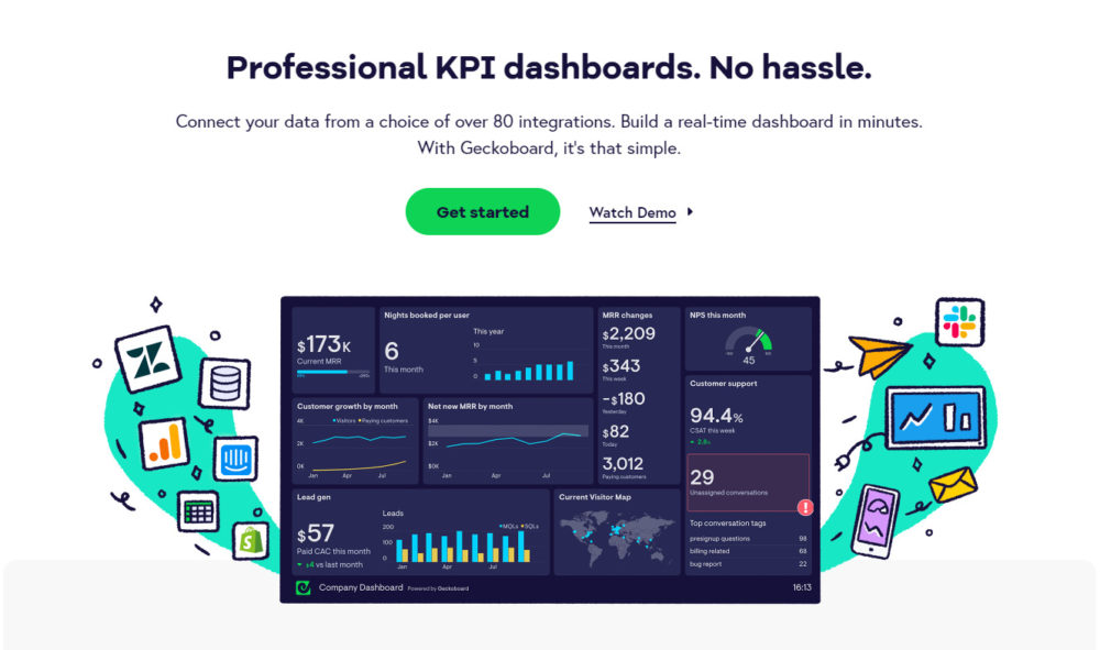
Ava Martin of Quality Water Lab lists a few Geckoboard benefits and one drawback. “One of my favorite dashboard tools is GeckoBoard as it allows me to visualize and share valuable information with employees. I have also been using it to monitor valuable data in real-time, all from one location. The tool has over 80 integration options, making my life as the CEO easier. I no longer have to guide my employees on the smallest of tasks as GeckoBoard presents everything perfectly. The only disadvantage is that the diverse tool’s mobile app is only available for iPhone users,” Martin explains.
Martin continues, “We chose this tool after countless hours of research. The most significant benefit it has brought to my business is the ability to show the dashboard under our domain name. This authenticates the experience, and we are now able to convert raw data into simple and easy-to-understand visualizations.”
As Martin mentioned, Geckoboard does not have an iPhone app. If you need a dashboard on your iPhone, Databox has apps for both Apple and Android.
It’s also worth noting that Geckoboard makes its free plan a little difficult to find. After you finish your free trial, you have to “downgrade” your plan to switch to a free plan, losing features.
7. Whatagraph
Whatagraph pulls data from different marketing apps to present them in one place.

WebCitz.com’s David Wurst says, “We chose Whatagraph because we needed a cross-channel reporting platform that was simple to customize and utilize to produce reports. With its automatic report delivery, this solution makes data analysis and metric monitoring easier and more simplified. We can easily track both real-time and historical data, allowing us to compare performance across channels simultaneously. It can accept a large variety of data sources and can be customized to meet our business priorities and objectives. It contains a drag-and-drop capability that allows us to add widgets that we need to visualize data better.”
Ben Hyman of Revival Rugs adds, “Whatagraph is excellent if you’re looking for a marketing cross-channel reporting tool. It has allowed us to track, measure, and analyze our marketing performance with our customers. Our team is able to easily pull data from any of our marketing channels to create visually engaging reports that can be shared with the rest of the company. Whatagraph’s best feature is its cross-platform reporting. I love that we can aggregate data from multiple sources into one single, concise report. It helps streamline reporting.”
Lily Wright of VisualHunt enjoys Whatagraph for its automated email notifications. “Whatagraph is a powerful tool that integrates multiple platforms and offers fully customizable reports. It allows styling the reports to look just how we want them. As an Editor in Chief, I’m more on the creative side of the business. I just need a snapshot of how our marketing is doing rather than diving deep into data. Thus, I enjoy the reports being occasionally sent to my email so that I don’t even have to log into the system,” Wright explains.
While Whatagraph excels at marketing, it doesn’t work with any other kind of data, making it difficult to measure the full RevOps cycle. Even if you only need a dashboard for marketing, you won’t be able to see how your marketing affects other aspects of your business. Databox helps solve this problem by covering marketing, sales, customer service, and many other areas of business.
8. Datapine
Datapine is a business intelligence platform that presents data from internal and external sources.

Piggybank’s Vishesh Raisinghani says of Datapine, “It’s a tool with many templates for different industries. I like this tool for its customizable dashboards. You can also use a template like you would on WordPress and modify it or modify the theme to fit what you need.”
Raisinghani highlights the tool’s interactivity: “Although you may notice that it’s not the biggest or most popular one in the market, the tool is being talked about by many for its interactive dashboards. It makes Datapine special because you want something that people don’t have to look at or search for. You want your audience to play with the data or communicate with it. Basically, to interact with your site. And that is what Datapine will give you. It’s a dashboard with some cool visuals that you can use to create something you think people want to see.”
Josh Nelson of Seven Figure Agency likes Datapine for its templates and dashboard design. “All personnel in a firm may simply construct interactive, dynamic internet dashboards using this dashboard and business intelligence application. There are over 80 professional dashboard templates for different sectors (manufacturing, healthcare, retail, logistics, and so on) and company operations, so the initial setup process just takes a few clicks (sales, IT, marketing, HR, etc.)” Nelson says.
Nelson adds, “The dashboards provided by this program are highly customizable and include a variety of tools such as chart zooms, time interval widgets, drill-throughs, and drill-downs. Live dashboards via URL, automatic Email reports, integrated dashboards, and a protected viewer area are all options for sharing them. More than 80 professional dashboard themes, a simple drag-and-drop user interface, many reporting choices, dynamic dashboard capabilities, and a free POC dashboard are just a few of Datapine’s highlights.”
If you need a wide variety of apps to connect to your dashboard, however, Datapine might not fit the bill. It has only around 30 integrations, with no option to connect through Zapier. Databox can help by providing more than 70 one-click integrations and more than 650 Zapier integrations.
Honorable Mentions
These dashboard reporting tools didn’t receive as many mentions as the top eight, but respondents considered them worth mentioning.
1. Zoho Analytics
Zoho Analytics is a business dashboard app that is designed for small and mid-sized businesses that are using the Zoho suite of products.
With both cloud and on-prem solutions, it is a solid business intelligence alternative to Tableau or Looker for companies with smaller budgets. It is also one of the easier tools to use.

“The very first option that I would give to others who are looking forward to finding the best dashboard reporting tool would be Zoho,” says David Reid of VEM Group. “This platform can be accessed by anyone who has little to zero knowledge of dashboard reporting and is very user-friendly and easy to use. Zoho is popularly known for solid customer support. Moreover, the tech support team promptly reports the solutions for the issues raised by the users, which contributes to their user experience. It offers a full complement of KPIs insights to help the users create a compelling story without needing an enterprise budget.”
How did Reid choose this tool? “One of my friends, who is also my inspiration to take up this business, has instructed me to use Zoho and compare the results with my previous dashboard reporting tools. The difference was very obvious, and so I liked it. In my business, the application of this tool has helped me create stunning data visualization by including hidden data that is being used to analyze the state of my business so that I can take appropriate actions to do better in the course of time.”
When it comes to data analytics dashboards, there is often a decision to be made between deep complexity, which enables the generation of the most sophisticated reports, and simplicity of use, which enables robust functionality even for users who have never had any training in data science,” says Jeff Mains of Champion Leadership Group LLC. “When it comes to simplicity of use, Zoho is unequivocally on the winning side. Along the same lines, its price is reasonable in contrast to the prices of other leading options in the dashboard market.
Anthony Chen of Kaizenzo adds, “The type of dashboard software will vary depending on your business goals and what metrics you’re looking to measure. We can easily recommend Zoho Reports which are competitively priced, has an intuitive dashboard, and a good range of KPIs that measure key metrics.
Zoho seems to be one of the most robust choices among the honorable mentions on this list. But, according to TrustRadius, many users find it hard to set up because it requires some coding knowledge. Databox can help with this pain point by providing an easy setup and one-click integrations.
2. Klipfolio
Klipfolio is a dashboard analytics app that aggregates data from internal and external sources.

“Klipfolio is a dashboard reporting tool with a high responsive quotient across devices, making it easier to access from devices like your TV monitor or tab, making it a handy tool no matter where you are or what you are doing. The cloud-based app gives you ready visuals of a user-friendly dashboard that can procure and present data from over 100 apps ranging from Xero and Salesforce to Google Analytics and Moz. The ease of using math to create unique dashboards comes in handy when realigning essential elements,” explains Richa Nathani of Dialed Labs.
While Klipfolio has many integrations and data visuals, it doesn’t have many templates to choose from — only about 10. If you prefer to work with templates, Databox has more than 300 dashboard templates to choose from, featuring apps in various business areas.
3. GoodData
GoodData is a business dashboard app that is designed to help enterprise e-commerce, software, financial services, and insurance companies break down data silos. As an enterprise tool, it is designed to be an all-in-one business intelligence solution.

Rodney Warner from Connective Web Design tells us, “GoodData is one dashboard reporting tool I would recommend to everyone who wants to take their business reporting to the next level. With GoodData, you have numerous pre-built templates that give you a host of dynamic options as far as your content visualization is concerned. Thanks to its drag-and-drop interface, you can collect and store data from many sources into a single, centralized database.”
Warner explains how GoodData has helped his business: “I chose this tool at the request of one of my oldest and most trusted business colleagues. Through this tool, I have been able to analyze data very meaningfully, unlike through any other dashboard. I can change the fonts and colors as I please and send the reports as frequently as I want with no restrictions. My clients have loved the visualization GoodData helps me bring.”
David Gu of Inyouths explains, “Data analytics, business intelligence (BI), and dashboards are becoming indispensable for organizations seeking to improve their performance and increase their revenues. With all the data you are required to collect, monitor, and analyze in the digital age, you may ask if you are making the most of your data. A critical initial step in enhancing your insights is locating a professional dashboard software with the capabilities your organization requires.
GoodData offers big data solutions in the cloud to businesses across many industries. The platform of GoodData is a scalable, trustworthy, and safe approach for evaluating massive data collections. It is beneficial for businesses seeking insights into their marketing, sales, and customer service performance. GoodData’s platform is capable of storing, analyzing, visualizing, and sharing data sets from any data source.
The data reporting and visualization capabilities of the platform are user-friendly and configurable. Imagine that your sales team is presenting to a prospective client and is on the approach of clinching a deal when a question concerning historical performance, financial efficiency, future predictions, or any of a number of other considerations surfaces. The user pulls out their smartphone or tablet, and seconds later, the data is charted while concurrently offering context. This is only one example of how performance data dashboard software adds value to organizations.”
If you need data from external sources like analytics apps, however, GoodData can’t pull data from them. Databox assists with this issue by providing multiple ways to connect your data – other than using one (or more) of our 130+ integrations, you can connect any data stored in Google Sheets or a SQL database, or send it via API or Zapier.
4. Microsoft Power BI
Microsoft BI is a business dashboard app that is designed for mid-market and enterprise businesses that are using Office365, Azure, and Teams. While there is a steep learning curve, it is an extremely powerful and customizable data analytics and visualization. It is most often used by data analysts, IT developers, and c-level executives.

“As a business owner, investing in dashboard software is a lifesaver for crafting a visually compelling report. It allows my team members to easily assess data trends and perform constant monitoring. Microsoft Power BI is my preferred dashboard to use,” begins Dr. Prav Solanki of Prav.com.
Solanki continues, “Apart from the affordability of $10 per user monthly, it is bundled in a version of Office 365. It is excellent for tracking metrics and KPIs. It features automated machine learning tools and can analyze and craft visual narratives around image and text data. The good thing about spending with Microsoft Power BI, monthly it provides updates and upgrades but stays user-friendly.”
For example, Joe Troyer of ReviewGrower says, “I utilize the Microsoft Power BI dashboard software tool because Microsoft provides the preeminent dashboard solution, making it the preferred option for corporate users.
It’s also worth noting that the company’s Power BI product costs just $10 per user per month, and it’s currently included in the latest edition of Office 365, which means that most commercial users already have it. Automation and artificial intelligence (AI) are key components of this system. Visual storytelling can be built from images and text. Microsoft has a long history of developing enterprise software, and the interactive dashboard is a product of that experience.”
Like other Microsoft tools, Microsoft Power BI has an interface with a bit of a learning curve. It also requires an outside service for integration with other apps. If these issues make it difficult for you to report data, Databox offers a simple interface and easy-to-use integrations.
5. Birst
Infor’s Birst BI platform analyzes data with industry and role-specific models. It connects to the rest of Infor’s enterprise resource planning (ERP) suite.

LinkBuilder’s Stewart Dunlop says, “Birst is a cloud-based dashboard platform perfect for our remote office. Birst has excellent scalability options that provide easy-to-access information.”
“Birst is a little limited in how large our company can grow by limiting its effects after 500 employees, but it’s perfect for our 30 employees. We needed software that would analyze metrics and project targeted KPIs to target an end-user. Most dashboard reporting tools have interactive features, like graphs, but we wanted to know how to adapt our sales goals to match our vision. We also needed software that could reflect our company goals,” Dunlop concludes.
As part of an ERP suite, Birst is geared toward professionals with at least some data modeling experience. Looking for an option that’s easier to pick up? Databox is designed for users of all experience levels.
Key Takeaways for Effective Dashboard Reporting
In conclusion, dashboard reporting tools are essential for modern data management, offering a unified view of metrics from diverse sources in real-time. These tools simplify complex data processes and enable comprehensive data analysis.
Our research with 78 dashboard users showed that 44% like using special tools like Databox because they are easy to use and can be customized. This matches what Harvard Business Review found: 70% of companies that use dashboards make better decisions because they can see important data more clearly.
The benefits of dashboards extend beyond visual representation; they support strategic alignment, operational efficiency, and improved performance outcomes. By selecting the right dashboard type and software, businesses can empower stakeholders with actionable insights, enhance productivity, and foster informed, data-driven decisions.
Get Databox Today
Still testing out reporting dashboard tools for your business? Databox is a great place to start. With its free trial, you can try out all standard all advanced analytics features so you don’t have to guess what the paid experience will be like. Sign up today.