


Already have an account? Sign in
Sign up for free
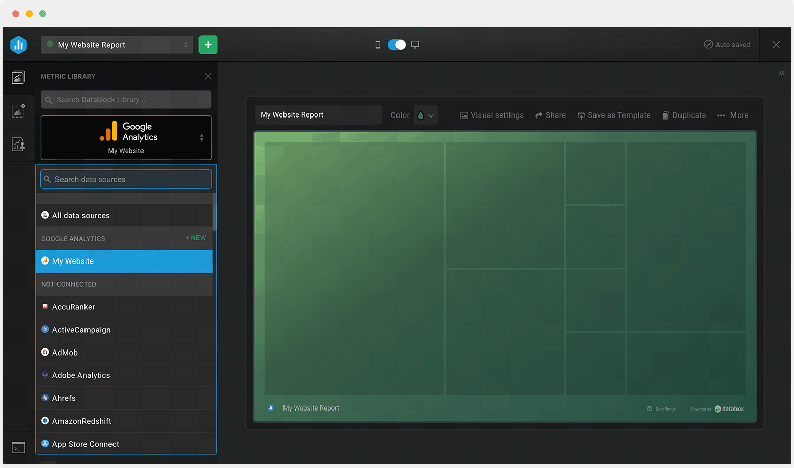
Connect your datasources and instantly see your data in this template.
Creating your account...
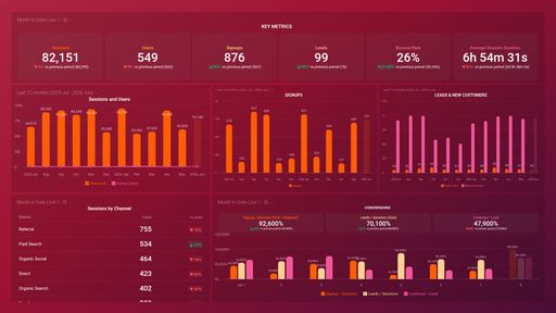
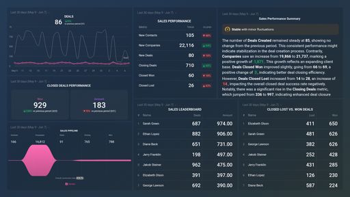
A HubSpot dashboard is a customizable tool that allows you to track, visualize and monitor key marketing, sales, and customer service metrics. It integrates data from various HubSpot features, presenting it through charts, graphs, and tables and various other data visulaisations for easy interpretation. By monitoring your data in real time you will be able to make executive decisions on the spot.
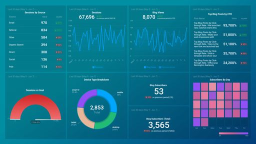
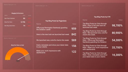
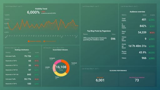
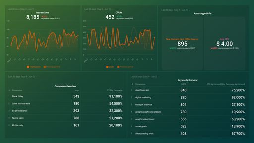
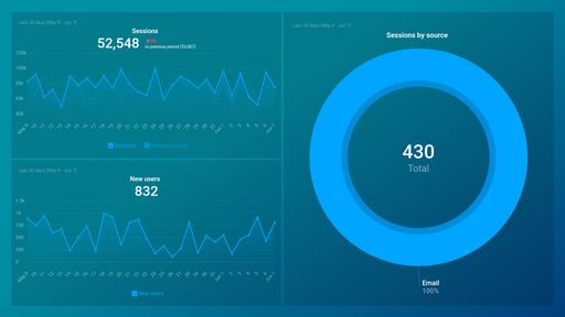
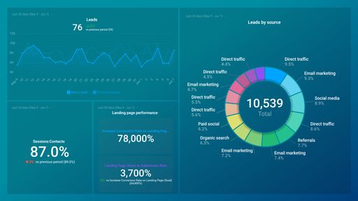
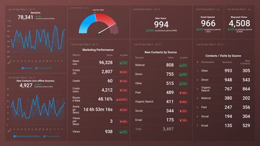
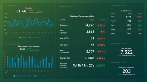
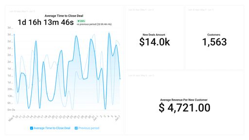
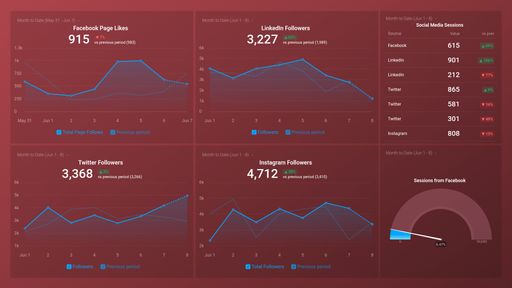
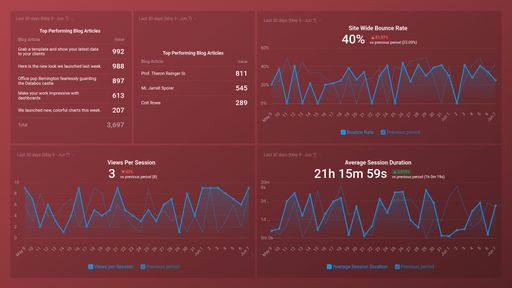
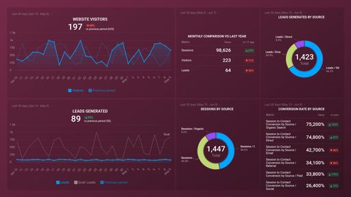
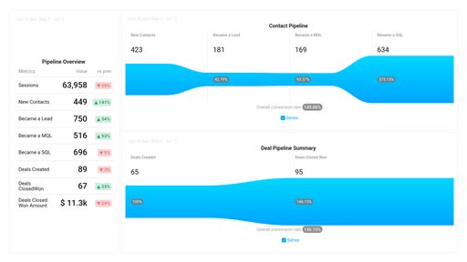
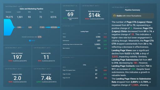
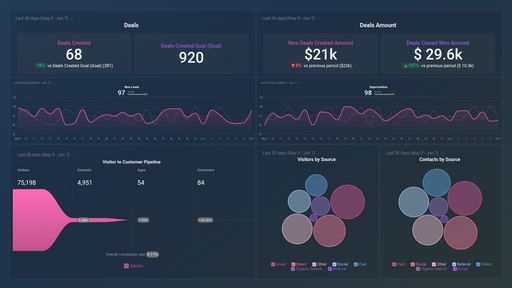
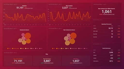
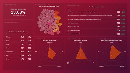
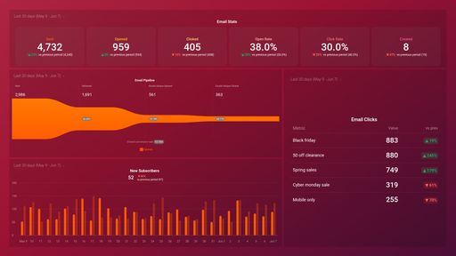
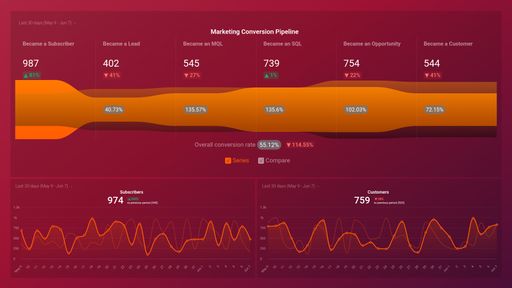
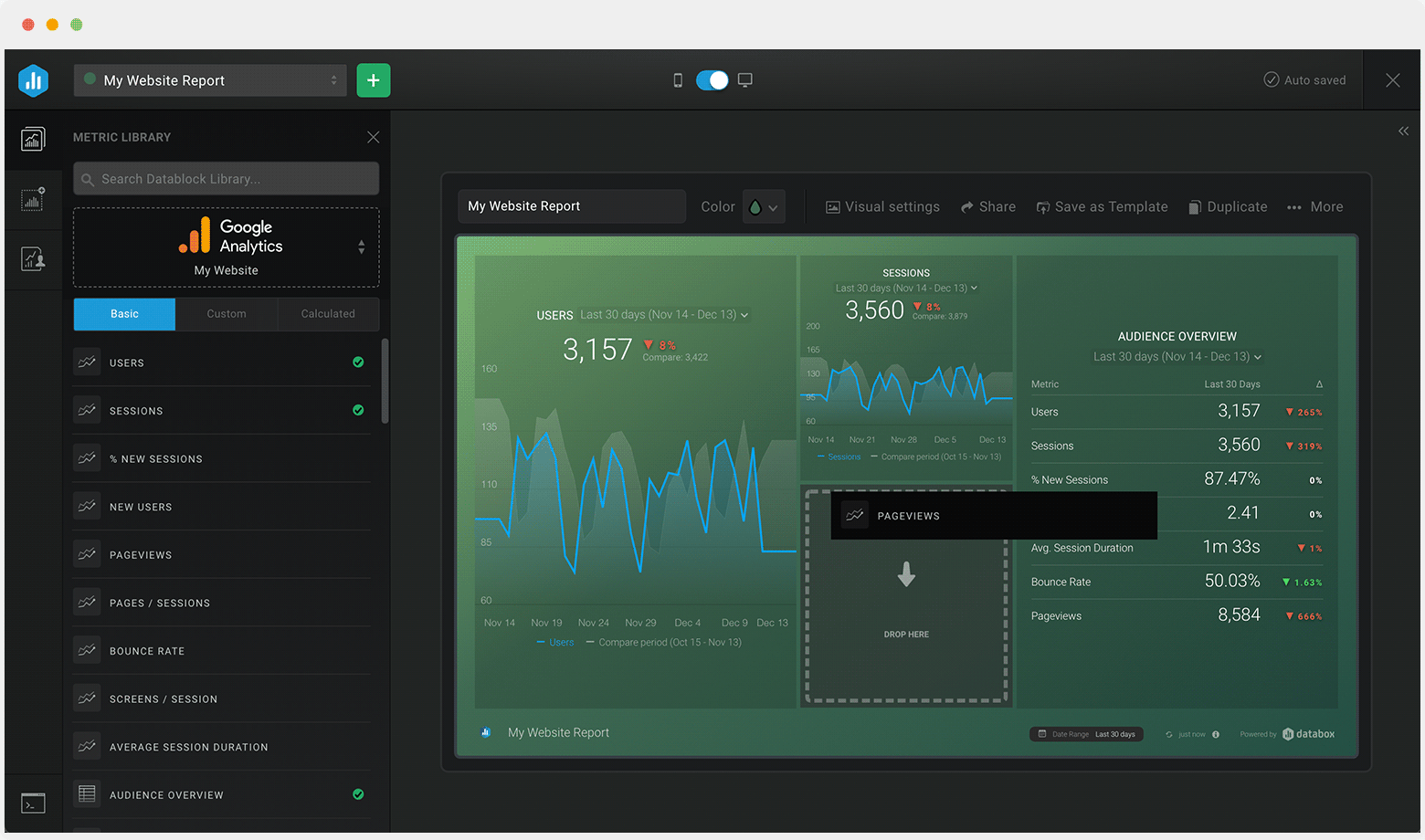
Your HubSpot Marketing dashboard should include all of your relevant marketing Metrics and KPIs. It should allow you to make on the spot decisions based on the real-time data and get insights that can help you increase traffic, convert leads, and prove ROI. Metrics like Sources of Site Traffic, Email Clicks and Opens, Conversion Rates throughout Funnel
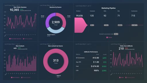
Daily Traffic and Traffic Amounts by Source are just some of the ones you should be adding to your HubSpot Marketing Dashboard.
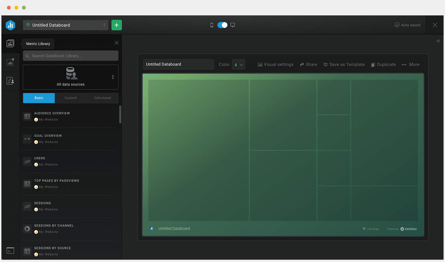
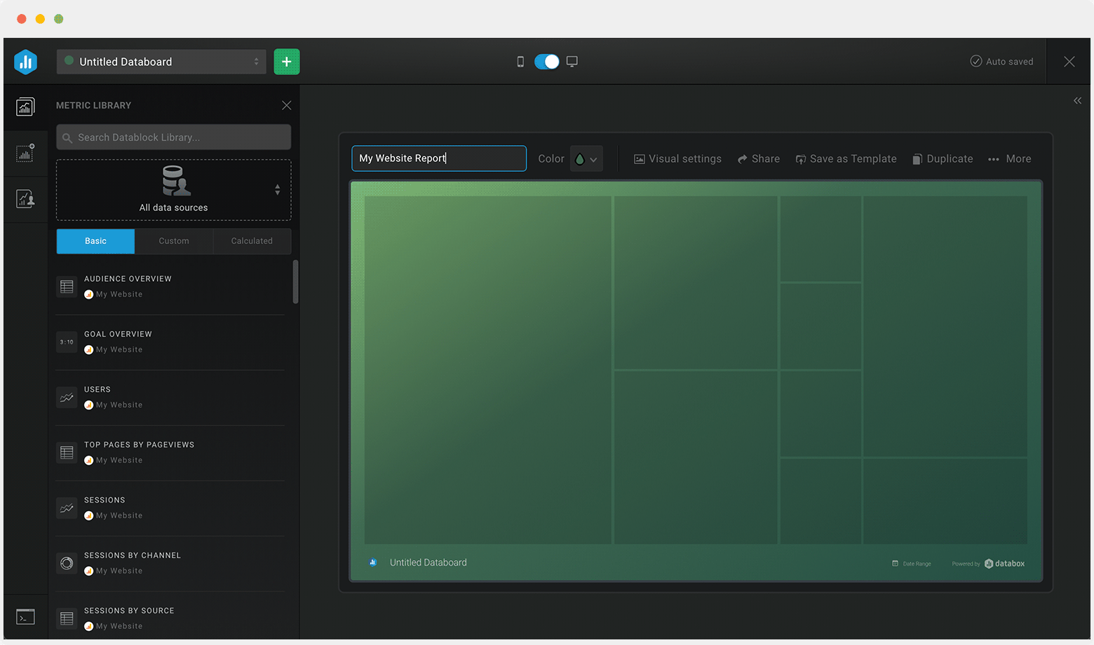
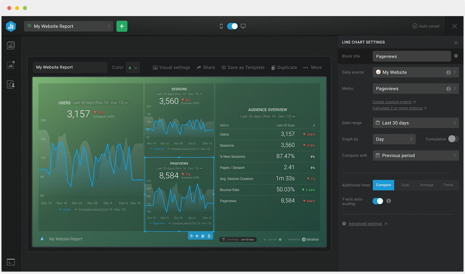

Drag & drop your metrics
No-code editor
Fully customizable
Trusted by 20,000+ growing businesses


Explore all the different ways you can use Databox to gain better data insights needed to drive better business decisions. Discover our pre-built templates from various integrations that businesses use on a daily basis to improve performance.
Whether you are looking for client reporting dashboards, agency dashboards, marketing dashboards, or sales dashboards, Databox can help you build them.
Let us know what you are trying to build and our team of experts will help you turn your data into actionable insights.
Book a callCompare
Databox Inc.
HQ: Boston, MA, USA
AI-powered analytics for teams that need answers now.
Databox Inc.
HQ: Boston, MA, USA

AI-powered analytics for teams that need answers now.


Compare
Connect your datasources and instantly see your data in this template.
Creating your account...