Table of contents
Five months ago Databox launched a first-of-its-kind, automated SMART goal tracking tool.
We’ve learned a lot since then.
There wasn’t a comparable product to help companies solve the challenge around setting and tracking progress against goals in a way that was accessible, so we were curious to learn how our customers would adopt the feature and ways we could continue improving it.
There were obvious improvements, like adding the ability to track Goal history, but there were other things we learned from seeing how customers used the feature as well as hearing both positive and constructive feedback.
Over the last several months, we’ve been hard at work codifying that feedback and building the necessary improvements to help everyone build and promote a Goals-focused culture within their teams and businesses.
Today we’re officially launching those improvements.
What’s new?
Improvements to the Goals overview page
The Goals overview page is the one place where you can see how all of your goals are performing.
The main visualization for viewing your goal progress was the progress bar (shown on the left part of the screenshot below). Although the progress bar view is a simple chart, it may not give you enough insight into how you’re progressing towards the goal.
There’s nuance on the way toward hitting a goal. Sometimes you’re on-track, and other times you’re off-track.
Being able to visualize how you’re trending toward a goal helps shape priorities over the remaining time period.
To help you visualize trends, we’ve implemented a change where the color is decided on the goal projection, meaning: a green progress bar, when you’re above the projected goal to date, orange when you’re less than 5% below the goal, or red when you’re more than 5% below your goal to date.
The percentage still displays the absolute progress towards your end goal.
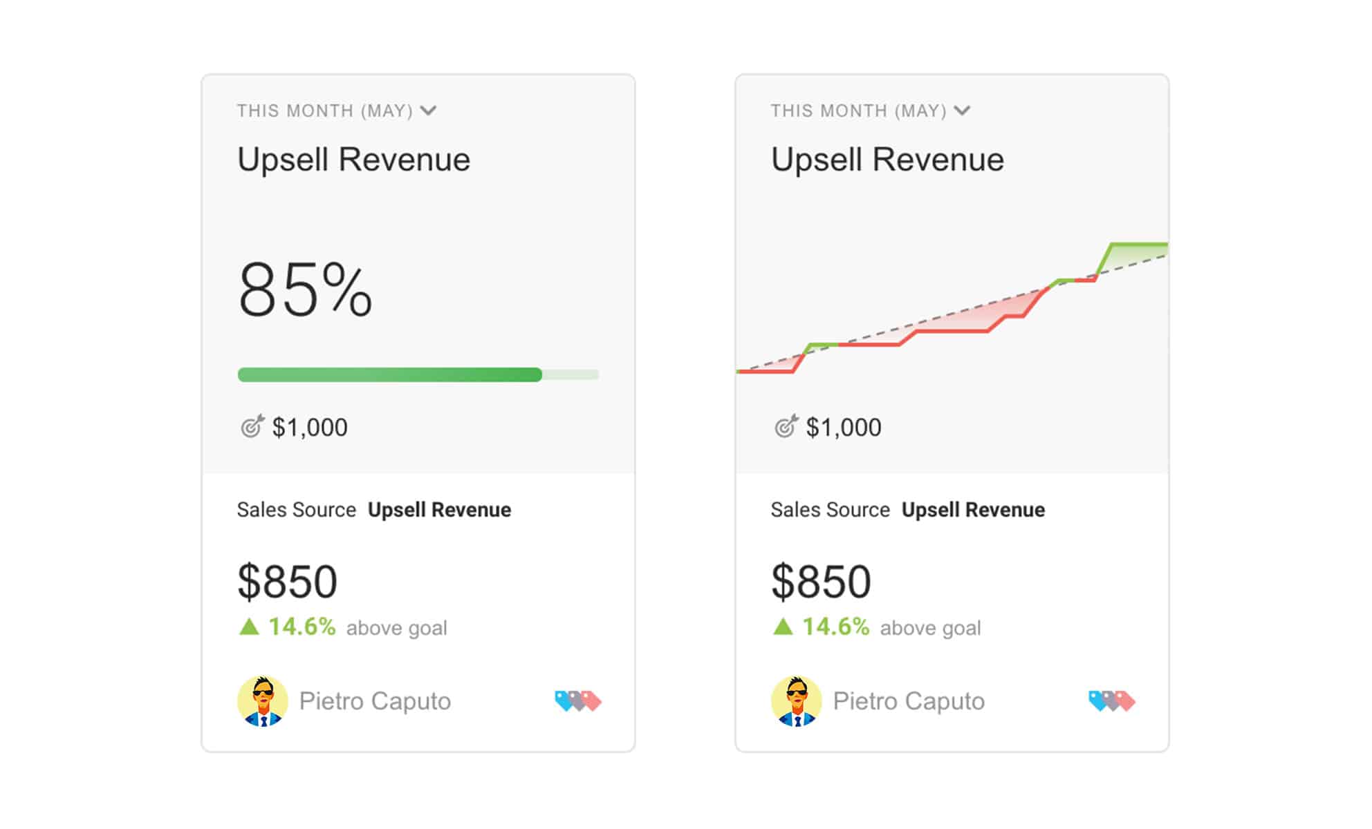
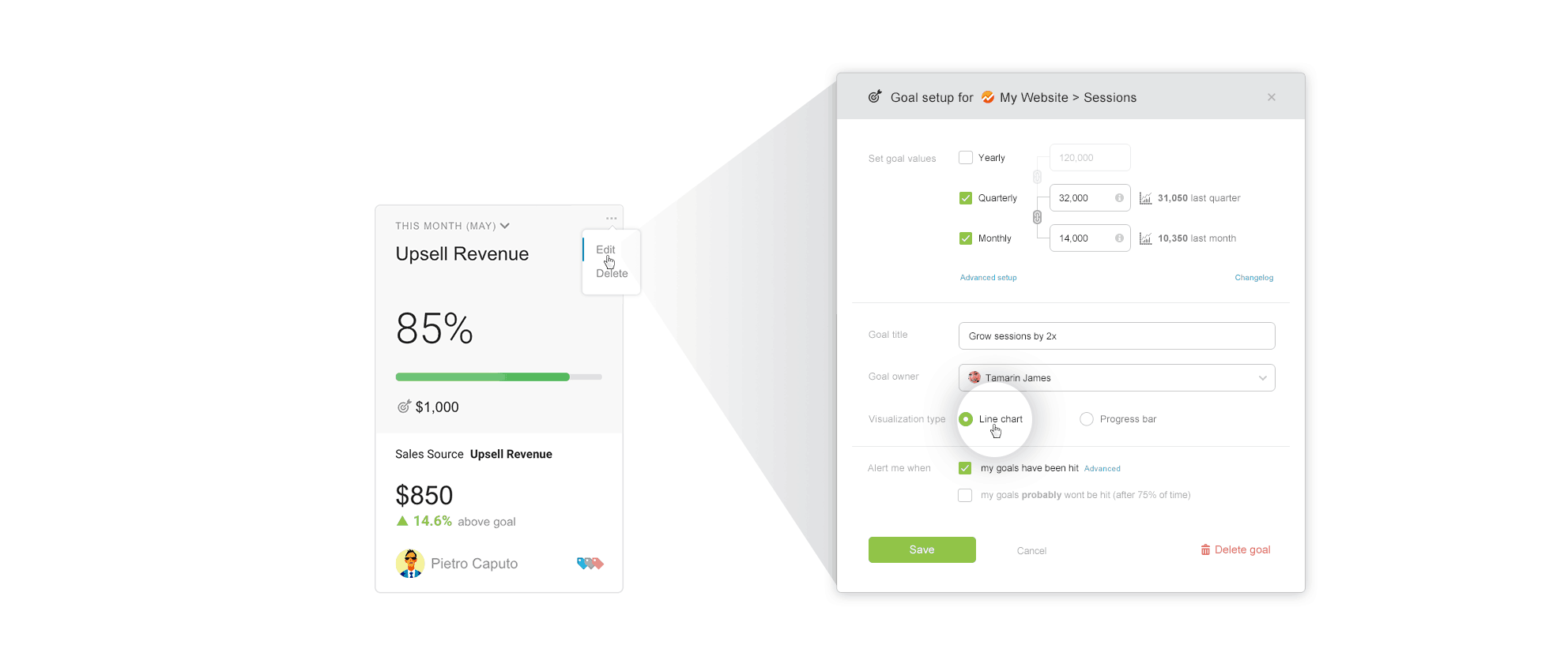
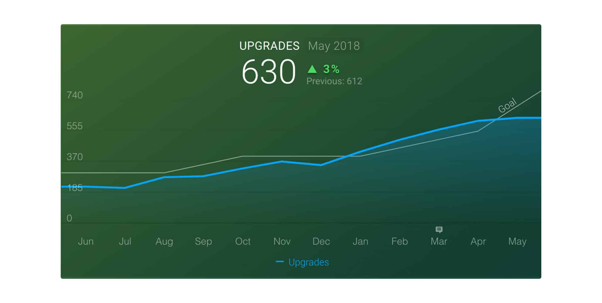
A new line chart visualization for goals
To have an even better overview, we have added a line chart option to visualize your goal progress (see comparison above). Because a line chart is two-dimensional (it shows time and progress), you will always know where you stand during the period (week, month, etc).
If you would like to switch to the new Goals visualization, it’s simple, open up the goal setup popup (by editing a goal under “Goals” overview page) and change the “Visualization type” to “Line chart”.
Update (August, 2018): Line chart visualization support has been added for all metrics.
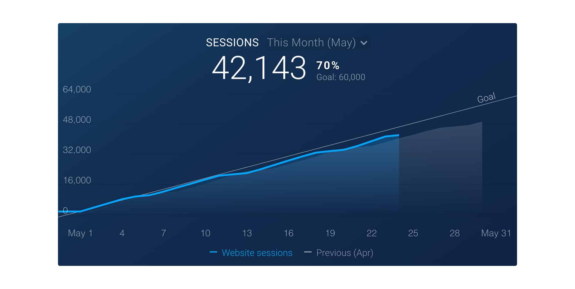
Goal line visualization changes on charts
We have also made a small change to the goal line visualization.
If your chart is set to be cumulative on your Databoard, then the goal value will be angled like the example below.
This should give you a better feel how you’re progressing towards the goal.
Storing goal history and scheduling progressive goals
Your goals change over time. It’s important that these changes are reflected in your charts, too.
Goals are not flat lines. They reflect a long-term vision for growth.
No more straight lines, we have finally brought goal value history to Databox.
If you switch your chart to display last year’s data, it will show the correct goal value that was set up for each previous week, month, quarter or year (depending on what goal frequency you used).
With goal value history, we also have given you more control over the goal values.
You can make a progressive goal setup by setting a different goal value for each week, month, and quarter. This will allow you to execute a long-term plan without changing the goal value every month–goals will follow your pre-defined growth plan. But, also give you the ability to change the goal if you need to.
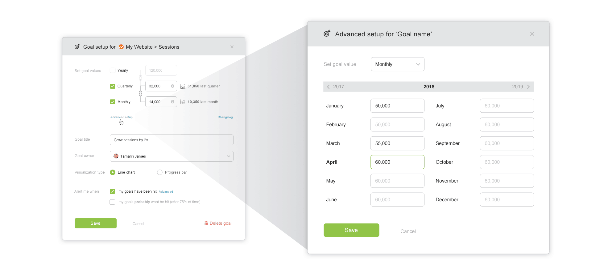
To set up goal vales on a timetable, open up the goal setup popup (by editing a goal under “Goals” overview page) and click on “Advanced setup“.
Choose between supported granularities (daily, weekly, monthly, quarterly or yearly) and set up your goal progression.
For fields that have no manual goal value entered, the last entered goal value will be set (displayed greyed.) This means that if the goal stays the same for the next few months, you don’t need to enter the same goal for all those months.
Goal changelog
We’ve also added a goal “changelog” feature where you can see what users have changed for specific goals (values, goal owner, etc.)
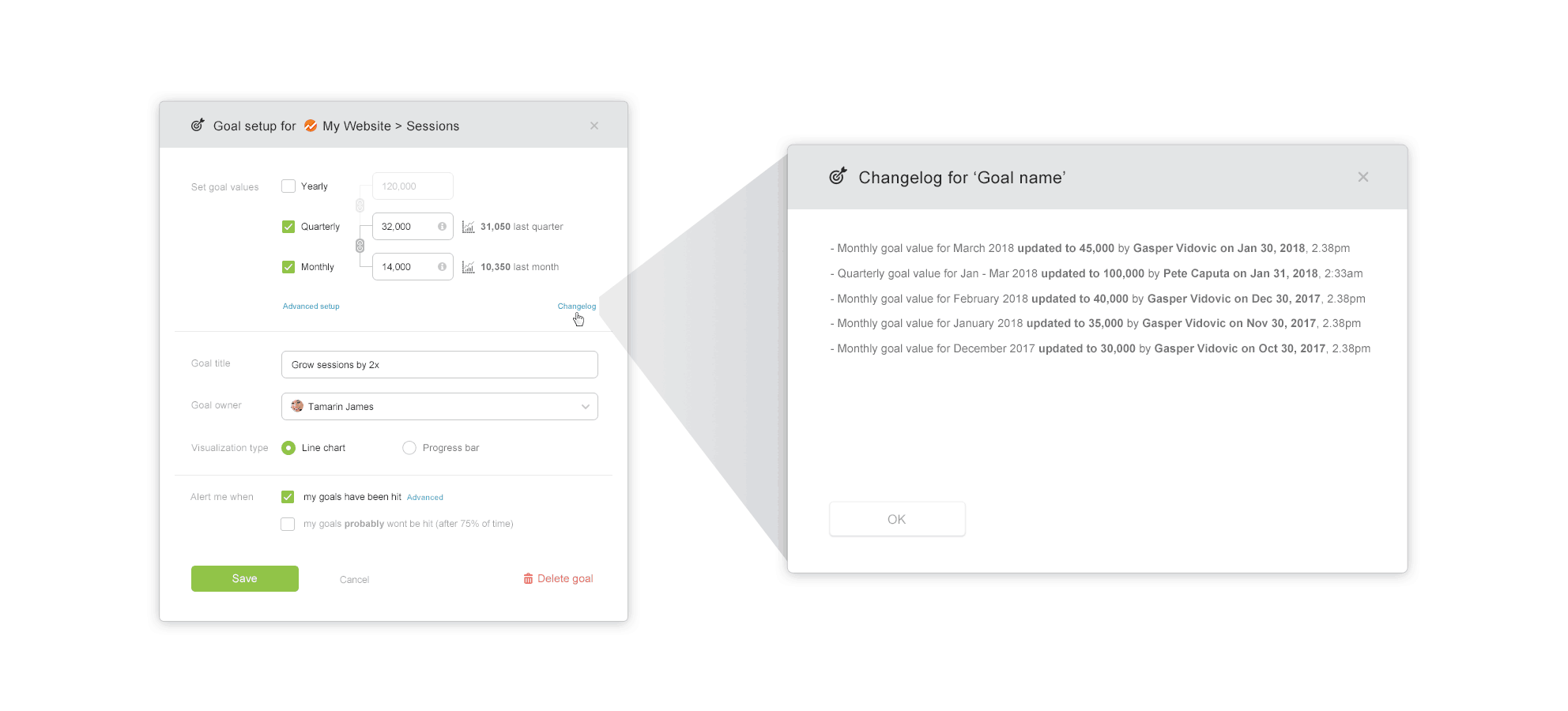
To see the changelog for a goal open up the goal setup popup (by editing a goal under Goals) and click on “Changelog“.
Are you ready to become goal-driven?
If you already have a Databox account, go to the Goals overview page in the app to get started.
Don’t have a free Databox account yet? Sign up for a free one here.