Table of contents
In the year since we launched the Databox Partner Program, we’ve gone from 10 to 1,000+ agencies actively using our software to monitor, report and improve client results.
Along the way, as we’ve gathered feedback, we have expanded the tool’s capabilities significantly.
In fact, many of the features below were built and enhanced because of requests from our partners. As we embark on our next round of improvements, we decided to ask our partners, “What’s your favorite feature and why?”
Here is what they had to say.
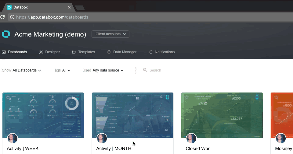
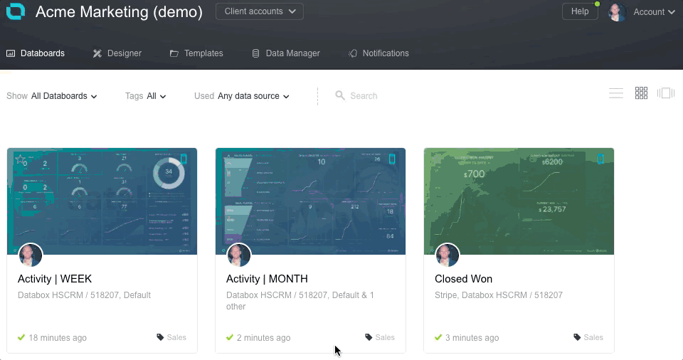
Agency + Client Accounts
Databox allows agencies to create many client accounts under one umbrella account. Early results from a survey we’re running show that the average agency must log in to 4-6 software products and look at 4-6 screens in each in order to get a pulse on one client’s performance. With Databox, that time-suck goes away.
Moreover, clients can monitor their data anytime they want via a URL, mobile app, a stream data on TV on their office wall or by logging in to their own account.

Josh Hansen
Human Design
Favorite Feature: Client Databoards
Reason: The client Databoard feature for agencies completely changed the way we add value to our client’s experience in campaign reporting.
Often, our clients would want to check in on the status of their campaigns outside of our scheduled performance reviews, something a manual reporting update failed to provide.
Now, our clients can access an auto-updating report. Their data, wrapped up and provided in a beautifully designed dashboard, allows our team to hold true to our roots as a high-profile design agency that provides a high-touch, responsive client experience in every interaction.

Tabitha Young
30 Degrees North
Favorite Feature: Easy access for clients
Reason: I love that our clients now have the ability to access their reports instantly, when or wherever they might need them. They no longer have to contact (and wait for) us for current reporting anytime they need to access them.
We meet with our clients once a month to discuss goals, progress, and review reports; however, we find that they often need to share up-to-date information with their teams throughout the month. It also gives our clients the ability to easily check in on their monthly progress and know where they stand in comparison to the previous month.

Alerts
With Databox’s Alerts feature, you can send an instant alert to your client when you hit the monthly goal or when a number increases by a large percentage. Or, you can use alerts internally to quickly discover issues, as opposed to learning about them during the last week of the month when it’s too late to course-correct.

Rob Ellis
Lollipop
Favorite Feature: Alerts
Reason: We use the Alerts tool to potentially save our clients thousands of [British] Pounds. Here’s how…
Whichever HubSpot marketing package you’re on, you start with a maximum contact limit. If you go above that limit, HubSpot will automatically increase your bill to the next tier. Sadly, website contact forms are under constant attack from spammers and chancers. The last thing you want is to end up paying more because your contact list is full of frauds. So, we set up an Alert in Databox.
We now get email and Slack alerts when the limit is close, so we can purge the contact list before the billing date arrives. Here’s to no more unnecessary increases.

Annotations
Annotations allow marketers to write a note on an individual data point. This could be an exceptional outcome, or a worrying sign that needs further investigation.

Ismail Aly
IDS Growth Agency
Favorite Feature: Choosing just one feature is hard but I would say Annotations.
Reason: In order to have effective reporting meetings with our clients, we combine data and storytelling. To do that, we used to take screenshots and paste them in Google Slides and then add notes.
Now, it is a lot simpler because we can add annotations right on the Databox charts. This feature saves us hours every month.

Carousel
With Databox’s Carousel feature, you can create a link with a series of constantly rotating Databoards. This is great for a TV screen in your office, or at the client’s location. And, you don’t need to share 10 links when you want to share 10 dashboards.

MaryAnn
108 Degrees
Favorite Feature: Carousel
Reason: My clients rarely look at their data without me prompting them. So, we review their monthly goals and results in our online meetings and via email. Although a simple feature, the Carousel feature allows me to send them an email with one link that gives them all the essential info they need. It’s easy for me, and for them.

Client Performance
The Client Performance screen allows an agency to monitor up to 5 KPIs for each client on one screen. This is great for an agency owner or client director that wants to quickly review account performance.

Martha Madero Gonzalez
Grou
Favorite Feature: Client Performance
Reason: This tool gives me an overview of all of my client accounts. I can see which are performing better than others, if our activities are getting them to reach their goals and if a account needs more attention. When we first discovered it, we immediately added it to our 90-day workflows as the key source of information to monitor the status of our objectives.

Alex Moore
Stratagon
Favorite Feature: Seeing all client performance on a single grid
Reason: Data and reporting is all about performance and efficiencies. The grid view provided by Databox allows our agency to quickly monitor client performance and make necessary adjustments. Additionally, having the ability to create custom dashboards using a very simple interface is paramount.

Leon Yeh
Y Verge
Favorite Feature: Client Performance
Reason: It helps me save time while scanning all of my customers’ data all at once.

Alison Leishman
Spitfire Inbound
Favorite Feature: Client Performance
Reason: As an agency, we have a number of clients for whom we deliver inbound and other digital marketing services. We have always been challenged by trying to have oversight of all accounts in the business in a snapshot view so we can monitor the health of the accounts through their metrics.
This feature allows us to, at a glance, have this oversight of all clients and how they are tracking on their unique five core metrics as set by client and agency together. We can use this to also identify trends that may be occurring across the business due to either internal or external reasons and apply these learnings to the benefit of all our clients. The metrics are simple to set in the tool, quick to review, and force us to we identify the five core metrics that direct our strategic focus.

Tyler Pigott
Lone Fir Creative
Favorite Feature: The Client Performance Dashboard
Reason: Are you kidding me? The client performance dashboard shows all your clients on one screen where you can customize the KPIs you want to track in real-time. (i.e. It is the middle of the month and leads are down for a client, what are you going to do about it?)
With Client Performance, there are no excuses for missing a goal for clients or “not knowing” what the status of a particular KPI is.
I remember at a past agency, we wanted one screen we could track all our numbers in real time. We finally gave up after spending $35k with developers on a barely working tool that needed a separate computer plugged into a TV display to work.
This feature truly helps keep us on track for both our clients and our agency so that we hit our own metrics too.
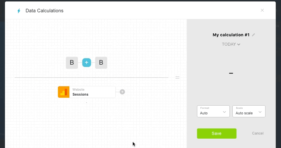
Custom Metrics
There are two main types of custom metrics in Databox: custom queries and data calculations.
Custom queries allow you to pull specific slices of data from sources like HubSpot, Google Analytics, Salesforce and Facebook Ads — to name a few.
Data calculations (a beta feature) allow you to combine multiple metrics and calculate specific ratios on the fly. No more copying and pasting into a spreadsheet every time you need to do some math.
(As an aside for those who are not yet using Databox, every feature on this list except for Custom Metrics and Calculations is available on our Agency Free plan.)

Mike Donnelly
Seventh Sense
Favorite Feature: Custom Metrics
Reason: Custom metrics within Databox are incredibly powerful once you get the hang of how to build them out. It pretty much allows you to build out visualizations for so many important metrics.

Gabby Shultis
Nectafy
Favorite Feature: Using Data Calculations to compare to past performance
Reason: It’s incredibly important for us to be able to show our clients the progress we’re making with our inbound marketing efforts.
We have found that using the Data Calculations tool in Databox is a great way to show how we’re growing visits, leads, and blog leads (three of our main KPIs for our clients) when compared with the client’s “Benchmark Month,” or the month before we started inbound with them. I love that the Data Calculations allow me to manually input the benchmark data on the left, and then set the metric on the right to always display the data for the month we are reporting on. This has been a big eye-opener for clients to be able to see just how much we’ve grown their inbound marketing from the time we began working with them.

Juli Durante
SmartBug Media
Favorite Feature: Comparison % for HubSpot blogs
Reason: One of the most difficult things to see in HubSpot at a glance is which blog posts are causing increases in total blog performance. With long-term inbound marketing efforts, we look for blogs to bring in more and more traffic over time… which they do.
In HubSpot, I can natively see if total blog views have increased or decreased month over month, but I can’t see which posts have increased the most and by what percentage their traffic has changed. Getting this visibility so easily in Databox makes the process of answering the “Whys” of blog performance so, so much easier.
For example, if I see that a post like, “10 ways to know if your dog hates you” has increased in views 60% month over month, my logical next step is to dive into that post specifically and see if its keyword ranking has improved, if there are new inbound links to that post, if it had new social media shares, etc. Pinpointing the changes is a time saver and great reporting point.

Jonathan Stanis
Weidert Group
Favorite Feature: Data Calculations
Reason: Many of our clients are using multiple platforms, so we end up doing a fair amount of cross-platform metric calculations. Data Calculations in Databox is a great tool to automate these calculations.
For instance, we run PPC campaigns in Google Adwords and we want to know the cost per new contact generated in HubSpot. Adwords can tell us how much we have spent over a specified period of time, and HubSpot can tell us the number of new contacts in that same time period from PPC sources. Data Calculations can take the data from both of those platforms and give us cost per contact, cost per MQL, and cost per SQL automatically.

Howard Schulman
Penguin Strategies
Favorite Feature: Custom Metrics
Reason: Apart from the basic metrics, being able to create a custom metric to present what matters to specific accounts is key.

Nicole Weathers
Crush My Market
Favorite Feature: Custom data calculations
Reason: I love it because it makes it a lot easier for me to pull custom data from Google Analytics and YouTube.

Brendon Macdonald
Yello Veedub
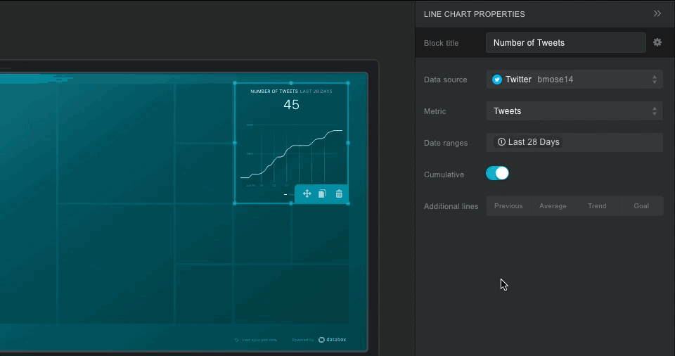
Favorite Feature: Metric Builder
Reason: We love creating custom queries to display the specific data we want to show in a Databoard.
We use the Metric Builder to create a Facebook Advertising Databoard that allows us to show the performance of the advertising program from a campaign, ad set and ad level with the corresponding cost per action, cost per click — all in one screen!!
To access this sort of information in Facebook Ad manager, you need 3 clicks to get to each set of info and still only see on a singular level – so we use to need to screenshot each dataset to put together a report or review internally. These Databoards help us get insights on the performance of the ad campaigns in half the time that it used to take.

Aneesh Babu
Webnamaste Consulting Pvt Ltd
Favorite Feature: Metric Builder
Reason: I love this feature because the conversions are easily visible in a single click. When I was assigned with a task of handling Databox by our CEO, I had no idea about how it worked and what I needed to do. But when I started using it, I was really comfortable with it and gradually it became my favorite tool I have ever used in a short span of time.

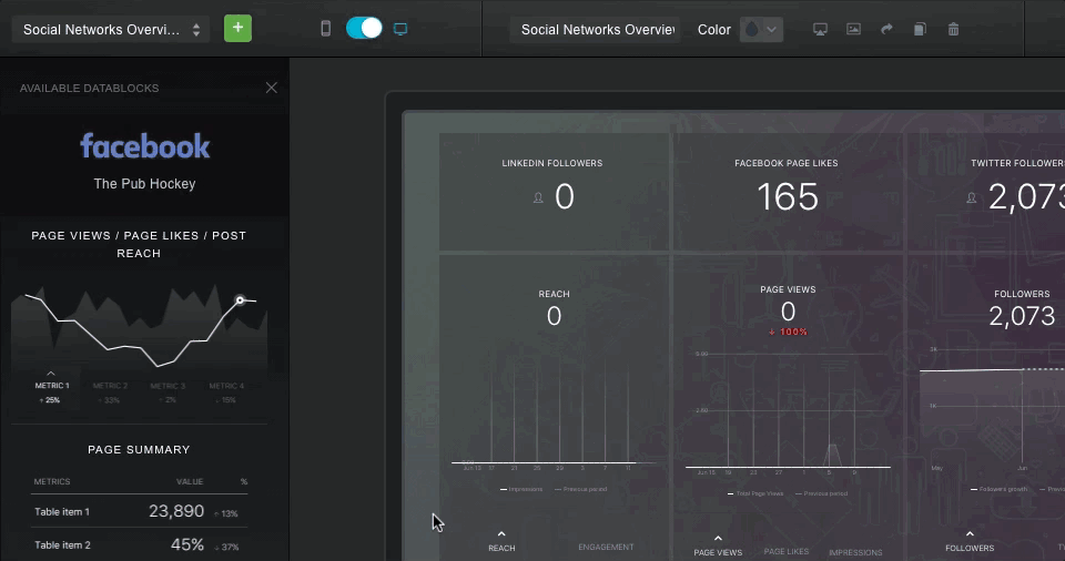
Data Visualization
Spreadsheets exhaust your brain, as well as your clients. Your brain can comprehend the latest data more easily when it is summarized in a graph. If you are trying to get your team or your client excited about data, you can start by making it easy to interact with.

Parker Short
Jaxzen Marketing Strategies
Favorite Feature: Combining multiple data sources into one dashboard
Reason: There’s a lot to like about Databox, but being able to set up business dashboards that use multiple data sources is my favorite feature. Normally, your reporting is limited by how much data a service will show you. So if you want to see the full picture on your strategy, you may have to look at 2-3 systems.
Reviewing an Adwords campaign may require looking at my Adwords console, Google Analytics and a CRM. That’s a lot of work just to see if something is working. With Databox, I can see the whole thing on one dashboard – how the ads performed, how the landing page performed, and where the leads are in my pipeline. It’s fantastic.

Darren Eiswirth
Adnorml Digital Agency
Favorite Feature: Quick selection of dashboards.
Reason: The dashboard allows us to provide a quick and simple solution to our clients seeking weekly or monthly reports without having to log into Google Analytics or social media.

Juan Pablo Sanchez
A Small Job
Favorite Feature: The Beauty of the Dashboards
Reason: Yes, I understand that dashboard apps all have a big focus on visualization. But, we love how cool Databox’s visualizations look on our big screen of 2m x 1m and how many times people stop to look at it.

Kris Aguero
Advancify
Favorite Feature: Databox makes dull data look awesome
Reason: We love how this custom dashboard software makes dull data look awesome! Adding photos behind our Databoards make numbers and graphs more interesting. One of our customers works with her children, so we added a photo of the family to their Databoard and she loved it. We’re pretty sure she likes the photo of her family more than the stats, but at least it gets her to look at her data.
Most of our customers don’t have time to pour over stats, so when the scheduled snapshots came out, we were in love. This feature allows us to send our monthly reviews with relevant data and custom photos too.

Chris Ross
Eight Digit Media
Favorite Feature: My favorite is the visualizations.
Reason: The format and colors of the boards are eye-popping. From an agency perspective, it is easier to understand the data and the clients are blown away by it as well. I first discovered Databox in a Slack group and I was asking for recommendations on BI dashboards because the one I was using at the time was no longer cutting it for me. Quite a few people spoke highly of Databox and once I saw the Databoards, I knew I would become a customer.
Goals
If you want to increase the chances that you will improve your client’s marketing performance, you need SMART goals. In Databox, you can track progress to weekly, monthly or annual goals in real-time.

Elise Bye
Inbound Norway
Favorite Feature: The Progress
Reason: I love it because it makes it so easy to keep an eye on important KPIs throughout the month, and get notifications if we are unlikely to reach the goals.
When showing this and other features to one of our clients, they got really excited and started creating custom databoards right away. By the time I got back to my office, they’d ordered a big screen to display their inbound marketing dashboards.

Mark Innes
Fifth Ring
Favorite Feature: Goals
Reason: Databox’s client performance features have been extremely helpful in allowing us to get better outcomes for our clients, especially the Goals tool.
Before using Databox for our management of client goals, we used Google Analytics with spreadsheets, lots of manual moving of data around.
Now we work with our clients to create goals based on agreed KPI’s, a process that is so much easier with a visual KPI dashboard.
The email alert system on the goals also lets us know if we need to allocate extra resources ahead of time if it looks like we may not meet our monthly target!

Peter Caputa
Databox
Favorite Feature: Goals
Reason: I love the Goals feature because it gives me one screen where I can see how our whole team is performing on any day of the month.
Each month, we review the goals together as a team, celebrate the milestones and when we fall short in a certain area, discuss what we’re going to do differently in the following months.
As a result of our monthly goal setting process, we also are much more aligned about the projects that we need to complete and the activities that need to happen each month in order to get there.

Ryan Howard
HeadsUp Marketing
Favorite Feature: Ability to track and set goals
Reason: It has allowed me and my team to stop the endless cycle of calculating where we are at.
Plus, it allows our entire team to quickly get a snapshot of how we are progressing and what we need to work on. It also helps justify our work, helping to determine whether we are on track or need to change course.

Paul Schmidt
SmartBug Media
Favorite Feature: Mobile App + Goals Functionality
Reason: In seconds, I’m able to scroll through all of my clients’ KPIs and see how they are each performing today, this week, month, year, etc.
On top of that, with the Goals functionality, I can see if I’m on track or off track within the first few days of the month (instead of trying to accelerate performance mid-month). What I love about the mobile app feature is the ability to be in tune with client data because I have access to it anywhere and anytime.

Thomas Carrere
Du Simple au Double
Favorite Feature: Objectives/goals
Reason: We love the ability to integrate goals in dashboards and follow them on a unique webpage.

Luiz Soares
MTX Digital
Favorite Feature: Databox has several excellent built-in features
Reason: It is very easy to find a dashboard solution with few very good features, however, it is not so common to find many good features and easy implementation in one solution.
After trying 3 solutions, we decided on Databox because:
Insights and direction: Dashboards are visual and objective. They:
- collect the important KPIs from different sources in one place,
- compare results vs previous periods
- Show trends
- Track goals
A call to action solution: Databox is an action-oriented solution because it allows you to track goals, receive automatic alerts, add annotations in each Datablock and automatically share all information. Since we started using it with our media performance and commercial teams, we sped up the velocity to identify gaps and identify where we should act.
Fast and easy setup: We could create a complete set of agency dashboards in 30 minutes. I read that this was easy and fast, but the reality was that it was so easy and very, very fast. It’s incredible how easy it is to create or adjust the dashboards. Even someone with low knowledge can do it and after less than an hour, they can have a complete business performance management dashboard solution.
Mobile App
Databox has a native mobile app that allows you to check your data anywhere, anytime. Best of all, your Databoards will automatically adjust to fit the mobile screen size, so you do not need to build them twice.

Chris Strom
ClearPivot
Favorite Feature: Mobile Datacards
Reason: I love the mobile Datablocks in Databox because I can see the key metrics for all our clients at any given time right on my phone.
Previously I would need to log into our client accounts manually one at a time if I wanted to see how one or more of them was doing. But now with Databox, I can quickly flip through any or all of them at any given time, allowing me to spot-check particular clients or metrics, maintain a real-time awareness of client performance, and identify macro-level trends across all of our clients in aggregate. I start my day with Databox, and I recommend that you do too.

Benjamin Jackson
For the Win
Favorite Feature: The iOS App
Reason: It does exactly what I expect, the way I expect it. I only ever check my stats when I have a spare minute, so the app is all I ever use. I downloaded it right after signing up and never looked back.
I love the alerts, which helped me prep for a 50% bump in user stats that happened out of nowhere over the course of a day or two.
Every single time I show my stats to someone, they ask me what app I’m using.

Scheduled Snapshot
Your clients or agency leadership may not want to log in to Databox every so often to check the data. Snapshots allow you to send a monthly or weekly update to key stakeholders without asking them to log in to the web or mobile app.

Stewart Bennett
Active Profile
Favorite Feature: The ability to schedule a snapshot of reporting every week
Reason: This feature brings the data to the forefront of our minds. By scheduling weekly snapshots to key people in the agency, we are able to adjust our campaigns and strategy accordingly and act to ensure monthly goals are met.
Templates
Dashboard templates allow you to start with a pre-configured Databoard centered around one specific topic, like traffic in Google Analytics or email from HubSpot. After adding your own modifications, you can then share these templates with any client in one click.

Carter Lackey
The PHNX21creative Agency
Favorite Feature: Template Builder
Reason: I love the simplicity of creating detailed custom templates. This feature is extremely helpful to a marketer that wants to create unique reports that drive home value to clients. The first time I used the template builder, I realized I could combine all my client’s most desired metrics all into one uniform board. This tool has saved me time and effort.

Johan Vandecasteele
leadstreet
Favorite Feature: Templates
Reason: I absolutely love the templates. There are a lot of high-quality ready-to-go templates that you can easily adapt to our needs or those of our customers. Not all our metrics dashboards can be based on these templates, of course, but a good 70% can. Impressed.
The First Step to Improved Client and Agency Performance is Better Monitoring and Reporting of Results
Typically, when we first speak with an agency, they are manually producing reports for some of their clients, using a process like this:
- Logging in and out of multiple tools,
- Cutting and pasting data into spreadsheets and slidedecks,
- Re-formatting and emailing documents back and forth with team members and clients.
The reason agencies start using a business dashboard software like Databox is to automate this process so they can spend more time “analyzing and improving” results.
As you can see, power users, like the agencies above, not only report time-savings from leveraging data obtained from their client tracking dashboards, but also improved financial outcomes for their clients and as a result, their agency too. In our survey, one hundred percent of agencies report that their ability to produce results and hit client goals has a positive financial impact on their agency.
How?
After a few months of using Databox, what many agencies realize is that Databox makes it easier to “analyze and improve” results in two ways. First, as they expected, it frees up time that they can reallocate towards analysis. Second, it enables more people in the agency to closely monitor performance for all clients. Once an agency starts monitoring activities and outcomes more frequently using our mobile app, goals, alerts and annotations, it is easier to identify and communicate issues, opportunities for improvement and the things that are working that they should do more frequently.
Have a Databox feature you love? Share in the comments.
PS. If your agency is not yet using Databox to more easily monitor results and automate reporting, set up a free account.