Table of contents
After talking to hundreds of marketers about collecting and analyzing data, I realized one thing: marketers DREAD the monthly marketing report for their boss or client.
You might think that by 2017, marketers would have an efficient way to inspect their data and make data-driven decisions. That is not the case. Usually, marketers put together their reports like this:
- Create a list of KPIs that determine success for the month.
- Log in to each digital marketing service– Google Analytics, Facebook Ads, HubSpot, AdWords etc. – and copy those key metrics on the last day or last week of the month.
- Paste the metrics into the KPI spreadsheet and compare them to last month’s numbers
- Assemble some graphs from the latest data
- Paste those graphs into a PowerPoint and add a few annotations with analysis
Wow. That is a lot of manual effort across 5+ tools without adding much actual analysis. At Databox, we want to automate every step of that process so you can simply open up our reporting tool and instantly begin inspecting your weekly or monthly results. Or, even better, you can avoid opening up the service altogether and instead use Alerts and Scorecards to get notified about KPIs.
Regardless of your preference, here are 17 GIFs that teach you how to eliminate the manual work and get straight to analyzing insights from our marketing dashboard software.
Set Up Your Reporting Dashboards
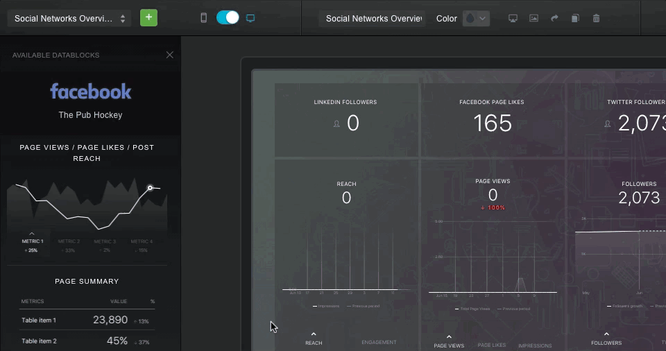
1- Add A Template to Your Account
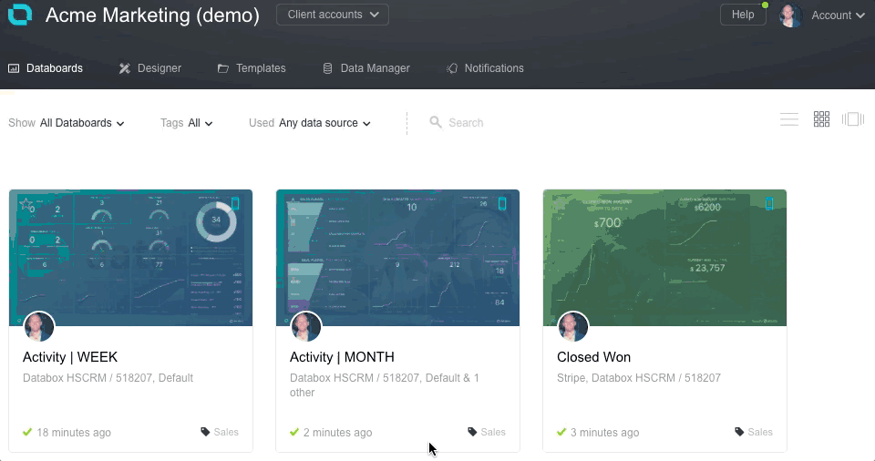
Templates are pre-made dashboards that top marketers have submitted to our directory. Some of them provide an overview of all your metrics from a specific service, like Google Analytics. Others go deep into specific metrics. For example, our HubSpot Landing Pages template tells you all you need to know about landing page performance.
Usually, marketers want to set up their marketing dashboards just the way they want them. But, if you would like to instantly populate your dashboard, or if you would like to get a new perspective on analyzing specific metrics, templates are there for you.
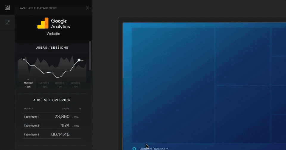
2-Add A Preconfigured Datablock to a new Databoard

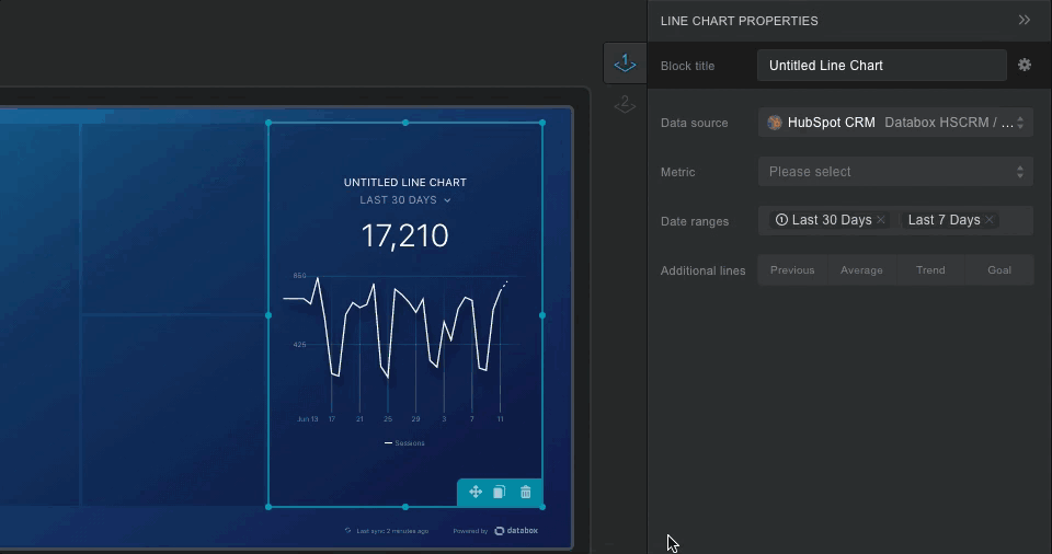
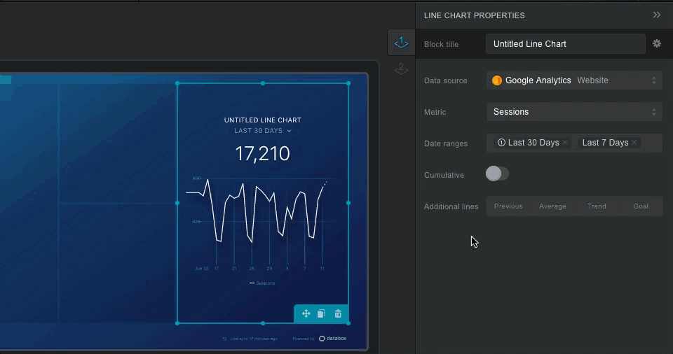
Datablocks are individual visualizations of specific metrics. Our Google Analytics integration includes a default Datablock that examines users and sessions over the last 30 days. You can use these to quickly explore the metrics available on custom Databoards.
3-Add A Custom Datablock to a new Databoard
We give you 15 different ways to visualize your metrics. But before you choose a metric, you need to determine the best way to display it.
Is time an important factor? You probably want a line graph.
How many data points do you want to compare? If less than 5, a pie chart may be best.
Do you want to see a month-to-month trend? You may need a Leaderboard.
4- Choose A Metric
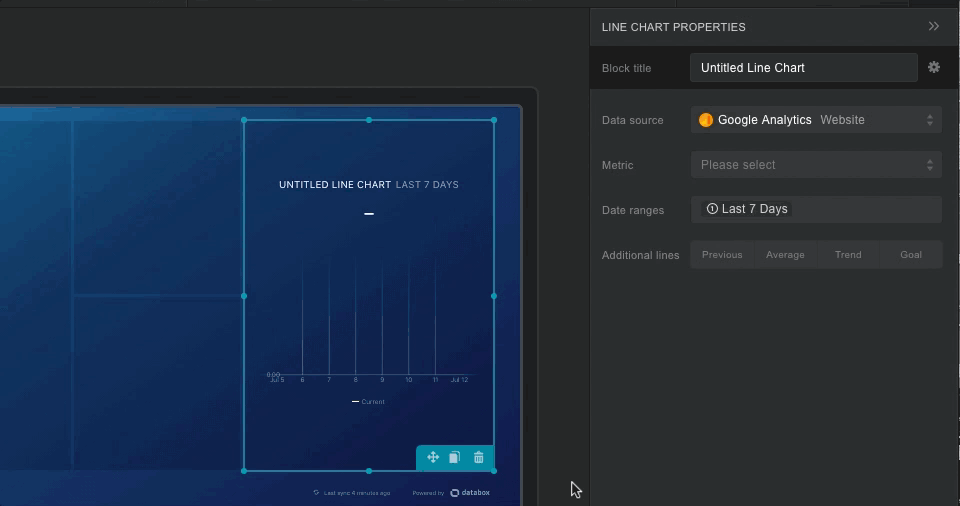
At this point, you probably know which KPI you want to display. Here is the key- you need to know the terminology from the digital marketing service to describe that KPI. Google Analytics has notoriously confusing terminology, but this specific jargon is necessary due to the variety of available in-depth metrics.
So, before you hunker down and start building dashboards, make sure you can map your KPIs to specific metrics in each of your services.
5- Choose a Timeframe
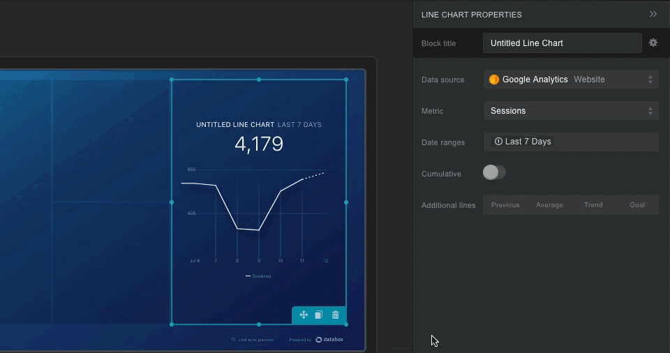
You can actually choose multiple timeframes for each metric, based around a day, week, month, quarter or year. You probably want to choose these based on your reporting period. Since you can switch the reporting period for all your Datablocks at once, make sure you load up the same options for each Datablock on the dashboard.
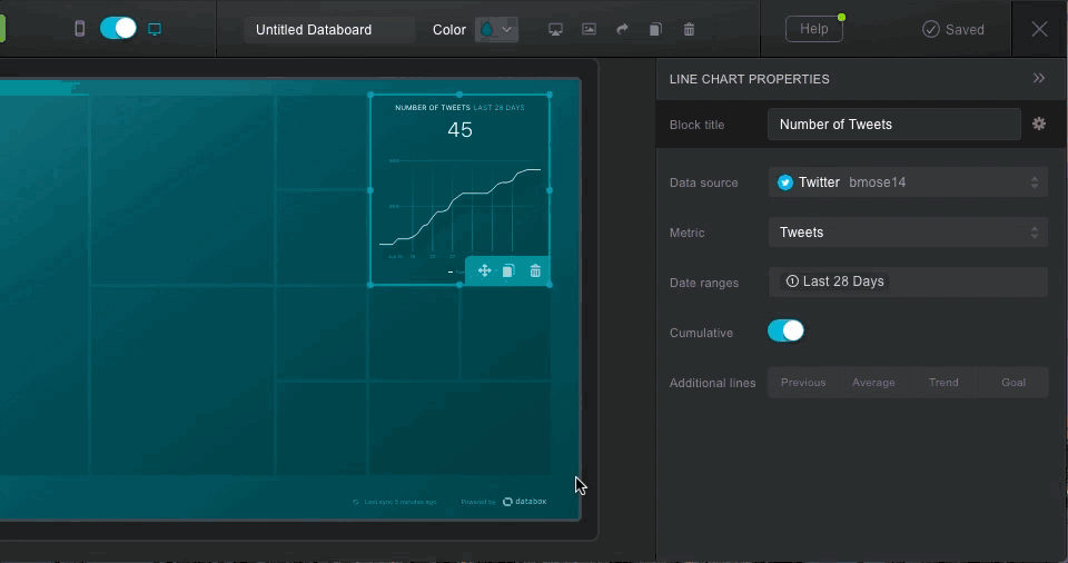
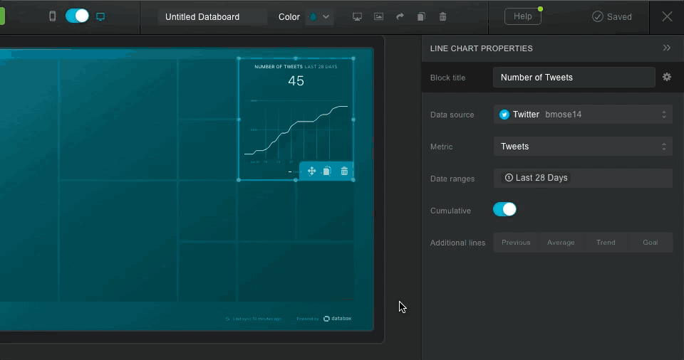
6- Compare to A Previous Time Period
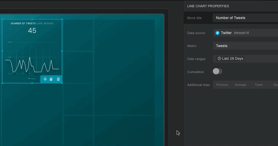
Let’s say you want to see how many times you have tweeted over the last 28 days. Then, you want to compare that to the previous 28 days to see how your habits have changed over the last month. You can do this with the ‘Previous’ toggle, which will instantly create a comparison. If you use a graph, it will chart the daily values from the previous 28 days on the same graph.
7- Set A Goal
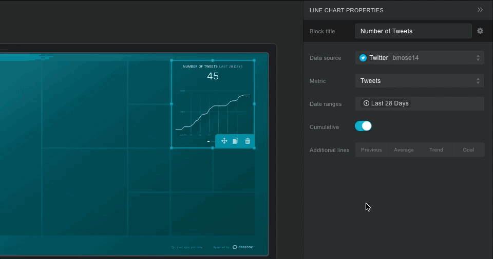
Let’s say you are hell-bent on tweeting 50 times this month. You want to make sure that is clear on your graph. You can use a Goal to add a line to your graph for that specific amount. Of course, you may want a more results-driven metric, like number of retweets or impressions. But that is up to you!
Measure The Exact Metrics You Need
8- Calculate Your Own Metrics
If you need to calculate ratios like open rate, deliverability, and goal completion rate, you need to create a new metric and save it with our Data Calculator.
9-Test Your Calculated Metric
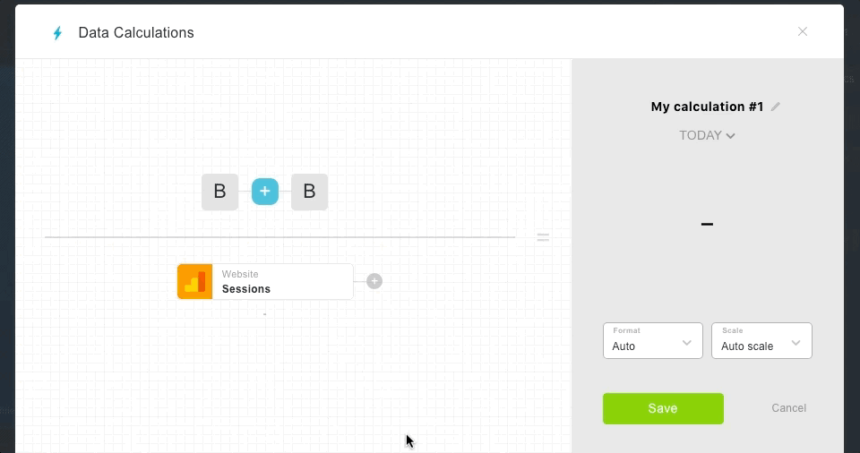
Let’s say you want to build your own Pages per Session metric in Google Analytics. You can calculate that number over multiple time periods and make sure it is working in Data Calculations.
10- Create a Custom Query for Specific Data
Sometimes, you need the standard metrics for subsets of your marketing data. This is where Custom Queries will help you. They allow you to group your data into specific cohorts, and just use that data in a Datablock.
11- Test Your Custom Query
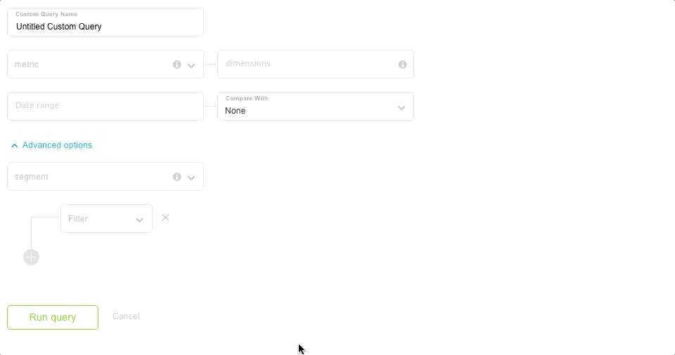
Let’s say you only want to count pageviews from organic sources over the last 30 days. The Custom Query tool gives you that level of specificity. You can also drill down using filters, just like in the normal Google Analytics interface. If you only want to look at URLs that contain ‘/blog/’, this is for you.
Collaborate with Teammates or Clients
12- Make Sure It Works on Mobile
If you want to review your data anywhere and anytime, you need the Databox mobile app. Or, if you have a boss or client that wants to casually check their data whenever they want, they need the mobile app too. The mobile toggle allows you to change the appearance and order of your Datablocks on mobile.
13- Set Up Weekly Reports
If your teammates or clients prefer email to a mobile app, no worries. You can send the real-time dashboard on a daily, weekly, monthly or quarterly basis so that you never forget to send out your updates.
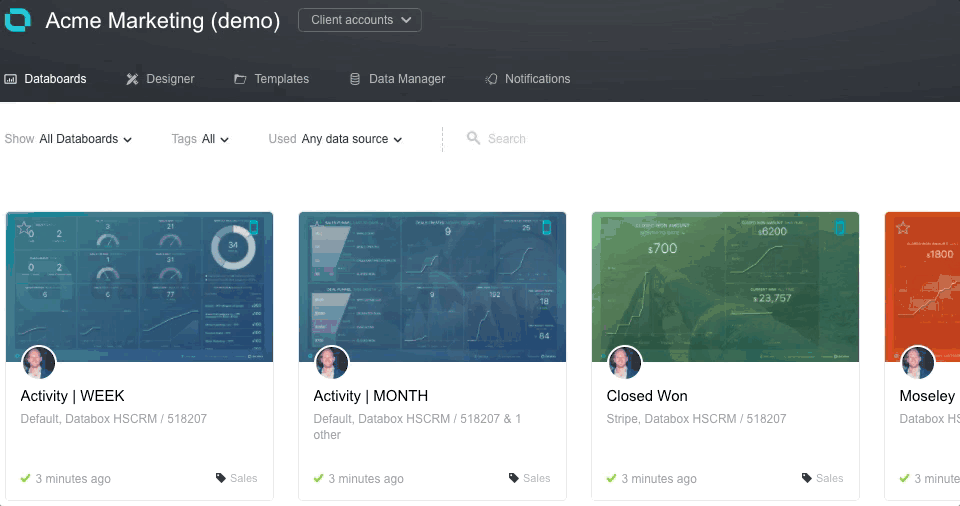
14- Create A Carousel of Databoards
Let’s say you have three specific dashboards that always go together, like HubSpot Landing Pages, HubSpot Email Campaigns and HubSpot Blog Post Performance. You can set up a carousel of dashboards that continuously loops the three of them repeatedly. This works well if you want to give a presentation or set up a TV in the office.
Add Clients to Your Account (Agencies Only)
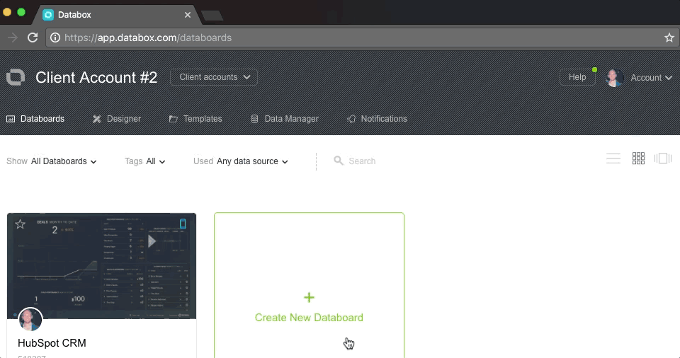
15- Add One Client Account
Before you start sharing your Databoards with clients, you first need to create a base set of reports within your agency account. These reports should cover the needs of most or all clients. Otherwise, you will spend hours on creating highly specific dashboards that cannot be shared.
After you have a consistent set of reports, you can then create client accounts to hook them up to client data sources.
16- Switch To Client Accounts
After you add a series of clients, you will need to go into each account to add data sources and create any custom dashboards relevant to that client.
17- Add Client Data Sources
Once you enter each specific client account, you need to add their individual digital services.
Make The Most of Your Limited Hours
Databox has free accounts for both marketers and agencies. If you do not already have an account on this custom dashboard software, you should give these features a try and see if they fit within your workflow.
Most marketers find that once they eliminate the hours of copy and pasting into reports, they can take time to do real analysis on their data. Their entire team can keep with marketing data in real-time. Agencies find that instead of giving high-level overviews to clients, they can immediately jump into analysis and data-driven strategies. Clients appreciate that they receive more service for the same amount of money.
Use these free marketing automation dashboard examples to streamline your marketing efforts and improve them.