Table of contents
Reporting can be as difficult and time-consuming as it is necessary. The larger an organization is, the more time is spent on reporting. On top of that, most companies produce between 5 and 20 reports per month, as shown in recent research on business reporting. In order to justify the time investment, these reports need to be useful. However, interpreting data can be complicated, which leads to the creation of numbers-heavy, difficult-to-parse reports that don’t bring much of value. This, in turn, leads to reports constantly being redone in search of useful and actionable information, wasting yet more time, and the cycle repeats.
Including interviews, open-ended questions, and surveys can ameliorate that somewhat, but that type of data doesn’t map neatly into graphs and tables, leading to more difficulties in reporting — which is why it’s frequently glossed over or omitted.
In addition, the focus on raw numbers and metrics, while undoubtedly useful, can provide a narrow understanding of the issue at hand. Excluding the human element and a more qualitative approach to information gathering and reporting robs organizations of unique insights that could help them develop.
This doesn’t have to be the case. You can present qualitative and quantitative data as a cohesive story if take the time to learn how. Emphasizing qualitative data and information derived from quantitative data as a narrative can make your business reports incredibly useful tools that will help your business grow.
This article will help you present qualitative data in business reports by covering the following:
- How Is Qualitative Data Reported?
- What is Reporting on Quantitative Data?
- What Is the Difference Between Reporting on Qualitative Data and Quantitative Data?
- How Do You Record Qualitative Data?
- Benefits of Presenting Qualitative and Quantitative Data Together
- Strengths and Limitations of Qualitative Research
- How to Structure a Qualitative Data Report
- Best Practices for Presenting Qualitative and Quantitative Data Together
- How to Improve Qualitative Data Reporting With Databox
How Is Qualitative Data Reported?
Qualitative research involves the collection, analysis, and interpretation of data that’s not easily reduced to numbers and are difficult to put into graphs and charts. This type of data usually concerns the social world and the concepts and behaviors of people within it. What’s more, it’s often presented as a narrative. It’s usually gathered from interviews or transcripts and consists of large amounts of text, so you’ll need to signpost it well and signpost your audience through it.
Since qualitative data analysis is often constructed around themes and stories, its reporting follows the same pattern. Direct quotes and the impact of raw numbers are used to support this analysis. Organization is also important, as data needs to be sorted in a way to frame a narrative and to help formulate general themes.
What Is Reporting on Quantitative Data?
This is what everyone thinks of they you say “data.” It’s black-and-white numbers and the “countable” part of the report. This includes raw numbers, percentages, statistics, metrics, and anything else that’s measurable and quantifiable — hence the name. This type of data is easy to replicate as it’s generated using specific calculations and formulas.
Since the main purpose of business reporting is to present high-level information in an easy-to-understand way, relying solely on quantitative data is not always the best idea. While charts, graphs, and tables are good for some types of information, they usually don’t tell the whole story. They convey data but not necessarily meaning, and meaning is invaluable to decision-makers.
What Is the Difference Between Reporting on Qualitative Data and Quantitative Data?
As qualitative data is built on the foundation of quantitative data, they’re both presented differently and have different purposes.
Quantitative data is fairly easy to report on; it’s basic raw numbers you can put in charts and possibly neat little graphs. You can calculate the impact of specific measured metrics and then use them as a basis for your report… but there will be something missing.
Qualitative data, on the other hand, needs to explain why quantitative data looks the way it does and what it all means. It’s often obtained using surveys, questionnaires, interviews, and similar methods. It can be used to make suggestions, explore ideas, and further explain quantitative results. Unlike qualitative data that’s “objective” and presented as cold, hard facts, quantitative data is presented as a narrative.
How Do You Record Qualitative Data?
Qualitative data is usually gathered via observation, interviews, questionnaires, and the like. Data collected in this way can be recorded through transcripts, checklists, audio and video recordings, or field notes. This data can be written down directly and/or behaviorally coded for easier sorting and synthesis. It’s important to be wary of the temptation to quantify qualitative data; you probably already have the numbers, now you need to understand the reasons, structures, and individual experiences.
In the recording stage, it’s a good idea to avoid interpreting the data, save that for analysis and reporting. Create clean data by clarifying meaning where needed, adding explanations in brackets, writing out abbreviations and acronyms (as a sidebar, if necessary), moving data points around, so they flow as a coherent narrative, and highlighting good and engaging quotes.
NOTE: Unless you have permission to attribute quotes, remove identifying information from the final document.
It can be helpful to include notes and insights about the context of the data gathering. You can include ancillary notes about the circumstances of the interview or the nature of the event being observed. For example: “The subject seven seemed confused and had trouble understanding the questions.”
Next, you want to capture emerging themes —this is especially useful if the data is collected over a long period of time or if there’s a gap between data collection and analysis.
Benefits of Presenting Qualitative & Quantitative Data Together
Of course, it’s obvious that business reports should include both quantitative and qualitative data. The former answers the question “what,” and the latter “why” and “how.” Both are necessary in order to make reports more engaging and to tell the story about how an organization or a business is performing. A report without one or the other is incomplete, can be ambiguous, or just plain boring and difficult to understand.
If you only used quantitative data in your report, the audience would likely end up mired in data points and miss the high-level analysis. If you were only to use qualitative data, they would have no evidence or clear numbers that would help them understand how you got to your conclusions.
Combining both types of data allows for a recursive process of rethinking and analysis. This process makes it clear which methods are and aren’t working and which initiatives need to be reconsidered. In addition, the combination of both types of data makes it easier for businesses to be transparent and share progress and achievements in a format that can be easily understood both internally and externally.
PRO TIP: Building a great story-telling dashboard is easy if you understand your audience, access the right data, and choose the right charts and metrics. Here’s how to create a report that actually tells a story.
Strengths and Limitations of Qualitative Research
While qualitative research is incredibly useful, it needs to be properly conducted to be truly effective. This means it needs to be done using a variety of information-gathering methods in order to build a comprehensive image of the subject being researched.
Strengths of qualitative research:
- Questions are not restricted to a specific set
- Allows issues to be examined in detail
- It’s possible to guide the interviewee in real time
- If needed, it’s possible to change the research framework and direction very quickly
- Since the data is based on human experience, it’s sometimes more compelling than quantitative data
- Findings can be transferred to another setting
- It allows analysts to discover subtleties and complexities that would be missed with other techniques
Limitations of qualitative research:
- Data is often collected from few cases and cannot be generalized to larger populations
- Research quality depends on the skills of researchers and can be affected by the researcher’s preconceptions and attitudes
- It’s more difficult to assess, maintain, and demonstrate rigor
- Collection, recording, and analysis of data can be time consuming
- The researcher’s approach can have an effect on the subject’s responses
- Findings can be difficult to present visually
How to Structure a Qualitative Data Report
Qualitative data can be structured in any number of ways. The segments should logically follow each other and below is just an example of a clear and simple qualitative data report structure; you may modify it as you see fit to suit the needs of your organization.
- Introduction – This is a simple overview of the topic. It includes the research question and a statement that justifies the research and the qualitative methodology. The introduction should provide background information, including relevant references, literature, and adjunct information.
- Methods – This section needs to clearly state and justify why particular research and analysis methods were chosen. The methods need to be outlined and illustrated with examples like focusing exercises, observation criteria, interview questions, etc.
- Sampling – Describe the study sample and setting. Since qualitative research has smaller sample sizes than quantitative research, this section should explain the sample in terms of characteristics and relevance to the wider population. Subjects are chosen either for maximum variation or because they have relevance to the study.
- Data Analysis – Include a description of how the data was analyzed. Did you use computer-aided qualitative data analysis software? Did you use a deductive or inductive process? You can include information about the context of the research, previous research done on the topic, and emergent themes (i.e., any issues participants raised).
- Discussion – Present the findings in the context of similar previous research or theories and your own influence on the data (as well as that of any member of your team or your organization as a whole). You may subconsciously affect the results, and you want to minimize the odds of that happening.
- Conclusion – The conclusion should summarize the main findings and emphasize the contribution of the research. A good idea is to ask three questions to determine if the conclusions are valid: How well does this analysis explain why people behave in the way they do? How comprehensible would this explanation be to a thoughtful participant in the setting? How well does the explanation cohere with what we already know?
Best Practices for Presenting Qualitative & Quantitative Data Together
Even the best research is not worth much unless it’s presented in a way that’s useful to the target audience and unless its results can be communicated in such a way to facilitate good decisionmaking.
Know your audience
If you’re reporting to organization leadership, you’ll probably focus on the strategic big-picture information. Reports for department heads, on the other hand, feature tactical and operational results. Follow your common sense. Present data that is relevant to your audience, and don’t clutter the reports by showcasing and overexplaining every single point of data.
Related: Reporting Strategy for Multiple Audiences: 6 Tips for Getting Started
Use visuals
This is more relevant for quantitative data. Diagrams, graphs, charts, and images are eye-catching, and they’ll keep your audience interested in the report. They also make hard data easier to understand.
BI dashboards are especially useful here, as you can use them to present information about past performance, trends, and projected outcomes of proposed changes in a way that’s simple and comprehensible.
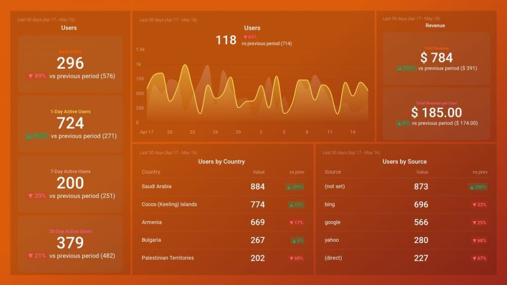
Pro Tip: Your Go-To Dashboard For Doing a Deeper Dive on Website Traffic and Conversion Sources
Struggling to find an easy yet effective way to gain a comprehensive understanding of your traffic sources, user behavior, and revenue generation?
You can do all that and more with our plug-and-play GA4 Acquisition dashboard template:
- Understand user acquisition: See where users come from, tailor outreach, and track new user growth;
- Focus on high-performing channels: Identify top channels, optimize resource allocation, and adjust underperformers;
- Track revenue & engagement: Monitor revenue growth, active users, and the effectiveness of your campaigns;
- Go beyond traffic & conversions: Gain deeper insights into demographics, sales, customer journeys, ARPU, and more;
- Optimize marketing & drive results: Make data-driven decisions to improve your marketing strategy and achieve business goals.
You can easily set it up in just a few clicks – no coding required.
To set up the dashboard, follow these 3 simple steps:
Step 1: Get the template
Step 2: Connect your Google Analytics 4 accounts with Databox.
Step 3: Watch your dashboard populate in seconds.
Pick poignant examples
Whenever possible, pick quotes that are representative of the analysis findings and see if you can back it up with other qualitative data. There’s no need to include large portions of an interview in a report. It’s tedious and no one will read it.
Connect quantitative and qualitative data logically
This will allow your audience can see how the numbers and their interpretations interconnect. If you’re using reporting software, you can link the data and use it to tell an engaging story. You can use qualitative analysis to decipher “hard” measurements and progress metrics and then lead all that into progress on achieving big-picture strategic objectives.

Improve Qualitative Data Reporting with Databox
As you can see, using qualitative data in business reports can only serve to make them better, more actionable, and more engaging. A well-crafted report that includes both qualitative and quantitative data can be used as a comprehensive guide to achieving amazing business goals and solving seemingly insurmountable problems.
We’ve covered how to conduct both qualitative and quantitative research, how to combine them, and how to assemble a report in marketing reporting software. This still requires doing the legwork when it comes to assembling metrics, collating data, planning and executing questionnaires, and a myriad of other tasks. Not to mention ensuring it all looks eye-catching and understandable to the clients. Assembling that kind of report is complex and requires a lot of time and attention. Time and attention you could be directing elsewhere.
Want to do it faster? Have more time for your other projects and running a business? Databox can help you assemble all the metric and qualitative data points you need. Customize your own data sources, and customizable dashboards will populate with nice-looking visualizations instantly.
But wait! It gets even better. Databox offers connecting 3 data sources and building 3 dashboards for free! Just create your free account, connect your data, and start building high-quality reports immediately.