Table of contents
Proper customer relationship management can bring you multiple benefits: increased customer satisfaction, increased profitability, and more sales.
But to manage these relationships efficiently, you need to set up clear goals, automate manual tasks that take up too much of your time, and ensure a clear overview of your performance.
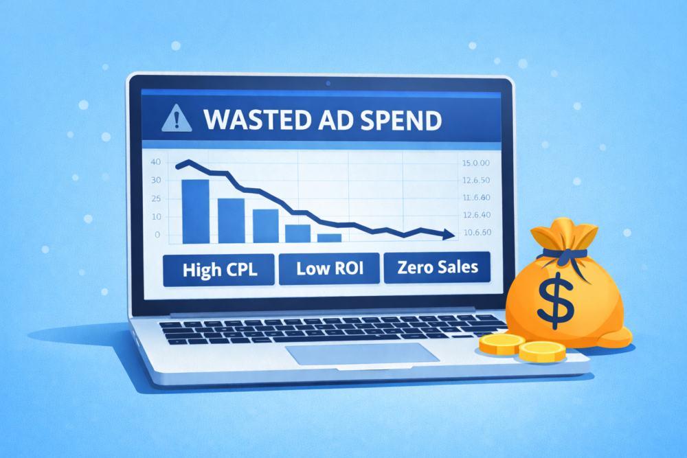
If you struggle to convert your data into useful insights to identify issues and opportunities in real-time, you need a CRM KPI dashboard, where you can track relevant KPIs and use them to make informed business decisions.
We’ve created a complete guide on CRM KPI dashboards to help you fully leverage their power. Here’s what you’ll learn in this article:
- What Is a CRM KPI Dashboard?
- How CRM KPI Dashboards Work
- Who Uses CRM KPI Dashboards?
- Benefits of CRM KPI Dashboards
- What Should You Include in a CRM KPI Dashboard?
- Most Popular CRM KPI Dashboard Data Sources
- How to Create a CRM KPI Dashboard?
- 5 Things to Consider When Creating a CRM KPI Dashboard
- CRM Dashboard Examples
What Is a CRM KPI Dashboard?
A CRM KPI dashboard is a centralized, interactive, and customizable report that contains relevant sales and customer relationship management KPIs visualized through graphs, charts, tables, and scorecards.
The main purpose of CRM KPI dashboards is to track and measure your organization’s business and sales processes, with the goal of improving them. Unlike static CRM reports, CRM KPI dashboards allow you to track all the data in real-time and act quickly to any sudden changes in your usual activity, whether positive or negative.
What professionals usually track in CRM KPI dashboards are sales pipeline(s), sales activities, and revenue metrics.
How CRM KPI Dashboards Work
CRM KPI dashboards collect data from different tools you use to give you information about the most relevant KPIs you track to evaluate your progress toward your business goals.
Through integrations with other tools, CRM KPI dashboards pull data from different sources: sales and marketing software, e-commerce software, accounting, and financial software, apps like Google Calendar, and more. They consolidate the data, displaying it through metrics you chose as your KPIs, and provide you with interactive, actionable reports. Based on these reports, you can easily compare and analyze your data to draw conclusions and build an action plan for the future.
Also, KPI dashboards are:
- Regularly updated, so you can always count on the most recent data
- Customizable, so you can eliminate and add KPIs as your priorities change
Who Uses CRM KPI Dashboards?
CRM KPI dashboards are beneficial for different teams within an organization:
- Sales: Sales representatives can use CRM dashboards to track their tasks, pipelines, and progress to make sure they reach the pre-set quotas, while managers and account executives can monitor their whole team’s or organization’s sales activities, performance, and goals.
- Marketing: Marketing managers and specialists can get valuable insights into the performance of lead-nurturing email campaigns or gated assets, or size of their contact lists.
- Customer Support: Customer support representatives can monitor KPIs that affect customer relationships, such as ticket response times or the number of pending tickets, as well as overall customer satisfaction rates.
- Business Owners: Small business owners can use a CRM dashboard to track progress toward their main business goals and understand how their business is performing. This way, they can identify areas of improvement or scaling opportunities.
- C-suite: Executives can use CRM dashboards to get a quick overview of their business and sales performance and understand how they should manage their budget in the upcoming period.
Benefits of CRM KPI Dashboards
We asked 35 professionals about their experience with dashboards.
All respondents from our survey are dashboard users: 74.4% have been actively creating and using dashboards for some time, while 28.6% have just started using them.

The majority of the companies we surveyed (63%) use 2 to 5 CRM-related dashboards.

Here are five benefits our respondents have seen since they started using CRM dashboards for their business.
Optimized Workflow
It takes time to create reports manually, especially if you need to do it daily or weekly. Dashboards allow you a quick overview of your most important metrics, so you immediately know what you need to do, without waiting for a report. Moreover, most dashboards allow you to schedule automatic report generation, so you save even more time and make your workflow even more efficient.
Harriet Chan of CocoFinder has helped her team work more efficiently thanks to a CRM KPI dashboard.
“The introduction of CRM KPI dashboards into our business was a total game-changer. It completely streamlined our process and allowed us to track our progress in a much more efficient way. Instead of relying on manual data entry and tracking, we were able to automate the entire process and get real-time updates on our progress,” explains Chan.
PRO TIP: Monitor Your Sales Team’s Performance in One Dashboard
Smart Sales Managers know that to achieve your monthly and quarterly goals, you have to monitor your team’s sales performance on a daily, weekly, and monthly basis. To do that, you need an actionable dashboard that summarizes both team and individual sales rep metrics and allows you to:
- Understand the current sales pipeline.
- Track sales rep performance.
- Compare team results to revenue goals.
If you use the HubSpot CRM, you can benefit from the experience of our sales experts, who have put together a plug-and-play Databox template showing some of the most important metrics for monitoring your sales team performance. It’s simple to implement and start using as a standalone dashboard or in sales reports!
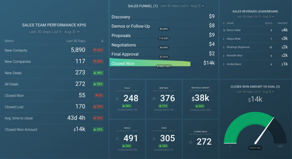
You can easily set it up in just a few clicks – no coding required.
To set up the dashboard, follow these 3 simple steps:
Step 1: Get the template
Step 2: Connect your HubSpot account with Databox.
Step 3: Watch your dashboard populate in seconds.
Real-Time Insights
When you create a static report, you can only look back on the data from yesterday, last week, or last month. Sometimes, that leads to lost opportunities or issues growing bigger. On the other hand, dashboards display real-time data and are constantly updated, so you always have the freshest information about your performance.
Related: How to Develop an Actionable Customer Insight Report Your Whole Team Can Use
Easy Prioritization
Dashboard reporting helps you identify urgent issues in your sales pipeline and business processes, and opportunities that could improve your performance and sort them by priority. With clear and concise visualizations of your data, your teams can easily determine what they’re supposed to tackle first instead of spending hours analyzing long, detailed reports.
Colton de Vos of Resolute Technology Solutions shares how simple data visualizations have helped his team improve their planning activities.
“Having visualizations of key sales trends over time has helped in our quarterly and annual planning sessions. Our team can quickly see high level items such as if the average time to close a deal has gone up or down. Then, has the ability to drill in deeper and filter by type of deal to see a more granular view of these trends to make adjustments going forward.”
Simplified Access
Dashboards are available for everyone to access from any location, on any device. When you create a static report, you usually need to share permissions manually or send the document to others on your team, not to mention that emails easily get lost in our full inboxes. Dashboards allow different teams to compare KPIs from different dashboards and draw even more valuable conclusions.
Informed Decision Making
Real-time data insights, collected and displayed in one place, shared with all teams involved provide you with the possibility to make better, informed decisions about your business.
Erin Neumann of Be Aligned Web Design confirms that using a CRM KPI dashboard has impacted her business positively.
“KPI tracking is essential for moving your business forward, and we were able to do that with our dynamic dashboard. By using our KPI dashboard, we are able to convert data into insight in real-time, allowing us to make better decisions,” explains Neumann and adds that she found tracking and managing business goals in one centralized place extremely helpful.
“I could easily monitor my company’s progress and ensure that we were taking the right steps forward to gain success,” says Neumann.
Andy Kolodgie of Sell My House Fast says that executives also rely on CRM dashboards when it comes to business strategy.
“Our CRM dashboard is one of our most important dashboards. It has significantly impacted our business, especially customer service. We’ve been using it to keep track of our sales performance. By measuring metrics like close rate, average deal value and sales cycle length, we stay on top of everything that goes on. These metrics and the derivative insights are highly beneficial in decision-making. Our managers and executives regularly use the CRM dashboard for strategy formation and adjustment,” explains Kolodgie.
What Should You Include in a CRM KPI Dashboard?
Professionals we surveyed about their CRM dashboard KPIs mentioned over 30 different metrics. That means there isn’t one correct answer to what you should include in your CRM dashboard. It’s important to experiment with your CRM KPI dashboard until you determine which selection of metrics works best for you.
James Chapman of Bella Bathrooms confirms that “it took his team and him some time to get their CRM dashboards right,” but that it eventually helped them streamline their processes and increase total ROI.
“The metrics we include are leads, sales pipeline, closed deals, individual sales. Understanding how each individual within the sales team is performing allows us to offer help or training when an employee is underperforming before it becomes an issue. Overall, the CRM dashboard has become a crucial tool in keeping our business on track,” adds Chapman.
Many professionals focus on marketing and sales when building CRM dashboards.
“That’s usually the departments working mostly with the CRM,” says Bastian Hammer of Bastian Hammer and shares what’s inside his team’s dashboards.
“Often, in sales & marketing we’ve got the standard dashboards like:
- Closed deals (per month, per user, month over month, etc.)
- Deal Pipeline
- Expected revenue and forecasts
- Campaigns and outcomes.
Sometimes (works fairly well for the service industry) they have just one or two software systems to integrate with the CRM data, like projects, financial, and more.”
There are five CRM metrics most professionals we surveyed consider relevant:

CLV
CLV (Customer Lifetime Value) represents the overall worth of a customer during the period of their engagement with your business. It’s a key metric for understanding and improving your customer experience, as it’s more affordable to retain your existing customers than attract new ones.
CAC
CAC (Customer Acquisition Cost) represents the total amount of money your marketing and sales departments need to spend to acquire one new customer. You can calculate it by dividing the total costs of gaining new customers by the number of customers you gained.
Conversion Rate
Conversion rate is the percentage of people who take the desired action that achieves your company’s acquisition goals – for example, the number of website visitors who signed up for your newsletter, booked a call, made a purchase, or similar. Sales conversion rate, for example, is a key metric that shows how successful your sales team is at turning leads into customers.
NPS
NPS (Net Promoter Score) is often used by customer experience teams to determine how loyal your existing customers are to your brand. This metric also gives you insight into customer satisfaction. You measure it by asking one question: On a scale from 0 to 10, how likely are you to recommend our company to a friend? Then, you subtract the percentage of 6 or lower answers from the percentage of 9 or 10 answers and get your NPS.
Churn Rate
Churn rate, or attrition rate, refers to the percentage of customers who stop using your products or services, cancel or don’t renew their contracts, usually on an annual basis. Sometimes, churn rate is also used to describe the percentage of employees who leave a company.
Related: Save Your Business From Churn: 9 Churn Risk Factors to Identify
Most Popular CRM KPI Dashboard Data Sources
We also asked companies what sources they pull data from for their CRM dashboards. Common responses included Salesforce, Zoho CRM, and Zendesk Sell. However, HubSpot is by far the most commonly used software to pull data for this purpose—66% of respondents use this popular tool as the primary data source.

“I use the HubSpot CRM dashboard to track and analyze the performance of my sales representatives. I have leveraged different metrics like client satisfaction, customer acquisition and retention ratio, and conversion rate, to name a few,” says Richard West of PuppyHero.
“As a result, the customer support team better understands consumer issues and resolves them more efficiently. Additionally, my customer retention has improved, positively impacting my sales and revenue generation.”
PRO TIP: Wondering how to easily track and visualize Close Rate by Sales Rep in HubSpot CRM? The answer is using it with Databox. Take a look at our data snack below to learn how to create this custom metric and track it without manual workarounds.
How to Create a CRM KPI Dashboard?
If you use Databox, you’ll find creating a CRM KPI dashboard rather simple. Here are the instructions to follow.
- Open your Databox account and click on New Databoard to start creating.
- Choose if you want to use Wizard and select the desired metrics immediately, or Start Blank to create the board from scratch.

- Once you’re ready to start building your dashboard, choose the desired data source from the menu on the left.
- Choose the desired CRM metrics (basic, custom, or calculated) and drag & drop them onto the dashboard.
- Select a Datablock to access the property manager and design the block as you like.

You can also add Datablocks from the Visualization library, by selecting it from the tab on the left. When the available Datablocks are displayed, choose the ones you like and place them on the dashboard. You can change their size and position as you see fit. In the menu on the right, you’ll see a number of options to complete the dashboard: metrics, data sources, etc.
It’s also possible to add Datablocks from My Metrics. Access this menu by clicking on the My Metrics icon on the left side of the screen, choose the desired visualization, and place the Datablock on the dashboard.
Visualization Types Cheat Sheet
If you’re having trouble choosing the suitable visualization for your metrics, this cheat sheet will help. Take a look at the different types of visualizations and what type of data they work with best.
- Number blocks: simple data
- Line charts: patterns over a period of time; comparisons to previous periods
- Bar charts: comparison of different dimensions
- Combo charts: correlation between two metrics
- Pie charts: distribution of data
- Tables: exact values and comparison percentages
- Progress bars: progress towards a goal
- Gauge: goal plus a max value
- Funnel: vertical visualization, data from single or multiple metrics
- Pipeline: horizontal visualization, data from multiple metrics
- Compare: two metrics side by side
- Interval: values of the same metric for multiple data ranges

TOP TIP: Don’t go overboard with the number of KPIs. Less is more in this case, and will give you a clearer picture of your performance. Creating simpler weekly reporting dashboards might do the trick, just like it did for Richard Baker of TWC IT Solutions and his team:
“Instead of monitoring and optimising our customer service KPIs on a monthly level, we decided to create a simpler weekly reporting dashboard that would only allow us to monitor the most important metrics, our core KPIs. Thus, instead of monitoring 14 different metrics, we narrowed our focus to four. As a result, we were able to react faster each time we detected a problem. This resulted in more satisfied clients and a better customer service agent performance,” says Baker.
Note: Your new dashboard is fully optimized for both desktop and mobile devices.
5 Things to Consider When Creating a CRM KPI Dashboard
Before you leave this article and start building your own CRM KPI dashboard, we’d like to share a few best practices to help you make the most out of your dashboard reporting.
- Great Tools Help You Achieve Great Things
- Simple Dashboard Design Ensures Clarity
- Several Dashboards Prevent Chaos
- The Dashboard Should Fit the Audience
- CRM KPIs Follow Business Goals and Priorities
Great Tools Help You Achieve Great Things
Using proper dashboard building tools rich with features that make your job easier is the first step toward creating a great CRM KPI dashboard.
To ensure you’ve got the best tool, look for these features in your software of choice: integrations with other tools you’re already using (like HubSpot, Salesforce, and more), customization options, robust reporting, automated workflows, simple user interface.
Simple Dashboard Design Ensures Clarity
It may be challenging to choose a few metrics to include in your CRM KPI dashboard and keep it neat and simple. But, it’s best to start with the most important KPIs that you can always build upon later.
Adding too many metrics will create chaos on your dashboard and you won’t be able to draw clear conclusions from the collected data. Your data should tell a story, so put the visualizations in a logical order and use the cheat sheet we shared in the previous section to display all data in an adequate way.
Several Dashboards Prevent Chaos
Your CRM KPI dashboard should reflect your overall sales strategy and activities that contribute to it.
However, there may be different contributors to lead generation, such as email campaigns, content on your blog, social media, and more. You can’t possibly fit all these metrics into one CRM KPI dashboard. That’s why it’s helpful creating several dashboards and track related metrics in a more streamlined way.
The Dashboard Should Fit the Audience
You will sometimes need to present your dashboard reports to your teammates. Other times, you’ll need to report to your manager or the C-suite. Always consider the audience of your CRM KPI dashboard reports to make it understandable and relevant for everyone.
Related: Reporting Strategy for Multiple Audiences: 6 Tips for Getting Started
CRM KPIs Follow Business Goals and Priorities
The KPIs you chose today are not set in stone; your priorities and goals may change, which means you’ll need different KPIs as well.
Testing and tweaking your dashboard will help you discover the best combination of KPIs that allows you to create a clear picture of your success. Reevaluating your dashboard and KPIs at least once a year will help you keep it up-to-date, relevant, and useful.
CRM Dashboard Examples
We’ve given you enough theory on how to build CRM KPI dashboards. Now, it’s time to share some examples to inspire you and get you started. Here are the most popular CRM KPI dashboards you can copy for your business.
- HubSpot CRM Dashboard Template
- Pipeline Performance Dashboard Template
- Pipedrive CRM Dashboard Template
- HubSpot KPI Trends Dashboard Template
- SharpSpring Sales Performance Dashboard Template
- CallRail Overview Dashboard Template
- Salesforce Pardot Opportunities & Prospects Overview Dashboard Template
- Salesforce Sales Pipeline Value Dashboard Template
HubSpot CRM Dashboard Template
The HubSpot CRM dashboard helps you track and grow your sales pipeline hassle-free. By monitoring and measuring metrics like deals, closed deals won, new contacts, and more, you can understand how your sales pipeline is performing and which team members are the most successful. In this dashboard, you can compare the current month’s activity to the previous month, identify your weak points, and ensure you make progress month over month.

Pipeline Performance Dashboard Template
The Pipeline Performance dashboard allows you to track your marketing and sales joint efforts and evaluate the health of your funnels. The available metrics include lifecycle stages, landing page conversions, MQLs, SQLs, and deals created. They allow you to understand better how you can improve your pipeline to increase the conversion rates and stop deals from falling through.

Pipedrive CRM Dashboard Template
The Pipedrive CRM dashboard enables you to track your sales deals as they move through different stages of your sales pipeline. The simplified view of your sales pipeline allows you to identify opportunities and shortcomings of your sales strategy, and see how your sales reps are progressing toward their individual goals. You can track and measure metrics like deals started, deals won, or deals lost by reason, and work on improving your sales pipeline.

HubSpot KPI Trends Dashboard
The HubSpot KPI Trends dashboard is your ally in identifying trends and patterns that can help you tweak your strategy for better results. Whether you spot an opportunity to take an advantage of or an area of improvement, you can act quickly and even share notes with the rest of the team to make your collaboration more efficient. Track metrics such as sessions, MQLs, new leads, and deals closed won to spot trends and act upon them quickly.

SharpSpring Sales Performance Dashboard
The SharpSpring Sales Performance dashboard facilitates sales performance tracking and help you grow your sales. You can compare the current month’s outcomes with previous months by tracking count and amount of opportunities, won and closed opportunities, opportunities won split by campaign, and more. These metrics enable you to find out which campaigns bring you the best results, so you can replicate your most successful strategies in the future.

CallRail Overview Dashboard
The CallRail Overview dashboard is a comprehensive template that tracks your sales teams’ incoming calls. You can track metrics such as 1st time calls by source, total calls, missed calls, calls by source, to find out where your calls come from, how many calls were taken or missed within a specific date range. This data can help you gain important insights into the performance of your sales reps and identify areas where your strategy might need a tweak to become more effective.

Salesforce Pardot Opportunities & Prospects Overview Dashboard
The Salesforce Pardot Opportunities & Prospects Overview dashboard gives you a holistic view of your opportunities and prospects so you can ensure your campaign is successful. Tracking the most relevant metrics like opportunities growth, prospects growth, opportunities by campaign, or prospects by campaign, over time allows you to identify trends and potential weak points in your strategy. In this dashboard, you can also track prospect demographics, campaign costs, and conversion rates through your funnels.

Salesforce Sales Pipeline Value Dashboard
The Salesforce Sales Pipeline Value dashboard allows you to accurately track the deals closed in the current quarter, while monitoring the whole sales pipeline. The dashboard also provides you with a way to track the expected value of the opportunities likely to be closed before the quarter ends. It helps you understand where most of your leads come from, what marketing channels bring in most opportunities, and how much your deals are worth in total.

Optimize CRM Dashboard Monitoring and Reporting with Databox
You already have the knowledge necessary to achieve great results and reach your goals. We have the tools to help you do it hassle-free, and save valuable time and resources in the process.
Databox helps businesses replace daunting, hard-to-read reports with efficient, interactive, visually appealing dashboards (and soon reports, as well). These dashboards allow you to track and measure your most relevant metrics in a simplified, well-organized way and get a holistic picture of your performance with just a glance at your screen.
Thanks to over 70 integrations and more than 4,000 metrics, you can pull the data from virtually any data source and then choose the most suitable visualization type to display your numbers. With Databox, you will be able to tell a compelling story with your data no matter who your audience is and take your customer relationship management and sales strategies to the next level.
Interested to learn more about our dashboards? Create a free account to get started and explore all the available dashboard reporting options.