Uses one-click integrations:
-
 CallRail
If you don't use CallRail, you can pull data from any of our 130+ one-click, native integrations or from spreadsheets, databases and other APIs.
Try this dashboard for freeWhat you’ll learn from this CallRail Overview Dashboard Template
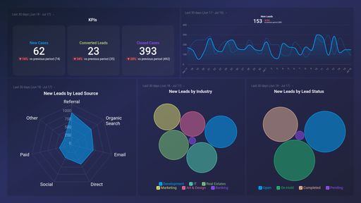
- Where do my phone call leads originate from? View the total number of calls your team received within a specified time period. Find out where your business calls originate from, and how many calls each source generated for your business (in terms of percentage). Learning where your calls come from is helpful, as it lets you and your team know what sources to focus on (in terms of call volume and quality).
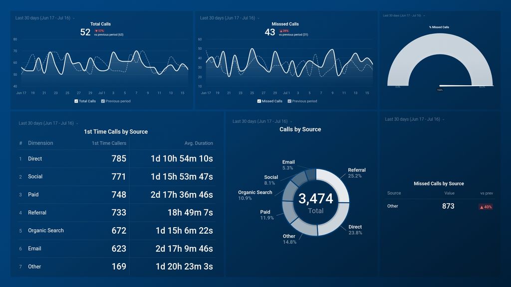
- What percentage of business calls go unanswered? See what percentage of calls were missed by your team in a day, week, month, or year. Missed calls are essentially missed sales opportunities, and not only can that harm your revenue, but it could also harm your reputation. If the volume of missed calls is high, dig in to find out why as it might mean that your sales team is overwhelmed or understaffed, lacking the right tools, or just focused on other forms of communication. Then, based on your findings, you can make necessary adjustments.
- Where do my missed calls come from? Keep track of your missed calls and see where they come from. Find out which sources generate the most missed calls within a given time period. Dig in to learn the reason(s) these channels are generating a high chunk of missed calls. For example, it could be that the specific source is not in sync with work hours.
- How many calls were made last month? Track the total number of calls handled by your team each day (incoming and outgoing calls combined). Then, measure your actual call volume against your set goal. If the total number of calls is lower than planned, you might want to revisit your prospecting strategy or better optimize your channels for generating lead calls.
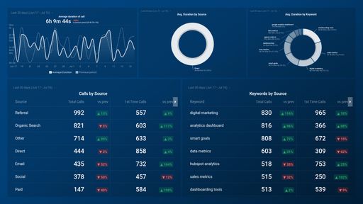
- Where do my first-time calls come from? See your best and least-performing channels for generating first-time calls. Also, track how long calls from these sources last on average.
Pull additional data using our deep integration with CallRail.
What else can you track and visualize with our deep integration with Callrail? When it comes to tracking and managing your business communications, almost anything:
- Call volume
- First-time callers
- Call duration
- Form submissions
- Customer location
- Lead status
- Missed, abandoned, received calls, and so much more
There are many, many different metrics and metric combinations you can track using CallRail. And in Databox, you can quickly visualize 100s of CallRail metrics in a variety of different ways.
Read more about Databox’s CallRail integration.
CallRail metrics included in this template
- % Missed calls
-
Missed Calls
The Missed Calls metric in CallRail refers to the number of calls received by your business that were not answered or picked up. This metric is important for tracking missed opportunities and identifying areas for improvement in your call answering and handling processes.
-
Total Calls
Total Calls is a CallRail metric that tracks the total number of calls received through your CallRail tracking numbers.