Table of contents
Most executives believe they are metric-directed. The evidence says they are metric-adjacent — and the gap is costing them decisions.
TL;DR
- Most executives are data-adjacent, not metric-directed: data is visible in the room, but it is not changing the decision. The test is simple: would the decision look different if the data showed the opposite?
- Three signs your executive team is data-adjacent: you cannot explain why a metric moved without asking an analyst, gut feel fills the gap because the analyst queue is too slow, and metric disagreement derails meetings before strategy can begin.
- More tools and dashboards have made the problem worse, not better. Most AI analytics tools introduce a new failure mode: confident-sounding answers built on hallucinated calculations.
- Trustworthy AI analytics requires four things: plain-language interpretation, a separate computation engine running against real data, standardized metric definitions, and answers traceable to source data. Most tools deliver only the first.
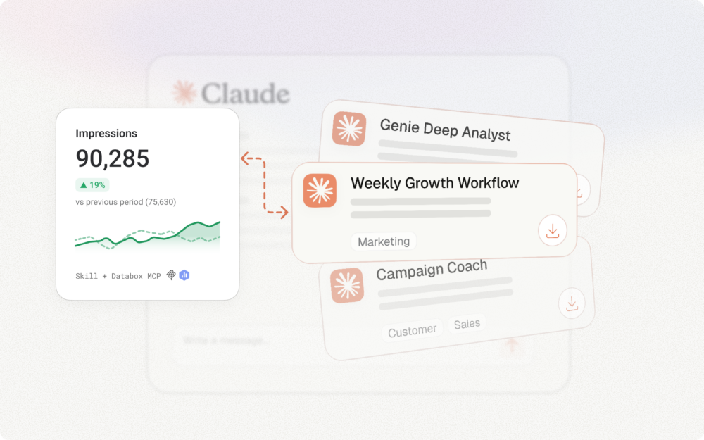
- Databox Genie answers the question the room is actually asking, not just what a metric shows, but why it moved, in plain language, grounded in verified data, at the moment the question arises.
Introduction
Monday morning. The leadership sync is five minutes in and someone pulls up the CAC chart. The number is 18% higher than last month. The team reviewed the dashboard on Friday. The metric was visible. And yet nobody in the room can explain why it moved.
The data was present. The decision will still be made. Those two facts have almost nothing to do with each other.
Welcome to data-adjacent decision-making, the dominant mode of executive analytics today.
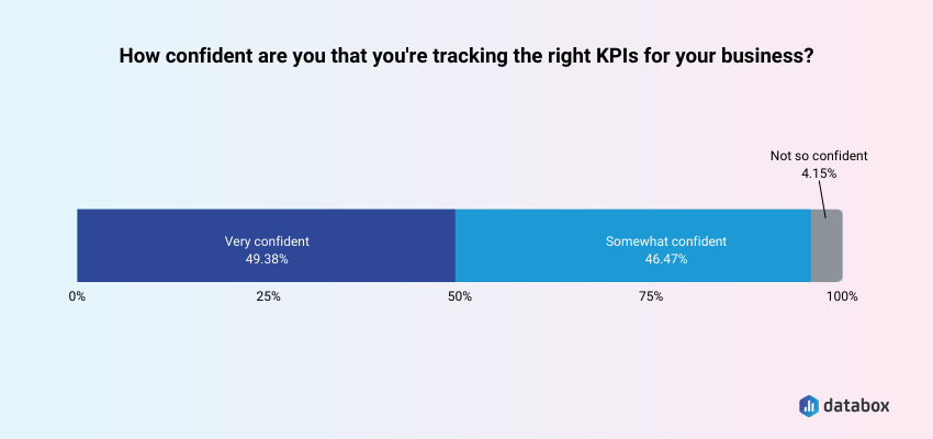
According to Databox’s State of Business Reporting research, only half of business leaders are very confident they are tracking the right KPIs in the first place. The gap is not access. Executives have dashboards, KPI reviews, and BI tools. The gap sits between seeing data and deciding from it.
What follows is a precise diagnostic: are you genuinely deciding from data, or are you operating in data-adjacent mode without knowing it? And if the answer is the latter – what does the structural fix actually look like?
What It Actually Means to Decide From Data (vs. Decide Alongside It)
Deciding from data is not a posture or a tech stack. It is a decision rule.
A decision is genuinely metric-directed if it would change when the data changes. If the decision was already formed and the data was summoned afterward to support it, that is data-adjacent.
Data-adjacent means data is present in the room, referenced in the meeting, displayed on the screen, but it is not directing the decision. Dashboards are open. Metrics are referenced. KPI decks are reviewed. The data decorates the decision rather than directing it.
Call it data science theater: the performance of being analytically rigorous without actual metric-directed decisions. Impressive dashboards that do not change behavior. Metrics reviewed in retrospect. KPI decks that describe what already happened rather than inform what happens next.
The distinction matters because data-adjacent looks like metric-directed from the outside. A CFO who opens the margin report after forming a view on pricing is operating in data-adjacent mode. A CFO who opens the margin report and lets the numbers reshape the pricing decision is operating in metric-directed mode. Same dashboard. Same metric. Entirely different decision architecture.
The clean test: Data-adjacent means you check the dashboard after you have already formed a view. Metric-directed means the dashboard is where the view forms. Data validates in the first case. Data directs in the second.
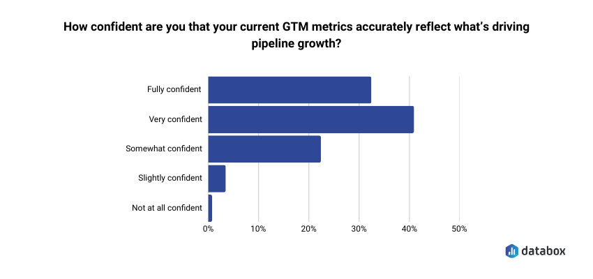
The Databox “Beyond Attribution” survey found that only 41% of go-to-market leaders are very confident their current metrics accurately reflect what’s driving pipeline growth. Confidence is a prerequisite for letting data direct decisions rather than decorate them. The majority of executives are operating without it.
For a closer look at the infrastructure required for genuine metric-directed decision-making, Databox’s AI analytics overview maps the full picture.
The Three Signs Your Executive Team Is Data-Adjacent
A diagnosis is only useful if it is specific enough to recognize. Each of the following signs is drawn from real executive behavior — the kind that reads as rigorous from inside the room while quietly producing data-adjacent outcomes.
Sign 1: You Are DRIP: Data-Rich, Information-Poor
Your team has access to data across seven platforms, three dashboards, and a weekly analyst report. Ask why conversion dropped last week and the honest answer is: no one knows yet. A solid answer requires a 48-hour turnaround.
Data scattered across systems requires substantial analyst mediation before it becomes usable. The volume of data creates fatigue rather than confidence. Zulay Regalado of Zeotap put it precisely in Databox’s research on data analysis mistakes: “Many marketers are data-rich and insight poor — meaning they struggle with the gap between having customer data and being able to act on it.” Databox’s own survey of marketing data professionals found that more than 85% reported being unsuccessful with analysis at some point — not because the data was unavailable, but because turning data presence into reliable conclusions is harder than it looks.
The paradox: more data access has produced less decision confidence, not more. When an executive cannot answer a first-principles performance question in real time, the data is present — but it is not doing the work it was supposed to do.
Sign 2: Gut Feel Is Driving; Data Is Riding Shotgun
Decisions are made in the leadership sync. The data review is scheduled for Thursday. That sequencing is diagnostic.
When data is consulted after the decision direction is already set, it functions as political cover rather than strategic input. The sequencing reveals the real relationship between the executive and the data: gut feel forms the view, and the analyst queue exists to confirm it, not challenge it. Gut feel fills the gap the analyst queue creates, and as long as answers take 48 hours, nothing changes.
Sign 3: Your Team Debates Which Number Is Right Before It Can Decide Anything
CAC from the CRM does not match CAC from the marketing platform does not match CAC from the finance model. Before the strategy conversation can begin, the meeting becomes an epistemological argument: which number do we trust?
Only half of business leaders are very confident they are tracking the right KPIs, according to Databox’s State of Business Reporting research — and nearly half selected those KPIs based on personal experience rather than validated benchmarks.
The problem is not that the data is unavailable. The problem is that nobody agreed on what to measure before the meeting started, so the meeting becomes an argument about definitions rather than a decision about direction. If your team cannot agree on the number, they cannot decide from the number.
Why the Problem Has Gotten Worse, Not Better
More tools, more dashboards, and more data integrations have not produced more metric-directed executives. They have produced more sophisticated-looking data-adjacency.
The analyst bottleneck is an executive problem. Self-service analytics promised that COOs, VPs of Marketing, and Heads of Sales could answer routine questions without waiting. In practice, self-service meant executives could see charts – not get explanations they could run the business on.
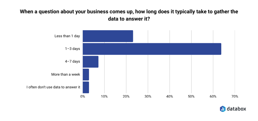
The Databox “Time to Insight” survey found that 64% of respondents say it typically takes one to three days to gather data to answer a business question.
By the time the answer arrives, the decision window has often closed. Gut feel fills that gap because nothing else is available in time.
Most AI tools make the problem worse. The risk executives are not yet fully aware of: most AI data tools let the large language model do the calculations, producing a number that looks authoritative, reads fluently, and is wrong.
The danger is a tool that fails confidently, not visibly. A CEO who presents a hallucinated metric in a board meeting has a data-tool problem disguised as a judgment problem.
The data trust gap exists not despite all these tools, but partly because of them. When the tool meant to provide answers introduces a new failure mode instead, trust erodes further rather than building.
What Genuinely Metric-Directed Executive Decision-Making Looks Like
Genuine metric-directed decision-making is a set of behaviors, not a technology purchase. The executives who operate there do specific things differently.
Decisions would visibly change if the data showed the opposite. The clearest marker: when a metric reverses, the decision reverses. The data directs rather than decorates.
The explanation comes before the board meeting, not during it. A metric-directed executive can say why a metric moved (not just that it moved) before walking into the room. The analysis is done in advance because the tools make it available in advance.
Answers do not require the analyst queue. Questions get answered at the moment they arise: before the leadership sync, during board prep, mid-week when the anomaly surfaces. The speed of the answer matches the speed of the decision.
Every function shares one definition of every metric. CAC means the same thing in finance, marketing, and the CRM. MRR has one number. Pipeline coverage has one formula. Metric disagreement is off the table before the meeting starts.
The best analytics do not stop at showing what happened. They explain why it happened and surface what to watch next. Executives gain the ability to interact with data directly, asking questions in plain language and receiving explanations, not charts, and that interaction happens at all organizational levels, not only among those with technical staff.
The shift worth noting: metric-directed decision-making lives at a specific moment: when a senior leader forms a view and commits to a direction. Culture change matters, but the critical intervention happens at that moment, in that decision layer.
How AI-Powered Analytics Closes the Gap
Databox’s Genie is built to make genuine metric-directed decision-making operationally feasible for executives who are not data analysts. The mechanics matter because not all AI analytics are built the same way.
Natural Language Querying: From Dashboard to Conversation
The shift from passive dashboards to active querying changes what executives can do without analyst support. Genie is Databox’s AI analyst, built for exploration, analysis, and creation through plain language, with no technical skills or complex queries required.
The capability goes further than question-answering. A VP of Marketing who needs a new dashboard can describe it: “Create a dashboard showing MRR, churn rate, and trial conversions by acquisition channel” and Genie builds it. A RevOps lead who needs a new metric can describe what it should measure and Genie creates it. The analyst queue that used to handle both questions and build requests shrinks on both fronts.
The practical implication: the question that used to take 48 hours now takes seconds. “Why did CAC jump last quarter?” no longer enters an analyst queue. It gets an immediate answer. And that speed-of-answer difference is a speed-of-decision difference.
The Accuracy Distinction: Why Most AI Analytics Tools Are a Liability
Trustworthy AI analytics requires four things working together: the AI interprets the question in plain language; a separate computation engine runs actual calculations against real data; standardized metric definitions eliminate the “which number is right” debate; and answers are traceable back to source data.
Genie’s answers are grounded in standardized, trusted metrics inside Databox. Genie does not hallucinate responses: when the data needed to answer a question is not available, Genie says so rather than guessing. The separation between interpretation and computation is the architectural decision that makes the difference between a board-meeting liability and a genuine decision tool.
The “Why” Layer: Moving Past What to Why
Dashboards show what happened. Genie explains why. The functional gap between data-adjacent and metric-directed at the executive level is the gap between a metric and an explanation.
Return to the Monday morning scenario from the introduction: the CAC chart is 18% higher. A dashboard shows the number. Genie answers the question the room is actually asking “why did it move?” in plain language, with traceable source data, at the moment the question arises. The explanation reaches the executive before the meeting, not after.
What Executives Are Actually Asking And How Genie Answers
The three failure modes named above, the DRIP problem, gut feel filling the sequencing gap, and metric disagreement, each produce a specific decision moment where data-adjacent behavior takes hold. Here is what those moments look like with Genie in the picture. All of the following questions are drawn from Databox’s prompt library, 100+ real questions teams ask their data across 22 integrations.
The Monday Morning Pulse Check
Before the leadership sync, a CEO asks on their phone, on the way in, “How is the business tracking against Q2 goals?”
In a data-adjacent environment, they pull up three dashboards, scan four charts, form a rough impression, and walk into the meeting with a directional feeling rather than a defensible answer.
With Genie, the questions that used to require three separate tools get answered in one conversation, pulling from HubSpot CRM, Stripe, and QuickBooks simultaneously:
- “How many deals were created this month, and how does that compare to last month and our target?”
- “What is our MRR this month, and how has it trended over the last 6 months?”
- “What is our total income this month, and how does it compare to last month and the same month last year?”
Because Databox already has the Q2 goals defined, Genie can pull performance against them directly: no manual assembly, no analyst required. The leadership sync starts from a shared view and if anyone missed the summary, the CEO shares the Genie conversation in one tap, including to colleagues who do not have a Databox account. The DRIP problem dissolves when the interpretation is already done and shareable before the meeting starts.
The Board Prep Moment
Forty-eight hours before a board meeting, a CFO needs to explain a margin compression. The analyst is finishing two other projects.
In a data-adjacent environment, the CFO pulls last quarter’s deck and works backward, reconstructing a plausible narrative from available charts.
With Genie in Extended mode, the CFO works through the analysis in a single conversation:
- “What is our gross profit this month, and how has our gross profit margin trended over the last quarter?”
- “What are our total operating expenses this month, and which expense categories are growing the fastest?”
Genie returns a deep analysis in plain language, identifying the patterns that explain the movement, with source data traceable enough to cite in the boardroom. The AI-generated summary is editable: the CFO adds context and shapes the narrative before sharing it. The metric trust gap from Sign 3 disappears because a single source of truth removes the debate before it starts.
The Mid-Week Anomaly
Wednesday afternoon. A VP of Sales notices pipeline coverage dropped. In a data-adjacent environment, the question enters the analyst queue and the answer arrives Friday, after the window to course-correct has narrowed.
With Genie, the VP works through the anomaly immediately, asking questions directly from the HubSpot CRM and Pipedrive data already connected to Databox:
- “What is the current total value of our open pipeline, broken down by stage?”
- “Which pipeline has the highest win rate, and which has the most deals stalling in early stages?”
- “Which sales reps have the highest closed-won revenue this quarter, and which are behind pace?”
Genie’s anomaly detection may have already flagged the drop before the VP noticed it, surfacing the change as an alert rather than waiting for someone to spot it in a dashboard. And because Genie saves conversation history, the VP can return to the thread Thursday morning and ask a follow-up without rebuilding context from scratch. The gap that gut feel used to fill closes. The VP acts the same day, not three days later.
Genie does not replace a data analyst. The analyst’s role shifts from producing routine outputs to building the systems, defining metrics, and shaping the semantic layer that makes those outputs trustworthy. Genie handles the routine requests. The analyst’s strategic value increases as a result. The same principle applies to executives: Genie frees leadership to lead rather than to analyze.
The Self-Evaluation: Are You Metric-Directed or Data-Adjacent?
Answer each question honestly, not aspirationally. Scoring: 5–7 “yes” answers means genuinely metric-directed. 3–4 means transitional. Fewer than 3 means data-adjacent – and that is the starting point, not a verdict.
Can you explain why a key metric moved last week without asking an analyst?
Would your last major strategic decision have been different if the data had shown the opposite result?
Does every function use a single agreed-upon definition of CAC, MRR, and pipeline coverage right now?
When your team disagrees on a number in a meeting, is there a source of truth you all defer to – immediately?
Can you get an answer to a business performance question in under five minutes, outside of business hours, without a data team present?
In your last board presentation, did you know why every metric moved or only that it moved?
Is your data review scheduled before decisions are made or after?
Executives who score low on this checklist are exactly the executives this article was written for. The gap the checklist surfaces is a decision infrastructure gap — and it is solvable.
Conclusion
The data-adjacent problem is not a data problem. It is a decision infrastructure problem.
Executives who have dashboards, KPI reviews, and BI tools are not automatically deciding from data. The test is whether the data actually changes the decision or whether it arrives after the decision is already formed.
AI analytics built on trustworthy computation, where the LLM interprets but never calculates, where metric definitions are standardized, where answers trace back to source data, converts data presence into decision confidence. That is the structural fix.
If the checklist surfaced a gap, Genie is built to close it.
Start free — no SQL, no analyst queue, no waiting.
Frequently Asked Questions
What is the difference between deciding from data and deciding alongside it?
Deciding from data means the decision would change if the data showed something different. Deciding alongside data means the data was visible and referenced, but the outcome was shaped by intuition or prior conviction rather than by what the numbers said. Most executive teams operate in the second mode without recognizing it, which is why the diagnostic in this article matters more than the label.
Can executives decide from data without a dedicated data team?
Yes, but only when the analytics infrastructure removes the analyst as the bottleneck. AI analysts like Databox Genie deliver direct answers to business performance questions in plain language, without requiring SQL, manual analysis, or analyst availability. The data team becomes more strategic, not obsolete
How do I know if my AI analytics tool is producing hallucinated results?
The risk is highest when the AI uses a large language model to perform calculations directly, rather than passing the question to a separate computation engine running against real data. Trustworthy AI analytics produces traceable answers, every result should link back to a source metric and a defined calculation. When a tool cannot show its work, treat its outputs with caution before a board meeting.
How do I know if a revenue drop is seasonal or structural?
What KPIs should executives monitor to make genuinely metric-directed decisions?
The right KPIs depend on function and stage, but the more important question is whether every KPI carries a single agreed-upon definition across finance, marketing, and operations. Metric disagreement is a more common executive problem than metric selection. Databox’s template library offers pre-built executive dashboards as a starting point.
Why has access to more data tools not made executives more metric-directed?
More tools created more dashboards and more data sources without solving the interpretation bottleneck. Executives can see more charts than ever, but explaining why a metric moved still requires analyst time or AI tools that risk hallucination. The gap between data access and decision utility has widened rather than narrowed