")
Table of contents
Get AI-generated reports that explain why your metrics changed, not only what happened, using connected live data, specific prompts, and a six-step process.
TL;DR
- An AI-generated business report interprets your connected data and explains why metrics changed in plain language. It is not a formatted dashboard or a prettier spreadsheet export.
- The six-step process begins with defining a business question (not collecting data) and depends on two steps most teams skip: data standardization and human validation.
- Prompt specificity determines output quality. “Why did MQL volume drop 20% this week?” produces useful analysis; “How is marketing doing?” produces noise.
- Harvard Business School’s 2025 study found AI reporting users completed 25.1% more tasks and delivered 40% higher quality outputs than manual analysts.
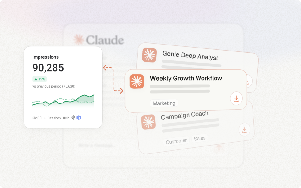
- Databox Genie connects directly to your live business metrics from 130+ sources, so answers come from your actual numbers, not from general knowledge or manually uploaded files.
Every marketing manager and ops lead knows the feeling. You pull up your dashboards on Monday morning. Pipeline is lighter than expected, organic traffic dipped, and a number you watch every week looks wrong. You have no fast way to find out why.
The data sits right there, in HubSpot, Google Analytics, and Salesforce, but the answer does not. Getting from “I can see the number” to “I understand what drove it” still means exporting spreadsheets, cross-referencing tabs, or waiting for the one person on the team who knows how to pull the analysis together. For a long time, that was the cost of being data-informed.
You can create an AI-generated report for your business insights by connecting your live data sources to an AI-powered analytics platform, asking a specific business question in plain language, and letting the AI analyze your metrics, identify what changed, and explain why. The result is a narrative report produced in minutes rather than hours.
Dashboards show you what happened. AI-generated reports tell you why.
Deloitte’s 2026 report confirms the shift is accelerating: worker access to AI rose 50% in 2025, and twice as many business leaders reported transformative impact on efficiency and productivity. Databox research on AI adoption in SMBs found that nearly 90% are actively implementing AI in business operations. The question is no longer whether AI belongs in your reporting workflow. The question is whether you are using it to generate genuine insight, or to produce the same reports faster.
The guide that follows walks through the process from defining the right question to automating delivery. You will also see a complete worked example: the exact prompt and the actual Genie output it produced from a connected marketing account.
Why Traditional Reporting Still Falls Short
Most teams adopted dashboards years ago. The data access problem is largely solved. But data access and data interpretation are two different problems, and the second one is still wide open.
A marketing manager running a weekly campaign review can see that MQL volume dropped. She can see it happened sometime between Tuesday and Friday. What she cannot see, without opening three tools, pulling two exports, and spending 90 minutes cross-referencing, is whether the drop came from a channel mix shift, a landing page issue, a seasonal pattern, or a budget change the paid team made without telling anyone.
The gap between seeing a number and understanding what drove it is where traditional reporting breaks down. And it breaks down every week, for every team that relies on dashboards alone.
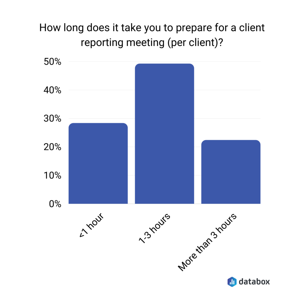
According to a Databox research on client reporting meetings, 49% of agency teams spend 1–3 hours preparing for a single client meeting. That time goes to compiling, formatting, and manually assembling data into something presentable. The analysis, if it happens at all, gets compressed into the final 10 minutes before the call. Reporting prep displaces decision-making. The answer is not more dashboards. The answer is getting from the chart to the explanation without a manual step in between.
The Six Components of a Useful AI Report
A strong AI-generated business report answers a specific business question using live metrics, and includes six components:
| Component | What it delivers |
| Executive summary | A concise synthesis a stakeholder can read in one paragraph to understand what happened and what to do about it |
| Key metric movements | What moved, by how much, against which baseline. Absolute numbers without context are noise |
| Trend analysis | Direction of change over time, not a point-in-time snapshot |
| Anomaly flags | Metrics that deviated from expected ranges, surfaced automatically |
| Narrative explanations | Plain-language interpretation of why a metric moved. The layer that differentiates a report from a dashboard |
| Recommended next questions | Investigations worth running next. Strong AI tools recommend questions to investigate, not actions to execute, because the AI lacks the business context to know which actions are right |
If the output from your tool lacks narrative explanations or anomaly flags, it is producing formatted data, not interpreted analysis.
How to Create an AI-Generated Business Report: Step-by-Step
The process applies whether you are building a weekly marketing report, a monthly revenue summary, or a board-level quarterly overview. The steps are the same. Only the inputs and the audience change.
Follow them in order. Skipping Step 3 is the most common reason AI reports return unreliable answers. Skipping Step 5 is the most common reason bad AI reports reach clients and executives.
Step 1: Define the Business Question Your Report Needs to Answer
Begin with the decision, not the data. “Show me this month’s metrics” is not a business question, it is a data request.
“Why did MQL volume drop 20% this week compared to last month’s weekly average?” is a business question. So is “Which channels drove the increase in demo requests this quarter, and are they sustainable?”
The question determines which data sources matter, which time ranges are relevant, and what a useful answer looks like. Write the question down before moving to Step 2. If you cannot state it in one sentence, you are not ready to build the report yet.
Step 2: Connect Your Live Data Sources
The architectural choice at this step determines whether your AI report reflects your business right now or reflects a snapshot that aged the moment someone exported it. Live data connections pull metrics directly from your tools (HubSpot, Salesforce, Google Analytics 4, Stripe, LinkedIn Ads) and keep them current without manual intervention. Static file uploads recreate the bottleneck you are trying to eliminate.
Databox connects to 130+ data sources natively. Databox AI Analyst Genie pulls from those connected sources in real time, with no CSV uploads. A marketing performance report that only sees Google Analytics but not HubSpot will miss the full funnel story.
Step 3: Standardize and Clean Your Metrics
Most AI reporting guides skip this step. Most teams that get unreliable AI outputs skipped it too.
AI accuracy is ceiling-capped by input quality. Before asking the AI to analyze performance, confirm your KPIs are defined consistently across sources. If “conversion” means one thing in HubSpot and something different in a manual spreadsheet, the AI will reflect that inconsistency in its analysis, and the report will be confidently wrong.
Accurate answers begin with clean, standardized data so everyone in the business is speaking the same language. Databox’s Metric Library standardizes the KPIs your business uses to measure performance, so every report and every AI-generated answer works from the same definitions.
Step 4: Prompt the AI with a Specific, Context-Rich Question
The quality of the output is directly proportional to the specificity of the input. Specific prompts (with time ranges, comparison baselines, segments, and a clear framing of what you need to know) return analysis you can use.
| Weak Prompt | Strong Prompt |
| “Write a sales report” | “Write a Q3 2025 sales report for the North American region comparing performance against Q2 targets” |
| “How is marketing doing?” | “Why did MQL volume drop 20% in October compared to September? Which channels drove the change?” |
| “Show me website traffic” | “Show GA4 Sessions for the last 30 days and compare to the prior 30-day period” |
| “Give me a revenue update” | “Compare HubSpot Deals Closed Won Amount for Q3 this year vs. Q3 last year, what is driving the difference?” |
| “Summarize last week” | “Summarize marketing and sales performance for the week of Nov 4–10, flagging any metrics that moved more than 15% from the prior week” |
In Databox Genie, Extended mode handles complex multi-metric questions. Extended mode instructs Genie to spend more time reasoning before generating a response, working through questions that compare trends across multiple data sources or investigate why a value changed.
A complete worked example: from prompt to report
The following prompt is structured to produce report-quality output from a connected marketing account. You can paste it directly into Genie, adjusting the time periods to match your reporting cycle:
“Generate a marketing performance analysis for [October 2025] compared to [September 2025] using my connected data sources. Cover the following areas in order:
1. Executive summary: 3–4 sentences identifying the most important changes across traffic, leads, and pipeline contribution.
2. Traffic: total sessions and channel breakdown (organic, paid, direct, referral, social). Flag any channel that moved more than 15% from the prior period and explain the likely driver.
3. Lead generation: MQL volume, conversion rate from session to MQL, and source attribution. Identify which sources gained or lost share.
4. Pipeline contribution: marketing-sourced opportunities and pipeline value. Compare against the prior period.
5. Anomalies: any metric that deviated significantly from its trailing 8-week average.
6. Recommended next questions: 3 things worth investigating further based on what the data shows.
Use specific numbers and percentages. Where you identify a driver, state what data supports that interpretation.”
A few design choices in the prompt are worth understanding. Every analytical request is anchored to a specific metric or comparison baseline. “Flag any channel that moved more than 15%” is testable; “tell me about traffic trends” is not. The prompt also asks Genie to justify its driver interpretations with data, which is the single best defense against hallucination because it forces the AI to point at its evidence. And the closing section asks for recommended next questions, not recommended next actions, which respects the boundary between pattern recognition and business judgment.
What Genie returns to the prompt is a full multi-section analysis with embedded tables. The Executive Summary delivers the headline in 3–4 sentences. The Traffic, Lead Generation, and Pipeline sections include real data tables, color-coded movement flags, and written explanations of likely drivers. The Anomalies section compares each metric against an 8-week trailing baseline. The closing section recommends specific investigations the data warrants next.
One behavior in the actual output deserves specific attention. When Genie cannot see a connected data source it needs, it says so explicitly. In the example output, Genie flagged that the account did not have a live GA4 connection, explained which alternative sources it used (Semrush, Google Search Console, paid ads click data), and noted exactly what would be needed to complete the picture. The behavior is the trust signal that separates analytical AI worth using from analytical AI worth ignoring. A weaker tool would have invented the missing data and presented it as fact.
Step 5: Review, Validate, and Add Human Context
AI excels at pattern recognition. It does not know your business strategy.
A report might flag declining conversion rates as an anomaly without knowing you deliberately shifted budget toward upper-funnel awareness campaigns last month. AI identifies the pattern. You provide the meaning.
Before sharing any AI-generated report externally, a human reviewer should verify three things: the data sources are current and correctly connected, the narrative matches what actually happened in the business, and any flagged anomalies have strategic context applied. Treating the step as optional is how teams send reports that are technically accurate and strategically misleading at the same time. AI produces a strong first draft. You turn it into a credible final product.
Step 6: Schedule, Share, and Automate Delivery
A report that lives in a dashboard tab and never reaches anyone’s inbox gets ignored. The final step is making the report reach the right people at the right time without requiring someone to remember to send it.
In Databox, you can schedule automated snapshots of your dashboards (combining live metrics, visualizations, and written context) for delivery to your team or clients via email or Slack. A weekly marketing report that arrives every Monday at 8 AM creates a reporting rhythm. A monthly board summary that delivers on the 1st creates accountability. Scheduled delivery turns a one-time report into a recurring system.
Want to skip straight to Step 4? Connect your first data source in Databox and ask Genie your first business question today.
Different Report Types Serve Different Decisions
Different report types serve different audiences. The underlying process from Steps 1 through 6 stays the same. Knowing which type you need before you build informs how you define the business question in Step 1.
Marketing performance report. Audience: marketing managers, CMOs. Example prompt: “What drove the change in organic traffic and MQL volume this month compared to last?” Output: channel-level breakdown with trend narrative and recommended areas to investigate. The worked example in Step 4 is a marketing performance report.
Sales pipeline and revenue report. Audience: sales leaders, RevOps teams. Example prompt: “How does our Q3 closed-won pipeline compare to Q2, and where are deals stalling?” Output: stage-by-stage pipeline analysis with velocity trends and deal-level stall points identified.
Agency client report. Audience: agency account managers, clients. Example prompt: “Summarize campaign performance for [Client X] for October, comparing results to September and to campaign targets.” Output: client-ready narrative with performance-vs.-goal framing, formatted for external delivery.
Each of these uses the same process. The variables are the business question, the data sources, and the audience the report needs to reach.
AI Reporting’s Real Benefit Is Analytical Depth, Not Only Speed
A joint study of Harvard Business School’s 2025 study and Boston Consulting Group found that AI reporting users completed 25.1% more tasks, worked 12.2% faster, and delivered 40% higher quality outputs than manual analysts. The efficiency case is well-established. But speed alone is not why AI reporting matters. The more significant benefit is analytical depth at scale, cross-referencing multiple data sources simultaneously and surfacing correlations a manual analyst might take days to find.
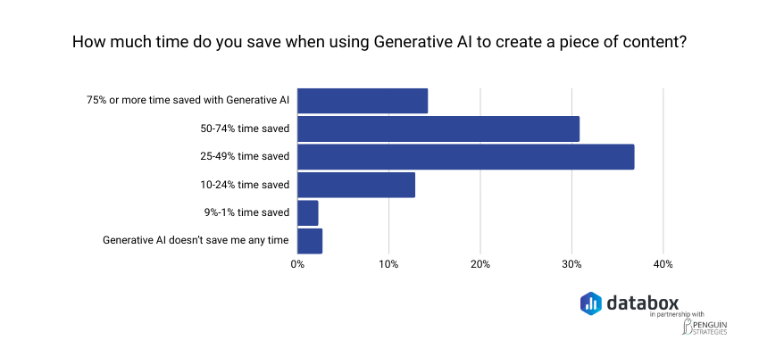
Speed. Reports that took hours to compile generate in minutes. A Databox survey found that about 37% of marketers report saving 25–49% of their time when using generative AI, and another 31% report saving 50–74%. Those hours flow back into acting on what the data shows.
Consistency. AI applies the same analytical logic to every report, with no variation based on who built it.
Monitoring. AI flags issues when they happen, not at the next monthly review. A metric that drops 15% on Tuesday surfaces on Tuesday, weeks before a manual reporting cadence would catch it.
See how Databox’s AI explains what changed in your metrics, no report building required.
AI Reports Introduce Failure Modes Manual Reporting Never Had
AI-generated reports are powerful. They also introduce failure modes that manual reporting did not have.
Hallucination risk. When AI reporting tools use large language models to generate narrative summaries, they occasionally state facts not present in the underlying data. The narrative sounds confident because LLMs always sound confident. Read the AI’s narrative against the actual metrics before sharing externally. The worked example in Step 4 showed the opposite behavior, which is the behavior to look for: Genie flagged a missing data connection rather than inventing numbers around it. If your AI tool does not tell you when it cannot see your data, it is more likely to make something up.
Data quality dependency. AI accuracy is ceiling-capped by input quality. When KPIs are defined inconsistently across sources, the AI will reflect that inconsistency in its analysis and the report will be confidently wrong. Step 3 in the process above is the primary mitigation.
Context blindness. AI identifies patterns. It does not understand strategy. AI flags the pattern. You provide the interpretation. Step 5 is non-negotiable for that reason.
Over-reliance risk. Teams that question AI outputs catch errors. Teams that do not, do not. Build the review step into the workflow as a process requirement, not a judgment call. Treat AI reports as strong first drafts, not final products.
The failure modes are not reasons to avoid AI reporting. They are reasons to implement it with the same rigor you would apply to any analytical tool.
Genie Closes the Gaps Other AI Reporting Tools Leave Open
Most AI reporting workflows described elsewhere share a common architecture: you export your data, upload it to an AI tool, and ask the tool to analyze the file you provided. The analysis is only as current as the last export.
Genie works differently. Unlike ChatGPT, Genie connects directly to your live business data. ChatGPT works with information you manually paste or upload. Genie works with your actual metrics in real time from 130+ integrated sources (Salesforce, HubSpot, Google Analytics 4, and more), so answers come from your numbers, not from general knowledge.
The worked example in Step 4 shows what that looks like in practice. The prompt asked Genie to compare October to September across traffic, lead generation, pipeline contribution, and anomalies. Genie pulled from Google Search Console, Semrush, Google Ads, Meta Ads, LinkedIn Ads, HubSpot CRM, Salesforce CRM, and HubSpot Marketing, ran the relevant queries against actual data, and produced an analysis grounded in the real numbers from each source. A general-purpose AI working from a manually exported CSV cannot reach that scope without significant manual prep.
One more behavior worth calling out: in the worked example, Genie ended its analysis with three “Suggested follow-ups” the user could click to continue the investigation. The first analytical answer is not a dead end. It is the beginning of a guided investigation.
Genie is built for non-technical users. You describe what you want in plain language and Genie produces analysis with no SQL required, no BI background assumed, and no manual data preparation between your question and your answer.
The Question Worth Asking Every Monday Morning
Most teams will not fix their reporting problem by finding a better dashboard tool. They already have dashboards, integrations, and the data. What they do not have is the layer between the data and the decision.
The missing layer, the explanation, the narrative, the why behind the what, is what AI reporting actually provides when it works correctly. Not faster charts. Not prettier exports. A marketing manager who used to spend Tuesday morning building slides now spends it acting on what Genie told her Monday at 8 AM.
Dashboards show you what happened. AI-generated reports tell you why. The six-step process in this guide is not complex. What changes when you follow it is that the Monday morning question, why did this number move?, gets an answer before the meeting, not after it.
Frequently Asked Questions
What is the difference between an AI-generated report and a regular dashboard?
A dashboard displays live data visually, with charts, scorecards, and trend lines. An AI-generated report interprets that data, explaining trends, flagging anomalies, and surfacing narrative insights in plain language. A dashboard shows you that MQL volume dropped 20%. An AI-generated report tells you which channels drove the drop and what you might investigate next.
Can I create an AI business report without knowing how to code or use SQL?
Yes. Tools like Databox Genie are built for non-technical users. Genie is Databox’s AI analyst that helps you explore and analyze your data by asking questions in plain language, without technical skills or complex queries. No SQL syntax, no BI configuration, no data engineering background required.
How accurate are AI-generated business reports?
Accuracy depends primarily on data quality, not on the AI tool itself. When KPIs are defined inconsistently across data sources, the AI will reflect that inconsistency in its analysis. AI reporting also introduces a hallucination failure mode in narrative summaries. Always review AI-generated narratives against the underlying metrics before sharing externally.
Is Genie the same as asking ChatGPT about my data?
No. Unlike ChatGPT, Genie connects directly to your live business data; ChatGPT works with information you manually paste or upload, while Genie works with your actual metrics in real time from 130+ integrated sources. ChatGPT can reason about data you give it. Genie analyzes data your business is generating right now, without a manual export step.