")
Table of contents
Dashboards present and organize your organization’s most important data, but that data can only be useful if you can do something with it.
After all, it’s one thing to observe trends and another to act on them.
Some databoard designs make it easier to take action than others. These actionable dashboards drive true, data-driven change in your company.
What strategies can you use to make your dashboards as actionable as possible? Let’s go over some best practices and examples.
- What Is an Actionable Dashboard?
- What Should You Include in an Actionable Dashboard?
- 5 Best Practices for Making Your Dashboard More Actionable
- 6 Examples of Actionable Dashboards

What Is an Actionable Dashboard?
An actionable dashboard is a dashboard that you can use to inform business decisions. When you look at the data in one of these dashboards, you should have an idea in your head of what you want to do to influence those numbers in the future.
In contrast, a non-actionable dashboard shows data for the sake of sharing data. The information in them isn’t related to your business goals and doesn’t inform what you plan to do next with your business.
What Should You Include in an Actionable Dashboard?
An actionable dashboard includes elements such as:
- Recommendations for action: A dashboard with built-in recommendations for action helps the user understand what to do next with their business strategy. Features like highlighted insights serve a similar purpose.
- A user-tailored design: To inspire action the most effectively, a dashboard should also have a design that works with the intended user. It should include data points and feature visuals that are relevant to the user’s data knowledge and business goals.
- Ease of use: An easy-to-use dashboard allows the user to view data whenever they need it and edit it to adapt to changing strategies.
We also consulted 36 business experts about their priorities in an actionable dashboard, 34 of whom use data dashboards themselves. Out of the two respondents who don’t currently use a dashboard, one plans on using them in the future. The entire group’s top three features were a carefully defined audience, appropriate KPIs, and a design that meets the user’s insight needs.

5 Best Practices for Making Your Dashboard More Actionable
The experts we polled also suggested best practices for creating actionable dashboards. More than 80% of those respondents have long-term experience building and using databoards.

They shared these five tips:
1. Add Filters
Sidepost’s Phi Dang says, “I found the best way to make a dashboard more actionable is by adding filters. This allows users to narrow down the data displayed on the dashboard to only what is relevant to them. For example, if you have a dashboard that shows sales data, you can add a filter for region or product type.”
While you shouldn’t try to cast too wide of a net when deciding on the types of data displayed in your dashboard, sometimes you need to cover a broad category. In these situations, filters help you keep your data focused.
You can also achieve similar results with a drill-down dashboard. This format zones in on certain data points or categories to provide hyper-specific data.
2. Aim for Specificity
“Dashboards become actionable when you make them more specific,” says Ankur Goyal from Coterie. “When we try to include too much data on a single dashboard, it’s hard to gain insights and generate solutions. When you design each dashboard with a specific goal (for example: generating more leads on Instagram), then you can select the relevant metrics. You need to be specific, so the audience and the dashboard generator can provide actionable steps to improve your performance.”
You can theme your dashboards around other topics in addition to goals to make them more specific.
Oliver Hudson of Word Finder, for example, suggests narrowing your data down to your target audience. “The best way to make your dashboard more actionable is to target a specific audience. If you cater to a wide audience, chances are that half of them won’t even be a part of your niche. So all your efforts will go down the hill, and having a dashboard that tracks key metrics won’t make sense,” Hudson explains.
Related: Reporting Strategy for Multiple Audiences: 6 Tips for Getting Started
Hudson continues, “This is something that I’ve learned from experience. I remember that I never targeted a niche audience. Due to this, the metrics my dashboard monitored were all over the place. But ever since I’ve focused on my target audience, I’ve had a clearer picture of my business and how to improve it. I was able to gauge my audience’s preferences and see how well they interacted with my products. As a result, developing targeted strategies [boosted] sales and profit margins, and overall customer experience and satisfaction.”
You can also focus on data from a single app in one dashboard to stay focused. This approach will keep your databoard centered on just the data points you need. Databox has plenty of app-specific templates for you to try.
3. Minimize Clutter
In line with some experts’ advice to stay specific, some advised to keep clutter down. Too many data points and visuals make it difficult to find the metrics that matter.
“In my experience, I’ve found that most dashboards are not very actionable because the user interface is too cluttered,” says Bombing Science’s Frederic Lebeuf. “Here is how I made my dashboard more actionable. First, I removed all unnecessary features and widgets because they just cluttered an already confusing user interface. Then, I redesigned the dashboard to make it easier to use by re-arranging the different widgets and moved them closer to the main goal of the dashboard. I was able to achieve much better results because the dashboard was much easier to use, and the main goal was very clear.”
Fehr Digital’s Tayler Fehr adds, “One great way to make your dashboard more actionable is by keeping the data to a minimum. You only want the most important numbers to be represented on your dashboard so you can take a look and know where you are in less than two minutes.”
Fehr continues, “An example could be your financial dashboard. You will want to [have] income, expenses, and maybe cash on hand. These three pieces of data will immediately let you know where you stand. Whether it is your financial dashboard or your Google Analytics dashboard, you will take more action if you can understand what you are looking at. Keep it simple so you can stay focused and not overwhelmed.”
It can take practice to know which metrics you need and which ones add to clutter. When in doubt, choose a dashboard template.
4. Provide Context
Arnas Vasiliauskas from CarVertical suggests adding context and refining your data to understand what to do with your dashboard results.
“Aside from incorporating the building blocks for a dashboard which are the organization’s top KPIs, ensuring there are also details that state why the data look the way it does and what actions are necessary to amend them is key to creating an actionable dashboard. A few sentences that explain the “why” and the “what” behind the KPI numbers are effective action triggers that would promote performance optimization, decision-making, and necessary corrections,” Vasiliauskas says.
Vasiliauskas adds, “Contrary to popular belief that comprehensive dashboards are much better, they’re actually unproductive as they utilize a data-bombing approach that generally overwhelms users and diverts them from actually taking action. Concisely boiling the dashboard down to just a few key items mentioned above, however, adds value that goes beyond a page full of metrics for aesthetics. This method has made dashboard monitoring more streamlined and massive amounts of data more digestible.”
For additional context, try setting up alerts and insights in Databox. These features let you know how your current data compares to your goals and identify areas for improvement.
You can also categorize your dashboards using tags so you can use the appropriate dashboard in different situations. Consider creating tags for different teams and business goals instead of just topics.
5. Choose Relevant Data and Visuals
Much of the previous advice connects to this penultimate tip: choose only data and visuals relevant to your business goals.
“The best way to make your dashboard more actionable is to choose the right data charts,” says Eyal Pasternak from Liberty House Buying Group. “You will have numerous options to nitpick from to make a more visually appealing and easy-to-understand dashboard. These charts, graphs, and trend lines can yield meaningful insights to help the team make better decisions. That’s because no information goes overlooked in the process.”
Pasternak speaks from experience: “Ever since I started to use this strategy, my employee communication has improved as everyone’s on the same page. This helps them make data-driven decisions regarding how to comprehend various data elements on our dashboards. Due to this, our workflow has improved, and we have overcome challenges much more quickly.”
A dashboard tool with easy-to-use design features will help you customize visuals so they stay relevant to your goals. Databox’s drag-and-drop Dashboard Designer lets you arrange your dashboard however you’d like to understand your data more effectively.
Greater Than’s Mark Sider says, “To make the data from your dashboard more actionable, include the right KPIs. Don’t merely look at data for the sake of possessing information, but also how you plan on acting on the insights that you receive. When setting up a dashboard, thoroughly understand which areas you need to monitor and why, and then look for the right moments to make well-researched big pivots.”
After all, you choose KPIs for their relevance to your business’s success. If you need help deciding on KPIs, read the advice we received from experts in a previous blog post.
Depending on your business goals and apps, you might consider adding custom metrics to your dashboard for better KPI tracking. Databox’s Query Builder helps you develop metrics based on dimensions, segments, filters, and other factors.
PRO TIP: How Well Are Your Marketing KPIs Performing?
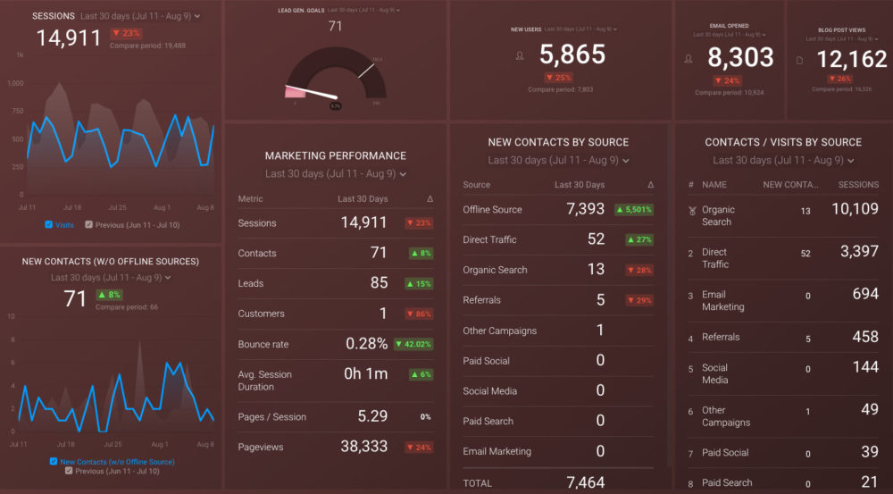
Like most marketers and marketing managers, you want to know how your efforts are translating into results each month. How is your website performing? How well are you converting traffic into leads and customers? Which marketing channels are performing best? How does organic search compare to paid campaigns and to previous months? You might have to scramble to put all of this together in a single report, but now you can have it all at your fingertips in a single Databox dashboard.
Our Monthly Marketing Performance Dashboard includes data from Google Analytics 4 and HubSpot Marketing with key performance metrics like:
- Website sessions, new users, and new leads. Basic engagement data from your website. How much traffic? How many new visitors? How many lead conversions?
- Lead generation vs goal. Did you reach your goal for lead conversion for the month, quarter, or year? If not, by how much did you miss?
- Overall marketing performance. A summary list of the main KPIs for your website: sessions, contacts, leads, customers, bounce rate, avg. session duration, pages/session, and pageviews.
- Email response. Overall, how effective were your email campaigns, measured by email opens?
- Blog post traffic. How much traffic did your blog attract during a certain period?
- New contacts by source. Which sources drove the highest number of new contacts
- Visits and contacts by source. How did your sources compare by both sessions and new contacts in a certain period of time?
Now you can benefit from the experience of our Google Analytics and HubSpot Marketing experts, who have put together a plug-and-play Databox template that contains all the essential metrics for monitoring and analyzing your website traffic and its sources, lead generation, and more. It’s simple to implement and start using as a standalone dashboard or in marketing reports!
You can easily set it up in just a few clicks – no coding required.
To set up the dashboard, follow these 3 simple steps:
Step 1: Get the template
Step 2: Connect your HubSpot and Google Analytics 4 accounts with Databox.
Step 3: Watch your dashboard populate in seconds.
6 Examples of Actionable Dashboards
What does an actionable dashboard look like? We asked experts about their most actionable dashboard categories, and their top six choices were marketing, sales, web analytics, customer relationship management (CRM), customer support, and finances.

Here are six Databox dashboard templates that correspond to each of those categories. Since they all work in Databox, they have all the features mentioned in this blog post that help you build actionable dashboards.
- Marketing Dashboard
- Sales Overview Dashboard
- Web Analytics Dashboard
- Customer Relationship Management (CRM) Dashboard
- Customer Success Dashboard
- Financial Dashboard
1. Marketing Dashboard
One of our popular marketing dashboards is the Google Analytics Website Traffic & Engagement template. It brings together some of Google Analytics’ most critical metrics for understanding customer behavior on your website.

2. Sales Overview Dashboard
Our Sales Overview dashboard uses HubSpot CRM data to report on your sales team’s monthly performance. It offers a full view of the sales funnel and how many contacts and deals your team creates.

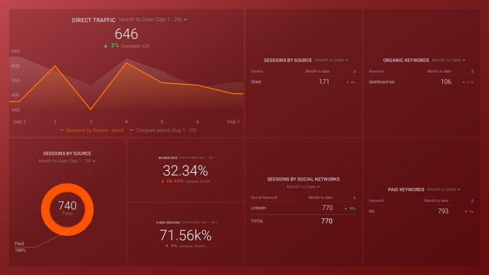
3. Web Analytics Dashboard
This Google Analytics Acquisition Snapshot template summarizes data on your website’s traffic sources. By listing your traffic numbers, sessions by source, and keyword performance together, it gives you a full picture of your most effective traffic drivers.
4. Customer Relationship Management (CRM) Dashboard
With the HubSpot CRM template, you can see trends in deals and get a visual of your sales pipeline. It also briefly shares performance by team members to see who needs extra support.

5. Customer Success Dashboard
The Customer Success Overview template combines data from Stripe and HelpScout mailbox to display your customer service performance and churn rate at the same time. You can draw connections between your customer service and retention without leaving your dashboard.

6. Financial Dashboard
This Stripe dashboard pulls revenue and customer behavior metrics to provide a bird’s eye view of your business’s financial performance. If you don’t have a subscription-based business model, you can swap or remove those metrics to keep your dashboard focused and actionable.

Build an Actionable Dashboard for Free
Looking for a tool to build an actionable dashboard using the tips we provided? Databox lets you build your first three dashboards for free. We also have a friendly customer support team ready to help you set up a dashboard that fits your business goals. Try Databox now by signing up for a free account.