")
Table of contents
Most dashboards stop getting opened long before anyone admits it. Here is why and what to build instead.
TL;DR
- A dashboard graveyard is any report that technically exists but is never opened by its intended audience, consuming maintenance time while driving zero decisions. The working diagnostic: zero opens by a non-builder in 90 days.
- Dashboards die because they get built for available data, not for specific decisions. The six root causes are: wrong audience design, analyst bottleneck, metric overload, missing context, fragmented metric definitions, and maintenance neglect.
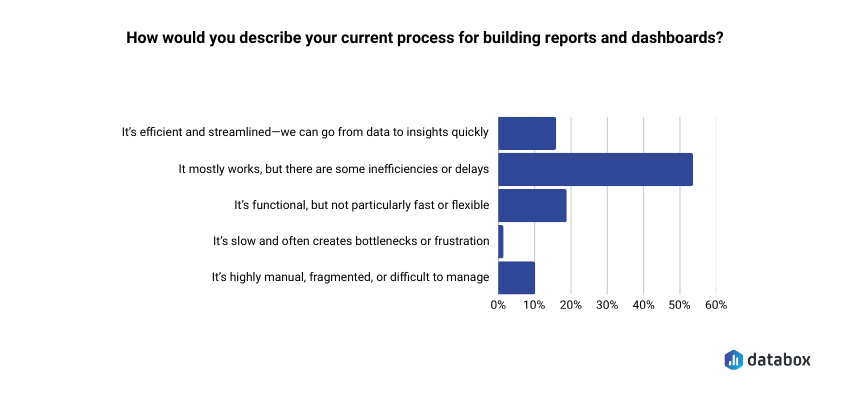
- According to Databox’s Time to Insight survey, 54.29% of teams say their reporting process has inefficiencies or delays.
- To audit an existing graveyard: pull 90-day usage data and apply a 2×2 triage matrix, Usage vs. Business Relevance, to sort every dashboard into maintain, diagnose, investigate, or sunset.
- To build dashboards that survive: answer three questions before opening your BI tool: what decision does this enable, who is the named owner, and what action changes based on what it shows.
Introduction
You open the analytics panel on the dashboard you spent a week building. Two views. Both yours: one from when you published it, one from when you checked whether anyone had opened it.
The stakeholder who requested it just sent a Slack message asking if you could “pull together a quick breakdown” of data. The same data that has been sitting in a dashboard with her name in the title for the past month.
Most business analysts recognize this moment but rarely name it out loud. The dashboard exists. The data is accurate. The charts are clean. And absolutely no one is using it.
According to Databox’s Time to Insight survey, 54.29% of teams say their reporting process mostly works but has inefficiencies or delays. For nearly half of organizations, the graveyard is already forming before anyone names it.
Dashboard graveyards grow because organizations treat them as a storage problem rather than a decision architecture problem, so the fix never targets the root cause. The rest of this article does three things: diagnoses why dashboards die, shows how to audit and triage what already exists, and gives you a decision-first framework for building ones that actually get used.
Why Dashboards Die: Six Root Causes
Dashboard failure is not random. Six root causes explain most graveyard formation, and most of them are baked in before the first chart gets drawn.
Built for the Builder, Not the Decision-Maker
A VP of Marketing asks for “more visibility into campaign performance.” You build something comprehensive: channel breakdowns, time series, conversion funnels, attribution models. But the VP wanted one number: “Are we going to hit our MQL target this month?”
The dashboard was designed around available data, not around a specific decision. Result: technically impressive, practically ignored. Wrong-audience design is the most common graveyard origin story.
The Analyst Bottleneck
When every data question routes through the analyst (because dashboards were not built for self-service) stakeholders stop asking and start working around the system. They export to spreadsheets, ping colleagues directly, or simply make the decision without data.
Dashboards built without self-service capability do not fail because stakeholders are incurious, but because requiring analyst intervention for every question makes the data too expensive to access.
Metric Overload
When a dashboard carries 25 KPIs with no hierarchy, no user knows where to look. Nothing stands out, so nothing gets acted on.
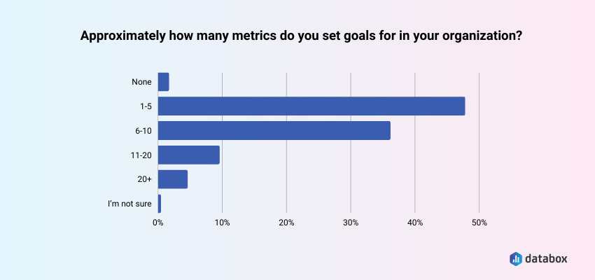
Databox’s State of Business Reporting survey found that 47.09% of teams set goals for 1 to 5 metrics; a deliberate decision about which numbers actually move their behavior. A dashboard that ignores that discipline produces the opposite effect: decision paralysis dressed up as data visibility.
“I don’t think dashboards need to be or should be actionable. I use them to surface the most important KPIs for the company and each team, and then if there are aberrations, I conduct further analysis to come up with hypotheses and recommendations. Trying to squeeze actionable insights out of the dashboard itself tends to overcomplicate the dashboard and lead to faulty analytical decision making (i.e., your week-to-week lagging indicator metrics shouldn’t necessarily dictate a change in focus or strategy).”
Birkett’s use case is real: dashboards built for monitoring and aberration detection serve a different function than dashboards built to drive a recurring decision. The graveyard problem targets the second category: reports commissioned for decision-making that never get opened because no one named the decision in the first place.
Numbers Without Context
A metric without a benchmark, target, or trend comparison is just a number. When the dashboard shows revenue at $1.2M this month, the stakeholder’s first question is: “Is that good?” If the dashboard cannot answer that immediately, the stakeholder stops trusting it and stops opening it.
Departmental Territory
In many organizations, dashboards become artifacts of ownership rather than a shared single source of truth. Teams build their own version of “the truth” rather than referencing a common metric definition, a data governance failure that manifests as dashboard proliferation.
Maintenance Neglect
Data sources change, business definitions shift, and metrics get deprecated. A dashboard that goes unmaintained quickly becomes untrustworthy: stale timestamps, broken connections, metrics that no longer reflect reality.
A single stale number confirms a stakeholder’s suspicion and permanently removes that dashboard from their workflow. Trust, once broken, rarely recovers without a deliberate rebuild.
How to Audit and Triage Your Zombie Reports
If the graveyard already exists, the fix is a structured audit, not a panic delete. A repeatable triage process using usage data produces defensible decisions about which dashboards to maintain, promote, or sunset.
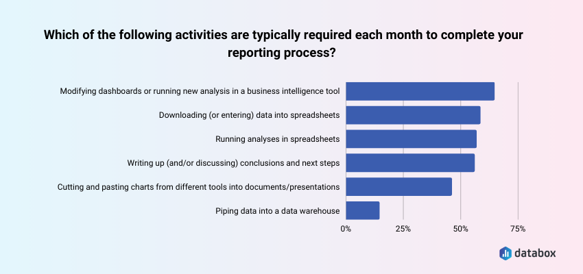
Databox’s State of Business Reporting survey found that 63.30% of teams say modifying dashboards or running new analysis is typically required each month. In an environment with 40 dashboards, a meaningful share of that monthly load goes toward reports nobody opens. The audit surfaces exactly which dashboards generate maintenance costs without producing decisions.
Step 1: Pull the Usage Data
Most BI platforms log view counts, last-opened timestamps, and unique user counts. Pull a 90-day usage report for every dashboard and sort by view count ascending. Zero opens in 90 days equals zombie status — that is the working threshold.
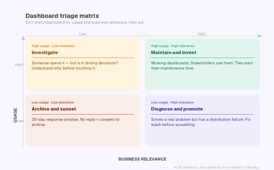
Step 2: Apply the Triage Matrix
Sort all dashboards into four categories using a 2×2 with Usage (High/Low) on one axis and Business Relevance (High/Low) on the other.
High usage, high relevance: Maintain and invest. These are your working dashboards. They earn their maintenance time.
Low usage, high relevance: Diagnose and promote. The dashboard may solve a real problem, but has a distribution failure. Before sunsetting, ask: is the problem usefulness or reach? A scheduled Slack snapshot often recovers adoption without a rebuild.
High usage, low relevance: Investigate. Someone is opening this, but it may not be driving decisions. Understand why before touching it.
Low usage, low relevance: Archive and sunset. Notify the original requestor with a 30-day response window. No objection equals consent to archive. The sunk cost of building the dashboard is not a reason to keep maintaining it.
Step 3 — Run the Stakeholder Conversation
Sunsetting without communication creates trust debt. A brief message positions you as proactive:
“I’ve identified that [Dashboard Name] hasn’t been opened in 90-plus days. Before I archive it, I want to confirm it’s no longer needed — or understand if there’s a reason it’s not being used that we should address.”
Allow a 30-day response window. No response equals consent to archive.
What to Build Instead: The Decision-First Framework
The decision-first approach is a pre-build discipline that requires naming the specific decision a dashboard will enable, the person who owns that decision, and the action that changes based on what the dashboard shows, before any data connection is made.
Before You Build — Three Questions
Most business analysts receive a request and immediately open their BI tool. The decision-first approach reverses that sequence. If you cannot answer all three of the following questions, the right output is a one-time analysis — not a persistent dashboard.
What specific decision does this dashboard enable? “Visibility into campaign performance” is not a decision. Push for specificity: “This tells us whether to increase paid search budget, hold steady, or cut.” If the answer is “we just want to see the data,” build something disposable.
Who is the named owner who will check this weekly? “The marketing team” is not an owner. A named owner is a specific person whose job function creates a recurring reason to open this dashboard. If no one can name that person, there is no recurring use case.
What action changes based on what this shows? If the answer is “nothing changes, we just want the information,” the dashboard is a reporting artifact, not a decision tool. If the action is clear: “if conversion rate drops below 2.1%, we pause this campaign”, the dashboard is justified.
Build It Right
Start with the decision, map backward to the metric. One decision. Two to four primary metrics. Supporting context only where it directly informs the decision. Anything beyond that is scope creep.
Design for one audience. An executive scorecard needs 3 to 5 KPIs with goal vs. actual, no drill-down. An analyst deep-dive needs segmented breakdowns and filter controls. An operator alert board needs threshold-based status indicators, green to red. Building one dashboard for all three serves none of them.
“We use scorecards in our dashboards to keep them actionable. These scorecards show the top 3-5 KPIs and every month we’re looking at whether they’re on or off. If they’re on, great – our action plan can focus on other areas to drive more value. If they’re off, the executive summary will highlight a) why we believe they’re off based on the data insights, and b) what we recommend doing to correct course.”
Build context in. Every primary metric should display alongside a target or goal line, a historical comparison, and a directional indicator. If the dashboard can answer “is this good or bad?” without the stakeholder needing to remember last month’s number, it will get used.
Assign a named owner. Every dashboard needs one person responsible for its accuracy, its stakeholder questions, and flagging when its decision context changes. Maintain a dashboard registry: name, owner, business question, and last reviewed date. Without it, ownership belongs to everyone and therefore to no one.
Push, do not pull. If a dashboard only gets used when you send someone a link in Slack, the distribution strategy is the Slack message. Formalize it. Scheduled Snapshots and email digests remove the activation energy that kills self-navigate adoption.
Review every 90 days. Every dashboard should be checked against its original business question quarterly. A 15-minute calendar event. When the business question changes and the dashboard does not, graveyard formation restarts.
How Databox Addresses the Root Causes
Each of the six failure modes has a direct structural fix.
Wrong-audience design and blank-slate over-engineering: pre-built templates anchor the build process around common business decisions from the start.
Analyst bottleneck and self-service gaps: Databox MCP and Genie give non-technical stakeholders direct access to the metrics they need without routing every request through the analyst.
Numbers without context: native Goals tracking and benchmark overlays add target lines and period comparisons automatically, every metric ships with its own “is this good?” answer built in.
Departmental territory and fragmented metric definitions: multi-source data consolidation into a single shared environment ends the proliferation of competing team-specific versions of the same metric.
Maintenance neglect: live data connections keep dashboards current without manual intervention – no stale timestamps, no broken extracts.
Distribution failure: scheduled reports and alerts push dashboards directly to Slack or email. The data comes to the stakeholder.
Conclusion
Sunsetting dashboards is not admitting failure, it is reclaiming maintenance time for work that actually matters.
A dashboard that no one opens is documentation with a maintenance burden. The goal is not dashboard coverage. The goal is decision velocity.
Frequently Asked Questions
What is a dashboard graveyard?
A dashboard graveyard is a collection of reports that technically exist in a BI environment but are rarely or never opened by their intended audience, consuming maintenance time while driving zero decisions. The working diagnostic threshold is zero opens by a non-builder in 90 days.
How do I know if a dashboard should be sunset or just needs better distribution?
Pull the usage data and check whether the original requestor or their team has opened it in the past 90 days. If they have not, ask directly: “Is this not useful, or is it not reaching you?” If the dashboard solves a real problem but no one knows it exists, the fix is distribution — scheduled digests, Slack alerts, or a standing link in a recurring meeting agenda. If the stakeholder cannot articulate what decision the dashboard supports, sunset it.
How many metrics should a dashboard have?
Databox’s State of Business Reporting survey found that 47.09% of teams set goals for only 1 to 5 metrics. Apply the same discipline to dashboard design: if a metric does not connect to a decision the stakeholder makes regularly, it does not belong on the screen.
What do I do when a stakeholder insists on a dashboard I know will fail the three-question test?
Document the conversation. If the stakeholder cannot name a decision, an owner, or an action, propose an alternative: a one-time analysis, a slide deck, or a scheduled report. If they insist anyway, build it with a documented 90-day review date. When the audit confirms zero usage, you have a defensible basis for sunsetting it.
How often should I run a dashboard audit?
Quarterly. Monthly audits create overhead withoutproducing significantly different results. Annual audits let graveyards grow too large before intervention. A quarterly 90-day usage check aligns naturally with business planning cycles.
What is the difference between a dashboard and a report?
A dashboard is a persistent, interactive view designed for repeated use — someone should open it at least weekly to inform an ongoing decision. A report is a point-in-time deliverable designed to answer a specific question once. The graveyard problem happens when requests for reports get fulfilled with dashboards, creating a maintenance burden without recurring value.