Table of contents
If you are serious about improving customer experience, then you need to have at least one customer service dashboard.
Customer service dashboards allow you to measure how customers think about your product or service as well as any support interactions they have with it.
In this post, we’re going to take a closer look at the different types of customer service dashboards, the metrics you should include in them, along with sharing a few templates you can use.
- What Is a Customer Service Metrics Dashboard?
- 4 Types of Customer Service Dashboards
- Most Important Customer Service Dashboard Metrics to Add to Your Report
- Customer Service Dashboard Examples
- Improve the Performance of Your Customer Service Team with Databox

What Is a Customer Service Metrics Dashboard?
A customer service metrics dashboard allows you to monitor the quality and quantity of support requests in your organization. These dashboards are essential for all levels of the organization, from the founder and VP of Customer Support to support managers and reps, as they help you provide a consistent, high-quality level of service.
Because of this, it should come as no surprise that 32 of the 33 companies we surveyed are dashboard users.

For additional context, most of our respondents have customer service teams with between 6 and 10 people.

4 Types of Customer Service Dashboards
From customer service team and customer satisfaction dashboards to customer retention and customer support KPIs dashboards, these are the four types of customer service metrics dashboards that are used the most often.

- Customer service team dashboard. A customer service team dashboard is exactly what it sounds like. It is a way for support managers to manage their team and ensure they are providing a consistent support experience across the board.
- Customer satisfaction dashboard. This allows you to monitor how happy your customers are. Happy customers tend to be more loyal and more likely to tell their friends about your product and survey. This is most often measured by survey metrics, like customer satisfaction score, net promoter score, or customer effort score. (Note: We’ll cover what these are in more detail later in this post!)
- Customer retention dashboard. This dashboard is all about keeping an eye on churn as well as customer lifetime value. It is particularly important for subscription and SaaS businesses.
- Customer support KPI dashboard. This is a dashboard primarily used by support managers and C-level executives to keep track of the most important customer service metrics. These are the metrics like churn, CSAT, MRR, and customer lifetime value, that have the most impact on the company’s bottom line.
Most companies use one or more of these dashboards. For instance, the majority of the companies we surveyed are using both Customer Service Team dashboards and Customer Satisfaction dashboards.
Pro Tip: Here Is Your Go-To Dashboard For Measuring the Performance of Your Customer Support Team
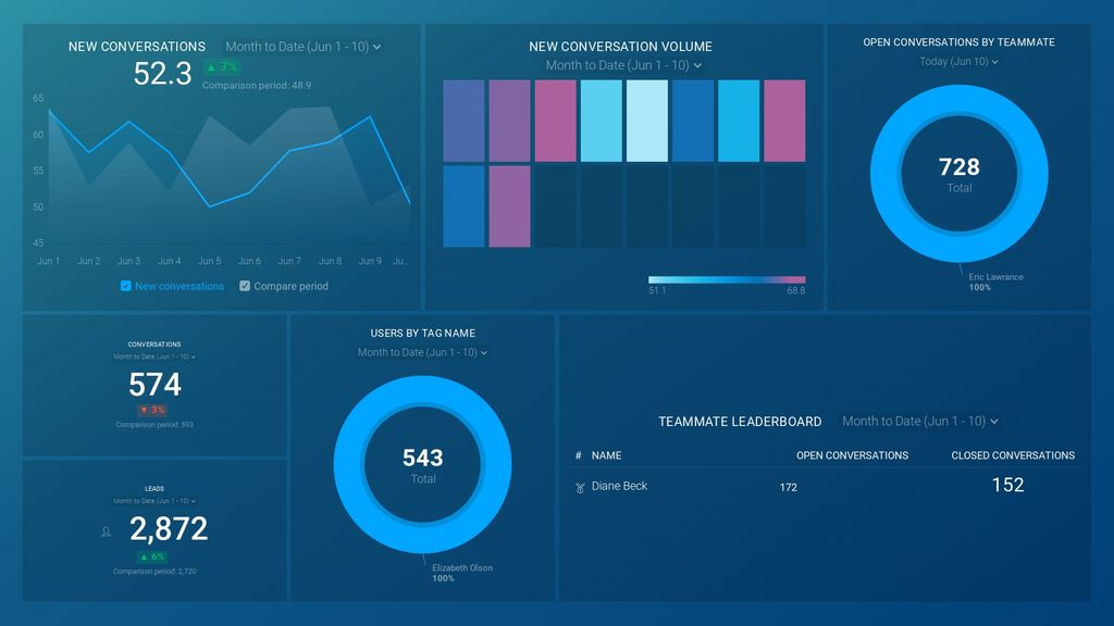
No matter your role in customer support – agent, manager, or VP – your core focus is to ensure that customers’ issues, complaints, and information requests are always dealt with promptly and efficiently. But to stay on track, you may have to spend hours manually compiling data from different tools into a comprehensive report. Now you can quickly monitor and analyze your customer service performance data from Intercom in a single dashboard that monitors fundamental metrics, such as:
- New conversations. Track the total number of new conversations your customer support team handles daily, weekly, monthly, or within the specified date range.
- Open conversations by team member. View the total number of conversations in your support inbox that are still open and find out which team members are handling them.
- Leads. Track the number of leads generated by your customer support team within a specified date range. Dig deeper to learn the nature of the messages that help convert visitors to leads, and use your insights to improve future conversations.
- Users by tag name. View the total number of conversations your customer support team has handled over time and see how your team members tagged those messages in Intercom. Using tags makes it easier for anyone monitoring the dashboard to learn more about customer needs, interests, and issues.
Now you can benefit from the experience of our customer support experts, who have put together a plug-and-play Databox template that contains all the essential metrics for monitoring and analyzing the performance of your customer support reps. It’s simple to implement and start using as a standalone dashboard or in customer service reports, and best of all, it’s free!

You can easily set it up in just a few clicks – no coding required.
To set up the dashboard, follow these 3 simple steps:
Step 1: Get the template
Step 2: Connect your Intercom account with Databox.
Step 3: Watch your dashboard populate in seconds.
Most Important Customer Service Dashboard Metrics to Add to Your Report
Some customer service-related metrics are non-negotiable, and should always be tracked. According to our respondents, those are:
- Customer Satisfaction Score
- Customer Lifetime Value
- Monthly Recurring Revenue
- Customer Churn Rate
- Customer Retention Cost
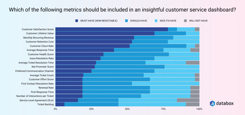
While these 5 metrics are essential to include in any customer service dashboard, there are 13 more metrics that most teams should be keeping an eye on as well.
- Customer Satisfaction Score
- Customer Lifetime Value
- Monthly Recurring Revenue
- Customer Churn Rate
- Customer Retention Cost
- Net Promoter Score
- Average Ticket Count
- Service Level Agreement (SLA)
- Average Response Time
- Average Ticket Resolution Time
- Preferred Communication Channel
- Customer Health Score
- Renewal Rate
- Number of Interactions per Ticket
- Issue Resolution Rate
- First Contact Resolution Rate
- First Response Time
- Customer Effort Score
1. Customer Satisfaction Score
Customer Satisfaction Score (CSAT) is one of the most popular survey-based metrics to gauge how satisfied a customer is with their recent support experience. You can measure this by asking customers this question, “On a scale of 1-5, how would you rate your overall satisfaction with the service you received?”
For instance, this is one of the core metrics that David Antoni, of Virtocommerce, monitors in his customer service team dashboard.
“Since using the customer service dashboard at Virtocommerce, there has been a significant improvement in our customer pulse detection which has its foundations rooted in structured and unstructured data recovered from support tickets,” says Antoni. “This gives us a better insight into customer relationships since we are able to measure inputs such as our Customer satisfaction score (CSAT), our net promoter score (NPS), and significant challenges in our operational processes.
Customer service dashboards assist in helping map required parameters with available data. We have also been better positioned to identify business opportunities as we encourage customer service teams to assist new and existing customers to discover their product portfolio. This opens a window that helps us identify and track vital market trends that are worth investing in.
2. Customer Lifetime Value
Customer lifetime value (LTV) is how much an individual customer is worth to your company. Calculating LTV will vary based on the type of business you run. For instance, it looks different if you have a recurring revenue business, like a SaaS, vs. an eCommerce business without any subscriptions.
However, regardless of the type of business, LTV is an important thing to know since it factors in to your marketing strategy and budget.
3. Monthly Recurring Revenue
For SaaS and subscription businesses, this is the holy grail metric, alongside customer churn rate. Monthly recurring revenue (MRR) is the total revenue you are bringing in from subscriptions that month.
Tracking this metric regularly in your dashboard can reduce stress.
For instance, Dean Lee of Sealions says, “A new email from the dashboard of my small business arrives in my inbox every day. My company is briefly summarized on one page in the attached email. It begins with my profits, then displays my sales, followed by the results of email, advertising, and customer service, amongst other things.
For each of these key metrics, I am able to view my month-to-date results as well as how they compare to the results of the previous month and the results of the previous year. These comparisons are color-coded, with green arrows pointing upwards indicating that I am performing better than the previous periods and red arrows pointing downwards indicating that I am not.
Because of this, I am able to immediately evaluate how well I am doing in every facet of my business. And if there is a problem (for example, there has been a decrease in revenue generated via email marketing), I know exactly who to contact inside my organization to get the issue resolved. I am therefore able to relax regardless of whether or not I am physically there in the workplace because I am fully aware of how well my company is doing and of the specific areas in which it may use some enhancement.”
4. Customer Churn Rate
While MRR tracks total revenue in a given month, customer churn rate looks at the number of customers who cancel or don’t renew their subscription in a given month. SaaS companies tend to track either customer churn, revenue churn, or both.
Here is a simple formula you can use to track your customer churn rate.
Number of customers that you churned last month / the number of customers that you started with a the beginning of the month x 100
The lower your churn rate is, the easier it is for your company to grow. Fortunately, you don’t have to leave this to chance if you are tracking this alongside other key support metrics.
For example, Dan Barrett of Social Vantage says, “My company is a social media management platform that helps businesses manage their social media activities. In order to do this, we needed to be able to see all of our customers’ interactions with our platform—whether it was about onboarding, training, or support issues.
We also wanted to see how these interactions were going: if they were resolving quickly or if they were taking too long and causing customer frustration. I knew that if we could track all of these things in one place and then use them as a way to improve our internal processes and support strategies, we’d be able to grow our business. By being able to see which parts of our product were working well versus poorly and why, we could make changes that would ultimately help us retain more customers over time.”
5. Customer Retention Cost
While customer churn rate looks at customers lost, customer retention cost looks at how much money you are spending to keep a paying customer.
This is helpful since some customers are better fits for your business than others. This metric can help you discover that.
Sam Speller of Kenko Matcha says. “We know that Kenko Matcha has a lot of repeat customers, who are loyal to us because they trust that their orders will arrive on time and be exactly what they expect. We also know that these customers are incredibly busy, so when they place an order with us, it’s not just about getting their order shipped—it’s about getting it shipped quickly so they can get back to work. That’s why we chose metrics like “average first-time order delivery time” and “customer satisfaction” as our top two metrics—they tell us how well we’re meeting those goals in real-time, so if there’s an issue with an order or with a customer’s satisfaction level, we can fix it before it becomes a problem for anyone else.
Building and using dashboards has influenced our business by making sure that everyone has access to all the information they need at any given time. Our developers built the dashboards in such a way that anyone from operations managers to salespeople can log into them from anywhere and see real-time updates on how things are going. This makes it easy for everyone on staff to collaborate and to see how their individual contributions are impacting overall business performance.”
Related: 9 Customer Retention Metrics You Need to Start Tracking ASAP
6. Net Promoter Score
Just like CSAT, NPS is a survey-based metric for measuring customer loyalty. You can measure it by asking this question, “On a scale of 0 to 10, how likely are you to recommend our product/service/company?”
Anyone who answers between 0 – 6 is a detractor. Anyone who answers 7-8 is neutral. And, anyone who says 9 -10 is a promoter.
Then, you throw out all of the neutral responses and subtract your percentage of promoters by the percentage of detractors.
7. Average Ticket Count
Average ticket count is the average number of support tickets that a customer submits. If most customers are submitting a lot of tickets, this can be an indicator that your product UX needs work or that it is full of bugs.
8. Service Level Agreement (SLA)
If you have enterprise customers, there is a good chance you have SLAs in place with all of them. That’s because it sets the expectations between your company and their company around service uptime and specific services/products delivered.
9. Average Response Time
Average response time looks at the average amount of time it takes for someone on your support team to respond to a support request. Typically, faster response times lead to better customer outcomes.
For instance, Arthur Worsley of The Art Of Living says, “The metrics I chose include the number of tickets opened and closed by each customer service rep in a given month, the average response time for all tickets opened in a given month, the number of times that reps had to escalate tickets to supervisors in a given month, as well as the number of new customers signed up in a given month. It was also important for me to track the total amount spent by customers (overall) in a given month.”
PRO TIP: Find out how Databox reduced median first response time, and which measures have been implemented to ensure this success is long-term and sustainable.
10. Average Ticket Resolution Time
If you are going to track average response time, you should also track average ticket resolution time. That’s because having a fast average response time is only great if you can also resolve tickets quickly (i.e. average ticket resolution time). If not, you are simply responding to customers quickly but stringing them along for days, weeks, or longer until you can solve their problem. Not ideal.
11. Preferred Communication Channel
Preferred communication channel refers to the support channel or channels, like phone, email, live chat, community forum, or social media, that your customers seek out the most for support. It is helpful to know this for staffing purposes.
For instance, if you know your customers prefer live chat over other channels, you can staff and train more reps to handle support requests via chat.
12. Customer Health Score
Customer Health Score is used by customer success teams as a way to gauge how happy specific customers or larger customer cohorts are. This metric is more ambiguous than CSAT and NPS and can vary wildly by organization.
However, it usually tracks customers from onboarding throughout their customer journey.
For instance, David Patterson-Cole of Moonchaser says, “We created dashboards for every stage of our customer interaction, from first touch to initial consultation all the way to follow-ups and referrals. It gave us a better way to visualize a lot of the data we were collecting that otherwise went unnoticed.
Deciding on metrics really came down to trial and error, in the end. If we put something up on the dashboard, we made sure to analyze whether or not that metric fit with the rest. Were we actually gaining a deeper, more augmented understanding here by looking at the metrics in tandem? That became our lodestar for deciding how to add to and edit our dashboard, and we learned a lot from the process.”
13. Renewal Rate
Renewal rate is another customer retention metric. If you have customers on fixed contracts, renewal rate measures how many of these customers renew for another term at the end of their contract. Since it is easier to retain customers than acquire new ones, having a high renewal rate can be a sign of a thriving business.
14. Number of Interactions per Ticket
The number of interactions per support ticket measures how many replies it takes to resolve an issue. The goal for most support teams is to resolve an issue quickly with as few replies as possible.
15. Issue Resolution Rate
Issue resolution rate, or ticket resolution rate is the number of tickets that are solved. It is typically tracked on a daily or weekly basis.
If the number of unresolved tickets is growing, this can be a sign of having a lot of bugs in your product or attracting the wrong types of customers who need specific features that your product doesn’t have. Both of which tend to lead to more churn.
16. First Contact Resolution Rate
First contact resolution rate (a.k.a. first call resolution rate) measures the number of customer issues that are resolved with one reply. Monitoring and improving this metric is one way to increase average resolution times.
For example, Melanie Bedwell of OLIPOP says, “Our customer service (CS) dashboard allows our team to monitor all of our CS KPIs in one place. It’s also an easy and accessible way to monitor our customers in a 360-degree view. We’re able to tailor our strategies based on the data we analyze from our dashboard. Once we fine-tuned our strategies, we were able to increase our customer retention, as well as our conversion rates. For our customer service team, in particular, our KPIs include:
- First call resolution
- Unresolved calls
- Average response time
- Best day to call
- Customer feedback.
Our customer service team is instrumental in promoting our brand and ensuring our current customers and prospects have a fantastic experience with our company. Our dashboard allows them to do their job efficiently and effectively.”
17. First Response Time
First response time is a similar metric to average response time except it looks at the amount of time that lapsed between when a customer reaches out for support and the time it takes for someone on your team to reply.
18. Customer Effort Score
Similar to NPS and CSAT, CES is a newer survey-based customer satisfaction metric. It measures how much effort it takes a customer to get their issue resolved.
Customer Service Dashboard Examples
Now that you know the four most popular types of customer service dashboards and the metrics you should be tracking, here are a few free dashboard templates you can use.
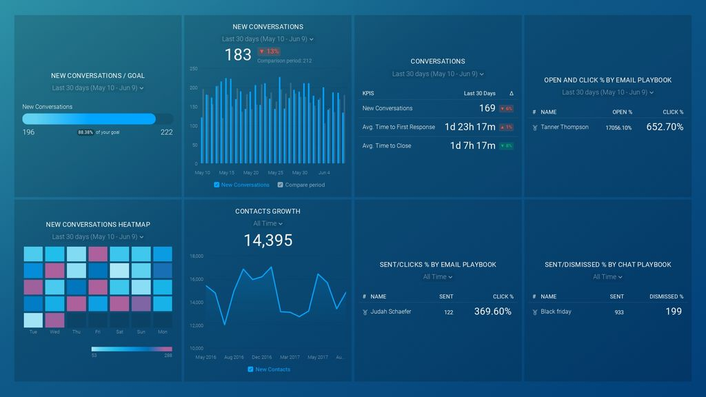
1. Intercom Customer Support Overview Dashboard
If you use Intercom for sales and customer support, this customer support overview dashboard allows you to monitor the overall efficiency of your support reports alongside overall performance.
Some of the metrics included are:
- New closed conversations by teammates
- Leads
- Open conversations by teammates
- Conversations
- New conversations
2. Help Scout for Customer Support Dashboard
If you use Help Scout, this customer support dashboard tracks key support team metrics like first response time, resolution time, % of tickets resolved on first reply, and customer happiness score.

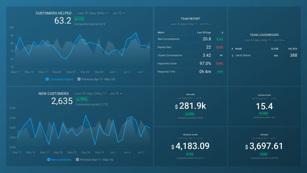
3. Customer Success Overview Dashboard
If you are looking to see data from both Stripe and Help Scout, this customer success dashboard allows you to see the correlation between new customers, customer service performance, and churn rate.
4. Drift Campaigns & Conversations Dashboard
Lastly, if you are using Drift, this campaigns and conversations dashboard allows you to see the correlation between sales, marketing, and support in one place.
The metrics you can track include:
- Average first reply time to chats
- Number of new conversations
- Contact growth
And more.
Improve the Performance of Your Customer Service Team with Databox
If you are looking to measure your customer service performance, then using Databox can make this process a lot easier.
Not only can you create a dashboard in minutes using our drag and drop interface, but you can also connect hundreds of sources, including Stripe, Help Scout, Intercom, Drift, and more.
Ready to create your first customer support dashboard? Create your free Databox account here.