Table of contents
A six-step AI diagnostic workflow with copy-paste prompts to find out exactly what broke in your B2B funnel, and whether the problem is even where you think it is.
TL;DR
- Rule out tracking failures and seasonal dips before running any AI diagnostic prompt. A broken GA4 event or CRM form mapping issue will mimic a funnel crisis that does not actually exist.
- The problem you walk into the meeting with is often not the real problem. A reported lead drop frequently turns out to be a conversion efficiency issue, a downstream revenue compression, or a data quality artifact. The diagnostic exists to find the real anomaly, not to confirm the assumed one.
- A connected AI analyst like Databox Genie runs these prompts against your live data from 130+ sources without CSV exports or analyst involvement, collapsing a multi-hour manual process into one structured conversation.
Introduction
Your Monday morning pipeline review starts the same way it always does: dashboard open, coffee going, quick scan of the weekly numbers. Something looks off. Maybe leads are down. Maybe pipeline is soft. Maybe revenue is tracking behind plan and you cannot yet say why. Your CMO’s Slack message is already sitting in your notifications: “What happened last week?” You have a leadership sync in two hours.
To diagnose a sudden funnel anomaly with AI, follow a structured six-step prompt sequence: establish the baseline volume trend using daily averages, check top-of-funnel health, measure conversion efficiency, run a cross-source anomaly check, investigate the trigger, and validate the finding before acting. Each step builds on the one before it, and each requires a specific prompt rather than an open-ended question. The full sequence, with every prompt ready to copy and run, is the core of this article.
Manual diagnosis of this problem means opening GA4 in one tab, HubSpot in another, your ad platform in a third, your e-commerce or revenue source in a fourth, and spending two to four hours cross-referencing numbers that may not even share the same attribution model or reporting window. By the time you have a hypothesis, the meeting is over and you have already promised a follow-up email with “more detail.” An AI analyst, like Genie, connected to your live data can run the same diagnostic in one conversation. But only if you prompt it in the right sequence, and only if you write the prompts to control for the data quality realities, like missing days, inconsistent sync windows, and dimensional gaps that produce misleading answers when you ignore them.
What follows is the prompt-by-prompt diagnostic playbook that no article on this topic has published yet. Six steps. Six prompts. One reusable workflow you can run every time the numbers look wrong, including the moment you discover the numbers were not telling you what you thought.
Why AI Cuts Diagnostic Time From Hours to a Single Conversation
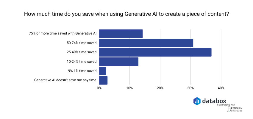
According to Databox’s research on how marketers use generative AI, 36.70% of respondents report saving 25 to 49% of their time when using generative AI tools for content-related work. For analytical and diagnostic tasks, where the bottleneck is data reconciliation rather than creation, the time savings are often larger still.
The diagnostic workflow below eliminates the reconciliation step entirely. Every prompt assumes your data sources are connected to a single AI analyst that can query across them. If they are not, you can still run these prompts in any AI tool by pasting in the relevant data, but the speed advantage and the cross-source health check depend on live data access.
Before You Prompt: Rule Out the False Alarm First
Before you ask AI to diagnose anything, eliminate the two most common false positives. Diagnosing a tracking failure as a funnel crisis will send your team chasing a problem that does not exist. Treating a predictable seasonal dip as an emergency will burn credibility when the numbers recover on their own next week. Both waste time you do not have.
Funnel fluctuations rarely come from one dramatic failure. They come from small shifts that compound quietly, or from data artifacts that compound loudly. The goal of this pre-check is to confirm the anomaly is real and unexpected before investing any diagnostic effort.
Check Your Tracking Is Working
Run through this in five minutes:
- Open GA4 and confirm your form-submit events are firing on key landing pages.
- In HubSpot, check the Forms dashboard for the past seven days. If submission counts show zero on pages that normally convert, the form or embed is broken.
- Verify UTM parameters are intact on your active paid campaigns. A missing or changed UTM will misattribute leads, making it look like a channel dropped when the leads are simply landing in the wrong bucket.
- Confirm CRM field mapping has not changed. A Salesforce admin updating a picklist or a HubSpot workflow modification can silently reroute leads away from your MQL count.
If any of these checks reveal a break, fix the tracking issue and re-pull the data before proceeding. Diagnosing bad data produces bad diagnoses.
Check for Seasonality or Calendar Events
Pull a year-over-year comparison for the same week or month. Check for holidays, industry conferences where your buyers are away from their desks, fiscal quarter boundaries, or known demand cycles in your vertical. If the current drop mirrors a dip at the same time last year within a similar range, you may be looking at expected variance rather than a crisis. Only proceed to the diagnostic steps if seasonality does not explain the magnitude of the anomaly.
Step 1: Establish the Baseline With Daily Averages, Not Period Totals
“Leads are down” is not a diagnostic input. Neither is “MQL volume is down 30% week-over-week.”
Period totals are the single most common source of misleading funnel headlines, because they are silently sensitive to whether both periods have the same number of observed days. A 7-day window compared to a 6-day window can show “+10% growth” when the daily rate is actually flat or declining. The first move in any AI-assisted diagnostic is to control for this.
Use daily averages. Compare the most recent 7 days against the prior 21 days, not the prior 7. The longer baseline reduces sensitivity to single-day noise and produces a more stable reference point. If a missing day exists in either period, daily-average math handles it cleanly. If you compared totals instead, the same gap could flip your conclusion entirely.
Be specific about which metric you are measuring. Raw form submissions, marketing qualified leads, and sales qualified leads are different numbers with different implications. A drop in raw submissions points to a traffic or conversion problem. A drop in MQLs with stable submissions points to a lead scoring or routing issue. A drop in SQLs with stable MQLs points to sales qualification criteria or handoff speed. Name the metric before you prompt.
Genie Prompt to Run
“Calculate the daily average of [your exact lead metric, e.g., Salesforce New Leads or HubSpot MQL count] for the most recent 7 days versus the daily average for the prior 21 days. Express the change as a percentage. Use daily averages to control for any missing-day gaps in the source data.”
Use the exact metric name from your CRM in the prompt. “Salesforce New Leads” will produce a more precise answer than “leads.” Precision in, precision out.
Note that this video uses a demonstration account with sample data; the prompt mechanics and Genie’s response behavior are identical to a live-data environment.
Step 2: Check Top-of-Funnel Health
A funnel anomaly that shows up at the lead stage often originates further upstream. Before you investigate the lead stage itself, check whether the inputs feeding it are healthy. If top-of-funnel volume is growing while lead volume is flat, you have a conversion efficiency problem. If top-of-funnel volume is shrinking while lead volume holds steady, your funnel is working harder to convert a smaller audience and that compensation will not last.
The cleanest top-of-funnel proxy depends on what you have connected. Website sessions from GA4 is the strongest signal. If GA4 is not connected, HubSpot New Contacts or another contact-creation event is the next best proxy. The point is to measure the size of the audience that could become a lead, not the leads themselves.
Genie Prompt to Run
“Calculate the daily average of [your top-of-funnel metric, e.g., website sessions or HubSpot New Contacts] for the most recent 7 days versus the prior 21 days. Express the change as a percentage. Tell me whether top-of-funnel volume is healthy, declining, or growing.”
Two outcomes matter. If top-of-funnel is declining roughly proportionally to leads, you have an acquisition problem upstream. If top-of-funnel is flat or growing while leads are flat or declining, the next step will tell you what is breaking between the two.
Step 3: Measure Conversion Efficiency
This is where most funnel diagnoses go wrong, because it is the step manual analysts skip. Volume metrics are easy to pull. Conversion ratios across periods require math against two metrics from two systems with two reporting windows. AI handles this in one prompt.
The conversion efficiency ratio: leads divided by contacts, on a per-day basis, tells you whether the funnel is getting better, worse, or staying the same at converting audience into qualified pipeline. A ratio that holds steady while volume grows is healthy expansion. A ratio that declines while volume grows means you are pulling in more audience but converting a smaller fraction of it, which is a classic symptom of a recent shift in lead quality, a qualification criteria change, or a routing issue.
Genie Prompt to Run
“Calculate the ratio of [downstream conversion event, e.g., Salesforce New Leads] to [upstream conversion event, e.g., HubSpot New Contacts] on a per-day basis for the most recent 7 days versus the prior 21 days. Tell me whether the funnel is converting at a stable rate, improving, or weakening.”
This single prompt frequently surfaces the real story. A team that walked in expecting a lead volume crisis often discovers the volume is fine but the conversion rate is softening. The fix for that is entirely different from the fix for a volume problem.
Step 4: Run a Cross-Source Anomaly Check
The single biggest advantage of an AI analyst connected to your full data stack is the ability to scan every source for anomalies in parallel. Manual analysts do not do this. They check the source they expect the problem to be in, find evidence consistent with their expectation, and stop looking. That is how a marketing team spends three days investigating organic search when the actual problem is sitting in Stripe.
The cross-source check asks Genie to flag any connected source where the most recent 7-day daily average deviates notably from the prior 21-day baseline. This is the prompt most likely to surface the unexpected finding — the one that reframes the entire diagnostic.
Genie Prompt to Run
“For each connected data source — CRM, web analytics, advertising, email, e-commerce, payments, and any others — report whether the most recent 7-day daily average is within normal range versus the prior 21 days, or whether any source shows a notable deviation. Highlight any source where the deviation is material, and flag whether multiple sources are showing the same directional change.”
Watch for two patterns specifically. First, a single source showing a sharp deviation while everything else is normal, that is your isolated anomaly. Second, two or more sources showing the same directional change at the same magnitude, that often points to a systemic issue (a tracking failure, an attribution model shift, a platform-wide change) rather than a marketing-specific problem.
Step 5: Investigate the Trigger
Data patterns tell you where the anomaly is. Triggers explain why it appeared when it did. A sudden shift that started on a specific Tuesday is almost never a slow market change. It is a deploy, a campaign change, a form edit, an integration failure, or a process change. This step maps the anomaly’s onset date against your team’s change log.
Genie Prompt to Run
“Show me [the affected metric] on a daily basis for the past 30 days. Identify any clear inflection point or sudden change. For that date and the three days before it, flag any simultaneous changes in connected data sources — traffic volume, conversion rate, campaign spend, send volume, or transaction counts.”
Cross-reference whatever date Genie flags against your team’s change log. Check for recent website deploys, form edits, landing page redesigns, campaign pauses, pricing page changes, integration updates, or sales team restructuring. Genie surfaces when the anomaly started and what other metrics moved at the same time. Your change log confirms why.
Step 6: Validate Before You Act
The diagnostic is only as good as the question you asked and the data behind it. Before you act on a finding (especially before you reallocate budget, pause a campaign, or escalate a problem to leadership) pressure-test the diagnostic with one more prompt.
This step matters more against real-world data than against a controlled example. Real customer data has partial syncs, integration lag, attribution shifts, and dimensional gaps. A diagnostic that looks clean on the surface can rest on a comparison where one period has missing data and the other does not, or on a metric that recently changed definition in your CRM. Validation is a five-second check that catches these failure modes before they become bad decisions.
Genie Prompt to Run
“Pressure-test the diagnostic you just produced. Are there any data quality issues, partial syncs, or anomalies in the underlying data that could be skewing the comparison? Of the conclusions you reached, which have the strongest data support, and which should I treat as directional rather than definitive before acting on them?”
Three things to look for in the response. Cross-check whether Genie flagged any missing days, sync gaps, or definition changes. Confirm which of the findings Genie marks as well-supported versus weakly supported. If anything sits in the weak category and your planned action depends on it, do the manual verification before moving.
Most articles on this topic skip validation entirely. It is the cheapest credibility check in the workflow, particularly when running this sequence against messier real data than a controlled example.. Genie connects to 130+ business data sources and runs the full diagnostic as a single conversation: no CSV exports, no tab-switching, no waiting on an analyst.
Run these six prompts against your live data, not a paste-in
How Genie Runs This Diagnostic Against Your Live Data
The six prompts above work in any AI tool, but only if you can feed them accurate, current data. That is the gap most teams hit. Copying numbers out of GA4, pasting them into ChatGPT, and hoping the context is sufficient produces answers built on whatever you remembered to include. Whatever you forgot to paste in becomes a blind spot in the diagnosis.
Dashboards show you what happened. Genie tells you why.
Genie is Databox’s AI Analyst, connected directly to live business data from 130+ integrated sources: Salesforce, HubSpot, GA4, Google Ads, LinkedIn Ads, Stripe, Shopify, cloud databases, and spreadsheets. When you run the prompt sequence above in Genie, it queries your actual numbers across those sources in parallel. No manual exports, tab-switching, or waiting on an analyst to pull a report you needed an hour ago.
The diagnostic value is not just speed. It is a methodological discipline most marketers would not think to ask for. Watch what Genie does in the embedded video: it controls for missing-day gaps in the source data without prompting, surfaces baseline-relative anomalies across five connected sources in parallel, and ends on a prioritized executive headline rather than a wall of numbers. That is the difference between an AI tool answering a question and an AI analyst running a diagnostic.
“The Genie AI Analyst is a massive time-saver. It eliminates the frustration of digging through scattered dashboards and manual analysis by letting me ask natural language questions and instantly get clear, contextual answers pulled directly from my real metrics. This ability to quickly turn a question into a data-driven decision is what truly stands out.”
The Diagnosis Should End With a Decision, Not a Question
Running this sequence once changes how you diagnose funnel anomalies going forward. But the larger shift is in what happens after the diagnosis. When you walk into a leadership sync with “leads are actually flat once you correct for the day count, top-of-funnel is healthy, the real issue is a 17% drop in conversion efficiency and a 27% revenue compression at the transaction level, and here is the date both started,” you are not reporting a problem, you are reframing one.
That difference, between arriving with an open question and arriving with a validated, prioritized finding, is about asking the right questions in the right order, applying the right methodology, and having an AI analyst that can answer against your actual numbers rather than a paste of whatever you remembered to copy.
The six prompts in this article are reusable. Save them. The next time a CMO sends a Slack message asking what happened to leads, you will have the sequence ready before you open the second tab.
Frequently Asked Questions
What should I check first when my funnel suddenly looks off?
Rule out tracking failure before anything else. A broken GA4 event or CRM form mapping issue will make it look like leads disappeared when they are simply not being counted. Open GA4 DebugView, confirm form-submit events are firing on key landing pages, and check HubSpot’s Forms dashboard for the past seven days before running any further analysis.
How do I tell if a lead drop is a traffic problem, a conversion problem, or something else entirely?
Use the baseline plus top-of-funnel plus conversion efficiency check from Steps 1 through 3. If both lead volume and top-of-funnel volume have dropped proportionally, you have an acquisition problem upstream. If top-of-funnel is stable or growing but leads are flat or down, the conversion efficiency ratio (Step 3) will tell you whether the funnel is converting audience at a lower rate than before. And do not stop at the lead stage — run the cross-source anomaly check in Step 4. The actual problem often turns out to be downstream of where it was first reported.
What AI prompts can I use to diagnose a sudden funnel anomaly?
The most useful starting prompt is: “Calculate the daily average of [lead metric] for the most recent 7 days versus the daily average for the prior 21 days. Use daily averages to control for any missing-day gaps.” Follow up with top-of-funnel health, conversion efficiency, and cross-source anomaly checks. The full six-prompt sequence appears step by step in the body of this article.
Why do you recommend a 21-day baseline instead of comparing week-over-week?
A 7-day-vs-7-day comparison is sensitive to missing days, single-day outliers, and small sample noise. A single missing day in either period can flip a headline finding from “+10% growth” to a daily-rate decline once corrected. Comparing the most recent 7 days against a 21-day baseline produces a more stable reference point and reduces the risk of acting on noise. This is also more honest about what week-over-week data can reliably tell you.
How is using Genie different from asking ChatGPT?
Unlike ChatGPT, Genie is connected directly to your live business data from 130+ integrated sources including Salesforce, HubSpot, Stripe, Shopify, and GA4. ChatGPT answers from general knowledge or whatever context you paste in. Genie answers from your actual numbers, which means its diagnostic output reflects what is happening in your specific account, not a generalized pattern. Genie also handles the data quality realities — missing days, partial syncs, dimensional gaps — that produce misleading answers when ignored.
How long should a funnel anomaly diagnosis take with AI?
With a connected tool like Genie, the full six-prompt sequence can run as a single structured conversation in well under an hour. Manual analysis of the same scope — pulling reports from GA4, HubSpot, ad platforms, and revenue sources separately and reconciling attribution models across all of them — typically takes several hours to a full day. The time difference is not about speed of reading. It is about eliminating the export, paste, and reconciliation steps entirely.