Table of contents
Are you struggling to create meaningful reports for your company? Does the sales team still provide you with spreadsheets for forecasts and you have to spend hours each week categorizing the most important data?
The Salesforce Report Builder can help you speed up the whole process.
This robust tool enables you to build reports both faster and more efficiently by using some of the most advanced drag-and-drop features in the CRM software world.
In this guide, we will explain how you can use the Salesforce Report Builder to streamline your business and create exceptional reports to impress your shareholders.
- What Is the Salesforce Report Builder
- How to Create a Report with Salesforce Report Builder
- How to Create a Report in Salesforce Lightning
- How to Use Salesforce with Databox
- Build Reports from Your Salesforce Data in Databox
What Is the Salesforce Report Builder?
The Salesforce report builder is an advanced tool that incorporates drag-and-drop features to make the reporting process in companies quicker and easier. After building a report, you can customize and filter the data included and then export the report to other members of the company.
This tool is especially useful for busy agency owners and executives that don’t have enough time to build reports from scratch. The creation process is very straightforward – you select a report type, report format, and then customize the fields that will be included in the report.
These fields are an innovative addition since they can be used to describe reported results. For example, if we look at a report as a table of information, the columns would be the fields, while the rows would be the results. Now, let’s say that an HR manager needs to create an employee report. The results would be individual employees and the fields would include their personal information (name, title, start date, etc.).
This may sound confusing at first, so we will explain the whole process in detail in the following headings.
How to Create a Report with Salesforce Report Builder
While creating reports is immensely easier through the Salesforce report builder, you will still have to learn how to operate this advanced tool.
We will explain each step in-depth so you can get your report builder up and running in no time.
- Choose a Report Type
- Choose a Report Format
- Group Your Report Data
- Customize Reports if Needed
- Save Your Report
- Other Options
NOTE: This guide applies only to users that are creating reports in the Classic report builder. To check out the lightning report builder guide, move on to the next heading.
Choose a Report Type
Choosing a Salesforce report type ultimately means choosing the fields and records that will be displayed in the report.
For instance, if you create an ‘Opportunities’ report, you will gain access to fields and records such as ‘Stage’, ‘Amount’, and ‘Type’.
The two main report types that users can choose include Custom Report Types and Standard Report Types.
Custom reports allow you to customize the Salesforce custom objects and custom views (Opportunities) within the standard objects. If the administrator of the account provides access to ‘Opportunities’ within a custom report type, you can use it to create a report for a specific product.
On the other hand, selecting Standard report types will provide you with access to overall Salesforce data sets.
For beginner users, we recommend that you use Standard report type naming practices if you choose to run Custom report types.
To choose a report type you should open up the ‘Reports’ tab and press ‘New Report’. Next, choose which report type you want and click on ‘Create’.
NOTE: Once you choose a specific report type, you can’t change it in the future.
Choose a Report Format
The next thing you have to do is select the format of your report.
There are four different formats you can choose from and these include:
- Tabular – This report format provides users with by far the simplest and quickest way to check data records. The tabular format is consisted of organized columns and fields that include matching records right beneath them. Users that often create lists or records in their reports may find the tabular format as the ideal solution. The main downside of the tabular format is that you can’t create data groups or charts.
- Summary – This format has a lot of similarities with the tabular report, but it comes with a few more advantages. For example, users can combine data rows, check the subtotals, and design charts. In most cases, summary reports are used as the source for different dashboard elements. Users that need hierarchical lists in their reports (team opportunities with Stage and Owner subtotals, e.g.) are the ones that can benefit most with the summary format.
- Matrix – Matrix reports have certain advantages over summary reports in terms of allowing users to summarize data via both rows and columns. This format works best if you need to compare related totals or you often have large sets of data to summarize. Also, the matrix format is great for comparing different field values and checking data through a specific categorization (person, product, or geography).
- Joined – By using the joined format, you can combine a few report blocks in one place and acquire a complete overview of your data. This way, each block functions as a separate ‘sub-report’ and has individual columns, fields, and filtering. Not only that, but you can also include data from other report types in the joined report. To use joined reports, you have to subscribe to an Enterprise, Performance, Unlimited, or Developer Salesforce account.
The best advice is to pick a format that will enable you to capture the data you want to report and allow you to communicate it easily to other team members.
Group Your Report Data
After you choose a report format, the next step is to group the data in columns/rows to present the most important information.
To group data, you should know what these things mean:
- Data for Grouping – This section includes fields from the report type you selected and they are organized by appropriate folders. Drag a few fields here to preview how your report will look before you continue.
- Add a Grouping – You create groupings by dragging fields into the drop zone. Press ‘Show’ or ‘Drop Zones’ to make the groupings visible. The other option is to choose ‘Group by this Field’ in the report menu. If you use a date field for report grouping, you can choose ‘Group Dates By’ to simplify the process.
- Grouping Data in Different Report Formats – If you previously picked summary or joined reports, then you can create three different levels of grouping. On the other hand, Matrix reports allow you to create two-row/column groupings.
- Remove a Grouping – For removing a grouping, all you have to do is click the ‘Remove Group’ option in the main menu.
- Change Order of a Grouping – You can alter the order of your groupings by simply dragging the groups onto other fields. The other option is to click on ‘Move Group Up’ or ‘Move Group Down’ in the main menu if you want to change the column, or ‘Move Group Left’ and ‘Move Group Right’ to change the row.
Customize Reports if Needed
Aside from simply building a report, you also want to visually edit them to make the data presentable.
Here are three panes you can use for customizing the reports:
- Field Pane 1 – The fields from your report type will be displayed in this pane. You can use the search box and field type filters to quickly track down the fields you are interested in modifying. Then, drag them into the Preview Pane if you want to add them to your report. This field pane also includes options for creating, viewing, editing, and deleting custom summary formulas.
- Field Pane 2 – This pane can be used for customizing the view, time frame, and custom filters in your report.
- Preview Pane – The easiest way to customize your reports is through the Preview Pane. This section includes options such as Add, Reorder, Remove Columns, Remove Summary Fields, Remove Formulas, and Remove Groupings. By altering the report format, you can display some other options you need or even add charts. Keep in mind, the Preview Pane can only display a limited amount of records, if you want to see all the results you will have to run the report.
Save Your Report
Lastly, you have to click ‘Save’ to make sure your reports are created successfully, or to update any existing reports you made changes to. If you want to make a duplicate of a report without any changes, you should click ‘Save As’.
Related: How to Schedule Reports in Salesforce? (Classic and Lighting)
Other Options
This part of the guide isn’t necessary for the report builder creation process, but it can be helpful to learn some of these advanced features in case you need them in the future.
Report Fields in Salesforce
As we said, the field panes include the fields from the report types you previously selected. Here are some additional options you can customize within these panes:
- Adding Field Filters – If you use Tabular, Summary, or Matrix reports, you can also add report filters by dragging down fields from the Field Pane.
- Finding Fields – You can find the fields you are interested in quickly by using the search box. Use the different shortcuts that Salesforce offers, such as All, @, #, and 1, to filter the list even further.
- Adding and Removing Fields – In Tabular, Summary, and Matrix reports, you can add fields by dragging them into the Preview Pane, or by pressing CTRL and choosing multiple ones to speed up the process. If the report already has a field, you can’t add any additional ones. To remove a field, simply drag the column header back to the original Fields pane, or press the ‘Remove Column’ option.
Subtotal Report Results
Using the ‘Subtotal Report Results’ option can simplify the process of analyzing future trends. This allows you to create information groupings, sort them out, and draw comparisons between the subtotals. If you selected Summary or Joined reports, you can create subtotals in a few different fields to acquire additional data.
To get to the subtotal feature, you should open up your report and click on ‘Customize/Edit’ and create an additional summary field in the report in the main menu of the report builder,
Smart Totaling in Reports
The ‘Smart Totaling’ option is useful in case you have any duplicate data in your subtotals. By turning on this feature, the duplicate data will be only counted once.
For instance, let’s say that your ‘Opportunity’ includes two similar products and you open the ‘Opportunity Product Report’ to sum up the total opportunity amount. In this case, the amount will be shown twice in the report details.
‘Smart Totaling’ fixes this and makes sure that the subtotals, grand totals, and averages are calculated correctly.
How to Create a Report in Salesforce Lightning
The Lightning Report Builder is a much more robust tool compared to the Classic Report Builder. It allows users to analyze data on a more granular level, while also bringing a lot more features to the table.
With that said, creating a report in Salesforce Lightning requires a different process.
Here is a quick overview of what the step-by-step guide looks like:
- Create a New Report
- Select Report Type
- Add Columns
- Summarize Columns
- Add Groups
- Filter Records
- Add Charts
- Run the Report
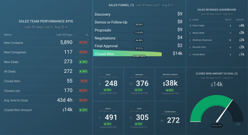
PRO TIP: Monitor Your Sales Team’s Performance in One Dashboard
Smart Sales Managers know that to achieve your monthly and quarterly goals, you have to monitor your team’s sales performance on a daily, weekly, and monthly basis. To do that, you need an actionable dashboard that summarizes both team and individual sales rep metrics and allows you to:
- Understand the current sales pipeline.
- Track sales rep performance.
- Compare team results to revenue goals.
If you use the HubSpot CRM, you can benefit from the experience of our sales experts, who have put together a plug-and-play Databox template showing some of the most important metrics for monitoring your sales team performance. It’s simple to implement and start using as a standalone dashboard or in sales reports!
You can easily set it up in just a few clicks – no coding required.
To set up the dashboard, follow these 3 simple steps:
Step 1: Get the template
Step 2: Connect your HubSpot account with Databox.
Step 3: Watch your dashboard populate in seconds.
How to Use Salesforce with Databox
Salesforce has become one of the most popular software for agency owners and executives who are looking to quickly grow their business in every aspect.
However, tracking all the different KPIs and data sources in Salesforce can become a bit overwhelming, especially when you have a busy schedule to follow.
This is why integrating your Salesforce account with Databox may be the solution to your problems. As they say, ‘two heads are better than one’, or in this instance, ‘two software are better than one’.
When you connect your account to Databox, you will not only be able to transform all the important KPIs into understandable insights, but you will also have them delivered to your Email, Mobile, Slack, or Apple Watch in a matter of seconds.
For more information on how to connect your Salesforce account with Databox, check out this page.
One of the main benefits of this integration is that Databox also allows you to combine all the different data sources in one comprehensive report.
Did you and your team struggle to stay on top of the key Salesforce metrics? Not anymore.
Some of the pre-built metrics and KPIs you will gain access to include:
- Converted Leads
- Opportunities Won Revenue
- Top Sales Rep
- Opportunities Lost
- Expected Revenue
- Closed Cases
- Open Opportunities
- Expense Total by Project
- New Cases
These are only some of the examples, there are dozens more metrics available to registered users.
That’s not all – you will also gain access to dashboard templates that can capture all of your Salesforce data into one comprehensive report and make it more understandable through advanced visualization features.
Here are just some of the dashboard examples we have built from Salesforce data.
Salesforce Leads Dashboard
The Salesforce Leads Dashboard provides you with a birds-eye overview of your most important Salesforce leads and lets you track your sales progress with more efficiency.

Some of the questions this dashboard can answer include:
- Where are my leads coming from?
- How do I track new and converted leads?
- At what stage are my leads in?
Salesforce Leads Overview Dashboard
This is another great example of a dashboard you can use to acquire a granular overview of your Salesforce leads.
By integrating the Salesforce Leads Overview Dashboard, you and your team will be up to date on all important updates regarding the sales process.

Salesforce (Expected Value of Sales Pipeline) Dashboard
For maximum visibility over your sales pipeline and expected opportunity values, you should consider using this comprehensive Salesforce Dashboard Template.

Some of the key metrics you will be able to track include converted leads, expected revenue, opportunities won revenue, open opportunities amount, and many more.
Related: 10 Essential Metrics to Include in Your Salesforce Dashboard
Build Reports from Your Salesforce Data in Databox
The Salesforce Report Builder is an extremely helpful tool for any executive looking to simplify their reporting process.
However, even though creating the reports will become easier, you will still have to spend quite some time pulling out and categorizing the data you want to include in the report.
This is where Databox’s reporting tool can come in handy.
By connecting your Salesforce account with Databox, you will be able to place all of your most important metrics and KPIs in one place. We know how overwhelming it can be to manage multiple data sources, which is why we found a way to combine them all in one comprehensive dashboard.
The next time you start creating a report through the Salesforce Report Builder, you can simply pull out the data you need from Databox dashboards and save up an immense amount of time as a result.
Not only that, but you will also be able to turn those KPIs into beautiful charts and graphs through our advanced visualization features.
Want to take your report-building process to another level? Sign up for a free trial and let us help.