Table of contents
The team from Revenue River, a digital solutions agency based in Golden, CO, are rightfully proud of the process-driven culture they have built over the past 8 years.
In fact, it has been pivotal for them as they have scaled from a founding team in 2009 to HubSpot Diamond Partner status in 2015.
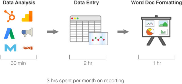
But one process had consistently lagged behind until this year: client reporting. Until 2017, Revenue River would leave it up to each account manager to log into every marketing service, copy data, paste it into tables within a Word document, add some analysis and then present that to the client.
They would spend 2-3 hours per client per month on reporting, and only about a quarter of that time on analyzing data and making data-driven decisions on behalf of their clients.
Worse than the time wasted, they did not have a standardized set of KPIs they report, which made it impossible for them to inspect their performance against clients’ goals until their account managers compiled this report each month.
They knew this needed to change, but did not have any technology to make that possible. So, they adopted Databox in early 2017 and joined the Databox Partner Program to systematize their reporting process to ensure they were using their time on improving client outcomes, not copying and pasting.
After rolling out Databox to 22 clients, they agreed to share their process with us… and you.
There have been three phases to their deployment of Databox:
- Pilot rollout: Copying previous reports into a set of 6 dashboards for a few clients
- Redefining KPIs: Getting a better understanding of which KPIs were worth measuring in the first place
- Final rollout: 3 refined dashboards with tweaks for individual clients
They didn’t want to just solve problems around reporting. As mentioned in the 3rd party case study produced by HubSpot, they also wanted to take the opportunity to re-evaluate which KPIs they use to frame their success. Here is their whole process.
Phase 1: Pilot Rollout
Amanda Daume, the Director of Sales Enablement, focuses on aligning sales and marketing at Revenue River. She also makes sure both departments report their results in the most helpful way for the client. She took charge of the first Databox deployment.
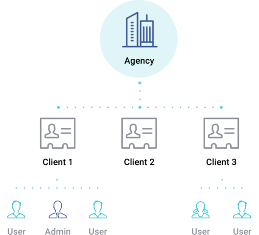
In order to get out of Word documents as quickly as possible, she prioritized the migration of existing reports into Databox. She first made a list of all the metrics that were being tracked at that time. Then, she created a series of 6 dashboards that encompassed all the different metrics. With Databox’s agency/client structure, she could create these reports once and distribute them to all clients immediately.
Amanda created a “quick win” with this approach, which built internal enthusiasm. She ended the painful hours of copying and pasting, and clients were pleased with the always-up-to-date reports too. “Just for consistency, we didn’t feel like it was a great idea to change up reporting for clients in the middle of their reporting year,” says Amanda. She kept their existing metrics and ensured account managers could immediately spend more time on analysis and recommendations rather than manual reporting.
For example, their Marketing + Sales SLA dashboard tracks the handoff between sales and marketing. It ensures that leads generated by digital marketers make it all the way to becoming customers at the right rates. Because they can set and track progress towards these numeric goals inside Databox, this dashboard makes sure they’re achieving the results their clients expect.
Phase 2: Redefining KPIs
After the initial rollout, Revenue River formed a committee to decide how to improve the reporting process. Amanda and Marc Hershberger, the Director of Marketing, led the effort. They felt that by reporting with 6 dashboards, they were likely pulling their attention away from the KPIs that drove their client’s business. By reporting too much about every marketing tactic they were employing, they were not helping clients focus on the most important marketing and sales outcomes.
They did an internal audit and tried to create a simpler framework around their KPIs.
“We went through the exercise of breaking down our old reports into their individual parts so that we could rebuild them in a way. We put all of them on a whiteboard, and we asked why we had to continue doing them this way. We wanted to regroup them in a way that was more insightful.”

Amanda Daume
Revenue River
Marc had the idea of focusing the reports around the tenets of inbound marketing: Attract, Convert, Close, Delight.
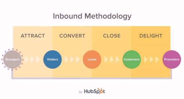
They decided that this would be a more logical way to report results. It would also make it easier for account managers to explain the data. So, they created a series of three dashboards called Attract, Convert and Close. ‘Delight’ is left to the customer success team at the client company. Databox pulls 145 HubSpot analytics metrics plus more specific data via Query Builders, so their KPIs were can be pulled automatically.
Phase 3: Full Rollout
Emily Cray, the System Optimization Specialist at Revenue River, is in charge of working directly with some of Revenue River’s retainer clients and making sure they get the most out of HubSpot. As part of her job, she has now taken charge of deploying Databox and customizing it to the needs of each client.
Revenue River (or more specifically, Emily) now rolls out this three Databoard sequence to all new retainer clients. And in 2018, they plan on migrating existing retainer clients to this new sequence to give account managers better focus.
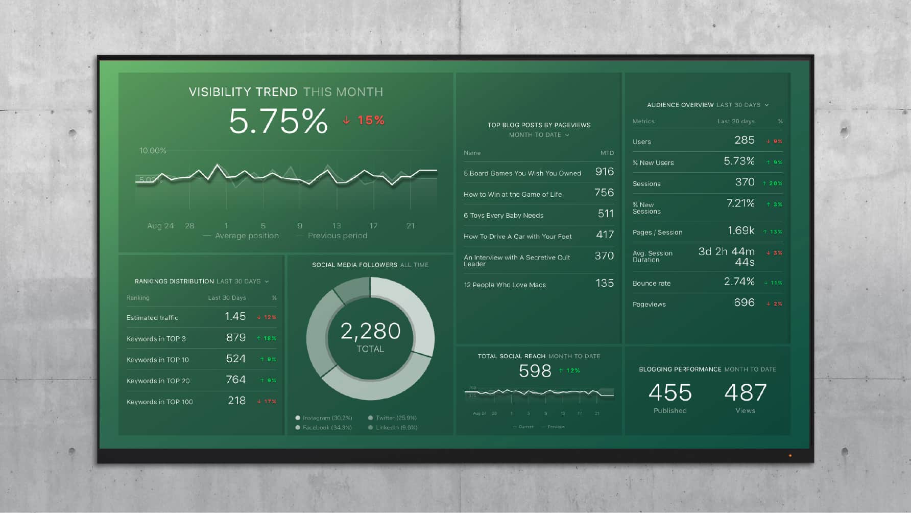
The Attract dashboard looks at all top of the funnel data, including the big 4 social media accounts, SEMrush, Google Analytics and HubSpot. It shows which social media accounts are driving interest, which blogs are viewed most often, and how well your domain ranks on SERPs.
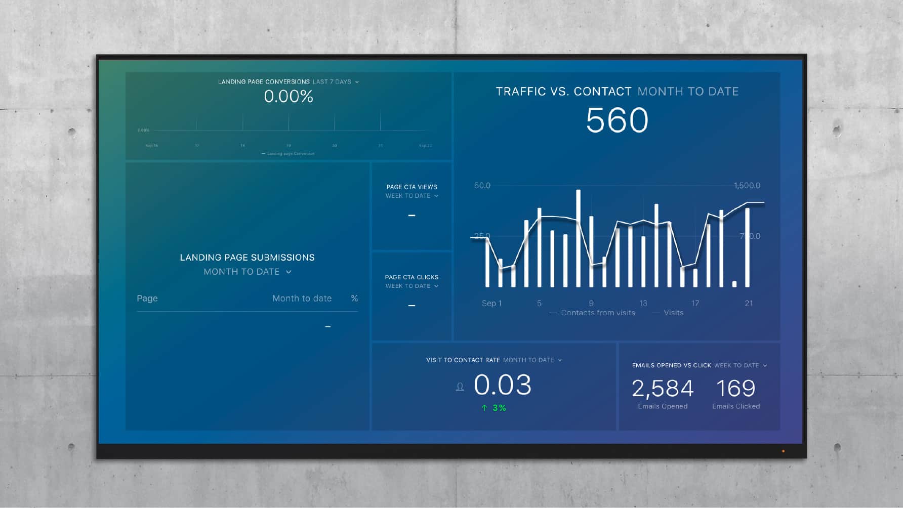
The Convert dashboard focuses on three parts of your inbound marketing: main CTA, landing pages and email. Lead generation is the general theme. You can get a full overview of the different ways that users convert on your site, and where you need to direct more energy.
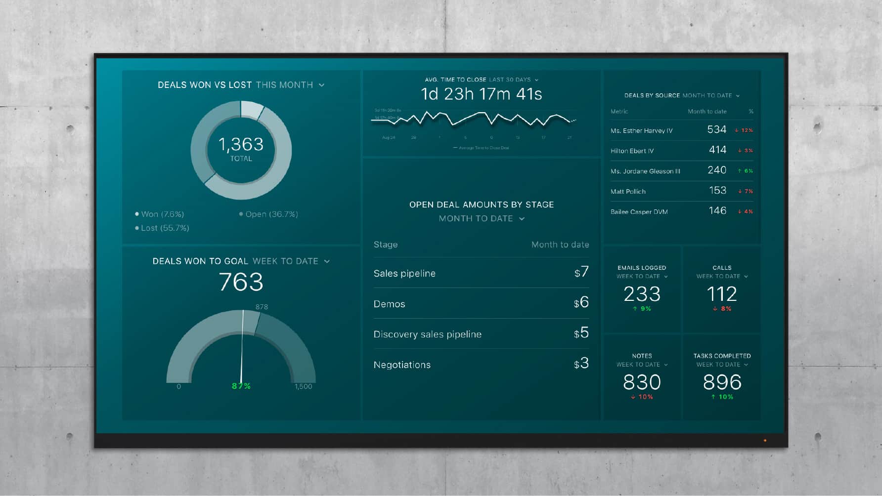
The Close dashboard strictly looks at HubSpot CRM. It gives you a full view of the bottom of your funnel, and shows where your new deals originate. It gives you an idea on how many deals will close in the next month.
Since the process has become well refined, she can begin customizing each individual account’s metrics. She listens to the requests of account managers, and adds metrics or modifies existing metrics. This does not complicate deployment because it does not change the general framework. For example, one client uses ShopperTrak, which does not integrate with Databox. She uses Databox’s integration with Zapier to get these metrics into their dashboards.
She also makes sure they can get their data anytime they want it. Databox works on mobile, desktop, TV, Slack and automated email, so they have a variety of options. “It varies from client to client. Some of our clients are data junkies, and they get a live URL that they bookmark in their browser”, says Amanda.
Next Steps
Emily is bringing other data sources online within client accounts. For example, most HubSpot customers also use Google Analytics. So, Emily will use a few of our pre-built Google Analytics report templates to quickly roll out optional Databoards with metrics that only Google Analytics can cover.
There is also one more important project planned. Emily and Amanda are now setting up an internal notification system so that Amanda can track a few key data points for clients:
- Any metric that unexpectedly falls rapidly, so they can jump in and fix it before it becomes a bigger issue.
- When their client sales teams are not working qualified leads, so they can jump in and figure out why.
Previously, Emily would need to log into multiple Databox client portals and the data sources themselves, like HubSpot CRM and Salesforce. She is planning on using Alerts on specific metrics to eliminate the need to check each account manually every week. Amanda describes the alerts as “a built-in safety net” for her inbound marketing efforts.
“Alerts allow us to identify both green and red flags in our clients’ accounts – we can immediately see if a marketing tactic is doing well and congratulate our clients, or we can course-correct something that’s gone wrong before the damage is done.”
How You Can Get Started
Anybody can join the Databox Partner Program for free and immediately begin automating up to 3 reports for up to 10 clients. Or, if you are a HubSpot customer and just want to set up an account for your company, you can use this guide to set up your first HubSpot analytics dashboard for free too.