Table of contents
You’ve been hitting your head against the wall (well, almost!) trying to perfect your About Us page and you feel like there’s definitely something that’s missing.
I feel you.
Databox recently relaunched our “About us” pages and it certainly wasn’t an overnight project.
It’s hard to knock together a killer About page without looking at About Us page examples, isn’t it?
So we’ve done the hard work for you and put together 21 About Us page examples to get your creative gears rolling. Additionally, we’ve also included the following:
- What is the About Us Page for, and Why It’s Important to Nail It?
- How Do I Write an About Us Page?
- 21 Best About Us Page Examples
Ready to learn? Let’s dig in.
What is The About Us Page For, and Why It’s Important to Nail It?
An About Page is where you share your brand story, company values, and mission, as well as experiences. So, it boils down to talking about:
- What makes you unique
- The story behind you or why you started your business
- What you stand for i.e., your values
- Your experience including how long you’ve been in business, awards you’ve won, and similar
If you’re a brand, be sure to share your team as well unless you have a separate page introducing your teammates.
But the question remains: why do you want to nail sharing all this information? The reason is simple: you want to take your audience backstage to show them you are human and tell them you are worth trusting (and, therefore, buy from).
Think of it like this: would you rather buy from a business you know nothing about or would you deal with someone with a friendly face shared on their About page and a story that you find inspiring? I’m willing to bet you’d work with the latter. Isn’t it?
An excellent About page not only narrates your story, values, and gives an inside look into how your business came to be, but it also helps sell. When prospects learn your story and connect with it, they’re likely to buy from you. A well-planned About Us page can do all this!
So without further ado, let’s walk you through how to write such a converting About Us page.
Related: 21 Examples of Stellar Services Page Copywriting
How Do I Write an About Us Page?
For this, you’ll need to put together some raw ingredients such as your:
- Value proposition explaining why people should buy from you.
- Brand story or what inspired your business’s birth. Was there a problem you faced that you thought about solving with your product? Or, did circumstances and a bunch of failures led you to your current business? Write it down.
- Experience including your business’s timeline and interesting milestones.
- Awards and any social proof that you’d want to add.
- Pictures – your picture and your team’s. Either go for headshots or share a team picture.
Now that you’ve all this information, get to writing your story. It’s best you start with a brief story of your business, followed by sharing your experience, timeline, and team members.
Need a template? Put all this information you’ve under the 5Ws: Who you are, What you do, Where are you based, Why/When or how you came to be and How can people get in touch with you.
Summing this up, Paul Bies from Mystique Brand Communications says, “The ‘About Us’ page is the ideal place to let your visitors know what makes your business unique. Address the who, why, what, and how your company is best suited to deliver the solutions they’re searching for. And don’t forget to include a contact form on this page. After you sell them on why your brand is the best fit, you want to make it easy for them to reach out.”
And, you’re almost done. Simply, remember two more things as you write your About page. First, write using your brand voice. You don’t want to try and sound funny here when your brand voice is formal.
Two, always include a smiling face. If you’re a large business, this would mean introducing readers to your Founder and team members. If you’re a one-person team, include your picture. Maybe even show your workspace or pet’s picture with you. The idea is to make it personal.
With this out of the way, here are some more experts tips for writing an About page:
- “The about page should show exactly with whom you will be dealing with. What is their experience? The whole focus of the about page should be around instilling trust.” – Carl Morris, Land and Aerial Surveys.
- “This part of your website is a real chance to set your company apart here. Don’t be afraid to brag. Be sure to include any relevant Press/Media mentions or links, a company phone number, address, & hours of operation!” Carley Hanna, Supplement Warehouse.
- “Be as transparent and personable as possible! Most About us pages are irrelevant and provide zero insight into a business. Be generous with your history and why you’re special!” – Dan Young, Loud Digital.
Related: 23 Copywriting Tips for Improving the Effectiveness of Your Website
PRO TIP: How to track these 10 popular Google Analytics 4 metrics
Sure, there are dozens (and dozens?) more Google Analytics 4 metrics you could track. But, starting with these 10 commonly tracked metrics will give you a pretty high-level view of how your marketing is working…
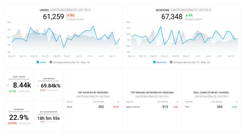
- Sessions: The number of sessions can tell you how many times people are returning to your website. Obviously, the higher the better.
- Sessions by organic keyword: Which organic keywords bring in the most traffic to your website? This may help you determine whether your SEO investments are paying off.
- Bounce rate: Do visitors leave shortly after landing on your website? Or do they stick around?
- Average session duration: How much time are people spending on your website? Users with a high average session duration are most likely relevant to your company.
- Goal completions: How many users responded to your call to action?
If you want to track these in Google Analytics, you might find the visualizations limiting. It’s also a bit time-consuming to combine all the metrics you need in one view.
To better understand how your website performs in terms of traffic growth and conversions, we’ve made this plug-and-play dashboard that contains all the essential metrics for understanding how successful you are at optimizing different aspects of your website.
You can easily set it up in just a few clicks – no coding required.
To set up the dashboard, follow these 3 simple steps:
Step 1: Get the template
Step 2: Connect your Google Analytics account with Databox.
Step 3: Watch your dashboard populate in seconds.
21 Best About Us Page Examples
Ready to see all the theory in practice? Let’s show you 20+ About Us page examples that our experts think are best.
- Moz
- LeadG2
- ESM Inbound
- Emergent Software
- MARION Digital Marketing
- Databox
- 10x Digital
- Vye
- Mailbird
- Steeped Content
- Beekeeper
- ClaySys Technologies
- Spitfire Inbound
- Milkwhale
- Pat Flynn
- Kinsta
- Stockarea
- The Creeks
- Funeral Funds
- JotForm
- ExaWeb Corporation
Here you go:
1. Moz
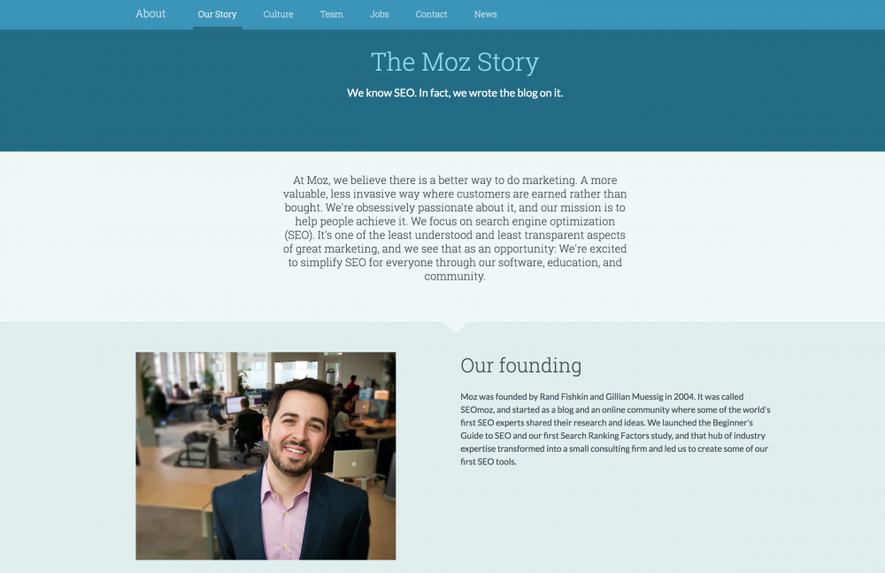
On number two in our About Us page examples, we’ve Moz’s page as recommended by Dan Rawley of Twinkl Hive SEO Service.
Rawley explains, “The marketing site moz.com has a strong ‘About Us’ page. It charts the company’s history from its origins to present day, explains where the name came from, and breaks up the text into bitesize chunks with images. Above all, it comes across as friendly, welcoming, and informative – everything an ‘About Us’ page should be.”
In addition to the example, Rawley outlines that “your ‘About Us’ section is your chance to demonstrate your company’s expertise to users and search engines alike – why should they trust you?”
Put simply, keep these tips in mind: “If you’ve been in business for many years, make sure to mention that, as it will give users confidence putting their trust in you. This is also great for meeting Google’s ‘Expertise, Authority, Trust’ criteria when it is assessing how reliable a site is in its niche.
And, “If you’re a small business, have pictures of your team so your customers can put a face to the company name. If you’re a larger business, tell your start-up story: all companies originate from humble beginnings.” The reason? In Rawley’s words it’s because “more than anything, though, users want to see the human side of a company.”
2. LeadG2
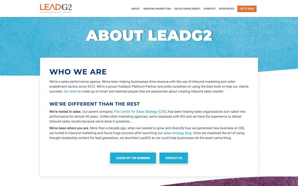
“The ‘About Us’ section of your website is the online version of your elevator pitch. Within a few seconds, visitors should know who you are, what you do, and what makes you different,” comments Amanda Meade from LeadG2.
The good news is their About page walks the talk. Meade writes, “our About Us page at Leadg2 briefly describes who we are, but more importantly, we focus on how we’re different than the rest.
We connect with our target audience by providing evidence of how we used the same services we offer clients to become as successful as we are today. Then, if visitors want to see our smiling faces, they can scroll down and learn more about the team.”
3. ESM Inbound

John Kelleher from ESM Inbound discusses their About page as an example. Originally, Kelleher wasn’t a fan of About pages: “Personally, I hate ‘About Us’ pages. More often than not, they go on and on about things that a potential customer doesn’t care about. ‘172 years of combined experience’ — honestly, who cares?
As a result, I resisted having an ‘About Us’ page on our website. I finally caved in when we were going through a major redesign and our team made a compelling case that I’m an exception rather than a rule. But I insisted that our ‘About Us’ page showed why we were really ‘About The Customer’.”
So what makes their About Us page unique? The simple fact that’s it written with their target customer in mind.
Kelleher elaborates: “Our ‘About Us’ page showcases our mission and values in a way that shows we believe we’ll only succeed when our clients are happy. We’ve avoided as much ‘history of the company’ information as possible in favor of ‘here are some things about us that you might actually care about’. I’m so much happier with this than having a page that does nothing but inflates my ego.”
4. Emergent Software

This is another attention-grabbing example of an About page. Emergent Software’s Brita Hammer shares their About Us page’s backstory: “Our about page used to have our company’s history, team, and award badges on one long page.
After looking at our analytics and seeing that a majority of our visitors didn’t reach the bottom of the page (where our award badges are), we reformatted our about page to break out into three separate pages:
- one dedicated to our award badges
- one to highlight our team (and)
- one to share our company history.
This change is to help visitors gather the information they need about us without feeling overwhelmed.”
Takeaway: tell your story, but pack in a punch of social proof too.
5. MARION Digital Marketing
Speaking of proof, Tony Mastri from MARION Digital Marketing adds, “An important element to include in the ‘About us’ section of your site is some sort of proof of your efficacy. Linking to a case study or award that you’ve won for a product or service is a great way to show that you walk the talk.”
Here’s MARION Digital Marketing About page doing the same:

Mastri notes, “MARION’s About Us page calls out some recent awards we’ve won, and links to a comprehensive list of tens of different awards we’ve won in the nearly 40 years we’ve been serving Texas. This form of proof can give a potential customer the confidence to begin their relationship with your business.”
6. Databox

Davorin Gabrovec, Founder of Databox shares:
“We recently updated our “About Us” page to better communicate our mission, values, and culture to our prospective and existing customers, partners, and team members. We wanted it to communicate what we do, why we do it, who we are and what we value. ”
7. 10x Digital
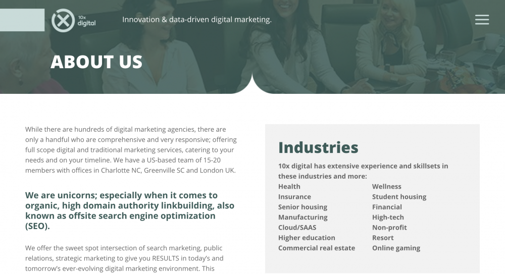
Holly Rollins from 10x digital puts forward their site’s About page too. It includes what Rollins says every About should: “your core business, some history, an overview of your philosophy and touch on your team/employees and overall environment. If not provided in your navigation bar or footer, include contact information as well.”
8. Vye
Clare Richards from Vye brings another essential aspect of a converting About Us page: the visual aspect.
Sharing their site’s About page, Richards highlights, “We just recently launched our new website, and crafting the About page was one of the most challenging aspects of the project.

Like many companies, our About page is consistently in the top three pages visited, so we knew the update would be important. While there are many vital aspects to the page, perhaps the most important is the visual depiction of our approach to work. Prospects want to know that you have a tested and proven methodology. Highlighting this on the About page can begin to build trust with the viewer.”
9. Mailbird

Andrea Loubier from Mailbird emphasizes the significance of the visuals of an About page too. Loubier points out, “We really like to depend on visuals for our About Us page. When a potential customer wants to get an idea about your company values, there’s nothing more insightful than providing them with a glimpse into who they’ll actually be working with.”
Related: 37 Marketers Share Their Favorite Marketing Design Software
10. Steeped Content

“About pages of websites usually speak about the founders of the spark, which created a company, but two opportunities to further enrich such pages exist,” advises Steeped Content’s Mackenzie Bailey.
“If a brand’s purpose and proposition are clear, it can be reduced to a single adjective; Steeped Content’s adjective is transformation.
✔ First, you want to define your brand’s adjective with draconian simplicity; then include that specific adjective in your about page.
✔ Second, you want to cement your brand in the eyes of consumers as instantly understandable. You can do this by incorporating a brand archetype and storytelling techniques on an about page. Steeped Content, for example, reflects the magician archetype.
You want to ensure your unique adverb and archetype are reflected in the about page and aligned in your content marking strategy.”
11. Beekeeper
While storytelling, visuals, recounting your badges, and awards are all essential, don’t forget to be human throughout your About page. Want a good example reflecting this? Here you go:

Beekeeper’s Alexandra Zamolo writes: “Through content and video, it’s important to introduce your team, so that, as a company, you become more relatable and more ‘human.’ It’s nice to put a face with a voice or a handful of emails, and including this type of information can introduce a deeper level of trust.”
12. ClaySys Technologies
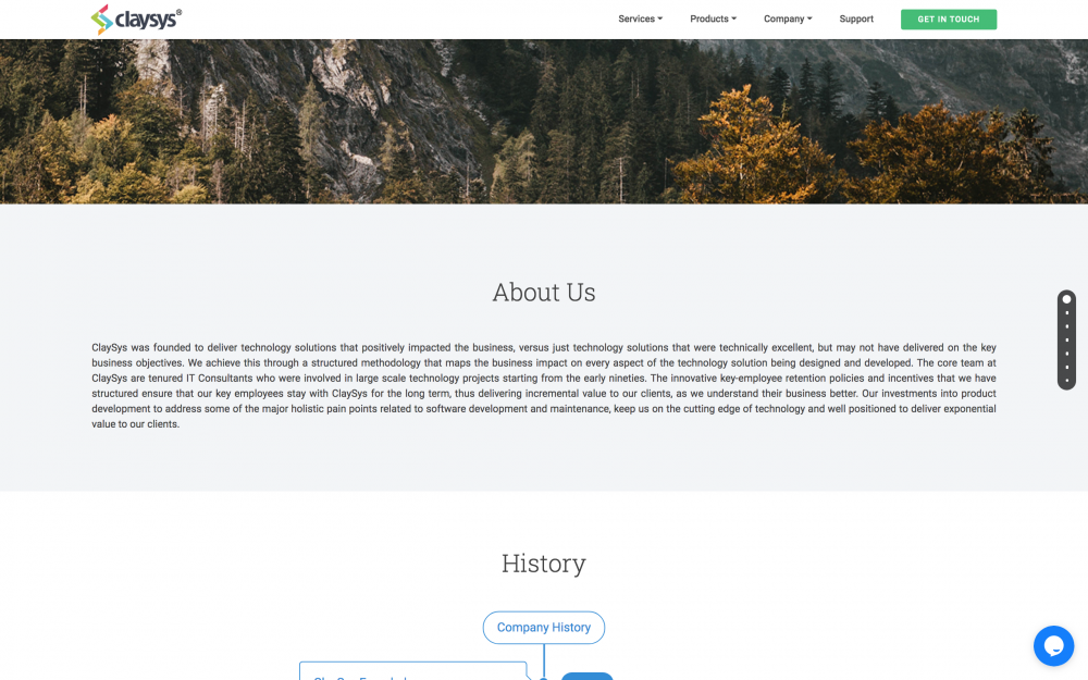
Abhijith VM from ClaySys Technologies observes, “With all the talk about EAT (Expertise, authoritativeness, and trustworthiness) in the SEO world, it became important to have a pretty good about us page on our websites.
There are two aspects to having a good about us page:
- It helps visitors understand who is behind a brand and what do they do.
- It allows search engines to differentiate between bogus brands and real ones. Fake brands wouldn’t be able to fill their about us page with relevant information.
Considering all this, what we think the important parts needed in an about us page are – information about the business, their team, and a story about the brand. We also added a timeline of our journey that shows how quickly we’ve been able to achieve various goals, and we believe this gives assurance to the potential customer of our capabilities.”
Related: SEO for Beginners: How to Improve Your Search Rankings from 103 SEOs
13. Spitfire Inbound

Spitfire Inbound’s Shiran Sugerman adds their About page to this list of About Us page examples. Sugerman writes, “The ‘About us’ section of your website is the one page on your website where you can focus on yourself as a brand.
Adding your brand story (especially if you have an unusual name) gives visitors the opportunity to understand your business’ beginnings. It’s also great to include any fun stories, core values, and give yourself a bit of a brag with any awards or certifications, etc.
You can also include introducing your team (though we have a separate page for that). The important thing to keep in mind is that you can add whatever you need to this page to let people know who you are, as long as you do it in a way that still keeps the reader in mind.
Make your content engaging and worth reading. Tell the story of your brand and bring in your personality so people have the chance to understand the culture of the business.”
And this is what Spitfire Inbound’s About page is based on.
14. Milkwhale

Andre Oentoro from Milkwhale makes a good point: your About page needs to be brief. Oentoro advises, “You should always include what your company does and how they work. Most of the time people want to find out what your company does and we think it’s better to keep it short and sweet.”
Milkwhale’s About page is an example of exactly what Oentoro recommends – it’s short, sweet, and covers the basic questions that a reader would have in mind.
15. Pat Flynn

Pat Flynn’s About Us page is a recommendation from Nikola Roza of Nikola Roza- SEO for the Poor and Determined. But what’s so good about it? Roza shares, “The best ‘about us’ pages manage to share the background of the site, its core values, and purpose of being; AND how the site can help improve the life of the person reading (the user.)”
Flynn’s page is a living example of this. Roza breaks down what makes it worth the mention:
- “He starts with a 2-paragraph blurb about himself.
- Then he quickly proceeds to tell how SPI was born. Then he continues to explain what SPI stands for and how it can help THEM achieve financial security (the most important part).
- And as a bonus, it ends with a group photo of Pat’s team. Genuine photos of real people build a human connection between Pat as a brand and his readers and followers.
It’s a perfect way to cap off an excellent ‘about us’ page.”
16. Kinsta
Tom Zsomborgi from Kinsta shares their About Us page. According to Zsomborgi, “Featuring your team members and having real photos of them, lots of faces on your about page.”
This is exactly what their About page does. Here’s a screengrab from the middle of their About page:

“In the age of cheap stock photos, most of the about us pages are very low-quality trying to fake who you are. People spot these from a mile and they don’t trust your company. Make sure you spend the time and design resources and make a really compelling page.”
17. Stockarea
Abhiraj Tulsyan from Stockarea shares their site’s About page too.

Here’s why Tulsyan thinks their About page knocks it off the park: “We include the solution we are providing to the market. In ‘about-us’ section, rather than describing the personal self, we should describe what our organization is trying to achieve and in what ways. We always try to emphasize on what we want to achieve and how we are going to achieve it.”
18. The Creeks
Niles Koenigsberg from FiG Advertising + Marketing shares one of their client’s About page. Explaining what makes a good About page, Koenigsberg says, “Every ‘About Us’ section on a website needs to include the story behind your company’s foundation. While the ‘About’ page is a great spot to outline your values and mission statement, we would argue that nothing is as important for your ‘about’ page than a more personal story about your company and why you started it.
Website visitors won’t read everything on each page of your site, but they will often be more critical of your ‘About Us’ page. When your company has a more touching personal story behind its foundation, you’ll be able to more effectively connect with your target audience on a more personal level.”

Keeping this in mind, Koenigsberg shares, “We feel we best captured this personal story for one of our clients, The Creeks – a leading memory care provider that houses clients in multiple dementia care communities throughout Illinois and Wyoming.
The founder and owner of this company has been in the healthcare industry for decades and she has a very touching story about what drove her to found these home-like memory care communities. Her story touches on themes of family, compassion, and legacy, while also illuminating the unique approach her caregivers take at their memory care communities.
As so many site visitors are likely looking for a caring community for their aging parents or partner, they’ll likely connect very quickly with the personal story on this ‘About Us’ page.”
PRO TIP: Here are 9 expert ways to identify the target audience for your website.
19. Funeral Funds

Want another tip to add social proof to your About Us page? Randy VanderVaate from Funeral Funds shares how they do it on their About page: “One of the most important things on our ‘About us’ page is a link to our reviews page that shows the 100’s of 5-Star reviews from our current clients.
By linking to our reviews page from our about page, we help potential customers see that they are dealing with an honest, trustworthy, and customer-focused business.”
20. JotForm

“A great way to spice us your ‘About’ page is to include an interactive timeline showcasing what your company has achieved [as in JotForm’s About page above],” recommends JotForm’s Annabel Maw.
“These can be milestones, such as when the company was founded, large product launches, opening new offices abroad, or reaching an exciting number of users. Timelines enhance the scope of a company and help paint a more comprehensive picture to customers.”
21. ExaWeb Corporation

Another important element in an About page: “Faces of your team members,” opines Patrick Garde of ExaWeb Corporation. “If you want to make your About Us page more credible, add the pictures of your team members. If you want to look more authentic, put real pictures, and not just avatars.
Potential customers who are checking out your About Us page will know who is behind the company. This will also answer a vital question if your company is a real business and not just fly-by-night.
This could also set you apart from your competitors. The only drawback is that you may also lose a potential client as they can check your social media accounts, particularly LinkedIn.
When we were a smaller company, we wanted to look bigger. When we started to grow, we wanted to look a bit smaller. But now, I learned that we should just be genuine. It starts with putting the faces of your team members on your About Us page.”
Wrap Up
Writing an About page doesn’t have to be hard. As long as you communicate all the essential elements such as your brand story, achievements, mission, values, you’re good to go. Just make sure your page is ‘human’ like these About Us page examples you learned from today.


