Table of contents
Most AI analytics tools added a chatbot to a dashboard and called it intelligence. These eight actually change how fast your team goes from question to decision.
TL;DR
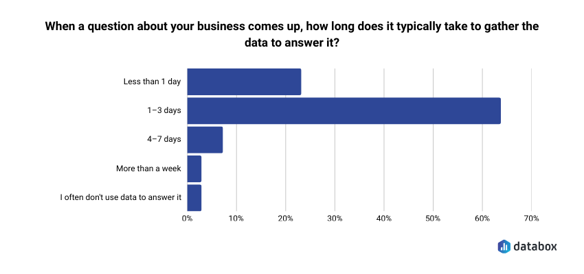
- The gap that matters: 64.29% of teams take 1–3 days to gather data to answer a business question, according to Databox’s “Time to Insight” survey. That turns Monday’s question into Thursday’s stale memo, and it’s the gap the eight tools below try to close.
- The shortlist: Databox, Power BI + Copilot, Tableau + Pulse, ChatGPT Advanced Data Analysis, Domo, ThoughtSpot, Polymer, and Julius AI.
- Who picks what: Non-technical functional leaders (CMOs, VPs Marketing, Heads of Growth) → Databox. Microsoft-embedded teams with a data engineering function → Power BI + Copilot. One-off analysis by Friday → ChatGPT. Everyone else picks by team profile, not feature matrix.
- The five capabilities that separate working tools from demo tools: NLQ a non-analyst can actually use; AI-generated explanations (not just visualizations); proactive anomaly alerts; predictive forecasts; native integrations that don’t require a developer.
- The pricing trap: Per-seat pricing scales linearly with team size. A 50-person Power BI Copilot deployment runs $2,200/month before Premium capacity. Flat-fee models like Databox stay constant whether 10 or 100 people use the platform.
Introduction
Traffic dropped 18% last week. Your dashboard confirmed it. Your analyst is backlogged until Thursday. You have a leadership meeting in two hours.
That gap, between seeing a metric change and being able to act on it, is the operating problem this article is about. Databox’s “Time to Insight” survey found that 64.29% of teams take 1–3 days to gather data to answer a business question. The leadership meeting is in two hours. The answer is on Thursday. The decision gets made without the data.
The best AI tools for data analysis in 2026 are the ones that close that gap. For CMOs, VPs of Marketing, and Heads of Growth evaluating tools right now, the shortlist that matters includes Databox for self-serve BI with a built-in AI analyst, Power BI + Copilot for teams locked into Microsoft, Tableau + Pulse for visualization-heavy organizations, ChatGPT Advanced Data Analysis for quick one-off analysis, Domo for enterprise-scale data platforms, ThoughtSpot for search-driven analytics on large datasets, Polymer for marketing teams living in spreadsheets, and Julius AI for non-technical users who need data science depth without writing code.
That is the shortlist.
The more useful question is how to choose between them, and the answer depends less on which tool has the longest feature list and more on how fast your specific team can go from a question to a decision they trust.
You already have dashboards. You probably have several. The problem isn’t dashboard supply; it’s that your tools show you numbers without explaining what they mean. A chart confirming that traffic fell by 15% is a data display. An AI that tells you the drop was isolated to organic mobile traffic from the UK, began on Tuesday, and correlates with a Google Core Update – that is insight generation. Most “AI-powered” analytics tools haven’t made that leap. Every analytics vendor added “AI-powered” to their homepage around 2023. Most bolted on a chatbot and called it innovation. A few actually changed how teams work with data.
The tools worth your time change how fast your team goes from question to decision, not data to dashboard.
This article evaluates eight tools through that lens, built for functional leaders evaluating their next analytics platform, not for data engineers comparing query languages. The criteria come first, then the tools, then a decision framework that routes you to the right one for your team.
The Criteria That Separate Tools That Get Adopted from Tools That Become Shelfware
Before comparing tools, you need to know what to compare them on. The standard criteria: number of connectors, chart types, export formats, won’t tell you whether a tool will actually change how your team operates.
A beautiful dashboard that nobody acts on is a waste of pixels. Turning data into outcomes requires a different evaluative lens. So the criteria below are built around one question: does this tool help a functional leader get from “something changed” to “here’s what we’re doing about it” faster than whatever they’re using today?
Natural Language Querying: Can a Non-Analyst Use It?
Natural language querying (NLQ) lets you type a question in plain English and get an answer without writing SQL, building a report, or waiting for an analyst to free up. Questions like “What were our top 3 products by revenue in Q1?” or “Is customer churn increasing or decreasing this year?” return answers in seconds.
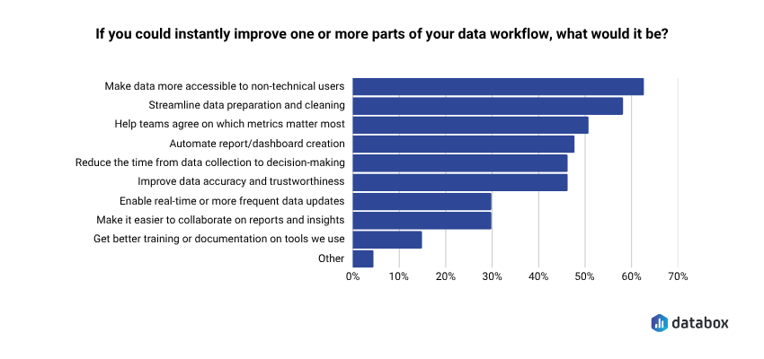
NLQ is the single biggest capability shift in this generation of tools, because it determines who on your team can actually get answers independently. The demand is documented: 62.12% of teams say their top desire is to make data more accessible to non-technical users, according to Databox’s “Time to Insight” survey.
But the quality gap between tools is wide. Some return a chart you still have to interpret. Others return a written explanation with the chart, flag what’s unusual, and let you ask a follow-up question in the same session.
The evaluative test: can your least technical team member get a useful answer in under 60 seconds without training? If not, the NLQ is a demo feature, not a working one.
Insight Generation vs. Data Display: Does It Explain the “Why”?
Dashboards show you what happened. They don’t tell you what it means. You can stare at a chart showing traffic dropped 15%, but the dashboard won’t explain why, won’t tell you if it matters, and won’t suggest what to do next.
The gap between seeing a metric change and understanding what drove it is where most teams lose hours, or make bad calls. Ask any tool you evaluate: does it surface explanations, or just visualizations? A VP of Marketing who opens a dashboard on Monday morning and sees MQLs down 22% needs more than a red number. She needs to know whether the drop came from a paid campaign pausing, an organic ranking loss, or a seasonal pattern that repeated from last year. Tools that generate written summaries and causal explanations compress the time between “I see a problem” and “I understand the problem.” Tools that display data leave that compression to the analyst — the one who is booked until Thursday.
Predictive Capabilities: Does It Forecast, Not Just Report?
Reporting is backward-looking by definition. It tells you what already happened. The most valuable AI data analysis tools project where a metric is heading, based on historical patterns, so you can adjust before the quarter closes.
Practical predictive use cases for functional leaders include demand forecasting, churn prediction, revenue projection, and anomaly-pattern recognition. But “predictive” has become a marketing checkbox. Distinguish between tools that genuinely model your historical data to produce forward projections with confidence intervals and tools that apply a trend line and call it predictive analytics.
The test: can the tool tell you where your conversion rate will be in 30 days based on the last 12 months of data? If it can only tell you where it was last month, it’s reporting with a better label.
Anomaly Detection and Alerts: Does It Watch Your Data So You Don’t Have To?
One of the biggest time sinks for a functional leader managing performance is monitoring: manually checking dashboards to see if something broke, scrolling through reports to find the number that looks off, asking “did anyone else notice this?” in Slack.
The best tools surface anomalies without being asked. When Databox’s Anomaly Detection flags a 3x increase in cost-per-click on a Tuesday afternoon, a Head of Growth can pause the campaign before it burns through the weekly budget. When the same signal arrives in a Friday standup three days later, the budget is already gone. Ad costs spike, conversions drop, leads dry up — you want to know within hours, not days.
The evaluative question: does the tool alert you when something significant changes, or do you have to go looking for it?
Integrations: Does It Connect to the Tools Your Team Already Uses?
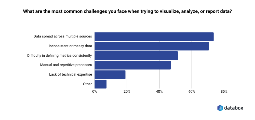
A tool is only as useful as the data it can access. The top reporting challenge teams face is structural: 73.13% say data spread across multiple sources is what makes it hard to visualize, analyze, or report performance, according to Databox’s “Time to Insight”.
A platform that connects to your CRM, paid media accounts, website analytics, and product data in a single view is fundamentally more useful than one that requires you to export CSVs and upload them manually.
Look for native connectors: pre-built integrations that pull live data without requiring a data engineer to configure API connections. The number matters (Databox offers 130+ native integrations), but so does the quality: does the connector pull the specific metrics you care about, or just the default fields? Some tools advertise broad connector libraries but require technical configuration that defeats the purpose for non-technical teams. If setting up the integration requires a developer, add that to the cost and timeline estimate.
Time-to-Value: How Fast Can a Non-Technical Team Get Live Dashboards?
Time-to-value separates the tools that functional leaders actually adopt from the ones that become shelfware after a six-month implementation. Frame it as a practical test: from signup to the first live dashboard pulling real data from your actual tools, how long does it take?
Days versus weeks versus quarters is a meaningful differentiator. Databox can have dashboards live the same day, pulling data from connected sources without a developer involved. Tableau and Power BI implementations at the enterprise level routinely take weeks to months before the first useful dashboard reaches production. Per-seat pricing models compound the problem: a tool that costs $75/user/month and takes three months to configure carries a real cost well beyond the license fee. Factor total cost of ownership (setup time, training overhead, and ongoing analyst dependency) not just the monthly price tag.
“We used Databox for client reporting for years and recently tested alternatives, but nothing came close. When we came back, Genie blew us away — AI-powered insights that actually make sense for marketers.”
Eight AI Tools That Actually Close the Gap Between Data and Decision
The criteria above exist for a reason: they filter out the tools that look impressive in a demo and disappear from your team’s workflow within 90 days. The eight tools below are reviewed through that filter: what each one does well, who it serves best, where it falls short, and what it costs. No ranked list, because the right tool depends on your team profile, not a composite score.
Find the entry that matches your situation. Non-technical functional leader at a growing company? Start with Databox. Deep in the Microsoft ecosystem? Start with Power BI. Need one-time analysis done by Friday? Start with ChatGPT. The criteria section should have already narrowed your focus.
Databox: Best for Functional Leaders Who Need Answers, Not Assignments
Databox is a business intelligence and analytics platform, powered by AI, built for teams that need clear, trusted answers fast. Instead of digging through multiple dashboards, reports, or spreadsheets, teams connect their tools, ask questions in plain English, and get instant explanations of what’s happening in their business. Databox pulls data from 130+ integrations and turns connected sources into trusted metrics, visual context, and performance explanations so teams can understand what’s happening, explain changes to stakeholders, and decide what to do next.
What makes Databox distinct from the other tools on this list is that it was built for the functional leader’s workflow from the start and not adapted from a data engineering platform or bolted onto an existing BI tool. Four AI capabilities make that concrete.
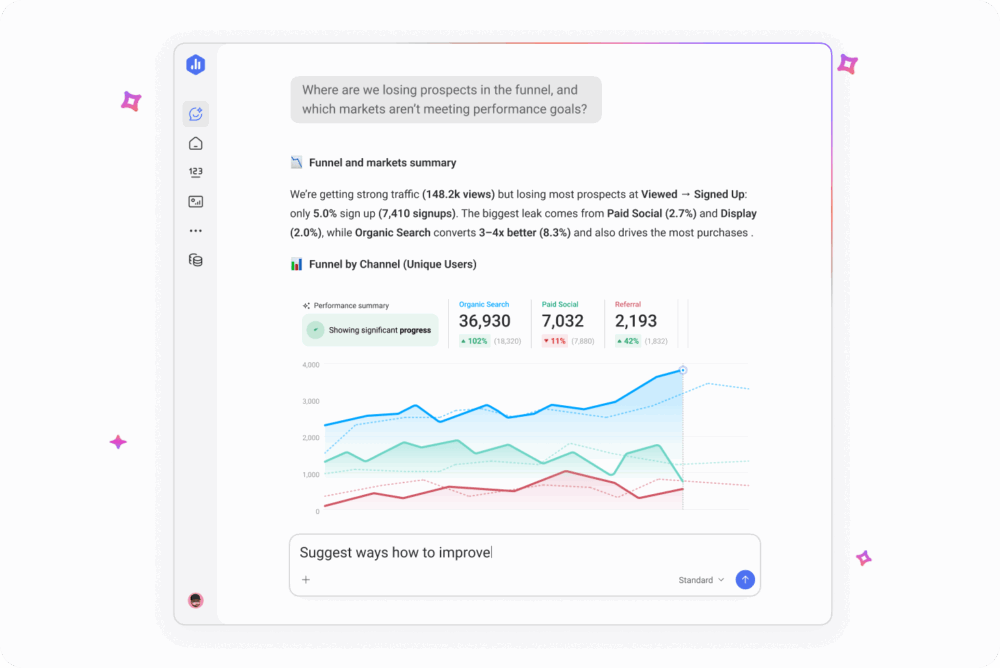
Genie is Databox’s AI analyst. Ask a business performance question in plain language: “Why did demo requests drop last week?” or “Which channel is driving the most revenue this quarter?” and Genie returns a written answer grounded in the live data from every source connected to your account. The answer shows the specific metrics used to reach the conclusion, so a VP of Marketing preparing for a Monday pipeline review can verify the reasoning before quoting the number to the CEO. No SQL. No report builder. No waiting for someone else to pull the number. Power BI Copilot’s NLQ requires a data engineer to pre-model the underlying tables first; Genie reads from the integration connectors directly, which is why same-day setup is possible.
Anomaly Detection learns each metric’s own historical pattern from your connected data, then alerts on deviations from that pattern, not against a generic threshold you set manually. A Head of Growth running paid campaigns across four platforms doesn’t get an alert because CPC crossed $5, she gets one because Tuesday’s CPC is meaningfully above what Tuesday usually looks like for that specific campaign. The alert lands in the same Slack channel the team already uses for incident triage. The alert that fires in a Friday standup is too late. The alert that fires against a generic threshold is noise. Anomaly Detection is calibrated to your own data, which is what makes it actionable instead of ignorable.
Metric Forecasts project where your numbers are heading — traffic, revenue, signups — based on historical patterns, so you can set goals grounded in data rather than gut feel. A Director of Operations who sees that current lead velocity puts the team 15% short of the quarterly target in week four has time to course-correct. One who discovers the shortfall in the post-quarter review does not.
Databox MCP exposes your connected data, 130+ integrations worth, through the Model Context Protocol. Claude, ChatGPT, or any MCP-compatible AI can query your business metrics directly. Your BI data plugs into the AI ecosystem your team already uses, so a RevOps lead can ask Claude a question about pipeline coverage and get an answer grounded in live Databox data without switching tools. No other tool on this list offers this level of AI ecosystem interoperability today.
Best for: Non-technical functional leaders at growing companies — CMOs, VPs of Marketing, Heads of Growth, Directors of Operations — who need BI-level insight without BI-level complexity, analyst headcount, or a six-month implementation.
Pricing: Starts at $64/month for the Analyst plan (Genie + MCP, 1 user). The full AI stack featured above (Genie, MCP, Anomaly Detection, and Metric Forecasts) is on the Growth plan at $399/month. Every plan starts with a 14-day full-feature trial so you can prove ROI before committing. Because dashboards can go live the same day and there’s zero per-user licensing, most teams recoup the subscription cost in days instead of quarters.
Limitation: Databox is purpose-built for business performance monitoring and BI: it handles data prep, datasets, automated forecasting, and anomaly detection out of the box. Teams that need custom ML model development (regression, classification, clustering) or advanced statistical analysis will need to pair it with a data science platform like Databricks or DataRobot.
Power BI + Copilot: Best for Teams Already in the Microsoft Ecosystem
Power BI dominates enterprise BI because the math works for companies already paying for Microsoft 365. The platform handles data modeling, visualization, and reporting at scale, and with the Copilot layer added, it supports natural language querying, report summarization, and formula assistance.
Key AI features: Copilot for NLQ and report generation; AI Insights for anomaly detection and key influencer analysis; integration with Azure ML for teams that need predictive modeling capabilities beyond built-in features.
Best for: Teams already deeply embedded in Microsoft 365 with a data engineering function in place to pre-model datasets for Copilot. Procurement is straightforward inside the ecosystem: it’s an add-on, not a new vendor relationship.
Pricing: Power BI Pro at $14/user/month. Copilot add-on at $30/user/month. Premium capacity available for enterprise workloads. Per-seat pricing means costs scale linearly with team size.
Limitation: Per-seat costs compound fast: a 50-person team using Copilot runs $2,200/month before Premium capacity, and that’s the license fee alone. The deeper issue is Copilot’s dependency on well-structured, pre-modeled datasets. Raw data from multiple sources still requires a data engineer upstream, so if your team doesn’t have that layer, Copilot’s NLQ degrades from useful to misleading. For a non-technical Head of Growth who needs an answer in 10 minutes, Power BI without dedicated engineering support is the wrong shape of tool.
Tableau + Tableau Pulse: Best for Visualization-First Teams
Tableau remains the industry standard for data visualization and executive-grade reporting. Tableau Pulse and Tableau Agent extend the platform into proactive, AI-driven territory: Pulse uses natural language and visual explanations to surface the “why” behind your data, and Agent allows conversational querying of Tableau datasets.
Key AI features: Tableau Pulse for proactive insight delivery and plain-language explanations; Tableau Agent for conversational analytics; Einstein Discovery (Salesforce-native) for predictive analytics and scenario modeling.
Best for: Salesforce-embedded organizations with a dedicated BI developer or analyst function. Tableau’s output quality in skilled hands is hard to match — which is also the catch.
Pricing: Creator license starts around $75/user/month. Pulse and Agent features require the Tableau+ tier with enterprise pricing. Costs scale with user count and feature tier.
Limitation: The gap between what Tableau can do in skilled hands and what it will do for a marketing director who needs an answer in 10 minutes is real and well-documented. Getting genuine value from Tableau without a dedicated analyst or BI developer is difficult for small and mid-size teams. Per-seat pricing makes broad team access expensive before it becomes useful.
ChatGPT Advanced Data Analysis: Best for Ad Hoc Analysis Without a Dedicated Tool
OpenAI’s code interpreter, embedded directly in ChatGPT, lets you upload a CSV, Excel file, or dataset and get instant analysis, visualizations, summaries, and follow-up questioning in the same session. Python runs in the background; results return in plain English.
Key AI features: File upload with instant exploratory data analysis; Python code execution within the session for custom analysis; chart generation; pattern identification with plain-language summaries; iterative follow-up questioning on the same dataset.
Best for: Individuals or small teams who need quick, one-off data analysis without committing to a BI platform subscription. Useful for experimenting with a dataset before building formal dashboards, or for answering a specific question when your BI tool doesn’t have the data connected yet.
Pricing: Available on ChatGPT Plus at $20/user/month and on ChatGPT Team and Enterprise plans.
Limitation: Not a BI platform. ChatGPT Advanced Data Analysis cannot connect live data sources, refresh automatically, or maintain persistent dashboards. Every analysis is a manual, session-based exercise: upload the file, get the answer, start from scratch the following week. No anomaly alerts, no ongoing monitoring, no goal tracking. A VP of Marketing who uses it on Monday to analyze last week’s campaign data will need to upload a new file and re-ask the question the following Monday.
Domo: Best for Enterprise Teams Needing an End-to-End Data Platform
Domo is a full-stack enterprise data platform covering ETL, BI, visualization, and AI in a single environment. Built for large organizations with complex data infrastructure, multiple source systems, and dedicated data governance requirements.
Key AI features: Domo.AI layer with NLQ, automated insights, predictive analytics, and AI application-building tools. Strong data governance and access control for compliance-driven organizations.
Best for: Enterprise organizations with complex data infrastructure, multiple data sources, and a dedicated data team managing governance, security, and pipeline reliability.
Pricing: Enterprise pricing only, so: contact sales for a quote. Known to be in the upper tier of BI platform costs. Expect a procurement cycle, not a self-serve signup.
Limitation: Implementation complexity is significant. The breadth of the platform is a feature for large enterprises with dedicated data teams and a liability for lean mid-market teams who need answers today. Without a data engineering function in-house, Domo’s power sits behind a configuration wall your team can’t clear.
ThoughtSpot: Best for Search-Driven Analytics in Large Organizations
ThoughtSpot is a cloud analytics platform built around a search-first interaction model. Users type questions into a search bar and get answers from their data warehouse: an approach designed to bring analyst-level querying to business users without requiring them to build reports.
Key AI features: Spotter (conversational AI analyst for follow-up questions and deeper exploration); SpotIQ (automated insights and anomaly detection); direct integration with cloud data warehouses including Snowflake, BigQuery, and Databricks.
Best for: Data-mature organizations that already have a cloud data warehouse and want to open querying access across business teams without building custom reports for every request.
Pricing: Team plan starts around $95/user/month. Enterprise pricing available through sales.
Limitation: ThoughtSpot is a query layer on top of infrastructure you’ve already built and paid for: Snowflake, BigQuery, Databricks, or Redshift. If you don’t already have a warehouse, the math doesn’t work: per-seat ThoughtSpot pricing plus data warehouse costs make it a significant investment for small teams. Without the underlying warehouse, ThoughtSpot has nothing to query.
Polymer: Best for Marketing and E-commerce Teams Analyzing Spreadsheet Data
Polymer is a lightweight AI-powered analytics tool that transforms spreadsheets, CSVs, and marketing platform exports into interactive dashboards and AI-powered analysis without SQL or data engineering.
Key AI features: AI assistant for NLQ on uploaded or connected data; automated chart and dashboard creation from raw spreadsheet data; anomaly and trend detection; integrations with ad platforms including Google Ads and Facebook Ads, plus CRM connections.
Best for: Small marketing teams, e-commerce operators, and individual analysts who live in Google Sheets or Excel and need a fast way to visualize and interrogate campaign, sales, or operations data without learning a BI platform.
Pricing: Free tier available. Paid plans start around $20/month. Pro tier for advanced features and additional integrations.
Limitation: Polymer is best suited as a personal or small-team tool, not an organizational analytics layer. Most integrations don’t support live data refresh, governance features are limited, and multi-team collaboration is basic. A marketing director running campaigns across five channels will eventually outgrow it.
Julius AI: Best for Non-Technical Users Who Need Data Science Depth
Julius AI positions itself as a personal data scientist: upload files, connect data sources, and get statistical analysis, chart generation, and plain-English explanations without writing code. Python and R run under the hood: the user never sees the code unless they want to.
Key AI features: Multi-file analysis across CSVs, Excel files, and database connections; code-backed statistical analysis behind a plain-language interface; chart and graph generation; correlation detection and pattern identification; Google Sheets, Excel, and database integrations.
Best for: Analysts and functional leaders who need to go deeper than a dashboard (regression analysis, correlation detection, multi-variable comparison) without data science skills or budget for a dedicated platform.
Pricing: Free tier available. Pro plan around $25/user/month.
Limitation: Julius AI is session-based and file-upload dependent. It cannot replace persistent dashboards, ongoing anomaly monitoring, or automated alerting. Better for depth than breadth, and better for one-time analysis than ongoing performance management. A revenue operations director who needs live pipeline visibility will need a different tool for that layer.
How the Eight Tools Compare on the Criteria That Matter
| Tool | Best For | Key AI Feature | NLQ? | Pricing Tier | Technical Skill Required |
| Databox | Functional leaders, cross-functional teams | Genie (AI analyst), MCP, Anomaly Detection, Forecasts | Yes | Starts at $64/mo | Low |
| Power BI + Copilot | Microsoft ecosystem teams | Copilot NLQ, AI Insights, Azure ML integration | Yes (with Copilot add-on) | $14–$44/user/mo | Medium |
| Tableau + Pulse | Visualization-first, Salesforce ecosystem | Pulse proactive insights, Agent conversational AI | Yes (Tableau+) | From ~$75/user/mo | Medium-High |
| ChatGPT Advanced Data Analysis | Ad hoc, one-off analysis | Code interpreter, file upload analysis, plain-English output | Yes | $20/user/mo (Plus) | Low |
| Domo | Enterprise data platform | Domo.AI (NLQ, predictive, AI apps) | Yes | Enterprise pricing (contact sales) | High |
| ThoughtSpot | Search-driven analytics, data warehouse orgs | Spotter, SpotIQ automated insights | Yes | From ~$95/user/mo | Medium-High |
| Polymer | Marketing teams, spreadsheet users | AI assistant, automated dashboards from spreadsheets | Yes | Free tier; paid from ~$20/mo | Low |
| Julius AI | Non-technical data science depth | Code-backed statistical analysis, plain-language interface | Yes | Free tier; Pro ~$25/user/mo | Low |
The Right Tool Depends on Your Team Profile, Not the Feature Matrix
The comparison table narrows the field. But functional leaders don’t choose tools by scanning feature columns; they choose based on which tool fits the way their team actually works. Four team profiles cover the majority of buyers evaluating AI data analysis tools right now.
If Your Team Is Non-Technical and Needs Self-Serve Analytics
Your priority is removing the analyst bottleneck. Every question that requires someone else to pull the data is a decision delayed by hours or days. You need a tool where any team member can ask a question and get a trustworthy answer without training, SQL, or a support ticket.
Best fits: Databox (Genie handles plain-language queries against live data from 130+ sources; dashboards go live the same day), Polymer (for teams whose data lives primarily in spreadsheets), or Julius AI (for one-off analytical depth without code).
Avoid: Tableau (requires BI developer skills for meaningful setup), ThoughtSpot (requires existing data warehouse infrastructure), Domo (requires a dedicated data team for implementation and maintenance).
If You Need to Connect 10+ Data Sources Without a Data Engineer
Your data is scattered across your CRM, ad platforms, website analytics, and product database. A tool that requires engineering work to connect each source trades one bottleneck for another. You need pre-built native integrations that pull live data without a configuration project.
Best fits: Databox (130+ native integrations, no engineering required, same-day connection for most major platforms), Power BI (strong connector library within the Microsoft ecosystem, though complex sources may require gateway configuration), Domo (broadest enterprise connector library, but implementation requires a data team).
Avoid: ThoughtSpot (query layer only — data still needs to land in a warehouse before ThoughtSpot can touch it), Julius AI and Polymer (file-upload or limited live-connection models, not built for multi-source live monitoring).
If You Need Insights Delivered to You, Not Pulled by You
Your team doesn’t have time to check dashboards. You need the tool to surface what matters, flag what’s wrong, and explain what changed — without anyone having to go looking. Proactive monitoring is the differentiator here, not query capability.
Best fits: Databox (Anomaly Detection monitors continuously and alerts on significant changes; AI Performance Summaries deliver weekly context without manual review), Power BI with AI Insights (anomaly detection within the Microsoft ecosystem), Tableau Pulse (proactive insight delivery for Salesforce-embedded teams).
Avoid: ChatGPT Advanced Data Analysis (session-based and manual by design — nothing happens until you go to it), Julius AI (same limitation), Polymer (basic alerting, not built for enterprise-grade monitoring).
If You’re Already in the Microsoft or Google Ecosystem
Your organization has made a platform bet. Introducing a standalone BI tool creates a parallel data environment that competes with your existing stack for adoption and budget. The path of least resistance runs through tools that integrate with what you already have.
Best fits: Power BI + Copilot (native Microsoft 365 integration; procurement is an add-on conversation, not a new vendor), Tableau + Pulse (strong Salesforce ecosystem fit for Salesforce-heavy revenue teams), Databox (MCP integration means your Databox data is queryable from Claude, ChatGPT, or any MCP-compatible AI your team already uses — no platform conflict).
Avoid: Domo (full-platform approach works against teams with strong existing ecosystem investments), ThoughtSpot (requires a separate warehouse layer that may duplicate existing Google BigQuery or Azure Synapse investments).
Conclusion
Most tools on this list have a version of the same promise: ask a question, get an answer. Two of them, Databox and Power BI Copilot, deliver that promise for non-technical buyers without an analyst in the loop, and only one of them does so without per-seat licensing or a data engineering layer underneath. The rest require a team you may not have. The right tool is the one your team can use on Monday morning to make a decision by Monday afternoon. The 64% gap between question and answer documented at the top of this article is what every category leader claims to close; very few actually do.
Frequently Asked Questions
What is the best AI tool for data analysis in 2026?
The answer depends on your team type, not a universal ranking. For CMOs, VPs of Marketing, and Heads of Growth who need self-serve analytics without a data engineering team, Databox is the strongest fit — Genie handles plain-language queries against live data, Anomaly Detection surfaces problems before they compound, and no per-seat pricing means the whole team can access it. For teams embedded in Microsoft 365, Power BI with Copilot is the practical default. For data scientists who need custom model development, Databricks or DataRobot. For a one-time analysis due by Friday, ChatGPT Advanced Data Analysis. The functional leader audience is the least well-served by existing tools — which is why 52.33% of mid-size SaaS teams would consider replacing their existing BI/analytics tool, and where the current generation of AI-native BI platforms like Databox are focused.
Can non-technical teams use AI data analysis tools?
Yes — the current generation of AI analytics tools is built for business users, not data scientists. Modern tools let you ask questions in plain English instead of writing code or complex queries. Databox’s Genie, for example, accepts questions like “Why did our MQL volume drop this month?” and returns a written explanation tied to live data — no SQL, no analyst required. The practical test for any tool: if your least technical team member can get a useful answer in under 60 seconds without training, the tool qualifies. If it takes a tutorial and a support ticket, it doesn’t.
What’s the difference between a BI tool and an AI data analysis tool?
Traditional BI tools display the data you configure. AI data analysis tools interpret it. A BI dashboard shows you that revenue is down 12% — an AI analytics tool tells you the drop is concentrated in one region, started after a pricing change three weeks ago, and projects that the trend will continue for another six weeks at the current rate. AI capabilities that separate the two categories include natural language querying, AI-generated explanations of metric changes, anomaly detection with proactive alerting, and forward-looking forecasts. BI copilots — Power BI Copilot and Tableau Pulse, for example — sit in between: they add AI assistance to established BI platforms for teams already using those tools who want AI without switching vendors.
How much do AI data analysis tools cost?
Pricing varies widely, and per-seat vs. flat-fee structures matter as much as the monthly number. Power BI starts at $14/user/month, with Copilot adding $30/user/month per seat. Tableau Creator starts around $75/user/month. Databox starts at $199/month for the team with no per-seat fees — a 10-person marketing team pays the same as a 2-person team. Enterprise tools like Domo and ThoughtSpot use custom pricing with procurement cycles. When comparing costs, factor per-seat scaling (a 50-person Power BI Copilot deployment runs $2,200/month before Premium capacity), implementation overhead, and whether analyst time saved offsets the subscription cost. A tool that costs $500/month and eliminates four hours of analyst time per week pays for itself inside 60 days at most market rates.
What AI features should I prioritize in a data analysis tool?
For functional leaders, five capabilities separate tools that change decision speed from tools that add another interface to manage: natural language querying (so any team member can get answers without SQL), AI-generated explanations of why a metric changed (not just visualizations of what changed), anomaly detection with proactive alerts (so problems surface before you go looking for them), predictive forecasting (forward-looking projections, not just trend lines), and broad native integrations (so your CRM, ad platforms, and product data connect without engineering work). A tool that checks all five closes the gap between seeing a number and knowing what to do about it. A tool that checks two or three delivers a better dashboard. Those are different categories of product.