Table of contents
Perhaps you have heard the phrase: “In God we trust. All others must bring data”
And it should be more reasonable than ever to expect data-driven decisions from every employee!
After all, the number of SaaS applications has increased by 30x from 2014 to 2017, from 3,000 to 150,000 (according to Cloudlock) And, in the 2016 BetterBuys Report on the State of SaaS, business leaders said they expect to double the number of SaaS apps they use in the next three years.

But here’s the issue: your team members have become inundated with all the data! Each tool has a different user interface, and they usually prioritize data collection over reporting capabilities. Plus, even if they do provide analytics, you likely need complementary data from another one of your many SaaS tools before you can do any actual analysis.
With this proliferation of apps, it is easier than ever to capture all kinds of data. But, it’s also next to impossible to effectively monitor and report all the metrics that matter.
That’s where specialized analytics tools (like the list below) can help. They allow employees to circumvent the process of going into every single SaaS app and manually extracting data into a document. Instead, they automatically pull data from popular services and visualize your key metrics. Using tools like these, any team member can understand the latest trends, track performance to goal and know when there’s an issue.
As we pulled this list together, we focused on tools that integrate with popular services used by small and medium sized businesses. In order to be included, each tool needed to:
- Specialize in analytics only: To take advantage of these tools, you will not need to change your processes or replace another tool in your stack. These tools simply make you more successful with the existing services you use. They are built for analyzing and reporting, not doing.
- Be priced for growing companies: Although many of these tools have an enterprise version, each one has a price point and deployment timeline suitable for smaller businesses. No demo required, and no complicated setup.
You’ll notice that some tools have overlapping functions. Many of them connect to some of the same data sources. A full-time analyst and one of the more expensive business intelligence tools (not on this list) might be able to solve all your organizations’s needs. However, there are no inexpensive, easy-t0-deploy tools that cover every uses case.
So, we recommend picking the tool that’s focused on solving your specific use case. In other words, if you’re a product manager, pick the tool designed for product managers. That’s why we’ve organized the list by function:
Types of Tools
- Marketing Analytics
- Sales Analytics
- Customer Retention Analytics
- Product Analytics
- Developer Ops Analytics
- Other
PRO TIP: How Are Users Engaging on My Site? Which Content Drives the Most Online Activity?
If you want to discover how visitors engage with your website, and which content drives the most engagement and conversions, there are several on-page events and metrics you can track from Google Analytics 4 that will get you started:
- Sessions by channel. Which channels are driving the most traffic to your website?
- Average session duration. How long do visitors spend on your website on average?
- Pageviews and pageviews by page. Which pages on your website are viewed the most?
- Total number of users. How many users engaged with your website?
- Engagement rate. Which percentage of your website visitors have interacted with a piece of content and spent a significant amount of time on the site?
- Sessions conversion rate. How many of your website visitors have completed the desired or expected action(s) and what percentage of them completed the goals you’ve set in Google Analytics 4?
And more…
Now you can benefit from the experience of our Google Analytics 4 experts, who have put together a plug-and-play Databox template showing the most important KPIs for monitoring visitor engagement on your website. It’s simple to implement and start using as a standalone dashboard or in marketing reports!

You can easily set it up in just a few clicks – no coding required.
To set up the dashboard, follow these 3 simple steps:
Step 1: Get the template
Step 2: Connect your Google Analytics account with Databox.
Step 3: Watch your dashboard populate in seconds.
Marketing Analytics Tools
Databox (yes, that’s us)

Specialization: Databox is a business reporting platform that allows marketers to track their data from 50+ services in real-time via custom-made databoards. Whether you are an employee of a large enterprise or small business leader, Databox has the integrations to keep you on top of your sales + marketing funnel.
Databox also has a Template Gallery so that users can use the same metrics that prominent digital marketers use. Prominent marketers share the reports that they use internally so that anyone can duplicate their reports.
What You Can Achieve: Databox will notify you quickly if something seems to be going wrong with your marketing data. And, if your metrics are going up and to the right, it can notify your boss or client. Also, you can eliminate hours of copying and pasting into spreadsheets and Powerpoints. Reports are ready instantly. Want to find out more? For a start, check out how Databox’s Slack Integration works.
Popular Integrations: HubSpot Marketing, Salesforce, Google Analytics, Facebook Ads, AdWords and 130+ more.
Entry-Level Account: An account includes 3 integrations and 3 metrics dashboards, as well as automated alerts.
Mention
Specialization: Mention is a social media monitoring tool. It monitors common social media apps for dialogue about your brand as well as mentions of competitors. It helps you find influencers relevant to your brand.
What You Can Achieve: There are all types of use cases for social media monitoring. You can monitor sentiments around your products, track growing trends where you may want to involve your brand or keep an eye on the attitudes around your competitors.
Popular Integrations: Mention integrates with Facebook, Twitter, Instagram and Youtube.
Entry-Level Account: A Solo Account costs $29 per month, and includes 2 alerts and 3000 mentions per month.
How Databox Compares: Databox also integrates with those 4 tools, but only provides engagement metrics.
Funnel.io
Specialization: Simply put, Funnel focuses on digital advertising platforms. They have 200+ integrations to popular ad platforms and allow you to create dashboards or send data to Google Analytics.
What You Can Achieve: You can stay on top of your PPC and display ad data from a variety of services at once. If you create ads across many platforms, this will help you stay on top of crucial CPA numbers.
Popular Integrations: Doubleclick, Facebook Ads, Bing Ads, Yahoo, Linkedin and 250 more
Entry-Level Account: Plans start at $199 per month, and cover $50k of monthly ad spend and integration to Google Sheets or Google Analytics.
How Databox Compares: Databox also integrates with Facebook Ads, AdWords, AdMob and AdSense
Sales Analytics Tools
VOIQ
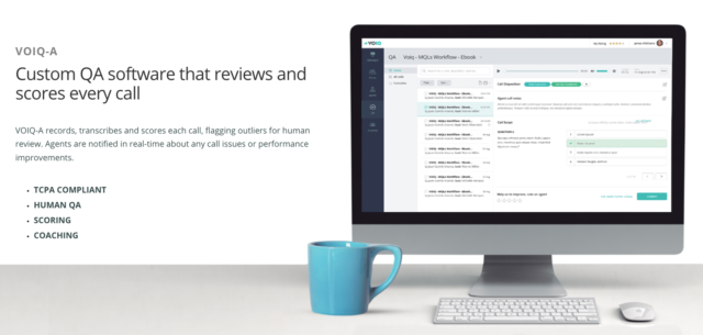
Specialization: VOIQ uses a combination of call analytics and on-demand agents to automate your qualification calls. It helps salespeople discover the factors that helped them to book the demo.
What You Can Achieve: Salespeople can get instant intelligence without using a sales coach. You can also automate the process of bookings so you can feed demos directly to your sales team.
Popular Integrations: VOIQ integrates with HubSpot and SalesForce directly.
Entry-Level Account: VOIQ charges $1.50 per minute of call time.
How Databox Compares: Databox integrates with VOIQ and also integrates with HubSpot and Salesforce to pull sales performance data.
Customer Retention Analytics Tools
ChartMogul
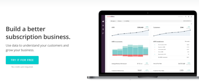
Specialization: ChartMogul helps you discover your best customers, based on the cost of acquisition and lifetime value. It is especially useful for SaaS businesses. It automatically digs up the data and presents it in charts so that you do not need to use SQL queries or view each page manually.
What You Can Achieve: You will not even need to figure out which SaaS metrics are most important! ChartMogul automatically pulls every relevant one. You can spend all your energy running campaigns to improve your CAC/LTV ratio.
Popular Integrations: Stripe, Braintree, Recurly, Chargify, Paypal and 7 more
Entry-Level Account: The service is free if you have less than $10,000 MRR.
How Databox Compares: Databox also integrates with Stripe and PayPal.
Baremetrics
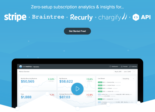
Specialization: Baremetrics also tracks all the key metrics that define a SaaS business. After a one-time setup, you can immediately begin viewing your funnel and identifying areas for improvement.
What You Can Achieve: Pretty much the same stuff as ChartMogul! Baremetrics helps you make wiser decisions on what plans drive ongoing revenue, and which customer personas are most important.
Popular Integrations: Stripe, Braintree, Recurly, Chargify
Entry-Level Account: Startup plans start at $50 a month.
How Databox Compares: Databox also integrates with Stripe.
Product Analytics Tools
Notion
Specialization: Notion helps product and project managers make sure that their work actually moves the business forward. Notion reviews common Agile, customer retention and customer support metrics to ensure that customer concerns are addressed by the engineering team.
What You Can Achieve: Notion ensures that your entire team understands sprint velocity, customer acquisition, churn and other common metrics that determine the success of engineering teams. It gives managers an early warning when more effort does not translate to improvement in product metrics.
Popular Integrations: Jira, Pivotal Tracker, MailChimp, Github, Mixpanel and 5 more.
Entry-Level Account: $180/month for a team of 10 users.
How Databox Compares: Databox also integrates with MailChimp, Mixpanel and Github.
Developer Ops Analytics Tools
Datadog
Specialization: Datadog automatically tracks any metrics related to server health. It helps dev ops teams debug any latency or crashes.
What You Can Achieve: Datadog will help your dev team stay informed in real-time. It massively reduces the time to debug live issues on your servers and ensures that the team can identify latency issues quickly and restore servers to full functionality.
Popular Integrations: A full suite of AWS, Azure and Google integrations as well as 200 more
Entry-Level Account: A free account gets you 5 hosts and 5-day metric retention
How Databox Compares: Databox integrates with 5 different types of SQL databases.
Other Options
If you rely on a tool that does not have a large user base or you need to pull very precise metrics, these tools may not work for you. For everything else, there is Zapier + Google Sheets + Datamatic.
Zapier integrates over 750 tools into workflows based on common triggers.
Google Sheets is a common end destination for new data from Zapier. You can use the “Update Spreadsheet Row” Action from Zapier to modify a value in a row from Google Sheets.
Datamatic is a Google Sheets plugin that allows you to create beautiful visualizations with data from a spreadsheet. Yes, Google Sheets has a built-in chart editor, but it is very limited. Datamatic allows you to create charts and graphs that match your brand.
Zapier + Google Sheets + Datamatic
Specialization: This three tool combo gives you much greater flexibility for automatically pulling data into charts. It is great if you have a particularly demanding client or boss that needs custom metrics. But, you need to make sure your tool integrates with Zapier.
What You Can Achieve: You can turn pretty much any piece of data into a quantifiable, trackable metric. You can create your own data points.
Popular Integrations: As long as Zapier integrates, up to you!
Entry-Level Account: Zapier has a free account that covers most integrations, and Datamatic has a free account with all basic visualizations.
How Databox Compares: Databox also has a Zapier integration so that you can push any data straight into Databox without Google Sheets.
When To Adopt an Analytics Tool
Typically, one of two things trigger a company to invest in a better business dashboard software. When disaster strikes, the decision will be obvious. But, the other reason will creep up on you when you think your metrics are doing just fine:
- A disaster situation: Let’s say that one of your ads failed to run, and you did not learn about it until 2 weeks later. That is 2 weeks of lost leads. This would make it incredibly challenging to meet your monthly goals. Or, let’s say that there is an error on your server that affects your web or mobile app. Struggling for days to find the issue will anger your customers, and some will lose faith in your product.
- Long-term underperformance: This is the tough one because it is hard to diagnose an issue when you do the same activities for months on end and expect steadily improving results. In reality, there may be a few small, insidious issues preventing you from hitting your goals.Here’s the best way to determine if this is an issue: Use industry-specific benchmarks to get an idea of how you stack up against others in your industry. You can use these benchmarks to find areas where you lag behind competitors and eliminate those barriers to growth first.
Would you like to create your own custom business dashboard? With our DIY dashboard designer, anyone can pull out the metrics they need and create a meaningful dashboard.