")
Table of contents
Creating high-converting product pages can be tricky, period.
Luckily, if you’re stuck in a rut, you can always look at some product page examples to get yourself inspired and ready to work on your own product page.
So, today, we’re on a mission to inspire you with 14 product page examples.
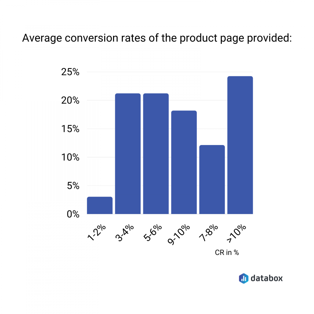
All of these have a decent conversion rate with the majority having a conversion rate of about 10%. Other examples in this list convert between 3-6%.
With each example, we also have a takeaway for you. So, if you’re ready to learn and get inspired, dig in:
1. The Rent Marquee Lights page
2. ConvertFlow’s popup maker product page
3. Tanzanite Jewelry Designs’ product page
4. Lipodrene with Ephedra tablets page
5. Zutrix’s Google SERP, Rank Checker page
6. Best Price Nutrition’s supplement page
7. Handwriting activity sheets page
8. Windows product page
9. The GraphCMS product page
10. Coffee gear page
11. Google CRM page
12. Podium product page
13. Black “Gold Tip” Shoelaces page
14. Coaching product page

1. The Rent Marquee Lights page
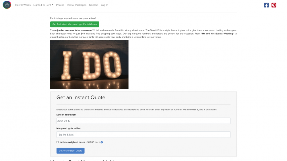
This page shows a conversion rate of 5-6%. William Chin from the team behind it, Prolightingrental.com, notes, “The reason that it’s so high converting is that we regularly heat-map and session record this page to see how users are interacting.
We’ve added anchor links (green button) to enable users who are trying to convert to transact more easily. Also, we’ve reduced the number of fields greatly.
That being said, we rank for valuable money keywords and the traffic that pushes to this page is very buyer-focused.”
Takeaway: Be sure to study your visitors’ behavior using heat maps and session recordings to pinpoint areas that convert and those that need work.
2. ConvertFlow’s popup maker product page
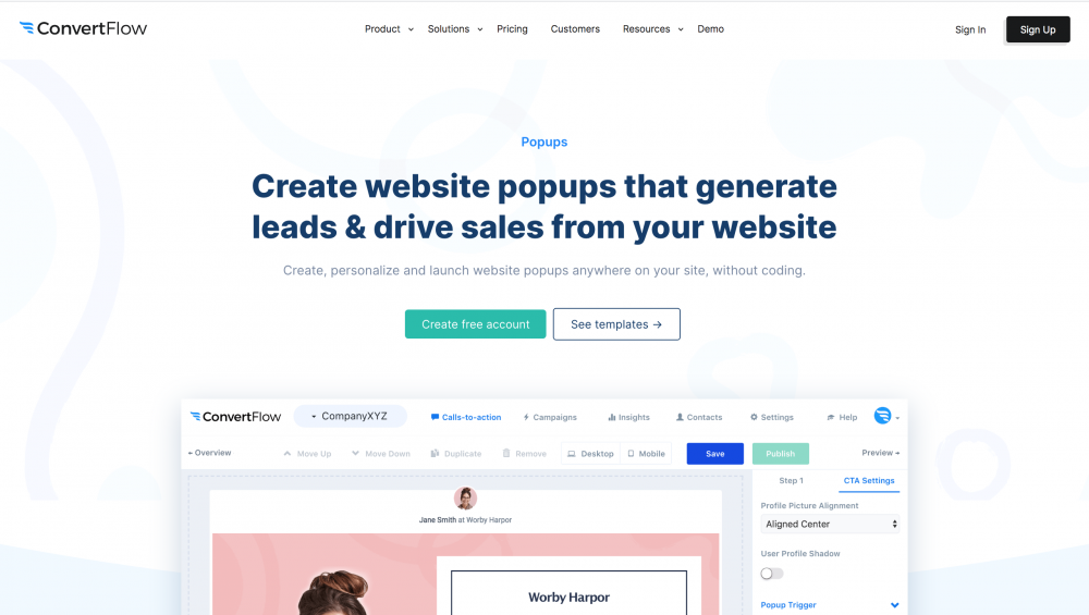
This product page example showcases an impressive conversion rate of 9-10%. ConvertFlow’s Michael Glover explains, “One of the reasons this page works so well starts with the fact that we are driving really targeted and high action-intent traffic to it.”
To this end, “the page is optimized and ranks for keywords like ‘popup maker’ and ‘popup creator’ — all of which bring people who are actively looking for a tool like ours,” Glover shares.
“Another reason is that we know our audience and what they actually want from the tool (drive leads and sales, personalization, no code builder, etc.) and so communicate that right off the bat at the top of the page.”
But that’s not all. There’s a third reason why the page converts so well: free templates. In Glover’s words, “we have found that templates work really well for conversion, so offering this up front and center is a big play for us.”
Takeaway: Know your audience well. It’s the secret to designing a high-converting product page that’s fully optimized to satisfy their buyer’s intent.
Related: 18 Tried and Tested Tips for Writing a High-Converting Homepage Headline
3. Tanzanite Jewelry Design’s product page
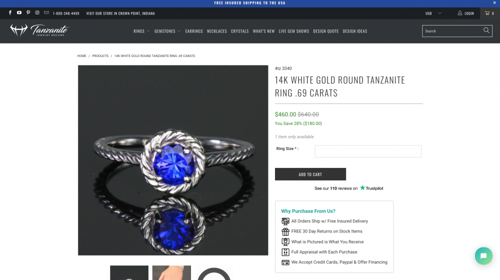
“This page, as well as others, were recently updated,” shares Jeff Moriarty from Tanzanite Jewelry Designs. And they convert at around 5-6%.
The aim behind the update was simple: “We wanted to make sure to provide as much information as possible for visitors that planned on spending a higher amount on our items,” Moriarty writes.
To this end, the team “included a video, important points when purchasing with us, and a detailed explanation/story about our business and what goes into making each piece of jewelry. Since implementing this, our conversion rates have nearly doubled.”
Takeaway: Tell a story – either visually or with a strong copy.
4. Lipodrene with Ephedra tablets page

“On this product page, we use several different marketing strategies for higher conversion,” highlights Carley Hanna of Supplement Warehouse.
Here are two marketing strategies at work here that give this page a whopping conversion rate of 10%.
- “This product page has a lengthy product description, meant to make the experience consumer-friendly.
- Several internal links on this specific product page, which helps it stands out to Google, helping it rank higher, and ultimately convert!”
Takeaway: Add all the product details that potential buyers would search for when buying. Leaving anything out would slow the decision-making process or the buyer would jump to purchasing from a competitor altogether.
Related: How to Use Internal Links to Boost SEO and the User Experience
5. Zutrix’s Google SERP, Rank Checker page
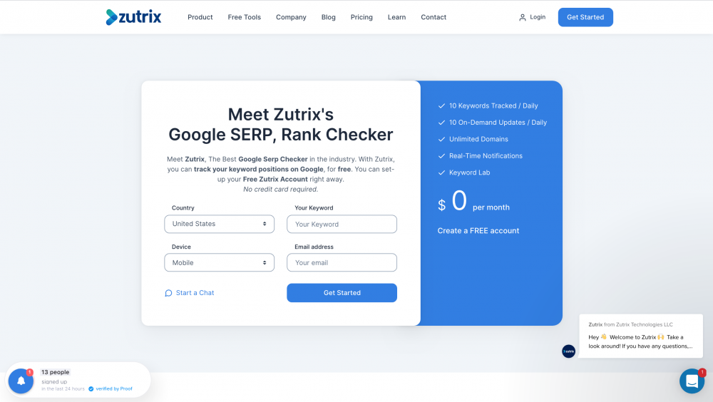
This is another product page example that converts at 10%. It’s “extremely effective because it delivers exactly what the user is looking for, while also requesting minimal information,” points out Zutrix’s Kristel Staci.
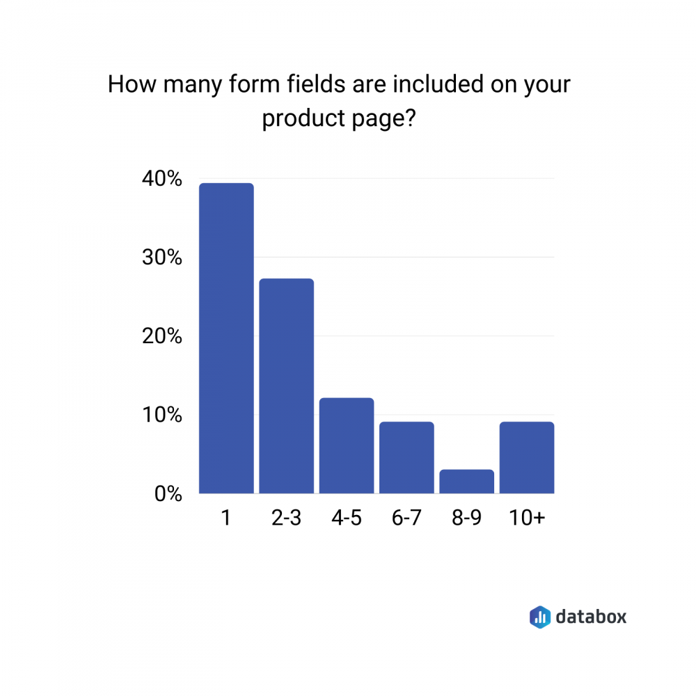
Speaking of asking for minimal information is key for improving your conversions. In fact, the majority of our experts think that you should have only one form field – meaning you should ask for only one piece of information.
If necessary, go for 2-3 form fields as recommended by roughly 28% of the experts we talked with.
Remember “it’s much better to make the sign-up process super easy, and then offer options for upgrading later on,” as Staci puts it.
Takeaway: Limit the number of fields on your form. Ask only what’s super important and leave the rest for later.
6. Best Price Nutrition’s supplement page
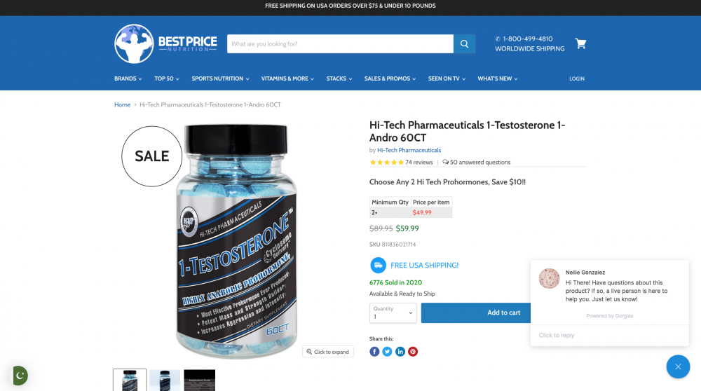
This product page converts at 5-6% shares John Frigo from Best Price Nutrition.
Here’s why:
“First of all this is not only a popular product but its a product in a category that doesn’t have a ton of options i.e. there’s not a ton of brands making prohormones and specifically 1-Andro prohormones so it’s got that going for it which has nothing to do with how well our product page is put together,” writes Frigo.
On top of that, “We’ve done extensive AB testing to figure out what parts of the page people were stopping reading on and made sure to put important and relevant information higher up on the page than that.”
“We also played around with photos and found that having an image of the actual pills converted substantially better than not having photos showing the pills,” Frigo goes on.
“More recently we’ve added a video to the product page for those who are more visual or would rather hear someone talk about the product than read about it and we use Stamped to allow customers to answer and ask questions about this product as well as show photos of their results using this product.”
Takeaway: Show your product in action – whether it’s with the help of a video or with high-quality product images.
7. Handwriting activity sheets page
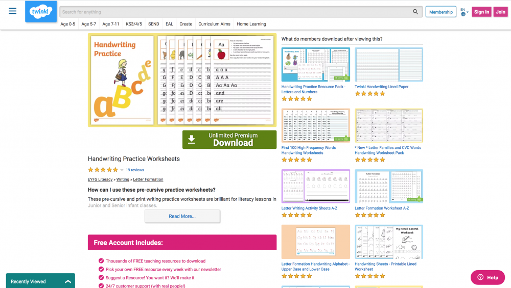
“Currently, this page ranks in the top three for the keyword ‘handwriting practice sheets’,” shares Twinkl Educational Publishing’s Liam Taft. Plus, it converts at 10%.
“The main reason it’s so effective is that it perfectly matches the user intent, helping teachers and parents to teach children handwriting,” Taft notes.
“In addition, it has a clear product image, call to action button, and several five-star reviews.
Not only that, there is a detailed and concise product description that describes the product and explains why handwriting is so important, alongside a handy supplementary video.”
In short, “all of these elements help prospects to understand the product and, ultimately, how it will benefit them and their children,” Taft sums up.
Takeaway: Add reviews as social
proof to convert your buyers.
PRO TIP: Measure Your Content Marketing Performance Like a Pro
Struggling to track the impact of your content across platforms? We feel you. Thanks to Databox, fragmented data doesn’t have to hold you back anymore.
Our library of free content marketing dashboard templates puts all the insights and metrics you need in one place. No more jumping between reports!
Measure engagement: Track key metrics like likes, comments, shares across social media platforms to see what content resonates most with your audience. Analyze website traffic, bounce rate, and average time on page to understand how visitors interact with your content.
Optimize conversions: Identify high-performing landing pages and blog posts that drive the most leads using dashboards like HubSpot Marketing Lead Source. Analyze campaign performance and user activity for both organic and paid content with a Facebook Pages & Facebook Ads dashboard.
Improve SEO: See which pages rank highest in search results and drive the most organic traffic. Improve search visibility by visualizing key SEO factors like backlinks and domain rank.

You can easily set it up in just a few clicks – no coding required.
To set up a dashboard, follow these 3 simple steps:
Step 1: Choose a fitting template
Step 2: Connect your data
Step 3: Watch your dashboard populate in seconds
8. Windows product page

Hannah Richter from Acadian Windows reveals that this product page example boasts a conversion rate of 3-4%.
The reason? “It’s designed to be incredibly user-friendly,” Richter outlines. “We’ve made sure our digital design efforts always revolve around a fulcrum of customer support.”
To this end, there’s a “floating contact form that allows users to convert from wherever they are currently browsing.
We’ve also embedded links to a plethora of additional resources including virtual tours, payment plans, and customer testimonials.”
Explaining the reasoning further, Richter writes, “Conversions are generally higher when customers have all the information they need to be condensed into a centralized, accessible landing page. Pages with conversion goals should be both educational and supportive.”
Takeaway: Always make sure the CTA button or buy now button is only a click away.
9. The GraphCMS product page
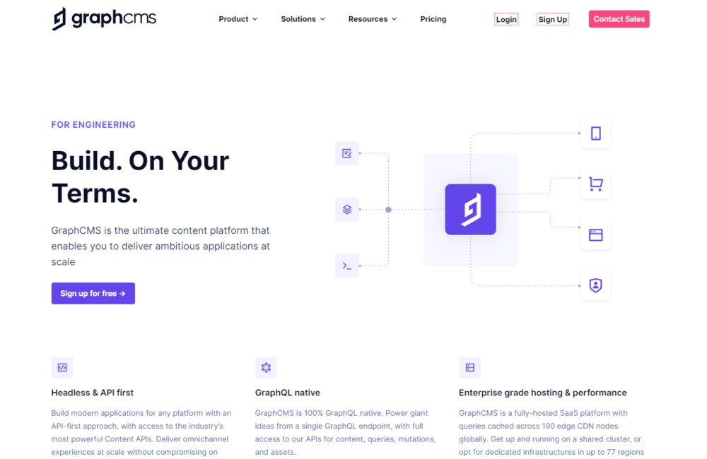
This is another one of the product page examples that convert in the 5-6% bracket.
Ronak Ganatra from GraphCMS goes into the details: “This page is extremely objective and does a quick job of explaining how GraphCMS works in an easy-to-digest manner without bringing in too much marketing fluff.”
So how did they manage to keep things crisp and to the point? “Given that we market to a highly technical audience, it’s important for them to gather as much context about the product as possible within a few moments, without jumping through any marketing or sales hoops.
This page allows visitors to self-qualify the product for their needs, and decide on whether or not they can achieve their goals – without speaking with sales, downloading too many marketing materials, or trying to ‘cut through the fluff’.”
Takeaway: Give readers all the information they need to make their buying decision. But make sure you present it all in an easy-to-digest format.
10. Coffee gear page
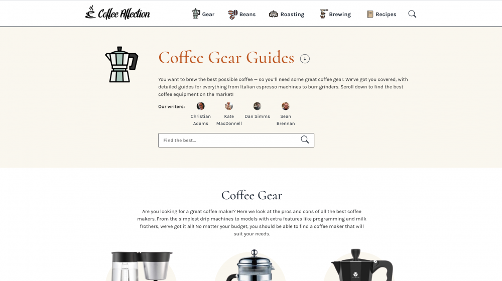
Coffee Channel’s Sean Brennan reveals this page converts at 9-10%. The credit for this conversion rate boils down to its minimalist design according to Brennan.
“When we went into designing this page,” Brennan recalls “we decided to go with a minimalist approach. In all web design, less is usually more, so a less crowded, clean-looking page usually does the trick.
We list out different categories of coffee gear for the consumer to then click on and then go to another page that has those products neatly sorted. This organization and easy-to-understand interface really help with our stupendous results on the product page.”
Takeaway: Less is more – design clutter-free, easy to navigate product pages.
11. Google CRM page
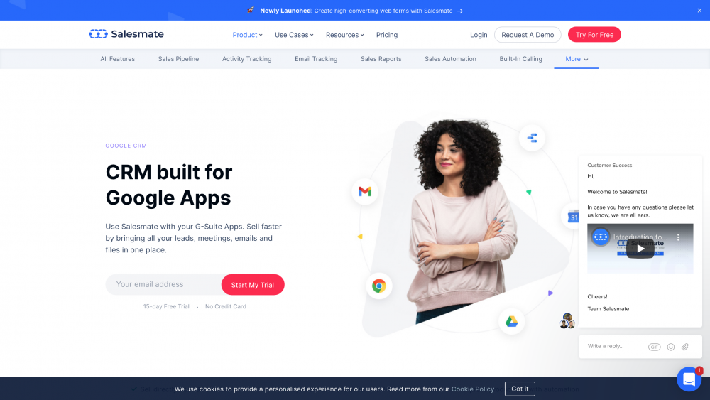
This product page example has a conversion rate of 7-8%. “Our product page of Gmail CRM is ranking at the top position on keywords such as ‘Google CRM,’” reveals Raaquib Pathan of Salesmate.
“We are getting huge traffic on that product page and on top of that, it has a decent conversion ratio. It’s because we answered the user’s query on the very first screen with a few convincing lines and gave a call to action of ‘free sign up’ right after it.”
“The visitors are looking for a CRM that integrates with all the Gsuite apps. And so, we satisfied the user’s intent without a shadow of doubt,” continues Pathan, “Thus, while targeting or making keyword strategy, the utmost important thing to keep in mind is – user’s intent.
If you provide value to users along with offering them a viable solution, you’ll certainly prevail in getting a higher conversion ratio.”
Takeaway: Make sure you satisfy the user’s intent.
12. Podium product page
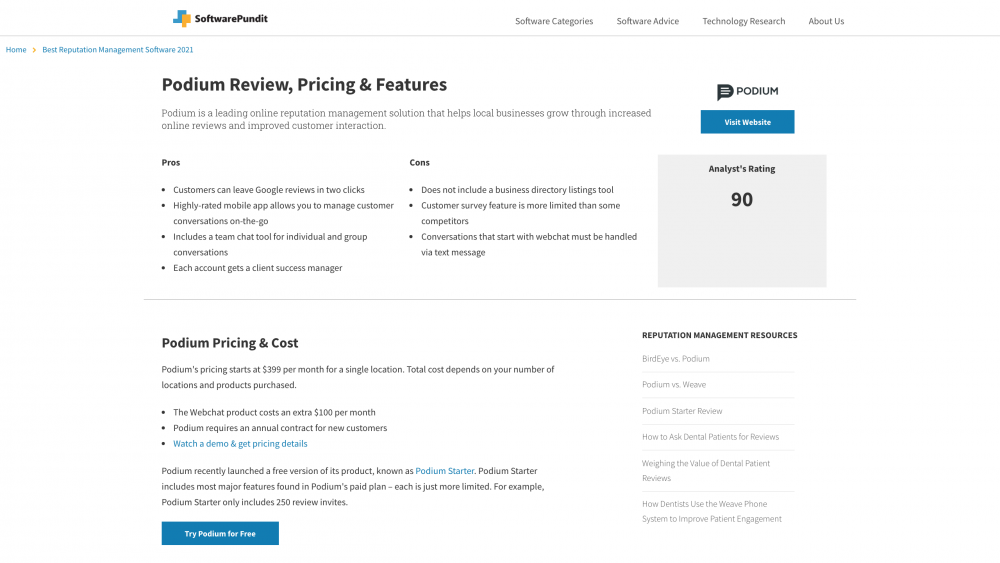
SoftwarePundit’s Bruce Hogan lists three reasons why this product page shows a conversion rate of 9-10%.
- We know the key information that browsers are looking for and have included it at the top of the page above the fold.
- There are multiple calls-to-action (CTAs) above the fold.
- We layered on a pop-up that reinforces the key information to the reader and includes another CTA.”
Takeaway: Ensure the call to action is above the fold and there’s no harm experimenting with multiple CTAs too.
Related: Convert More Visitors Into Leads With These Proven Strategies From 25 Digital Marketers
13. Black “Gold Tip” Shoelaces page
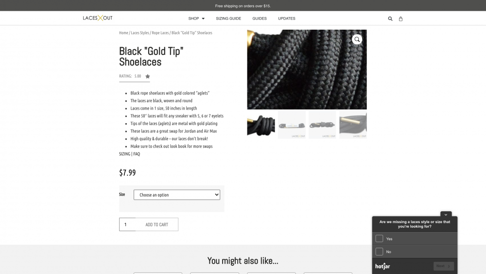
Another product page example that converts at 10% is this one. growth360’s Sasha Matviienko credits the conversion rate and sales to the page being “highly-optimized from an eCommerce SEO perspective.
This allows the page to laser-target a highly-relevant and converting audience on Search Engines.”
“On-page optimizations target multiple highly-relevant searches, such as size, number of eyelets, list of shoe brands and models these laces would fit. These are the things users search for, and this page provides an excellent User Experience, thus gets lots of relevant traffic and a high Conversion Rate.
Takeaway: Add on-page optimization to your product page to-do list.
14. Coaching product page

James Pollard of The Advisor Coach LLC notes the page converts between 5-6%. “One of the reasons I think this page converts well is because I’ve stacked up so many bonuses for such a small price,” comments Pollard.
“The newsletter is only $99 per month, yet you get more than a thousand dollars worth of bonuses immediately upon signup.”
On top
of that, Pollard outlines, “I donate 100% of the first month’s subscription
price to a charity called First Book. I think this reduces friction as well
because people understand that not only are they helping themselves succeed,
but they’re helping children get access to the educational resources they need.
This page converts extremely well for a
subscription newsletter, especially when you consider it comes with no
money-back guarantees and customers have to check a box agreeing to those
terms.”
Takeaway: Offer freebies that are genuinely valuable.
Here’s hoping these product page examples have left you feeling excited to work on your own page. Keep in mind, high-converting product pages are designed to be easy to navigate, pack in social proof, offer freebies, and provide complete details of a product.