Table of contents
A website redesign is a significant undertaking that usually takes a lot of time and effort and involves several groups of stakeholders. By the time marketing undertakes one, the process usually has to address multiple issues and achieve multiple goals.
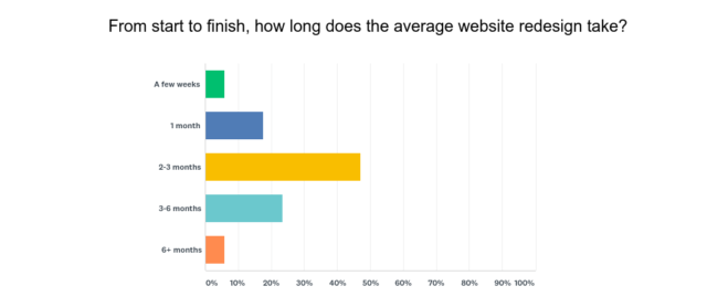
It’s no wonder that most marketers told us it takes 2–3 months to complete a redesign:
And when the redesign is done, you want to see results.
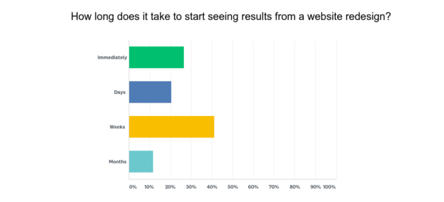
But results don’t happen immediately. Well, sometimes they do—but more often, it’s a matter of weeks before you’ll know how the redesign has affected user behavior:
Even then, the success of a redesign is often a gray area. How do you know if your redesign was a success? We interviewed dozens of experts to find out.
1. Focus on The Most Important Website Redesign KPI: Conversion Rate
There are lots of things you might hope to achieve with a website redesign. But most marketers agree that there’s a single metric that matters: Conversion rate.
“Ultimately, that’s the one statistic that matters for a website redesign,” says David Denning, head of business development at Jumpstart Go. “Making the site pretty doesn’t mean it was successful.”
Dary Merckens, CTO at Gunner Technology, also emphasized the importance of conversion rate: “That should honestly be the goal for anyone with a business site.”
Of course, if you’re going to be measuring conversions in your web analytics dashboard, you need to know what counts as a conversion. And that may depend on your website.
Blue Compass‘ digital marketing associate Mallory Cates says that her agency tracks both conversions and “positive actions” for a site. “These [positive actions] are usually determined by what the business wants potential customers to do on their website, but common actions include making a call from the website, completing a contact form or signing up for a rewards program or monthly newsletter.”
The proof is in the pudding, though. One of Cates’ clients, a pest-control company, redesigned a website to get more visitors to submit web forms. Here’s how form submission changed in a year:
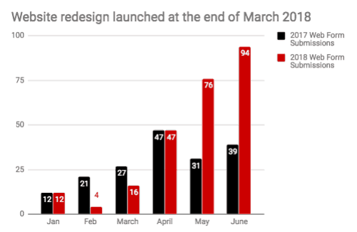
George Perry, SEM specialist at Bandwidth, reported a 173% increase in conversions just by redesigning his firm’s Contact Us page. With a more concise layout and a clearer call to action, Bandwidth saw huge results. And it’s largely because they focused on what they wanted their visitors to do.
It’s obvious that a focus on conversions can pay off.
But don’t expect a huge boost immediately after the redesign.
Cale Loken, creator of Business Website Blueprint, suggests giving your redesign three months and comparing data over that period of time. This three-month sample gives you a more robust comparison, especially if your site doesn’t get a huge amount of traffic. In other words, don’t expect miracles.
2. Before Redesigning a Whole Site, Start with A/B Testing
You might think you know how to redesign a website to improve conversion rates. And that might be true. But there’s nothing better than hard data to back up your claims.
A/B testing provides that data. By splitting website traffic between two versions of a site page, it allows marketers and designers to compare the performance of two versions in real time. This real-time comparison also eliminates other variables that could get in the way of robust comparison.
Many businesses “immediately resort to a redesign without even having the necessary data that can back the redesign results,” says Sean Si, editor-in-chief of SEO Hacker. This leads to less-than-optimal redesigns.
Instead of jumping in too early, businesses should make incremental changes and A/B test both the content and layout of a new site, says Alfred Goldberg, president of Absolute Marketing Solutions. These comparisons require solid analytics data on the original site, he notes.
3. Gather Qualitative Feedback from Would-Be Customers
While many of our respondents emphasized data, a few pointed out that there are also qualitative measures you should pay attention to. It might not be common in site design, but it came up enough that it’s obviously important.
“Never lose sight of the collective impression and overall emotional response that a new website should provide your company or organization,” says Stephan Roussan, president of ICVM Group.
He cautions that “if technical improvements are not implemented in support of how you want your visitors to feel about you and what you’re offering, you may be hurting your brand more than you’re helping it.”
Remember that conversion rates aren’t the only thing that matters. Your website is an important part of your brand, and it needs to reflect what your company stands for.
JotForm‘s director of communications Chad Reid told us that it’s “easy to look at numbers and assume you know the problem.” But it’s crucial, he says, to understand what your users are thinking when they visit a page.
Of course, asking your visitors is also a great idea. Roussan recommends a focus group of would-be audience members when you “suspect that everyone has fallen for the bells and whistles.”
Hussein Ebeid, senior director of search at Pacific Digital, specifically recommended user experience testing. “One of my favorite methods is simply asking people to navigate the site while asking them to complete basic tasks that are essential to the success of your business,” he told us.
“You would be amazed at the things a typical visitor to your website might find challenging or confusing.” When you’ve worked on a redesign, it’s easy to become blind to some of the difficulties that users might have. Outside opinions and UX data can reveal a lot.
PRO TIP: Save Time Creating Your Google Analytics 4 Traffic Dashboard
Yes, you can DIY in Google Analytics 4, but what if you would prefer a simpler, easier route? After all, once you learn how it’s done, you still have to choose the right metrics and design your custom dashboard to answer the important questions your stakeholders have, for example:
- How many people are visiting my website?
- Which channels bring in the most users?
- How engaged are my users?
- How well is my website keyword optimization performing?
and more…
Now you can benefit from the experience of Google Analytics experts, who have put together a great Databox template showing all the most important website traffic KPIs. This template allows for easy integration with scheduled report delivery. It’s simple to implement and start using as a standalone dashboard or in marketing reports!
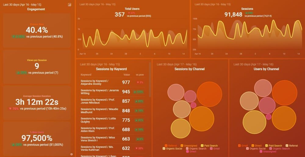
You can easily set it up in just a few clicks – no coding required.
To set up the dashboard, follow these 3 simple steps:
Step 1: Get the template
Step 2: Connect your Google Analytics 4 account with Databox.
Step 3: Watch your dashboard populate in seconds.
4. Make Sure you Didn’t Make Technical Mistakes
Matt Litwin, Bus.com‘s digital strategist, mentioned error testing and real-time monitoring for bugs and other problems. The closer to roll-out, the better, he says. Make sure you’re checking for dead links, 404 errors, incorrectly triggered 301 redirects, and anything else that affects user experience.
Litwin and his team recently relaunched the Bus.com site, and he says the first 24 hours after launch is a crucial time. There should be no gap in customer experience.
Another of the benefits that you’ll get from measuring user experience improvements on your redesigned site is faster results. It only takes a week or so to see the effects of changes in user experience, says PPC Protect‘s managing director Alexander Winston. SEO changes, in contrast, can take up to a month.
5. Measure These Metrics to Determine Website Redesign Success Quickly
Outside of conversion rates, many marketers recommended tracking other metrics. Many of them, if optimized well, will lead to more conversions in the end. But these are important to track because they are good leading indicators of success, as you can often see changes in these metrics shortly after your new site launches.
Small business coach Mostafa Hosseini, for example, is big on increasing visitor engagement. How does he measure it? With four different, but related, metrics:
- Number of sessions per user (which should go up)
- Pages per sessions (should also go up)
- Average session duration (up)
- Bounce rate (which should go down)
These are the metrics you should benchmark before your redesign and retest after.
Twenty Over Ten‘s associate director of digital marketing Amanda Larson also emphasized engagement. You should have two months’ worth of data on the following metrics:
- New vs. returning users
- Bounce rate
- Average session duration
- Average page time
- Organic search traffic
With this information, you’ll have a good idea of how engaged your visitors are. And more engaged visitors means more conversions.
(It’s also a good idea to ask your client what they’re hoping to accomplish with the redesign, says Seaworthy Digital‘s director and head developer, Ian Rose. If they aren’t aiming for a specific metric, conversion rate is the way to go.)
6. Pay Special Attention to Bounce Rate And Page Load Speed
A few marketers recommended looking at bounce rates after a website redesign. Codal‘s digital marketing intern Arielle Kimbarvosky explains why: “By comparing your bounce rates before and after a website redesign, you can effectively tell whether or not the new design keeps users engaged. If a website’s bounce rates are high before a website redesign and low after it, it likely means that visitors are clicking on more pages and converting into customers.”
Katherine Ohman, content creator at Envision Horizons, adds that “bounce rate and time spent on a website are the ultimate KPIs for website content redesign. . . . the amount of time spent on a site is an indicator of how compelling your redesigned content is.”
One way to reduce bounce rate is to reduce page load speed. It can also increase search traffic as Google purportedly uses page load speed as a ranking factor.
So, how fast does your website load? The answer might be more important than you realize. “One thing I’ve personally measured and seen success from is speeding up page load time after redesigning a website,” says Stacy Caprio of Improve Your Life.
She also notes that decreased page load times often result in (primarily mobile) organic traffic increases.
Modern picture book creator Trevor Carss recommends using image and HTML compressors alongside Google’s page speed testing tool.
7. Track The Success of Each New or Updated Website Page
Jordan Harling, chief digital strategist at Wooden Blinds Direct, shared an interesting tip on choosing metrics: “Each page on your site should serve a distinct purpose. . . . As such, it doesn’t make sense to judge them all on the same metric.”
Instead, he assigns each page on the site to a group, and chooses a metric for each group. Product pages, for example, are judged on conversion rate. Navigation pages, however, are measured by a different criterion: the percentage of users that subsequently visit a target page.
This method requires a lot of work. But it will help you determine what’s working and what’s not on a more granular level than just looking at conversions. Of course, you probably want to start by optimizing your website’s home page, since that page will likely be viewed by any curious prospect.
8. Map and Measure Your Buyers Journeys and Marketing Funnels Using Micro-Conversions
Several of our respondents mentioned buyer journeys and marketing funnels in their responses. Which, at first glance, may not seem like a part of the redesign evaluation process. But, it’s definitely something you should have a good grasp on when you start the redesign and is something you can measure.
So, understanding exactly what you want your customers to do and how they go through the purchase process can be very valuable indeed.
Matt Boland, search marketing strategist at Brand Builder Solutions, discussed the importance of micro-conversions as a means to understand the path your buyers take through your site. Not every action that you’re trying to get is a purchase, he says. So you’ll want to monitor other actions as well.
“There are navigation-based actions (viewing a product page), interactions (watching a video, clicking through to a related blog post), and engagement actions (time on site, number of pageviews, visit frequency).”
He gives the example of tracking clicks from your product page to your pricing page. That’s a valuable piece of information, and it shows when users are transitioning from one part of your funnel to another. Simply monitoring conversions won’t catch that.
And by tracking these actions with Google Tag Manager and Analytics, you can start seeing immediately which pages are having the desired effect.
Sarunas Budrikas, CEO of Angle180, also recommended measuring conversions throughout the customer lifecycle. It might be purchasing a product, subscribing to a service, creating an account, or filling out a request form, he says.
Interestingly, you may need to measure these conversions as a percentage of total traffic, as you may get fewer visitors to your site for a while, says Digital Authority CEO Codrin Arsene.
“Our advice to executives has always been to closely monitor the end to end funnel in a website after a redesign. Simply put, the ultimate measure of success for a redesign is that more people are pushed through the funnel (as a percentage of total traffic) than before.”
Arsene also points out that you’ll need to reconfigure your analytics schema, as your funnel may change. During a redesign, “you often add steps or remove steps from the funnels in your analytics tools.”
Brand Builder Solutions‘ Chris Queen emphasized watching for changes in the buyer journey after the redesign goes live. “The whole purpose of redesigning your site is to adjust it to the buyer as much as possible in order to get more results.”
Queen also recommended some qualitative evaluations, like asking your sales and marketing team about the quality of leads they’re getting from the site after the redesign, to get a handle on the buyer journey.
9. Use Heatmap & Other Advanced Analytics Tools to Further Improve
Of course, being marketers, we’re big on tools. So we got a lot of recommendations.
One of the most common tools that we saw from our respondents was heat-mapping tools like HotJar and LuckyOrange. With their visitor tracking, conversion funnel measurements, and heatmaps, they provide a lot of data on what’s working and what’s not.
Brand Builder Solutions’ inbound marketer Brittany Taglienti emphasized the importance of heatmaps: “If your main action point is at the bottom of the page and 75% of the users aren’t getting to it there will likely be a defined breakpoint on that page where they all drop off. Change that section in a way that is helpful to the users,” she says.
She also pointed out the importance of being able to get and act on these results quickly.
What else might you use to measure the effectiveness of your redesign? Adam Conrad, founder of Anon Consulting, suggests Kissmetrics and Optimizely. Google Analytics and Tag Manager were popular choices, and we heard quite a bit about HubSpot, as well.
10. After You Relaunch, Keep Testing and Making Changes
With A/B testing and all the analytics tools at your disposal, website launches shouldn’t be a one-and-done process. “Continuous testing and optimization ultimately leads to a better customer experience,” says iHeartRaves‘ digital marketing strategist Brandon Chopp.
When you define the redesign’s key objectives and quantify the previous version’s performance against those objectives, you can continue improving the site, says Chris Oquist, director of user experience and digital strategy at Dialogue Theory.
11. Predict & Measure the ROI of Your Website Redesign Efforts
In the end, figuring out whether a website redesign was a success comes down to knowing the cost of doing nothing. How much would you have lost if you hadn’t done the redesign?
Joe Jerome, founder of Brand Builder Solutions, emphasized the importance of knowing these sorts of numbers going into the process: “Do you currently track the amount of business that comes from your website? If you showed me your top 20 sales from the last year, could you tell me how they came to you?”
If you don’t know the answers to those questions, you may want to reconsider the timing of your redesign. Jerome gave us an example of a company that gets 10,000 visits per quarter, gets contacted by 1% of visitors (100), sees that 20% of those contacts are qualified (20), and closes 25% (5) of the deals.
A redesign could increase the number of new contacts to 1.5%, resulting in 50 more contacts per month. It could also improve the qualified leads from 20% to 30%, resulting in 25 more leads. Even with the same 25% closing rate, this company would now close 11 deals per quarter instead of 5.
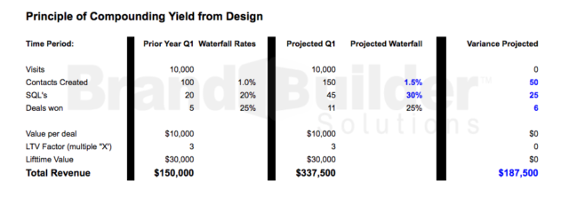
Assuming an average deal size of $10,000 and an average of three deals over the customer lifetime, that adds over $187,000 of revenue per quarter.
This might seem like a complicated calculation, but it’s the kind of numbers you should be running to determine what you can gain from a redesign in the first place. And once it’s done, you’ll have estimated metrics to compare.
Which means you’ll need to analyze metrics from both before and after the redesign.
Website redesigns are serious undertakings, and they deserve serious consideration both before and after the fact.
Have you run a website redesign in the past? Was it a success? How did you know? Share your thoughts in the comments!


