Table of contents
Data is everywhere. Whether you’re an executive, a manager, or just trying to keep your head above water in your day-to-day job, the chances are that you’ve had at least one interaction with a set of data this month alone.
And if you’ve ever tried to interpret data for yourself or your team, you know how confusing it can be to make sense of it all, understand what information is critical, and what can be left to the wayside.
Data management isn’t just about collecting and storing information—it’s about knowing what that information is and how to find it when needed. And if your company doesn’t have transparent processes in place for managing its data, it could be costing you money and making your job harder than it should be.
We’ve created this easy-to-digest guide to help you get started on mastering data management. When you’re finished with this data management playbook, you’ll know:
- What data interpretation is
- How to make sure your business can interpret and understand data
- What data management is
- Why do companies need to get it right
- 6 steps to master data management
What is Data Interpretation?
Data interpretation is the act of reviewing data to draw conclusions. It is different from data analysis, which refers to the process as a whole. While each step of a data analysis process is necessary for complete and accurate results, data interpretation is the most crucial step. Data interpretation is the final step in data analysis; it requires you to analyze, aggregate, and understand data to make informed decisions.
Data interpretation unlocks the full potential of your data and allows you to take all of the information you’ve gathered and use it to draw conclusions about your business. This can be a precious exercise—if executed correctly. If not, it’s a waste of time and effort that leaves you with no new insights or learnings.
So how exactly do you interpret data? Data interpretation involves taking all of your collected data and making sense of it. You’ll need to organize your data into a visual format that makes it easier to interpret. Then, you’ll need to comb through this info and try to unearth trends or other meaningful insights. Remember: only focus on trends that matter to your business goals or bottom line.
The Importance of Data Interpretation
Data is the lifeblood of any company, and mastering data management can be the difference between a thriving business and a floundering one.
But what about the interpretation of your data? What does that mean for you and your company? Well, it can help you make better decisions faster. It can help you avoid mistakes or discover new opportunities. And in some cases, it can help save money and time—both are precious commodities to any entrepreneur.
As mentioned above, data interpretation is when raw information is turned into meaningful insights by humans who have expertise in reading through such things as reports and charts. This means they know what questions to ask themselves when interpreting their findings; they understand the limitations of different research methods (e.g., qualitative vs. quantitative); they recognize patterns within datasets, etc.
A team member might be able to identify problems before they become significant issues or even prevent them altogether—which saves money on repairs down the road. They also might find ways to make specific processes more efficient using fewer resources/less time. So overall, employees can focus their energy on other tasks at hand instead of spending all day trying to get one step done correctly without making any mistakes.
Related: How to Write Data Analysis Reports in 9 Easy Steps
How Your Workflow Impacts Data Interpretation
The data you manage impacts its interpretation. The way it’s collected and stored, the tools used to analyze it, and who has access to it all shape how your raw data is interpreted. Understanding the data management workflow will help you keep things organized to limit misinterpretation.
Here’s an example of a typical data management workflow:
- Data collection (think surveys, interviews, experiments)
- Data storage (databases, file systems)
- Data usage (visualization tools, software development)
- Data analysis (statistical analysis software, Python programming language)
- Data sharing (whitepapers, presentations, infographics)
- Data archiving (self-archiving or government archives)
What is Data Management?
Data management includes those activities required to ensure the reliability, accessibility, and timeliness of data for your users.
More simply put: data management is ingesting, storing, organizing, and maintaining the data created and collected by a company.
The Importance of Data Management
Data management is an integral part of the customer journey because it allows your company to track trends, understand customer needs, and make better business decisions.
With clearly labeled data that’s easily accessible and actionable, you can use it to target campaigns to a segmented audience, create more effective strategies, and improve product offerings. Data management isn’t just about collecting customer information—it’s about using what you’ve collected to keep your customers engaged along every step of their journey with your brand.
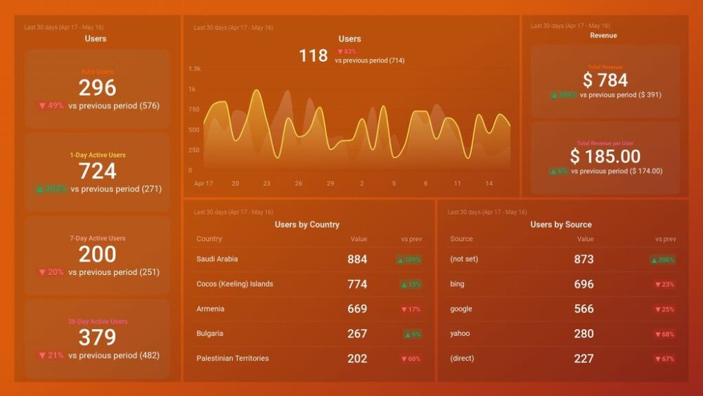
Pro Tip: Your Go-To Dashboard For Doing a Deeper Dive on Website Traffic and Conversion Sources
Struggling to find an easy yet effective way to gain a comprehensive understanding of your traffic sources, user behavior, and revenue generation?
You can do all that and more with our plug-and-play GA4 Acquisition dashboard template:
- Understand user acquisition: See where users come from, tailor outreach, and track new user growth;
- Focus on high-performing channels: Identify top channels, optimize resource allocation, and adjust underperformers;
- Track revenue & engagement: Monitor revenue growth, active users, and the effectiveness of your campaigns;
- Go beyond traffic & conversions: Gain deeper insights into demographics, sales, customer journeys, ARPU, and more;
- Optimize marketing & drive results: Make data-driven decisions to improve your marketing strategy and achieve business goals.
You can easily set it up in just a few clicks – no coding required.
To set up the dashboard, follow these 3 simple steps:
Step 1: Get the template
Step 2: Connect your Google Analytics 4 accounts with Databox.
Step 3: Watch your dashboard populate in seconds.
6 Steps to Master Data Management
Here are the essential steps that will allow you to become better at managing your data:
- Gather all data sources
- Clean and organize data
- Create a visual
- Analyze data
- Share your findings
- Archive and store data
Step 1: Gather all data sources
Data can take many forms but generally falls into one of two categories: structured or unstructured. Structured data is easier for us to understand and analyze because we already know how a piece of information is collected, organized, and formatted. Think of a spreadsheet of sales numbers or data on the number of visits to our website. Unstructured data doesn’t follow any particular format—there are no rules dictating how it should be collected or organized. This can include videos, photos, audio recordings, and even social media posts.
Related: The Best Structured Data Tools for SEOs and Content Marketers
We also use the terms qualitative and quantitative when describing data types. Qualitative data represents something in narrative form that attempts to capture people’s feelings and attitudes toward a topic—including their emotions. While this type of research tends to be less reliable than quantitative methods (because it relies on self-reporting), it does provide insights that are difficult for other ways to capture. For example, a customer pain point or which features the user finds most valuable about your product.
Quantitative data focuses solely on numbers; these are reports from experiments with control groups or pilot programs. These reports will typically provide a statistical analysis that helps determine if your hypothesis has been proven true by reviewing measurable parameters like conversion rates for different landing pages on your website.
The first step in the data management process is to gather all of your data sources. There are a few questions you should ask yourself when doing this:
- What are the various data sources you need?
- Where do they come from?
- How do you get them (i.e., from an API or by scraping a website)?
- What kind of data is contained in each source (i.e., text, images, etc.)?
- What is the format of each type of data? What is the quality of that data? Is it messy? Does it contain errors? Is it complete and accurate? How can we account for these issues in our analysis and model-building processes?
Step 2: Clean and organize data
Data cleaning is essential to avoid misleading results when analyzing data. Data cleaning is removing errors and inconsistencies from a data set. The importance of data cleaning cannot be understated, as it ensures that your data is accurate and useful.
Incomplete, inaccurate, and inconsistent data can cause analytical models to draw incorrect conclusions from the underlying dataset. Some examples of potential errors in a dataset include missing or invalid values, duplicated records, outliers, and inaccurate or invalid values for variables.
It’s also essential to clean your data because you may want to share it with others later on down the road—and sharing dirty data can lead to all sorts of problems.
Here are a few helpful reminders:
- Use proper formatting: Make date fields consistent (for example, change to MM/DD/YYY).
- Check for duplicates: Remove duplicate rows and ensure there are no identical values within a column.
- Remove insufficient data: Filter all empty rows or cells, junk leads, or anything that doesn’t belong in the database.
- Re-order columns: Move columns into an order that makes sense for your building database. For example, the first name should come before the last name when importing contact information into a CRM (Customer Relationship Management) system. You should also consider whether some column headers would be more effective if they were renamed. For example, “account rep” could be re-labeled as “salesperson.”
- Create a new column for calculations: This will help keep your formulas from being overwritten when adding new data to the database.
Related: Google Analytics Data: 10 Warning Signs Your Data Isn’t Reliable
Step 3: Create a visual
With endless numbers of data points from all over the company, it can be hard to collate your information. The first step to making sense of data is to put it in a helpful format. Visualization is one way to do this.
The human brain processes visual information 60,000 times faster than text. By visualizing your data, you’re making it more accessible and easier to understand, speeding up decision-making, and ensuring everyone views data differently. But choosing how you want to visualize this data isn’t straightforward; there are many options.
One of the main types of data visualization is an interactive dashboard. Instead of wasting time in chart editors, you can display your data in a meaningful way right from the start by using Databox.
Databox gives you the ability to visually display your data in many ways with a few clicks. The visualization library allows you to choose from a slew of pre-made layouts or create your own by arranging and customizing the chart types that best fit your data.

There are also other ways to visualize data, including infographics, maps, diagrams, or other images that can be used for comparison or analysis.
Visualizing your data is another way to make it easier for you to understand and act on it. You can also combine two or more data sets into one visualization, showing their relationship (for instance, a scatter plot or bubble chart). This method can help you identify the most critical data in your set and unearth insights that might not be apparent when looking at each individual set.
It’s also an easy way to consolidate large amounts of information. Instead of having a spreadsheet with a million different tabs, everything is visualized in one place—a piece of cake.
Step 4: Analyze data
Data analysis evaluates data using analytical and statistical tools to discover meaningful patterns and trends. Data interpretation is assigning meaning to the collected information and analyzing the results. Data interpretation and analysis allow you to understand the significance of your data, draw conclusions, support decision making, establish priorities, develop objectives and action plans, and evaluate success.
Scientific data analysis involves collecting information from experiments or surveys, then sorting it out and drawing conclusions.
Data analysis aims to identify problems in your data and determine whether your hypotheses are supported. Your findings should correspond with the key questions you specified earlier, such as where your customer growth is coming from or how it compares with your competitors’.
To do this, you must find the most important variables within your data sets and extract them. Then it would be best if you analyzed these variables individually and about one another through a variety of methods. For example, you can use statistical tests like regression models (which predict the relationship between different variables), descriptive statistics (which summarize relationships between other groups), or hypothesis testing (which looks at statistical significance). After completing your analysis, visualize your results to show meaningful patterns and trends. Some useful reporting tools include graphs, charts, and tables.

Step 5: Share your findings
In this step, you’ll share your findings with the appropriate people and can take a variety of different forms, depending on who you’re sharing it with and what the purpose of your data project is. Maybe you’re creating a dashboard to share with your team in real-time, so they all have access to the same information at any given moment.

Or maybe you’ve created a presentation to send to clients each month that covers key metrics and showcases your findings as they relate to their specific needs. Or perhaps you’ve written a blog post containing your results and analysis, explaining how a company or brand made strategic decisions based on data insights to shape their business strategies or marketing campaigns.
However, if you choose to present and format the information, make sure that it’s presented in an intuitive way that makes sense for both yourself (as the creator) and whoever will be receiving it.
It is essential to comply with all data privacy regulations when sharing data. You might need to find a solution that will allow you to use data without violating any rules. For example, many companies that handle large amounts of proprietary or sensitive data use synthetic data in their reports and case studies. Synthetic data simulates real datasets without compromising any data privacy regulations.
Step 6: Archive and store data
You may be storing data on your premises or in a cloud-based system, but how you organize and name files should remain consistent. The best way to put your data management plan into action is by creating a system of folders and files that’s easy to navigate. Consider setting up clear rules for naming conventions, file structure, and security levels if you work with many people.
Here are some helpful tips for storing data:
- Come up with an organizational structure that makes sense for your business. One approach is to separate files by department (e.g., marketing or sales) or function (e.g., legal or financial), then subcategorize them by the project (e.g., conference presentation or client pitch).
- Create a reference master list so everyone can see the standard naming conventions and file formats used across your company—and keep it updated regularly! It’s also important not to let other people get involved with this process; if they try changing things up too often, it will just confuse everyone who uses this tool daily.
- Robust cybersecurity is an essential part of successful data management and secure storage. It is critical to have systems to protect your data from unauthorized access, including managing who has access to what data and ensuring proper password management systems are in place.
- If your organization houses essential data in a computer data center, you will need to consider investing in data center infrastructure management. This will improve operational efficiency, boost security, and can lower operational costs for your business.
Related: Data Warehouse Reporting: Definition, Tips, Best Practices, and Reporting Tools

Monitor Your Most Important Data in One Place with Databox
By now, you understand how important data management is to your business. There are many benefits to mastering data management, which can improve your company’s ability to grow and scale.
Business leaders who want to manage their data effectively need a solid strategy. But it’s important to remember that you don’t have to do all of this by yourself; help is available if you need it. For example, you can use Databox to monitor data from multiple sources on one dashboard to quickly draw correlations, spot trends, and make adjustments in real-time.
Remember that this playbook isn’t a one-time read; it’s meant to be a go-to resource for coaching yourself on how best to put together a winning data management system for your organization.