Table of contents
Building or revising your testimonial page but not sure how to go about doing so?
While there’s a lot of theory out there explaining the ‘how’ of building high-converting client praise pages, there’s nothing that inspires ideas more than testimonial page examples themselves.
So, in this post, we’ve gathered 7 of the best testimonial page examples for you alongside an expert analysis of what’s good about them.
All in all, you’ll learn the following today:
What is a Testimonial?
A testimonial is a formal statement – written or spoken – from a business’s customer/client that talks about the product/service’s quality and virtues. In several instances, customers also talk about their experience working with or buying from the business.
Related: 12 Proven Ways to Encourage Customers to Write Reviews (According to 100+ Marketers)
Types of Testimonials
Testimonials come in various shapes, sizes, and formats – as you’d see in our collection of testimonial page examples. But before we dig into those, here’s an overview of the different types of testimonials that you can leverage:
- Quote testimonials. These are short quotes, written words of praise that customers share with businesses. Either they might share their testimonial directly with the business or they may give one on a review site such as Capterra.
- Social media testimonials. As the name indicates, these testimonials are shared on social – either intentionally (for example, on LinkedIn or Facebook page) or in a conversation with others. Business can showcase the latter, for instance, by embedding tweets of what people are saying on their site.
- Influencer testimonials. These are business testimonials given by celebrities or industry influencers. Influencer testimonials are effective for a simple reason: the people giving them have a lot of influence on your target audience. This makes the testimonial useful in driving conversions.
- Blog post reviews. These are product reviews published by affiliates on other sites. A business can, of course, share them on their site – either in full or pull a compelling quote from the review. Oftentimes, reviewers also write comparison posts. A business might find it helpful to share it with their audience if the review shows them winning over their competitor(s).
- Case studies or success story testimonials. These are testimonial types that businesses create in collaboration with their customers/clients. The aim? To capture the before and after of the customer using the product with an emphasis on the results the business helped their client achieve.
- Video testimonials. Video testimonials typically feature the customer talking about the business. The format may, however, vary from an interview style or a before and after story.
- Documentary series. Unlike a case study or video testimonial, the documentary series goes deep into how multiple customers/clients benefited from your business. It’s an effective and highly authentic way of walking prospects through your clients’ success journey.
- Media coverage. These involve industry-renowned publications talking about your business.
7 Testimonial Page Examples
On to some amazing testimonial page examples now:
- SEO Hacker’s client testimonial page
- Mark Armstrong’s testimonial page
- Alliance Technology Group’s testimonial page
- Bizzabo’s testimonial page
- Klientboost’s testimonial page
- Booksy’s testimonial page
- Better Proposals’ testimonial page
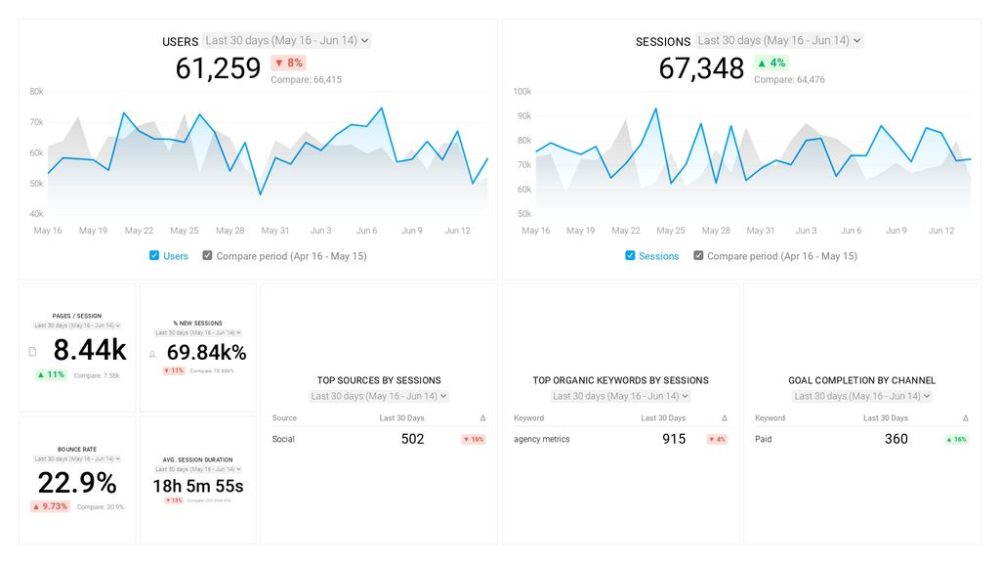
PRO TIP: How to track these 10 popular Google Analytics 4 metrics
Sure, there are dozens (and dozens?) more Google Analytics 4 metrics you could track. But, starting with these 10 commonly tracked metrics will give you a pretty high-level view of how your marketing is working…
- Sessions: The number of sessions can tell you how many times people are returning to your website. Obviously, the higher the better.
- Sessions by organic keyword: Which organic keywords bring in the most traffic to your website? This may help you determine whether your SEO investments are paying off.
- Bounce rate: Do visitors leave shortly after landing on your website? Or do they stick around?
- Average session duration: How much time are people spending on your website? Users with a high average session duration are most likely relevant to your company.
- Goal completions: How many users responded to your call to action?
If you want to track these in Google Analytics, you might find the visualizations limiting. It’s also a bit time-consuming to combine all the metrics you need in one view.
To better understand how your website performs in terms of traffic growth and conversions, we’ve made this plug-and-play dashboard that contains all the essential metrics for understanding how successful you are at optimizing different aspects of your website.
You can easily set it up in just a few clicks – no coding required.
To set up the dashboard, follow these 3 simple steps:
Step 1: Get the template
Step 2: Connect your Google Analytics account with Databox.
Step 3: Watch your dashboard populate in seconds.
SEO Hacker’s client testimonial page
Sean Si from SEO Hacker shares the story behind their testimonial page. “We’ve helped a lot of clients throughout the years and we’ve documented the most memorable ones on this page.”
“Many of our new clients who come to us say that the thing they like the best on our testimonial page is the videos. It makes testimonials feel more genuine as to just plain text and a few star icons.” This makes sense as video testimonials feature your clients telling their stories which makes them quick and easy to trust.
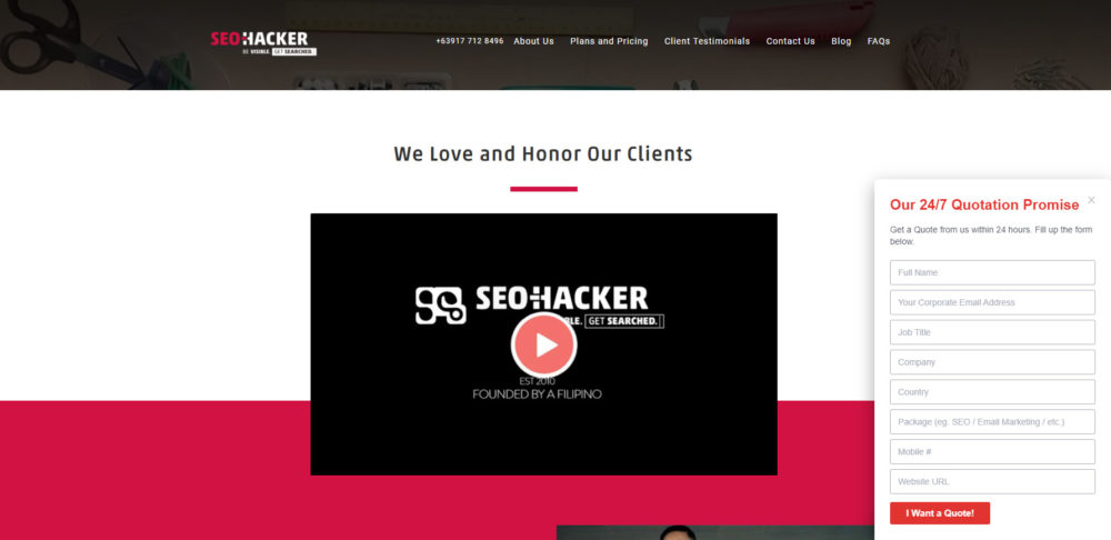
Takeaway: Tap into videos for testimonials – ask happy clients to shoot a bite-sized clip about how it was like to work with you. Or, if they’re keen, invite them for a video-based interview testimonial.
And here are a few more examples of useful marketing videos you can make without breaking the bank.
Mark Armstrong’s testimonial page
“The page is highly visual. It’s one long string of testimonials (36 in all),” writes Mark Armstrong Illustration’s Mark Armstrong. “Lots of white space. The viewer can scroll down and read as many as they wish.”
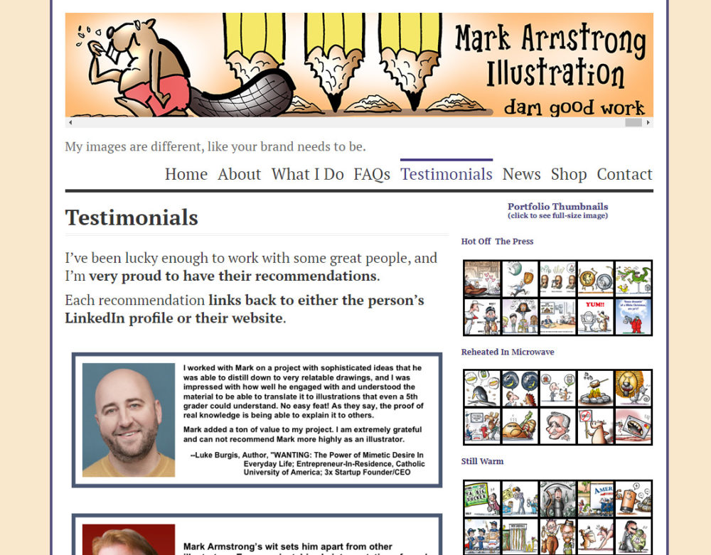
Note that the emphasis is on two things here:
- Providing a gallery of testimonials so visitors can read as many as they like.
- Making sure the page is easy to read – not cluttered and, therefore, incomprehensible.
If the same page featured small font and less white space, it’d have repelled visitors. Meaning: they wouldn’t have been interested in reading the testimonials at all.
Another notable point: Armstrong features testimonials from their biggest clients such as Coca-Cola and Chick-fil-A at the top. This way, they get the most eyeballs – even in cases when visitors don’t scroll down the page to read more words.
This tactic also helps build instant credibility as visitors think ‘if folks like those at Coca-Cola trust this person, we should too.’
On top of this, Armstrong adds: “worth mentioning: with two exceptions, the testimonials were given to me via LinkedIn, and they reside on my LinkedIn profile.”
“The problem: LinkedIn recommendations are text-only, and only the first two actually display (the viewer has to click to see more). Also: they display in date-received order, and there’s no way to reorder them and put the ‘best ones’ on top. Which means my LinkedIn recommendations are giving me very limited exposure.”
“So I used the recommendations to construct corresponding graphics, and those are what you see on my site’s Testimonials page,” explains Armstrong. “If you click on a testimonial, you’re taken to the person’s LinkedIn profile or website, which also adds credibility.
As you scroll through the testimonials, my illustration samples (thumbnails) display on the right-hand side, which, in a subtle way, ties the testimonials to the work I do for clients.
Finally, by reformatting the original text-only testimonials and turning them into graphics, I made them mobile. I can tack one on to the end of every blog post and include them in social media posts.”
Takeaway: Publish your LinkedIn testimonials on your site. This helps you get more people to consume your testimonial content – plus you can arrange them in whatever order you prefer (think of it as a great way to feature the best ones first for extra credibility).
To learn more about marketing your business on LinkedIn, check out our post on the most effective LinkedIn marketing strategies (sourced by 30 experts).
Alliance Technology Group’s testimonial page
The team at the Alliance Technology Group doesn’t have a separate testimonial page. Their ‘About Us’ page “is basically a testimonial page that we request our sales agents to bring up during their initial calls with potential clients,” comments Addys Guerra.
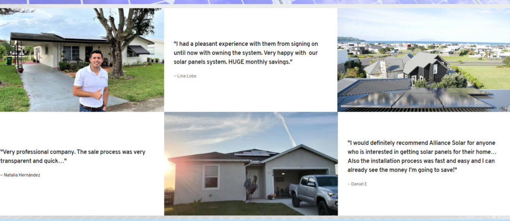
Guerra explains the layout of this page: “It showcases the list of news stations and other online news that have featured our company, along with a screenshot of the article. The page begins like this because readers can see from the beginning that we are a real company and have been so successful that we are featured in influential media.”
“As you scroll down, we use quotes from our Google Reviews that our past clients have left us, along with images of solar panels that convey the work we’ve done,” continues Guerra. “This testimonial page is so powerful because it proves that we are the best in what we do in our area. This page alone helps us close around 33% of our potential sales.”
Takeaway: Double the social proof by adding media channels you’ve been featured at on your testimonial page.
Bizzabo’s testimonial page
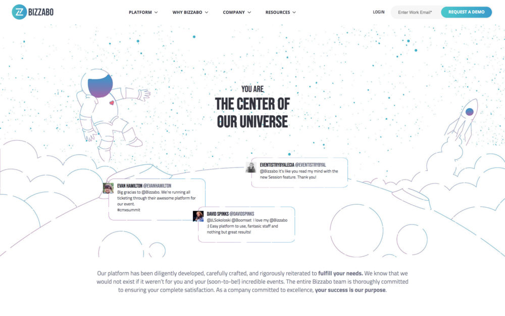
PhotoAiD’s Tomek Mlodzki share Bizzbo’s page when asked about testimonial page examples. Mlodzki applauds the variety of social proof-based content shared.
“It starts with small tweets where customers state why they are satisfied with their product. As you go along, the company establishes its authority through case studies they have done, and finally ends with a very interactive video testimonial,” elaborates Mlodzki.
What’s more, their page design is also commendable as Mlodzki notes. “The design introduces you to the space, and prompts you to take action with a ‘You are the center of the universe.’” Talk about engaging your visitors right.
Takeaway: Pay attention to your testimonial page’s design. You can always keep it minimal while focusing on adding enough whitespace and using design elements like arrows to encourage people to scroll. Or, you can get creative and design a theme-based page as Bizzabo did.
Klientboost’s testimonial page
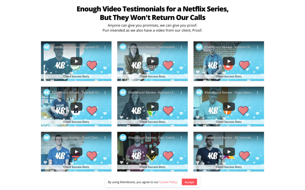
Nate Rodriguez from LIFTOFF Digital writes “I’ve seen a lot of testimonials pages but the KlientBoost results page is the best I’ve ever seen.”
The reason Rodriguez appreciates it so much? The design and variety of testimonials – things we’ve seen in other testimonial page examples above.
“It’s a great example because first, the page has a ridiculous amount of amazing testimonials, and second, the design and layout of the page is stellar. I’d hire them,” as Rodriguez puts it.
Takeaway: Gather all the praise clients have sent your way – be it on social media, a reviewing platform, or directly with you. Then, select the best ones – including ones that explain how working with you made them feel – and add them to your testimonial page.
Wondering what’s the ideal number of testimonials to add to the page?
42%, the majority of folks from our contributor’s pool say between 1-5 testimonials are good. 35% say it’s okay to add over 10 testimonials. And, approximately 20% think you should share 6-10 testimonials on your product/service.
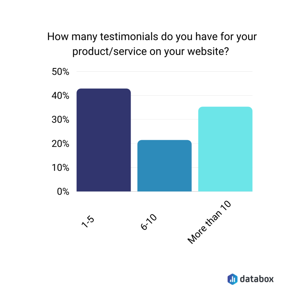
That said, remember: there’s no magic number of testimonials you should be adding. Just keep in mind: too many can confuse the reader – some may even give up reading them altogether. Too few, however, means you aren’t offering variety – which reduces your opportunity of sharing what your customers think about you.
Booksy’s testimonial page
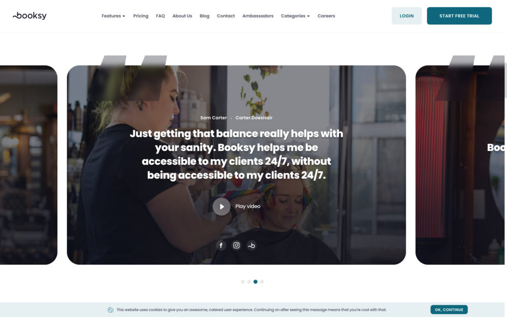
“Booksy’s testimonial page is very innovative and well-made,” highlights Dima Suponau from ExtensionFile.
“The company starts by listing the advantages of signing up. Their claims are supported by the credentials of business owners who greatly benefited from signing up to Booksy.
You can easily replicate this approach – talk about your product/service. However, it’s best to balance this with the actual benefits that your product has driven for your customers.
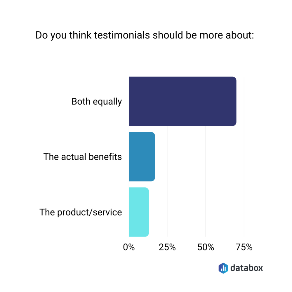
Nearly 65% of the respondents agree these types of testimonials that balance sharing benefits while talking about the product are helpful.
Some 18% think testimonials should be about the actual benefits only. And, only around 12% say testimonials should be product/service-focused.
Circling back to Booksy’s page, Suponau goes on: “the video form is more personal showing real people, to whom visitors of the website can relate; and telling real stories, which are more compelling and engaging than text.”
Takeaway: Sell your product’s benefits by backing them with real-life stories (aka case studies) of how it’s helping others achieve X results. Wherever possible, use hard numbers to share results you’ve achieved for other customers. For example, increased client conversion rate by 77.4%.
Related: 22 Marketing Agencies Shared Their Top Case Studies. Here Are the Precise Strategies They Used
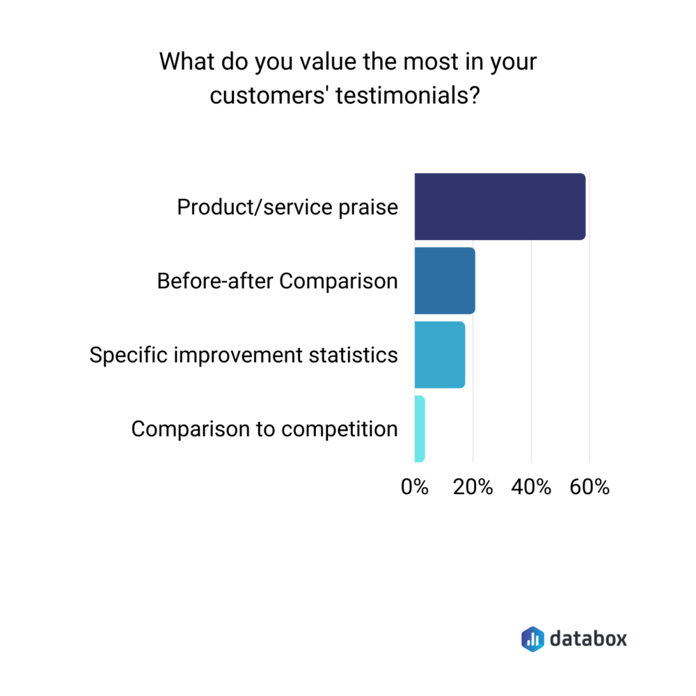
Don’t have hard numbers proving results? No worries. Of all the types of testimonials and the customer views they bring to the table, simple praise-giving customer reviews tend to be our respondents’ favorite. In fact, around 59% say they evaluable praise the most in the testimonials they get.
20% look at the before-after comparison and 18% look for specific improvement statistics. Only 3% look for testimonials that compare them to their competition.
Better Proposals’ testimonial page
Last on this list of testimonial page examples is this one.
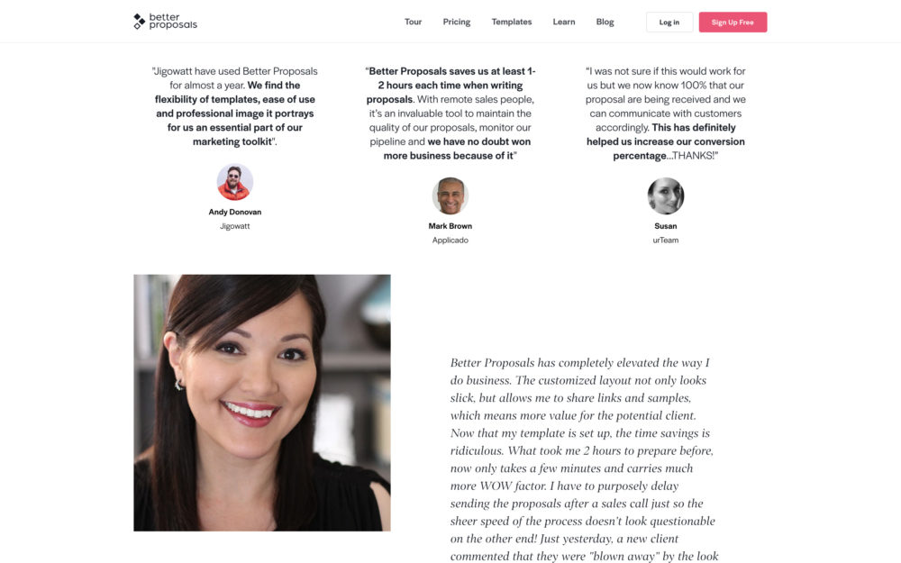
Better Proposals’ Petra Odak talks about what they did: “We used a good mix of videos and text and we made sure to include a variety of industries and people with different ranks, from account managers to CTOs and CEOs.”
Takeaway: If you’re targeting multiple audiences, make sure you share customer praise from various industries as well as different people – preferably those who align with your target buyer persons.
To recap, testimonials bring social proof to the table, therefore, helping increase conversions. It’s why you can never take sharing them lightly. With these testimonial page examples though, we’re sure you’re feeling ready to create or revise your testimonial page to make it more readable and showcase variety.


